About
Randy Krum
President of InfoNewt.
Data Visualization and Infographic Design

Infographic Design

Infographics Design | Presentations
Consulting | Data Visualizations

DFW DataViz Meetup

Join the DFW Data Visualization and Infographics Meetup Group if you're in the Dallas/Fort Worth area!

Search the Cool Infographics site

Custom Search

Subscriptions:


Feedburner

The Cool Infographics® Gallery:

How to add the
Cool Infographics button to your:

Cool Infographics iOS icon

- iPhone
- iPad
- iPod Touch


Read on Flipboard for iPad and iPhone

Featured in the Tech & Science category

Flipboard icon

Twitter Feed
From the Bookstore

Caffeine Poster

The Caffeine Poster infographic

Entries in poster (133)

Monday
Jan252010

Making-Of The Caffeine Poster - Part 3


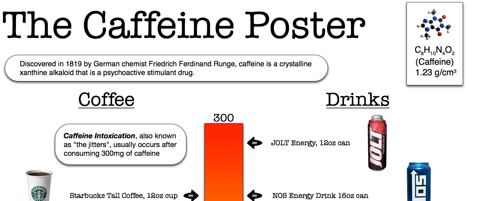
How did you pick which drinks to include?

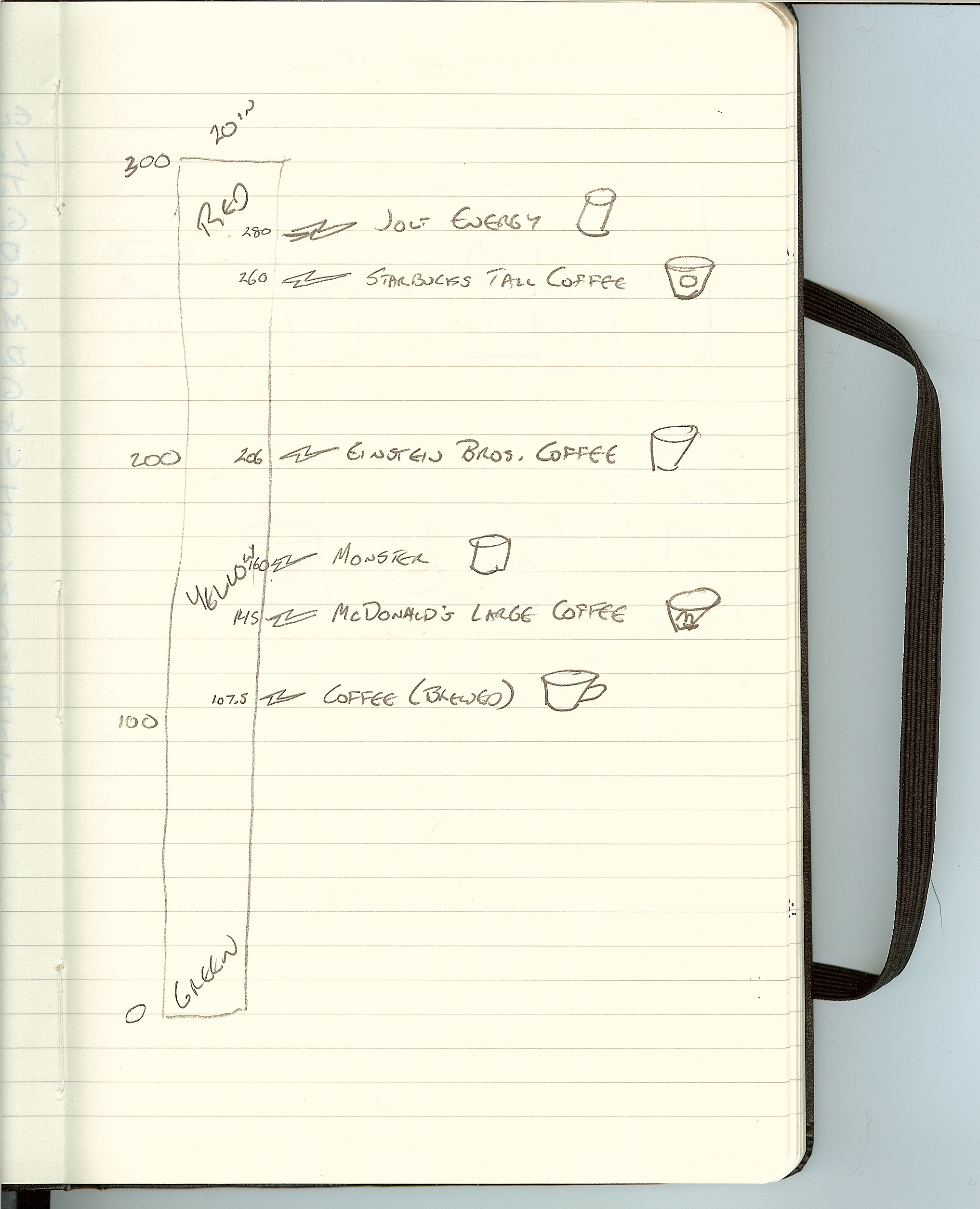
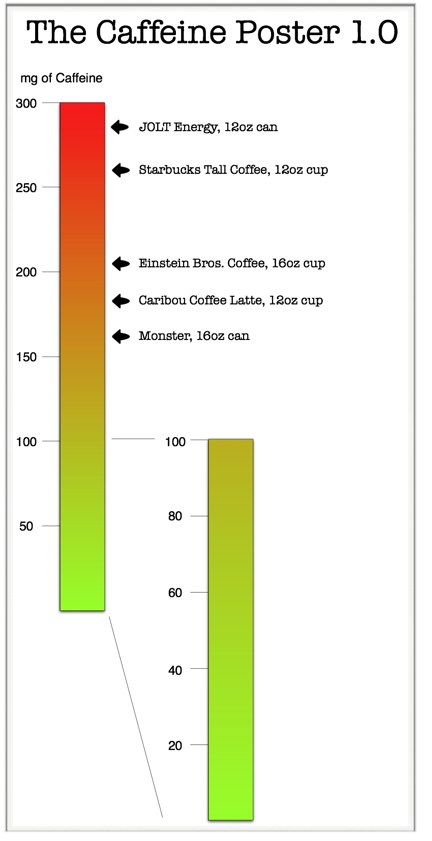
The original spreadsheet with the caffeine calculations had about 100 drinks on it, but that made the image WAY too crowded.  Looking back, I could have made the images smaller to fit more drinks onto the poster, so maybe the next version will have more.

For the coffee side, I picked some of the most widely available coffee shops, and I also only picked one drink from each.  Starbucks alone had 20-30 different drinks I could have listed.

For the drinks side, I picked the drinks that were most widely available at the grocery stores in the DFW area.  It may be different regionally, but the local region was all I had to work with.


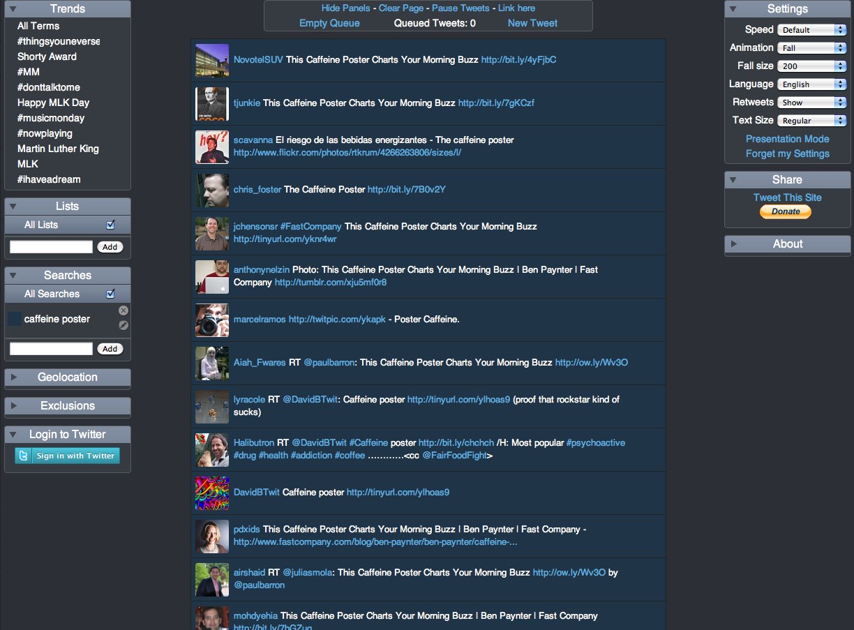
Dude, where’s the TEA?!?

I posted this in the comments, but I know I left tea out of the graphic (along with thousands of other drinks). It was actually hard to cull down the wide assortment of drinks down to only the ones I included. Not a tea drinker myself, tea didn’t make the cut (Kevin Rose would be disappointed, I know).  It’s very crowded in the under 100mg space, so tea didn’t make the cut.  Based on the feedback I got, I’ll include it if a next versions happens.

FWIW, tea averages between 40-70mg of caffeine in each 8oz cup


Can I buy a copy of The Caffeine Poster?

I haven’t setup the poster for sale, but I did keep the high-resolution images offline so I could make it available if there was interest.  The images on Flickr are certainly high-resolution enough to read the details, but they won’t print very nicely as a 24” x 36” poster.  So far, I haven’t heard from many people who wanted to buy a copy.

I also got some feedback that The Caffeine Poster makes a good infographic, but maybe not a great poster.  To be a great poster, it probably need more details and other additional information to make the viewer curious to step closer and read more.

However, I did have a few copies printed for myself…of course.


Will there be a next version?

Probably.  I’ve got some other projects in the works, so there’s no telling how long it will take.  You suggestions on what to change or add are very welcome.


The is the end of the Making-Of posts.  I got so many questions about the behind-the-scenes stuff that I moved all of The Caffeine Poster posts together on a separate page.  Check out the Caffeine Poster link at the top of the page.

Tuesday
Jan192010

6 Twitter Topic Visualizations for "Caffeine Poster"

The Caffeine Poster got a huge amount of traffic, specifically on Twitter, so I thought this would be a good chance to share a collection of the available, interactive twitter visualizations.  Although there are many visuals that show a Twitter user’s network of connections, these are visualizations that show conversations based on the search topic “caffeine poster” on Twitter.

SocialCollider.net, by Karsten Schmidt and Sascha Pohflepp, maps the connections within a conversation starting with a Twitter stream or search topic.

This experiment explores these possibilities by starting with messages on the microblogging-platform Twitter. One can search for usernames or topics, which are tracked through time and visualized much like the way a particle collider draws pictures of subatomic matter. Posts that didn’t resonate with anyone just connect to the next item in the stream. The ones that did, however, spin off and horizontally link to users or topics who relate to them, either directly or in terms of their content.


The Twitter Streamgraph from Jeff Clark at Neoformix.

The StreamGraph shows the usage over time for the words most highly associated with the search word. One of these series together with a time period are in a selected state and coloured red. The tweets that contain this word in the given time period are shown below the graph. You can click on another word series or time period to see different matches. In the match list you click on any word to create a different graph with tweets containing that word. You can also click on the user or comment icons and any URL to see the appropriate content in another window. If you see a large spike in one time period that hides the detail in all the other periods it will be useful to click in the area to the left of the y-axis in order to change the vertical scale.


Cloud.li, by Elbert F, creates a word cloud based on your search terms.


Trendistic will plot the tweet volume on a timeline based on your search terms.  You can click anywhere on the timeline to see the specific tweets for that time too.

Trendistic is a tool that allows you to track trends on Twitter, similarly to what Google Trends does for Google searches. It gathers tweets as they are posted, filters redundant ones and compiles the rest into one-hour intervals.

This way, it shows how the frequency of one, two, three and four-word phrases fluctuate over time. The result is a visualization of what is popular and what is not among Twitter users, and how certain events are reflected or even predicted by themicroblogosphere.

You can enter a phrase (topic) in the 
Trendistic search box to see how its frequency varies over time, or several different topics separated by commas to see how they relate (each topic will show in the chart with a specific color): try comparing ‘dinner’ and ‘breakfast’ or ‘morning’ and ‘night’ for instance, to see how powerful it can be. 


TwitterFall shows you the tweets based on your search term, and presents them as an animated waterfall.

Twitterfall is a way of viewing the latest ‘tweets’ of upcoming trends and custom searches on the micro-blogging site Twitter. Updates fall from the top of the page in near-realtime.

For popular trends, Twitter is queried from the Twitterfall server, and results arepushed to your browser, rather than your browser doing the queries, or your computerpolling our server repeatedly. This means using Twitterfall for popular trends is nicer on Twitter than other services.


 TwitRadar.com will map out a search term, a user or a hastag into a handful of different visuals.

Google Translated from Portuguese: The TwitRadar is a tool for monitoring Twitter. With TwitRadar you can track, monitor and share real-time, the subject you want. Just type the tag you want to track, the TwitRadar show, very simple and intuitive, all that is written about it on Twitter. And not to be confused with the volume of information tracked, the TwitRadar organizes the results according to the criteria that you want.

Friday
Jan152010

World Progress Report poster - Available for one week ONLY


Nathan Yau at FlowingPrints has released a new poster, the World Progress Report.  It’s available for one week ONLY, and then he’s going to release the printer to start printing them up.  Orders will only be taken until January 21st.  Each 24”x30” poster is signed and numbered, and one can be yours for $26 + shipping & handling.

Nathan is doing another great thing.  All proceeds go to UNICEF’s relief effort in Haiti!

One more thing…for the first 50 people who pre-order: a free copy of Atley’s “How America Learns” poster!


UNdata provides a catalog of 27 United Nations statistical databases and 60 million records about the past, present, and future state of the world. Topics include demographics, life expectancy, labor levels, poverty, and a lot more. What does all that data mean though? World Progress Report, the latest from FlowingPrints, offers a look into the expansive UN collection.

In whole, the report tells a story of how we live and die, and the stuff in between.


Check out some of the great details in the poster:


Friday
Jan152010

Making-Of The Caffeine Poster - Part 1

As much as I love infographics, I’m not a graphic designer.  I’ve created a number of graphics for my corporate jobs, but they always deal with confidential information so I can’t share those on the blog.  Up until now, all of the graphics I’ve posted about on Cool Infographics are the work of great designers around the world.  Recently, I decided to try my hand at creating one of my own to share with everyone.

If you follow me on Twitter (@rtkrum), you may have read that I started on this back in June 2009.  I haven’t had much time to spend on it, so it definitely took longer than I originally thought.  I want to share some of the decisions and solutions I came across during the process, and maybe it will help anyone reading this when they work on their own infographics.

You may say, “This is such a simple graphic, why did it take 6 months?  It looks like it should be pretty easy.”  First, I would say that I wasn’t working on it full time, but I think the exercise also highlights how much work really goes into infographic designs.  It’s not a new sentiment, but let me say that designers don’t get enough credit.


What should the infographic be about?

Of course the first question I had to tackle was what should I create an infographic about?  I wanted to find something that had a lot of publicly available data, but also a topic that hadn’t already been covered by a bunch of other graphics.  A topic of interest to a lot of people, so the audience for the infographic would also be large.  I liked the idea of caffeine content because although the data is available online, it’s not included on the government regulated Nutrition Facts on drinks.  Very few companies add it voluntarily, but for the most part you have to go find the data on your own.

Also, the data available online was predominantly text figures, so you have to scroll through pages of information to find the drink you’re looking for.  This combination of hard to find data, and hard to decipher once you find it made for a good topic.


How to calculate the data?

I created a simple spreadsheet to massage the data, and there were two ways I could have calculated the caffeine content.  Either total caffeine content (mg), or caffeine concentration (mg/oz).  Although caffeine concentration would be a good common denominator to compare drinks, it doesn’t capture how much you consumer when you actually purchase a drink.  Most of these drinks don’t come from a dispenser where you could choose how much you wanted to drink.

For example, the Starbucks Doubleshot is a very high concentration (20 mg/oz), but it comes in a 6.5oz can.  Therefore you only get 130mg of caffeine when you drink a can.  Compare that to a McDonald’s Large Coffee that has a lower concentration (9 mg/oz), but comes in a 16oz cup for a total of 145 mg.

Ultimately, I decided to visualize the consumer friendly version that would should how much you get when you make a purchase decision, and went with the total caffeine content.


What type of visual should I use?

The scale was the obvious choice to show the relative content of the drinks.  Back in June, I started with a very simple sketch in my Moleskine.


Because there are so many drinks in the lower half, my original design thought had a closeup of the 0-100mg range.  Here’s an early working version:

I didn’t like how this looked, or how much dead space in the post this would create.  So ultimately I ended up significantly cutting down the number of drinks I could include, and moving the scale to the center so I could include drinks on both sides.

You’ll also notice how muddy brown the yellow in the middle of the scale looks in these old images.  I later figured out how to do a 3-color blend instead of just a 2-color blend from red to green.


What software did I use to create the poster?

This is easily the most asked question I hear about any infographic.  I use a Mac, and really only used a small number of applications.  Here’s a list of the software packages I used:

  • OmniGraffle Pro 4.2.3 - Overall layout and creation of the final image
  • Pixelmator 1.5 - Image editing
  • Keynote 5.0.3 - Used for image editing and alpha masks
  • Numbers 2.0.3 - For the data calculations

 I will add that one of my best friends is an art director, and she helped clean up a few of the photos using Photoshop and Illustrator.  A huge “Thank You” to Steffani for her help.


More to come…

Making-Of The Caffeine Poster - Part 2

Tuesday
Jan122010

Bronson Wins Infographic Poster!


Congrats to Bronson Harrington (@Gnuboss on Twitter)!  Bronson won a free poster of his choice from Infojocks.com by retweeting about the infographic contest we announced in December.  By including the #BCSvisual hashtag, Bronson was then randomly selected to receive the free poster.

The contest wraps up next week, so look here for all of the entries and the winner.

Thanks to everyone for helping to spread the word!

Monday
Dec212009

Infographic Posters for Data Lovers

Both Infosthetics.com and Datavisualization.ch have posted great stories about what to give the data lover in your life for Christmas.  From books to posters to software to conferences.  Please visit those sites to get the whole list of ideas, but here I'd like to present a few of my favorite posters made by the friends of Cool Infographics.  Just click on the images to be taken to somewhere you can purchase these.

Posters:


The History of the Supreme Court of the United States
from Nathaniel and Frank at TimePlots.com


Death & Taxes
from Jess at WallStats.com


Two posters: "Cities of Champions" and "The Taxonomy of Team Names"
from Jeremy at InfoJocks.com


Web Trend Map 4


The Conversation Prism 2.0
from Brian Solis and Jesse (Jess3) at theconversationprism.com

Thursday
Dec172009

The Simpsons 20th: Comedy [Family] Tree


The Simpsons celebrate their 20th anniversary this week on Thursday, and CNN Entertainment published this chart "The Simpsons Comedy Tree" on Monday.  A combination Nightingale Rose Graph (also called a polar area diagram), family tree and timeline, this simple chart connects the influences that impacted Matt Groening and the creators of the Simpsons as well as the shows that came after.
"The Simpsons" stands on the comedic shoulders of many that came before -- and has influenced countless works that have arrived since. Here are just a few of the roots of the "Simpsons" comedy tree and the branches of those it gave life to. (The following, illustrated by the doughnut at the top of the story, is by no means complete, and each member has its own, sometimes overlapping influences.) 
Thanks to Tony Hendra's "Going Too Far" for inspiration and cartoonist Art Spiegelman for having his fingerprints all over the place.
The article also includes descriptions of the actual influence for each of these shows.

Thanks for the link Matt!

Also:


For those Simpsons fans of you, here is also the poster created exclusively for Entertainment Weekly celebrating the release of the 20th season DVD set on Jan 12.  Dude, make sure to go look at the large, scrollable version.

Saturday
Dec122009

My Digital Life - personal infographic


My Digital Life, is an quick infographic by me!  A mindmap or network map of the digital products in my life, and how they all interconnect. Each connection is color-coded by the connection type (USB, wireless, ethernet, etc.) including its respective standard icon.  High-res version is on Flickr.

This started as a simple sketch to help me determine how to add a new external hard drive I got on Black Friday, but it quickly became much more fun to see how far out I could push the network.  I already know of some more that I want to add, so someday there may be a 2.0 version.  Apparently, I could use an IT manager at home.


I did ignore some differences within the connection types to keep this fairly simple.  I don't distinguish between USB 1.1 and USB 2.0 connections.  I use "Display" as a connection type, but its a DVI connection for the MacBook, a HDMI connection from the AppleTV and a composite connection from the DVD player.  I also show only one "Wireless" connection, but I know that the iPhone only uses 802.11g and the laptop uses 802.11n.

I did this using OmniGraffle, with a little help from Pixelmator and Keynote to clean up the images.

Monday
Dec072009

A Visual History of the Supreme Court - New Infographic Poster!


Today, I want to share the launch of Timeplots.com.  A new infographic site focused on designing visual timelines by Nathaniel Pearlman and Frank Hamilton.  The Timeplots.com site launched today highlighting their first project; a poster called “A Visual History of the Supreme Court of the United States”.

This large-scale (48″x32″) print displays the full sweep of American federal judicial history from 1789 to 2009. It combines biographical information on every Supreme Court justice with a visualization of the influence of U.S. presidents and their political parties on the Court over time, and includes vote counts and summaries of landmark cases.

Months of work went into researching the history of the Supreme Court, and that effort really shows through in the level of detail in this poster.


It’s a good thing they offer this as a large format poster, because the detail draws you closer to discover the events and landmark decisions that are the colorful history of the SCOTUS (Supreme Court of the United States).


I love that even on their About page, they created small, infographic timelines as a visual of their individual experiences and career histories.  Here’s Nathaniel’s:


Timeplots has also started a new service, Timeplots on Demand:

Timeplots’ dedicated staff is ready to work directly with you to honor your own organization—your company, school, nonprofit, team, church, or family—with a custom Timeplot of your institution’s history. Let us help you collect data, create memorable images, and visualize the developments of your institution.

Congratulations to both Nathaniel and Frank!


Thursday
Dec032009

Sports Infographic Poster Deal from Infojocks!


Jeremy over at Infojocks is offering a special discount deal for the holidays: Buy one poster, and get the second poster for half price!  (offer good through Friday, Dec 11th).  That's any two posters from his store for $30!  Choose from "Cities of Champions", "Taxonomy of Team Names" or "Road to the Stanley Cups".

For readers of Cool Infographics to take advantage of the deal, go to the Infojocks store.  No promotion code necessary, the discount will be automatic when you add two posters to your shopping cart.

Infojocks.com is a great site by our friend Jeremy Yingling who designs and produces infographic posters covering sports related topics.  Great gifts for the sports fan on your Christmas list!