About
Randy Krum
President of InfoNewt.
Data Visualization and Infographic Design

Infographic Design

Infographics Design | Presentations
Consulting | Data Visualizations

DFW DataViz Meetup

Join the DFW Data Visualization and Infographics Meetup Group if you're in the Dallas/Fort Worth area!

Search the Cool Infographics site

Custom Search

Subscriptions:


Feedburner

The Cool Infographics® Gallery:

How to add the
Cool Infographics button to your:

Cool Infographics iOS icon

- iPhone
- iPad
- iPod Touch


Read on Flipboard for iPad and iPhone

Featured in the Tech & Science category

Flipboard icon

Twitter Feed
From the Bookstore

Caffeine Poster

The Caffeine Poster infographic

Entries in poster (133)

Thursday
Apr072011

The Map of the Internet

The Map of the Internet is an ambitious project from Peer 1 Hosting that maps the network of hosts and routing connections that are the foundation of the Internet.  Clicking on the image above takes you to the poster in an interactive zooming viewer so you can see the details.  You can also read about the making of the poster in this post on the Peer 1 Hosting blog.

It’s a layout of all the networks that are interconnected to form the internet. Some are run by small and large ISPs, university networks, and customer networks - such as Facebook and Google. It’s visual representation of all those networks interconnecting with one another, forming the internet as we know it. Based on the size of the nodes and the thickness of the lines, it speaks to the size of those particular providers and the connections. 

In technical speak, you’re looking at all the autonomous systems that make up the internet. Each autonomous system is a network operated by a single organization, and has routing connections to some number of neighbouring autonomous systems. The image depicts a graph of 19,869 autonomous system nodes, joined by 44,344 connections. The sizing and layout of the autonomous systems is based on their eigenvector centrality, which is a measure of how central to the network each autonomous system is: an autonomous system is central if it is connected to other autonomous systems that are central.

My apologies for being late posting this one here on the blog.  They were giving out free printed 24”x36” posters at SxSW in Austin, TX a couple weeks ago, but the high-resolution PDF is available from the Peer 1 Hosting site.

Thanks to Shobhita for sending me the information and the link!

Friday
Feb182011

The 2011 Massachusetts Budget infographic poster

Jess Bachman, from ByJess.net,  has designed this new government budget poster of the 2011 Massachusetts Budget for The Pioneer Institute.

The most largest and most detailed visualization of a state budget ever, this 864 sq in poster (not for sale) compares hundreds of programs and expenditures from the billions down to the thousands of dollars.  If you really want to see how a state (like Massachusetts) spends it’s tax payers money, this is it.

The above graphic is a massive visual guide to the Massachsettes state budget. It presents hundreds of government departments, agencies, and programs in a visual format, proportionate in size to their funding level. The largest item is $15 billion, the smallest is $65 thousand.

Similar to his Death & Taxes poster of the Federal budget, the Massachusetts Budget poster is highly detailed, showing how spending for every department is broken down.


Although it’s not clear if The Pioneer Institute will make posters available for purchase, you can see the full detail online in this high-definition zoomable image.  (Check it out full-screen too!)


Wednesday
Feb162011

The Visual History of the Political Parties (infographic posters)


Timeplots.com has just released two new posters visualizing the history of the two major American political parties.  Zoomable images of both A Visual History of the Democratic Party and A Visual History of the Republican Party are available so you can see all of the detail online.  

Timeplots is also offering a discount to readers of Cool Infographics!  Enter the Coupon Code “CIG020311” to receive 10% off until 3/31/11!


Just like the other great posters from Timeplots.com, these are highly-detailed posters, loaded with a huge amount of data.  At its heart, they are timelines that show the overall party strength from 1832 (Democrats) or 1856 (Republicans) to the present.  Along the timeline additional information is included like the names of the national party chairs, Congressional leaders, city where the party convention was held, who were the winning and losing party nominees for President (along with campaign material), election highlights, party events, major legislation, as well as pictures of other party notables.

You get the point that there is a lot of history in there!

It places each party event in historical context, visualizing a remarkable range of party events, legislation, election results, and leadership to succinctly tell the story of the party. Narratives are displayed within the larger context of party strength by aggregating and annotating data on presidential elections, Congress, Governorships and State Legislatures. The Timeplot provides a new lens into American political history; it is not intended to be absorbed at a glance, but rather to be visited and revisited over time.

Posters are 36” x 24” and normal price without the discount is $29.95.

Posters should start shipping by 2/28.  Also, check the Timeplots.com site for student discounts on any of their posters.

Monday
Oct182010

The Conversation Prism 3.0 for 2010

Brian Solis and JESS3 have released v3.0 of The Conversation Prism for 2010.  The Conversation Prism is a great infographic showing the major players in each of 28 different online conversation categories.  The original 1.0 version from August 2008 (image available on Flickr) only had 22 categories, and some of those only had one player.

You can buy the poster (I’ve got v2.0 hanging in my office) for $20, or there are also some great multi-pack deals for 3 posters for $40 or 4 posters for $50.

One of the best projects I’ve worked on is to use this idea to help companies map out their own corporate online strategy.  Which if these categories and tools are you trying to use to drive your business?  My advice, don’t try them all, be targeted about which ones are best to reach your target customers.  Use this as a guide, but make your own company-specific conversation prism.

Found on FastCoDesign by Cliff Kuang

Thursday
Jun242010

Adobe Actionscript 3.0 Poster Viewer

Adobe has published posters like this one before for registered users of their different software packages.  Now you can download the ActionScript 3.0 Diagram Viewer, a zoomable version using Adobe AIR.  This can keep a stand-alone viewer on your desktop (or 2nd monitor) as a reference when you need it.  For some developers, this may be easier than viewing the high-resolution JPG.

With the excellent feature from Zoomify, and the nicely laid out AS 3.0 posters, you are able to zoom and navigate through the entire Flash and Adobe® AIR™ ActionScript 3.0 API.

The AIR app was designed by ShaneHoffa.

Thanks to Julz for the link!

Thursday
Jun102010

A Visual History of the American Presidency - new infographic poster


Timeplots has released their second infographic poster, A Visual History of the American Presidency.  Timeplots was launched by Nathaniel Pearlman and Frank Hamilton in December 2009 with the release of the Visual History of the Supreme Court infographic poster, which is now hanging in many schools, law practices and political offices.

This large-scale print is like nothing else available on the history of the American presidency. It places each president in historical context, visualizing a remarkable range of political, social, and economic measures to succinctly tell the story of the presidency. Narratives are displayed within the larger context of American political history by aggregating and annotating hard data on population, presidential elections, Congress, the Supreme Court, the Cabinet, the U.S. economy, and the federal budget and debt. The Timeplot provides a new lens into American political history; it is not intended to be absorbed at a glance, but rather to be visited and revisited over time.


A beautiful poster, and a very impressive infographic design.  Very Tufte-like in its infographic design, which is no surprise since Nathaniel was a student of Edward Tufte at Yale.  

At its heart, this is a fantastic mix of timelines.  Additionally, the poster is an incredibly detailed infographic that includes things like the time period of each President, the balance of Congress during each term, approval ratings, population growth, the U.S. GDP, the Federal Budget, unemployment, election cartograms and statistics, a biography of each President’s political history and so much more.


The high-resolution infographic is available on the Timeplots site using Zoomify, but it really shines as the printed poster.  You can order the printed 32”x48” poster from the Timeplots.com site for $45, or a smaller 24”x36” version for $30. 


Great job to the entire team at Timeplots!  Later today, I’ll post a behind-the-scenes interview with Nathaniel.

Friday
Apr302010

What Font Do I Use? - a Typeface Decision Flowchart

Graphic designer Julian Hansen created this cool typeface decision flowchart, So You Need A Typeface, as part of a school project.  The high-resolution version is available to view online, but you can also pre-order the poster version here for $22.  It should start shipping on May 2nd.

So you need a typeface is an alternative way on how to choose fonts (or just be inspired) for a specific project, not just by browsing through the pages of FontBook. The list is (very loosely) based on the top 50 of the “Die 100 besten schriften”.

Of course, the part all of you want to see is the infographic branch…

Found on FlowingData.com

Wednesday
Apr282010

Jess Bachman Interview (Death & Taxes 2011 Poster Giveaway!!)  #deathandtaxes

Last week, Jess Bachman (@mibi) from WallStats.com released the new 2011 Death & Taxes poster.  I caught up with Jess (by email) to ask some questions about his huge infographic undertaking.  The high-resolution image of the poster is available now online, and the printed version will start shipping on May 7th.  You can pre-order for $24, and the shipping cost is only $0.75 TODAY (April 28th)

WIN a copy of the poster!  Jess has been kind enough to offer a free poster to a reader of Cool Infographics.  To be eligible, you must tweet (or retweet) a link to this post on Twitter before May 7th, and include the #deathandtaxes hashtag.  I included the hashtag in the post title, so any retweets will be automatically eligible.  NOTE: you must also be following me on Twitter (@rtkrum) so that I can send you a DM if you have won!
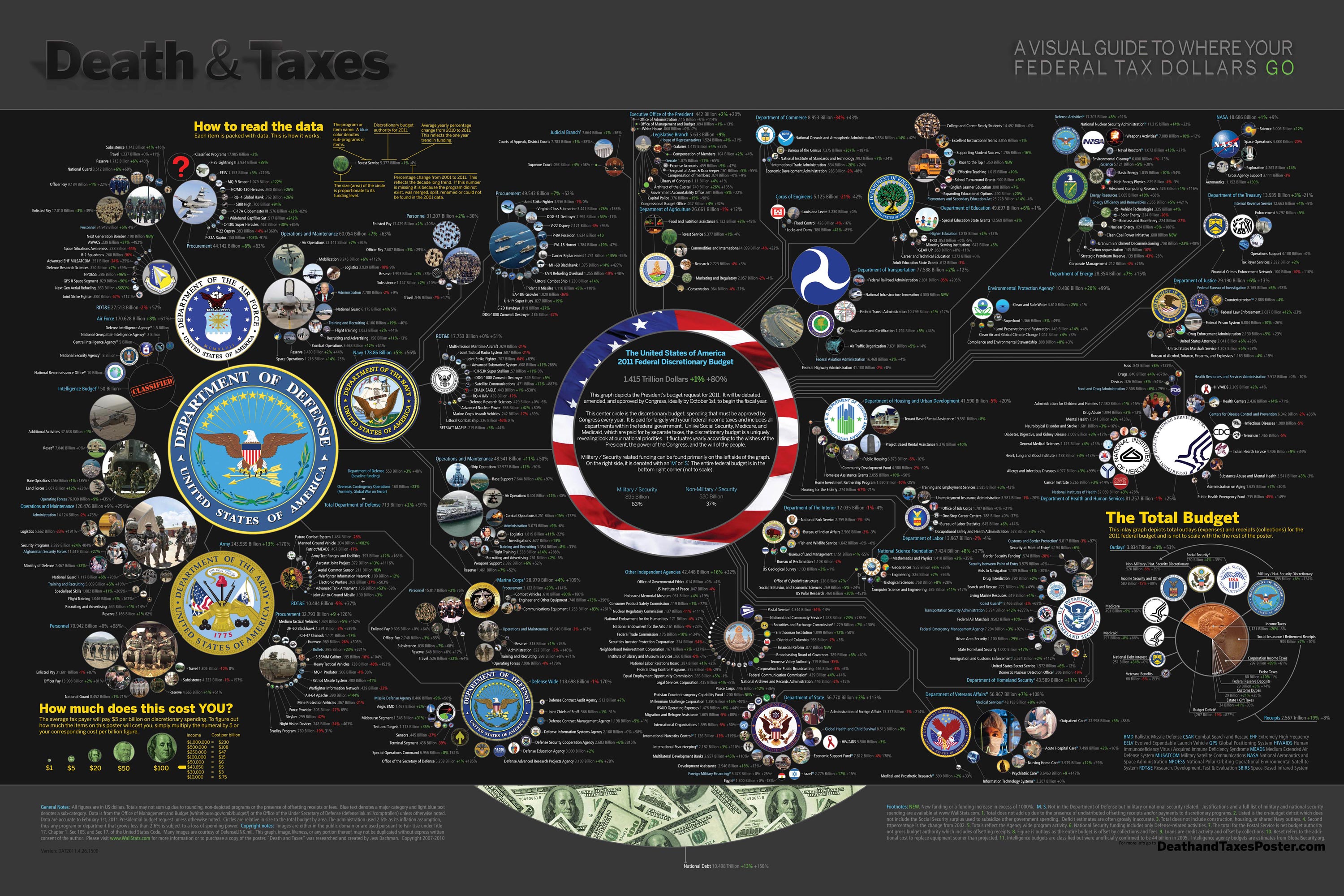
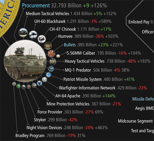
Death and Taxes” is a large representational graph and poster of the federal budget. It contains over 500 programs and departments and almost every program that receives over 200 million dollars annually. The data is straight from the president’s 2011 budget request and will be debated, amended, and approved by Congress to begin the fiscal year. All of the item circles are proportional in size to their funding levels for visual comparison and the percentage change from both 2010 and 2001 is included so you can spot trends.

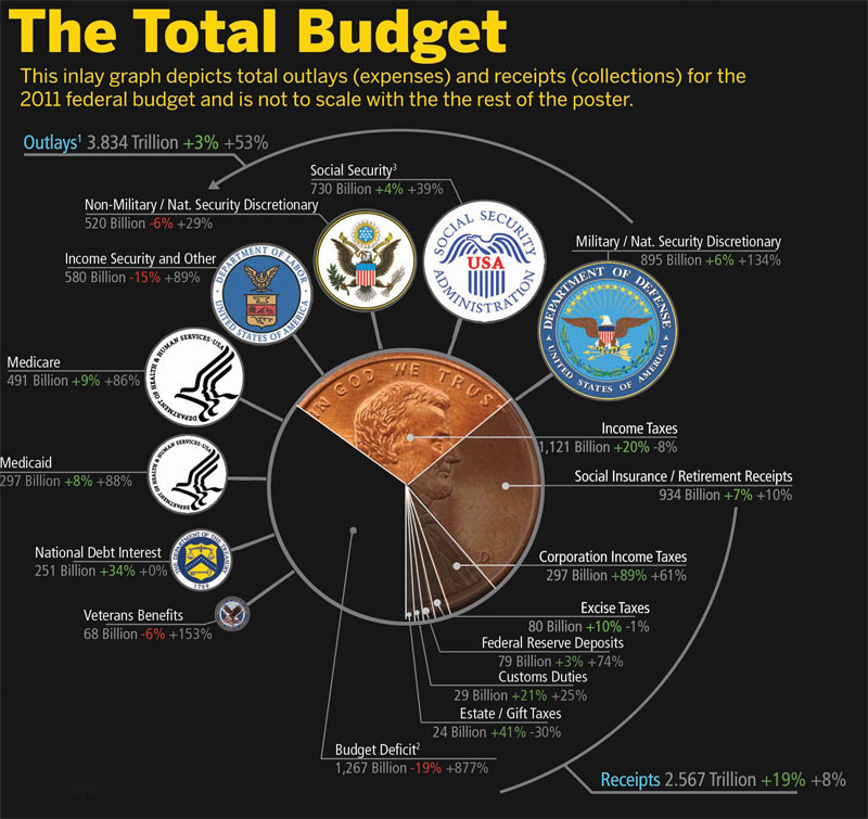
The detail in this poster is stunning, and in this small shot you can see how the total budget request breaks out. Only the “Military/Nat. Security Discretionary” and “Non-Military/Nat. Security Discretionary” portions of the budget request details are displayed in the poster.


Jess was also nice enough to answer a few interview questions I sent him:

Cool Infographics: What software applications do you use for the Death & Taxes posters?

Jess Bachman: The only applications I use are Photoshop and Excel.  Excel is where I in put all the data and it crunches the numbers, adjusts for inflation and calculates diameters.  Photoshop is where I put it all together and the PSD file occasionally exceeds 1 gig so it can be a beast to work with.  Saving takes about 5 minutes.

Cool Infographics: What’s your design process?

Jess Bachman: Normally I start from scratch and layout the images and make them fit; however, this year the budget didn’t change all that much, likely being from the same President, so I was able to keep the 2010 format and change the size of circles.  Of course some things had to be added and removed.  So this year I saved myself about 3 weeks of work just getting right into it, but the design process is grueling.  it’s small tasks, repeated 500 times.

Cool Infographics: What’s the most interesting thing you learned from the data?

Jess Bachman: I can definitely see the differences in Presidents from Bush to Obama.  Lots of reductions on the military side this year and the whole security climate as a whole isn’t as fiscally robust as it was a few years ago.  Much more progressive funding with Obama too.  Every year Bush would cut climate change research, now its back, along with other green tech.  For some reason, public proadcasting gets the hack saw every year no matter who’s in office.

Cool Infographics: Where are some of your favorite places that have the Death & Taxes poster on display?

Jess Bachman: Well it’s always good to see it on display in schools and classrooms.  But I really enjoy hearing from military members who have in their offices or even in station.  I have sent several to Afghanistan.  Critics often say the poster is anti-military, but the military is quite receptive to it, even the former Dept. of Defense Comptroller, Tina Jonas, loved the poster.  Some people from the Dept of Energy’s Oak Ridge Lab displayed the poster on their 30’ Everest computer screen… that was cool too.

Cool Infographics: What’s the hardest part when developing the poster?

Jess Bachman: The hardest part is just getting through all the rote data processing and mindless photoshopping.  The research side is quite fun, and going through the military budgets is a trip with all their classified and hi-tech programs. However, copying and pasting 5,000 times really takes a toll on my creativity and motivation.

Cool Infographics: You said you do a lot of copy & paste work, in what format do you get the data?

Jess Bachman: Some of the government data is in Excel already, but there is no context so I am dubious about working solely with their data sets.  Mostly I pull the numbers from the actual printed budget, which is in PDF form.  So I end up copying and pasting the program name and its funding level for 3 years into Excel, then I copy and paste the program name, funding level, and percentages back into photoshop as a text layer.  Rinse and repeat 500 times.  Many people ask if there was an automated way to create the poster each year and I wish there was, but the confines of the paper make size and fit a manual process.

Cool Infographics: Where do you have them printed, what are the printing specs and why?

Jess Bachman: I get my posters printed from a company called PrintPelican in Florida.  There really are no cheaper prices out there but I opt for a thicker cut of paper than usual.  I get 100# gloss cover which is a few shades from a business card in thickness.  To be honest, they have screwed up my order a few times over the years but we have always managed to work it out.  I usually print runs of 1000-2500 and always 24” x 36”.

Cool Infographics: How do you handle all of the printing and shipping of the posters?  Do you tube them yourself?

Jess Bachman: I used to do it all myself.  I had a 400lb brick of posters next to my bed, and 12 giant boxes of tubes all over the house, and I would roll pack and ship them all.  Now I use two shippers who do fulfillment of the orders for me.  For a while I would send them the orders and addresses weekly but I have offloaded that duty as well.  I think the self shipping method is a good lesson in customer service and its good to know your product inside and out, but after while my time became more valuable than stuffing tubes could afford.

Cool Infographics: You’ve used a few different online zoomable image services in the last few years, what have you learned?

Jess Bachman: There are lots of zooming options out there and new ones seem to pop up all the time.   I used Zoomify until it felt too clunky and slow, then Zoomorama which I really loved for its performance and options.  This year I experimented with an self hosted open source app called Open Zoom and it certainly was a slick and great user experience, unfortunately the demands it placed on my server from huge inflows of traffic proved too much, taking down the whole site.  So I had to switch to my backup, which was Closr.it, and let them deal with server demands.  Closr.it has been very attentive to my needs and I have found that most developers will work with me to tailor a custom solution if I ask.  The zooming apps keep getting better so I expect to keep changing apps as long as the space keeps innovating.

Cool Infographics: You mentioned the 30’ display, have you printed it out in larger sizes?

Jess Bachman: No, I have not printed it out any larger.  The file being Photoshop, and the images being mostly rastered do not allow quality printing beyond the poster size.  The file is 300 dpi so I could get away with a slightly larger size, but oversize printing is expensive and who wants a poster that big anyways. 

Cool Infographics: Where do the images come from?

Jess Bachman: Most of the military images come from defenseLINK, which is a great repository for hi-res military photos.  Other images come from stock photography sites for the most part.  It does help that most government logos are round.  I suppose it’s just an old school way of doing things, government seals and all.  The design aesthetic amongst government logos is really all over the map though, and its quite interesting.  Some look like that are from the 1700’s, and some from the 2700’s.

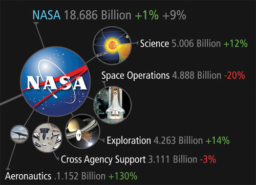
 There was one correction to the online version that Jess has posted:

So I totally had the wrong data for NASA on the visual. Here is the corrected image, which reflects what you have been reading in the news. Science up, space down. I fixed it before it was printed, don’t worry.

You can view the image, buy the poster and more at the new site DeathandTaxesPoster.com.

SPECIAL: If you pre-order the poster TODAY (April 28th) shipping is only $0.75!

Monday
Feb152010

My Digital Life 2.0: A Consumer Gadget Map

Presenting My Digital Life 2.0!  I’ve significantly updated the My Digital Life infographic I designed last year.  In addition to including many more gadgets and accessories in the graphic, I changed the connection lines to indicate either a constant or occasional connection.  The line arrows also indicate the direction of information flow (sometimes one-way, sometimes both ways).  You can see the high-resolution images on Flickr by clicking on the images.


The infographic highlights many of the decisions a consumer has to make with each new gadget they buy.

  • What kind of batteries should I use?
  • How much and what kind of memory will I need?
  • How do I connect to my existing gadgets and computers?
  • How will it work in my car?
  • Do I have an available connection?
  • Where can I add a new gadget (like a new hard drive)?

For the purpose of Product Development and Marketing, this is a fantastic way to map out the experiences a consumer faces and how new products will fit into their life.  For example, if you were at a company designing a new consumer electronic gadget how would your product fit into your target consumer’s life?  What decisions would they have to make about your product?  Is it easy for them to understand if your new product will work with their existing setup?

Even if you’re only a headphone manufacturer, it’s incredibly important to understand the whole consumer experience.


You’ll notice that the map began to form natural groupings that I call experience zones.  Here’s a modified version that highlights six specific areas of experience: video, audio, phone, photos, computing and mobile.  From an average consumer perspective, I know I’m missing two potential additional areas: Gaming and Reading.  I don’t own a gaming console (Xbox or Wii) and I don’t own an e-reader (Amazon Kindle or Sony Reader).

Since I’m a technology geek, I already understand how all of these connections work…in my head.  I’m the one who set them up and I use them every day.  However, imagine your parents or grandparents trying to understand all of these connections, and that doesn’t include the software communication between many of these gadgets.

I’ve added a few new types of connections, and included the different line types in the legend.  I also took a few liberties with the connection types.  “Snap Together” indicates any type of physical connection, like the Ear Jams snapping onto my Apple Earbuds and also the iPhone snapping into the car mount.  I left the camera memory cards as USB connections without getting into any more detail of the inner connections in the cameras.  The legend is not truly necessary because in true Tufte form, I included the connection icons in each of the connection lines, but I decided to leave the legend in to identify any icons that people aren’t familiar with.

The biggest challenge in designing the infographic, was arranging everything so that none of the lines crossed.  To make this happen, I ultimately had to skip a couple connections.  I have used the Etymotics earbuds with the MacBook occasionally, but that connection line would have been horribly ugly, crossing the entire graphic.

Monday
Jan252010

Photos of The Caffeine Poster


I tried out the poster printing service from PosterBrain.com last week and printed out a couple copies of The Caffeine Poster.  I've never posted the full, high-resolution image online, but I used it with PosterBrain to print it out fullsize 24" x 36". (Apologies for my not-quite-professional photos)


The poster is gorgeous!  I'm so impressed by the PosterBrain service, and the quality of their prints.


You really should try their service.  I uploaded the file on Sunday, and paid only $24.99 each to have them printed with free shipping.  I received the posters on Friday by standard USPS mail.  They were beautifully packaged with sheets of tissue separating the posters.