About
Randy Krum
President of InfoNewt.
Data Visualization and Infographic Design

Infographic Design

Infographics Design | Presentations
Consulting | Data Visualizations

DFW DataViz Meetup

Join the DFW Data Visualization and Infographics Meetup Group if you're in the Dallas/Fort Worth area!

Search the Cool Infographics site

Custom Search

Subscriptions:


Feedburner

The Cool Infographics® Gallery:

How to add the
Cool Infographics button to your:

Cool Infographics iOS icon

- iPhone
- iPad
- iPod Touch


Read on Flipboard for iPad and iPhone

Featured in the Tech & Science category

Flipboard icon

Twitter Feed
From the Bookstore

Caffeine Poster

The Caffeine Poster infographic

Entries in poster (133)

Friday
Nov272009

Black Friday Deal! 3-for-1 posters at Flowing Prints


Nathan over at FlowingData and FlowingPrints is offering a special 3 posters for the price of 1 deal for Black Friday (offer good through Sunday 11/29).  That's all three posters for $20!

For readers of Cool Infographics to take advantage of the deal, go to FlowingPrints, click on the "Buy The Series" button and use the promotion code: bfridayfps20

The three posters all focus on Education, titled "College High", "Education: Enrollment and Dropouts" and "How America Learns: by the Numbers".  If not for yourself, think about buying a set for your local school or library!

The state of education in America is the theme of this series. With funds getting cut nationwide, it's important to know how today's youth are learning (or not learning).  We looked at over three decades of data from the National Center for Education Statistics (NCES). Education has seen a lot of improvement over the years, but there is still plenty of room for growth.
Also, for every print you buy, Nathan will send an additional one to a local school too!  Thanks Nathan!

Friday
Sep252009

Infographic Stickers for your Walls


From Hu2 Design, cocktail recipe infographics for your wall (drink not included).  They've created different ones for Rum, Tequila, Whiskey, Gin and Vodka that show the drink recipes for the common mixed drinks.  They're also available in different colors to help coordinate with your wall colors, and the website lets you see the color graphics on different wall colors to find what you are looking for.
Hu2 Vinyl Stickers are designed to be applied to any smooth surface including walls, windows & furniture. The vinylโ€™s are completely removable and leave no residue.
Also available is a cocktail ingredients by percentage infographic.


They also have bath tub level indicators, cable organizers, and things not to be forgotten as you leave your house.  In addition to the infographic stickers, they offer a bunch of fun, decorative and well designed wall decals as well.  Go check them all out at Hu2.com

Thanks Romain!

EDIT: You can also follow Hu2Design on Twitter!


Thursday
Sep172009

The History of Jack The Ripper (Infographic Poster)


Ryan Nussbaum is a recent graduate of the design program at Washington University in St. Louis, and he created this infographic poster mapping out the murders of Jack the Ripper.

In this exhibition panel, I mapped the possible escape routes of a chief suspect in the Jack the Ripper murders. Upon closer examination, one can see the different types of wounds and removed organs of each of the victims. The piece is meant to dispel the notion that the murders were random occurrences.

Psst…Ryan is looking for work in New York…I’m just saying.


Monday
Aug312009

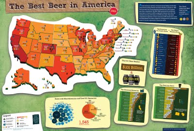
Best Beer in America: 2009 Update!


Our friend, Mike Wirth, has released the 2009 Great American Beer Festival Medal Map, but it's much easier to call it the Best Beer in America Map!

Mike uses the data of the Great American Beer Festival medal winners from 1987-2008, and this year he has added some new infographics to help support the map.  If you live in Oklahoma or North Dakota, I hope you're drinking out-of-state beer!  I'm just saying.

I posted about his original poster here.  The infographic was published on the Lyke2Drink blog, and on Mike's own website.

Nice work Mike!

Tuesday
Aug042009

NEW Death and Taxes 2010 poster!!

First, Jess from WallStats.com has released the 2010 Death & Taxes poster.  This is one of the best infographic examples today.  It's extremely informative, and the topic has a very wide reach.  The Death & Taxes poster from 2007 was my initial post on Cool Infographics, so I'm very excited to see this update.   Now the 2010 version is available to purchase as a poster here. Great job Jess!

Second, I'm really impressed by the viewer code for the poster. It's from Zoomorama.com, and lets me embed the interactive viewer.  The built-in zoom is pretty nice, but the Quick Find index on the left side is the best part.

Friday
Jul032009

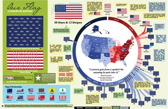
Graphical History of the American Flag


A great infographic for America's Independence Day from Mike Wirth.  The graphical history of the American Flag shows a circular timeline of when changes were made over the years and when stars were added.  I love additional information Mike included like the official folding pattern and the state each star represents by showing them chronologically.  Makes a great poster!


Tuesday
Jun162009

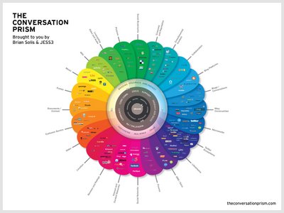
The Conversation Prism 2.0 has been released!


Check out the new version of The Conversation Prism 2.0 by JESS3 and Brian Solis and theconversationprism.com.  Available as a poster for $20 US on thier website, and they also have some high-resolution versions available.

I love the design of this one.  It's seems to be essentially a mind map, but much easier to read and understand.

This is an update to the original Conversation Prism that you can see here on Flickr.

Thanks Dana!  I found the link to the 1.0 version on ON:Digital+Marketing

Friday
Jun122009

Web Trend Map 4.0


The great team at InformationArchitects.com released their updated version of the Web Trend Map 4. (They should call it 4.0)   You can buy it as a poster for $49 from their website, or they have also made a high-resolution version available.
iA's Web Trend Map plots the leading Internet names onto the Tokyo Metro system.
Paying attention to the intersections, we grouped associated websites and ensured every domain is on a line that suits it.  As a result, the map produces a web of associations: some provocative, some curious, others ironically accurate.
Why Tokyo Metro?  Because it works.

Tuesday
Mar312009

Periodic Table of Typefaces


Created by Cameron Wilde/SquidSpot, The Periodic Table of Typefaces lays out the top ranked type fonts.  Makes a great poster for the office.


I found this over on Visual Think Map

Thursday
Dec112008

The AI Landscape


From the Association of the Advancement of Artificial Intelligence (AAAI), a cool poster image designed by Giacomo Marchesi that lays out the different areas of AI development.

Thanks Zach!  Also can be found on digg.com