Bio-Suit EVA Infographic Poster
From the Man Vehicle Lab at MIT, an infographic poster from professor Dava Newman and illustrator Cam Brensinger. The poster shows the technology development in spacesuits and some future design concepts.
Join the DFW Data Visualization and Infographics Meetup Group if you're in the Dallas/Fort Worth area!

The Cool Infographics® Gallery:
How to add the
Cool Infographics button to your:
- iPhone
- iPad
- iPod Touch
Read on Flipboard for iPad and iPhone
Featured in the Tech & Science category
From the Man Vehicle Lab at MIT, an infographic poster from professor Dava Newman and illustrator Cam Brensinger. The poster shows the technology development in spacesuits and some future design concepts.
As to what the image depicts, it was constructed by sorting roughly 800,000 scientific papers into 776 different scientific paradigms (shown as red and blue circular nodes) based on how often the papers were cited together by authors of other papers. Links (curved lines) were made between the paradigms that shared common members, then treated as rubber bands, holding similar paradigms closer to one another when a physical simulation forced them all apart: thus the layout derives directly from the data. Larger paradigms have more papers. Labels list common words unique to each paradigm.
 CEO,
CEO,  brand,
  bubble,
  charts,
  connections,
  corporations,
  executive,
  mind map,
  poster,
  subway
A small poster from our friends at XPLANE,
How Obama Reinvented Campaign Finance Barack Obama is the first major candidate to decline participation in the public financing system for presidential campaigns. He’s found a more effective way to raise money — by leveraging the power of the American people through online Social Networks.Available as a PDF formatted for printing on 11x17 paper.
 budget,
  campaign,
  connections,
  election,
  money,
  politics,
  poster,
  presidential,
  spending,
  wealth
Gerd Arntz (1900-1988) was a German artist with a political activist focus. Many of his infographics, as well as his Isotype project to create a universal set of icons for signs, are available at www.gerdarntz.org. This infographic poster shows the New York City population explosion from 25,000 in 1767 to 9.5 million in 1930.
 art,
art,  history,
  population,
  poster,
  time
time 
Created by Alwyn B., this hierarchical tree shows the complex Hero Item recipes for the WarCraft III MOD "Defense of the Ancients". As a fan and a player of the game, Alwyn painstakingly created his own infographic and then posted in on the Internet to share with other players. This makes a fantastic poster!
More than just the item combinations, the poster shows:
Our Greenwash Guide (PDF) was born out of a desire to help communications professionals get their green messaging right. The majority of Greenwash is the result of over-eager communications campaigns that lack environmental rigour rather than malicious intent.Found on Melodies In Marketing, thanks Mario!
 ad,
ad,  brand,
  corporations,
  environment,
  poster
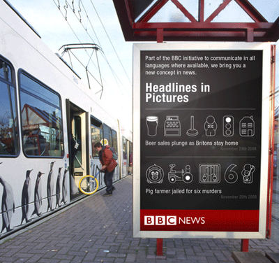
Neat experiment by Dave Bowker over at Designing The News. The idea is to use pictgraphics to visualize news headlines in public places. Specifically in Europe, you could establish a universal set of icons over time that people who speak different languages could interpret and understand.

From the United Nations Environment Programme website, the Global Distribution of Water specifically highlights the scarcity of freshwater.
Found on digg.com

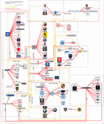
TooManyCars.com has updated their family tree style poster of how all of the car companies are related. The latest updates were as of 4/1/08. They have also changed to better software used to zoom into the poster. Each of rectangles you see on the images will zoom in close so you can read the details about the connections.
They've really done a good job tracking down the specific types of relationships and the ownership portions between the companies. High-res PNG or PDF files are also available.