About
Randy Krum
President of InfoNewt.
Data Visualization and Infographic Design

Infographic Design

Infographics Design | Presentations
Consulting | Data Visualizations

DFW DataViz Meetup

Join the DFW Data Visualization and Infographics Meetup Group if you're in the Dallas/Fort Worth area!

Search the Cool Infographics site

Custom Search

Subscriptions:


Feedburner

The Cool Infographics® Gallery:

How to add the
Cool Infographics button to your:

Cool Infographics iOS icon

- iPhone
- iPad
- iPod Touch


Read on Flipboard for iPad and iPhone

Featured in the Tech & Science category

Flipboard icon

Twitter Feed
From the Bookstore

Caffeine Poster

The Caffeine Poster infographic

Entries in spending (78)

Thursday
Apr012010

Overpriced HDMI cables

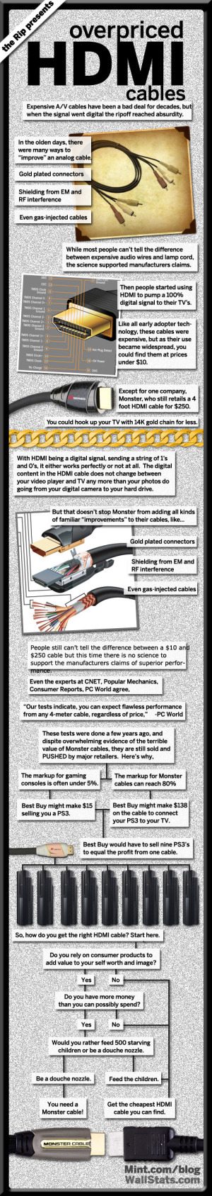
Overpriced HDMI Cables was created by our friend Jess Bachman at WallStats.com.  This infographic shows the history and reasoning behind high-priced HDMI cables and why you should avoid them.


If you’ve already splashed out on the huge flat-screen tv, a state-of-art Blu-Ray player, and a satellite dish with a monthly subscription that brings with it hundreds of channels, then it probably seems like it’s a small price to pay for HDMI cables. But, this is exactly the mentality that gets people to pay for this habitually over-priced bit of technological excess. The truth, as our infographic points out, is that there is absolutely no difference between the cheapest and most expensive HDMI cables, at least over shorter runs. If you’re wiring an entire house, you may find these cables to be worth it.

To understand why you shouldn’t pay extra, you need to understand the difference between analog and digital. With analog cables, the signal degrades, with digital cables such as HDMI, it either works or it doesn’t. The signal doesn’t degrade any more than your JPEGs degrade when you put them on a thumb drive.


Monday
Mar292010

How To Improve Your Credit Score (infographic)

Using the format of a board game, How To Improve Your Credit Score is an easy-to-read infographic from YourWealthPuzzle.com.

“Pay on time, wipe out debt, raise credit score.”

Thanks Dave for the link!

Monday
Mar292010

Online Dating Is Bigger Than Porn [Infographic]

Online Dating Is Bigger Than Porn Infographic

New infographic, Ever Gotten A Date Online?, from OnlineSchools.org examining some of the data behind online dating.  As Mashable points out, one of the most surprising statistics is that the online dating industry is larger than the porn industry.

From Jennifer Van Grove at Mashable: Per the graphic — which pulls data from a number of sources, including Reuters and The Washington Post — online dating is worth more than one billion dollars per year, with the mobile phone dating market worth $550 million.

Found on Mashable via @hessiej on Twitter

Friday
Mar262010

The Best Small Cities to Buy A House (Infographic)

Fixr.com posted this infographic on their blog yesterday showing the statistics behinds the top 10 Best Small Cities to Buy A House in America.  I like the format of a larger infographic that combines a few different styles into one comprehensive image.  Combing map data, stylized bar charts and informative lists into one, easy-to-read infographic.

Imagine living in a small town where people are relaxed and friendly, no traffic jams, clean air, great education, fun leisure and culture, high salaries, and much more. We want to illustrate the top 10 small cities to live in the U.S taking into consideration such factors.

Thanks Andres for the link, and the chance to provide some input.  Nice job!

Thursday
Mar252010

What Does Your Email Provider Say About You? [infographic]

From CreditKarma.com, apparently, the email provider you use can imply certain things about your personal financial position to the world.

You may have kept your AOL account since receiving a free disc in the 90’s, signed up for Yahoo! in college, got a Gmail invite, or moved to Comcast when you finally installed broadband, but what does it say about you? When categorized by email provider, the credit score and debt averages of users begins to tell a story. Do Gmail users take on larger mortgages? Do Yahoo! users have lower credit card limits? Credit Karma takes a closer look at how users of the most popular email providers stack up.

Found on FlowingData

Monday
Mar152010

The FedEx Universe

Revised Infographic

Robin Richards (ripetungi) created this infographic about the FedEx Universe for MeetTheBoss.com.  The version above is slightly modified to correct the size of some of the bubbles, add some mind-map style connection lines and add some photo images.


Created for MeetTheBoss.tv, it is a celebration of Fedex as a company and its size.  Working thought creating this, I was amazed at the huge numbers involved in running a global company and getting packages around the earth.  This is what I have tried to show.

I have updated this infographic.  I received some great feedback from Randy Krum over at Coolinfographics.com (Great Site) and on reflection decided that it could be improved with greater use of the bubble mind map graphics.  So that is what I have done.  Also added some more eye candy with images inside of the main bubble totals. Let me know what any thoughts on the old vs the new.


You can see the original version below, and Robin has posted some comment about creating it on his blog, ripetungi.com.  There’s a lesson here for infographic designers everywhere; the viewer sees the area of objects as representative of scale.  So in the original version, the diameter of the bubbles changed with the value, but in the corrected version, the area of the bubbles changes.  When the diameter increased by 2x, that meant that the area increased by 3.5x and the bubbles didn’t accurately represent the values.

Also worth noting that Robin created this infographic in ONE day.  Great work under tight timelines!


Original Version

Tuesday
Mar092010

BBC Budget Treemap Infographic

David McCandless, from Information Is Beautiful created this treemap of selected highlights from the BBC budget for the Guardian Datablog.

Recent controversy about the budget of the BBC here in the UK made me curious about its spending. Here’s the BBC-o-Gram, a visualization I created for the Guardian Datablog, exploring the costs of running one of the biggest broadcasters in the world.

David has also posted the underlying data in a GoogleDocs spreadsheet.

Friday
Feb192010

NASA's New Budget [infographic]

GOOD has a good timeline of NASA’s budget over the last 50 years.

The Obama administration announced a new budget for NASA, which despite a nominal increase, cuts future programs and the prospect of more space exploration. This is a look at NASA’s budget over time, and the major missions it accomplished with that budget.

A collaboration between GOOD and 
Karlssonwilker.

Although, since the timeline wraps like text to keep it on one page, I think the bars that represent the different programs should stay in the same order.  And what’s with the flashing images when you view the large infographic?

Thursday
Feb182010

Early-Bird Taxpayers Get the Refund - infographic

$2,869 was the average refund for early filers in 2009 based on this infographic from TurboTax.  Designed by Column Five Media for Intuit.

Are you an early bird or a tax procrastinator? Did you know that people who file their income tax returns in February are among the most likely to get refunds – and larger ones at that?  TurboTax reports that 82% of taxpayers who filed before the end of February last year got money back, and on average, the refund for early filers is typically larger: $2,869 compared to $2,753 for returns filed through April 15th last year.


Forty percent of all tax returns last year were filed before the end of February. That means 60% missed out on some of the benefits of filing early such as putting money in your pocket faster – making your refund work for you.

Although I’m not a fan of the overuse of pie charts, I think it works in this case.  The infographic doesn’t have so many pie charts that it becomes confusing, so its very easy to wrap your head around who this typical TurboTax, early-filier consumer is.

Thanks Laura for the link!

Wednesday
Feb172010

CD Laddering Investment infographic

Designed by Derri Hasmi for DepositAccounts.com, this CD Laddering infographic does a great job helping to explain the investment theory of CD laddering as compared to investing in standard CDs.

CD laddering is a strategy that allows you to take advantage of the higher cash rates offered by CDs, while at the same time ensuring that you have access to your money regularly. The most common type of CD ladder is the five year ladder. In this scenario, you open five different CDs. Let’s say that you check your savings account, and you have $15,000. You want to keep $5,000 for emergency purposes (move it to a high-yield savings account if it isn’t in one already), but use the remaining $10,000 to get your CD ladder started.

Thanks Jeremy!