About
Randy Krum
President of InfoNewt.
Data Visualization and Infographic Design

Infographic Design

Infographics Design | Presentations
Consulting | Data Visualizations

DFW DataViz Meetup

Join the DFW Data Visualization and Infographics Meetup Group if you're in the Dallas/Fort Worth area!

Search the Cool Infographics site

Custom Search

Subscriptions:


Feedburner

The Cool Infographics® Gallery:

How to add the
Cool Infographics button to your:

Cool Infographics iOS icon

- iPhone
- iPad
- iPod Touch


Read on Flipboard for iPad and iPhone

Featured in the Tech & Science category

Flipboard icon

Twitter Feed
From the Bookstore

Caffeine Poster

The Caffeine Poster infographic

Entries in timeline (240)

Monday
Nov302015

A History of Communication

A History of Communication infographic

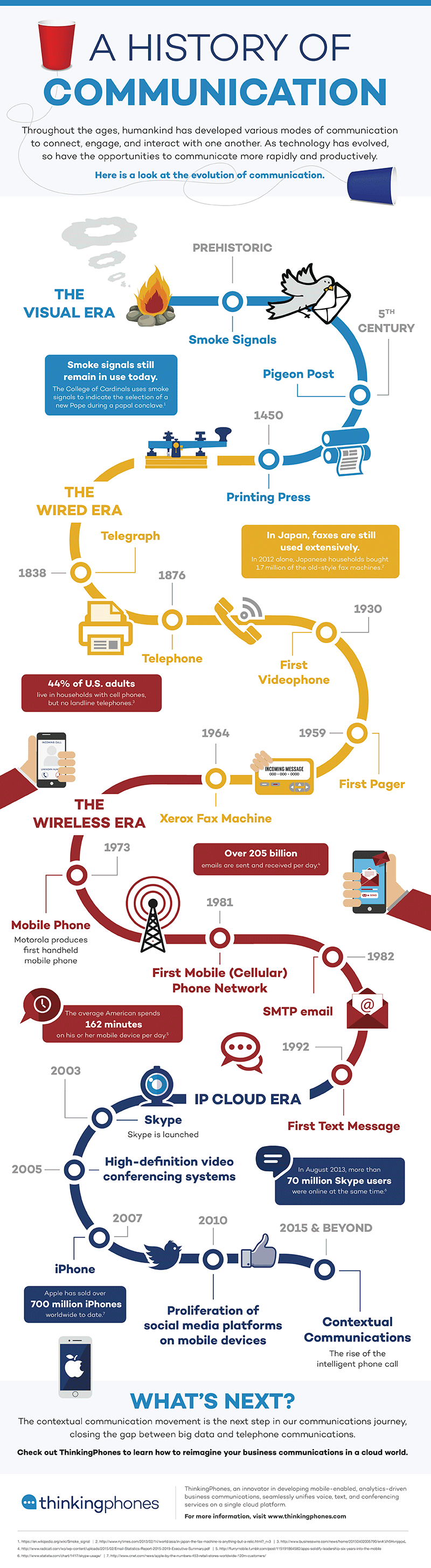
Communication is just as important to us today as it was in prehistoric times. The need hasn't changed much, but the way we accomplish it sure have! A History of Communication infographic from Thinking Phones divides our technological advances in communication into 4 eras, and then leaves us with the question of, "What's next?"

From the primitive use of smoke signals to today's cutting-edge contextual phone calls, humans have proved there are no boundaries when it comes to advancing the methods with which we communicate. Personally and professionally, we are constantly adopting new interactive technologies for the purpose of getting ahead – to make our lives simpler in a more convenient, intelligent way. Today's innovative communication platforms like text, voice, video, and complete cloud solutions easily enable this goal of efficient and effective contact. As our connectivity needs evolve and technology continues to expand, we humbly take a look back through the history of communication as we know it. 

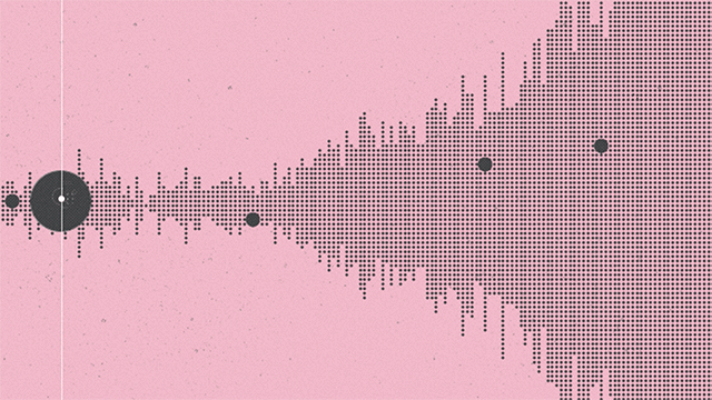
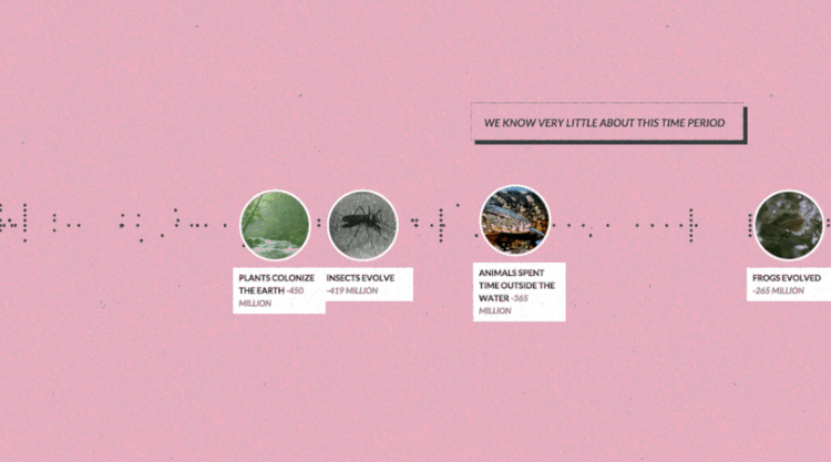
Simple timeline that highlights the key milestones of communication at a very high level. Minimal detail and text keeps the design clean and easy-to-read.

Thanks to Stephanie for sending in the link!

Monday
Nov232015

Anatomy of Songs

Anatomy of Songs and Anatomy of More Songs are hilarious looks at the common layout of songs from different genres. Designed by cartoonist John Atkinson, his site is called Wrong Hands. These stacked bar charts are geat visualization of timelines for songs.

John has designed many more along this same style like Anatomy of the Holidays, Anatomy of Generations and Anatomy of Ages

Found on Visually

Friday
Nov202015

Histography

Histography

Histography is a timeline created by Matan Stauber that visualizes every moment in history from Wikipedia as a steel ball. You can navigate the timeline by using a slider to determine what time period you would like to see. Then simply place the courser over a ball to read an event! It is very easy to navigate and tons of fun. Go to Histography to visit the full imteractive site.

Below is an article from Fast Co Design that explains the process in detail.

If every moment in human history was a single steel ball, Histography is like an 4-D Newton's Cradle, visualizing how all of these events bump up and knock up against each other on a 14-billion-year time frame. It's beautifully hypnotic—and impressively, it's all sourced from Wikipedia, which means that it keeps on updating itself.

Created by Matan Stauber, Histography is an interactive timeline spanning the Big Bang to whatever was in the news yesterday. It basically draws all historical events from Wikipedia, visualizing each as a black dot. You can click on each dot to get more information about the event it represents. These dots are then ordered chronologically from left to right, with simultaneous events being stacked vertically on top of each other. The result is that the Histography looks something like a pointillist sound wave, growing and shrinking according to how noisy a year, era, or epoch was.

There's a number of different ways you can browse Histography. The default view shows every historical event from Wikipedia's database at once, which you can then filter down by category: for example, by literature, politics, assassinations, and so on. But I think the 'Editorial Stories' view (accessible by clicking the Histography logo) is more interesting. It represents Wikipedia's database as a nearly endless spiral, which you can descend through scrolling, zooming right down to the Big Bang.

Found on FastCo Design

Tuesday
Oct132015

The Future, as Foretold in the Past

The Future, as Foretold in the Past infographic

The Future, as Foretold in the Past is a timeline of future events based on the stories of famous works of fiction. The article that released the infographic was from Brain Pickings; however, the creation story of the graphic is an interesting one. Giorgia Lupi saw the information just on a normal timeline on The Awl and turned it into what you see above.

There is a lot of information on the infographic, the legend above helps explain how it is organized.

Giorgia Lupi explains:

The visualization is built on a main horizontal axis depicting a distorted time-line of events (in fact we put them regularly, in sequence), starting our future-timeline in 2012. The y-axis is dedicated to the year the novel / book foretelling the event was published.

On the lower half of the visualization you can find the original quotes (shortened)

We then wanted to add further layers of analysis to our piece:

– finding out main typologies of foretold events (are they mainly social, scientific, technological, political?)
– discovering and depicting the genre of the book,
– and most of all, dividing them into positive, neutral or negative events.

Finally, good news, in 802,701 the world will still exist!


Thanks to Mike for sharing on Facebook: https://www.facebook.com/mikewirth/posts/10153557417821133

Monday
Jul132015

A Brief History of Open Source Code

A Brief History of Open Source Code infographic

Learn about the last 20 years of collaborative software development, language relationships, and the current state of the art with A Brief History of Open Source Code infographic. Kinvey, a company that helps its clients create mobile apps, published the infographic designed by Beutler Ink back in 2013. For more in-depth reading, check out this article at Read Write.

We were able to visualize the percentage of total commits in a given quarter for the top 16 programming languages from 1993 until today. We hope you’ll find this image—a provocative pattern of dips and spikes—to be as interesting as we do. It truly shows how dynamic the world of programming is. We’ve also included a few graphs on other interesting data points: total number of languages by year, average lines of code per commit, and tracking which languages influenced the development of others.

There is good use of colors and charts to tell the story of the 16 different source code languages. No numbers were needed to show the popularity of each language, only distances between the colors. The colors are similar, but not to the point where we would have trouble telling them apart. I like the gradual color gradient in the infographic. Too many different colors would make the graphic look too busy.  

Found on http://readwrite.com

Thursday
Apr302015

Mobile Phone Size Evolution

Mobile Phone Size Evolution

Great data visualization of the Evolution of Mobile Phone Sizes on the Future Trends page from 3 Danmark!

Simple, easy to understand.

Infographic and data visualization images are often shared without any links or accompanying text, so online images like this need to include some additional text with the source publishing and a URL in the image file itself.

Friday
Apr172015

Your Life in Weeks

Your Life in Weeks infographic is the life of a typical American broken down into the 52 weeks within each year. This infographic was created by Tim Urban from Wait But Why. Each dot represents one week of your life. The infographic highlights some of the major milestones in life, while color coding the weeks into the big categories of schooling, career, and retirement.

Each row of weeks makes up one year. That’s how many weeks it takes to turn a newborn into a 90-year-old.

It kind of feels like our lives are made up of a countless number of weeks. But there they are — fully countable — staring you in the face. 


There are multiple events you can chart on this graph. Famous Deaths is an example of charting which week some famous people died.


Tiger Woods Major Championships (red) and Roger Federer Grand Slam Championships (blue) is another example. This chart makes it easy to track the peak years for athletes.

Tim made a blank version also available for you to fill in your own events or add some world events for perspective like the examples above. What would you add?

Found of Huffington Post.

Friday
Mar272015

How to Build a Website in 2015

How to Build a Website in 2015 infographic

Do you have plans to build a website soon? There are three major different workflow styles. How to Build a Website in 2015 from Rukzuk has shown the 3 most popular workflows so that you can pick the style that fits your skills.

There’s tons of different ways to get from client briefing to a live, working website. We’ve put the three most popular workflows up against each other. What’s your workflow of choice?

Simple clean design that does a good job of comparing the three different workflows without overwhelming the reader with too much information. Great job with the Creative Common license and complete list of data sources!

Found on Rukzuk.com

Thursday
Mar122015

Apple Product Flops Timeline #Fail

Apple Fail infographic

Not all ideas are good ones. Apple has had it’s own fair share of ideas gone wrong. The Apple #Fail infographic from 7 Day Shop is a compiled list of Apple’s not so successful inventions.

Behind All Successes Are a Series of Failures

When starting your own business, you should be ready for some failures along the way – but the most successful firms learn from their mistakes. As author C.S Lewis once said: “Failures are finger posts on the road to achievement.”

Take Apple. The Cupertino-based tech giant may be known for the runaway success of the iPhone and Ipad. But as our Infographic shows, Steve Jobs suffered a number of epic fails over the years.

Some misses like the Apple III and the Macintosh Portable, almost put them out of business!

Never Giving Up

But they didn’t give up – even when their machines were tipped for success, but failed to appeal to the tech market. Take the PowerPC processor for example. It could be used as a games console and a word processor, but consumers weren’t bothered.

The same can be said for Apple’s U2 iPod and the U2 album giveaway “Songs of Innocence”. Both failed, but perhaps because of the music churned about by the Irish rock band more than the marketing idea.

And FireWire’s inability to displace the USB, encouraged Apple to develop the Lightning Cable, which is now the standard iPhone charger cable. Even some good ideas did catch on. What about the Power Mac G4 Cube? A shiny monitor in an acrylic glass enclosure with upgradeable video – surely, that had to work! The idea was magic in a box, or as Apple might say, it was genie-us. Consumers didn’t think so. It failed.

Thanks to Kunie for sending in the link!

Monday
Mar022015

Stories of the Past and Future

xkcd Stories of the Past and Future

Stories of the Past and Future is an awesome timeline design from Randall Monroe at xkcd.com depicting the differences between when movies and TV shows were released, and the time periods they depicted. I printed off the large version and starting adding a few more on my own.

Thanks to Tweets from Nathan Yau @flowingdata and Alberto Cairo @albertocairo!