


Sunday
May182008
Beer in Germany this week?
 Randy
Randy
I'm headed to Nuremberg, Germany (also know as Nürnberg) for a trade show this week. Anyone in the area want to meet for a drink? Send an email to my Gmail account.

![]()

Join the DFW Data Visualization and Infographics Meetup Group if you're in the Dallas/Fort Worth area!

The Cool Infographics® Gallery:
How to add the
Cool Infographics button to your:

- iPhone
- iPad
- iPod Touch
Read on Flipboard for iPad and iPhone
Featured in the Tech & Science category


I'm headed to Nuremberg, Germany (also know as Nürnberg) for a trade show this week. Anyone in the area want to meet for a drink? Send an email to my Gmail account.

From the United Nations Environment Programme website, the Global Distribution of Water specifically highlights the scarcity of freshwater.
Found on digg.com
What if the only things you could see in the world around you were brands and advertising? No walls, no people, no sidewalks...just ads. Apparently it would be more than enough to get around in the world.
This is an awesome video! Thanks to pascal for submitting the link in the comments to an earlier video post: See The World in Words

From geostrategis.com, the world's first map of world happiness.
This world map on happiness was distributed through a Globe and Mail article by Sheryl Ubelacker (28/07/06). It is an interesting perspective, but primarily focused on the social side of well being. It provides a strong visualization but lacks the substance to become a strategic or policy significant map. This map was prepared by Adrian White, University of Leicester

Check out the Map of Creativity from the Next Generation Foundation.
The Map of Creativity is a user-friendly, interactive database of innovative educational projects throughout the world.
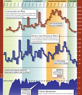
From foreignpolicy.com, a really tall chart showing statistical information covering the last five years of the Iraq war. I'm not sure I like the idea of this big chart that covers so many different types of data. The information on the bottom half of the chart tends to get lost to the reader.

Currently on exhibition at MOMA, The Museum of Modern Art, from Feb 24th - May 12th is an exhibit called "Design and Elastic Mind". New York Talk Exchange is included as part of the exhibition.

New York Talk Exchange illustrates the global exchange of information in real time by visualizing volumes of long distance telephone and IP (Internet Protocol) data flowing between New York and cities around the world.Thanks Oliver!

I got a note from John Emerson, the author of Visualizing Information for Advocacy, and I wanted to share that his booklet on using infographics for NGO's and advocacy organizations is now available online as a free PDF (6.9MB) at apperceptive.com. Although geared to advocacy groups, the information is definitely relevant to everyone.
John also has a blog post up on Social Design Notes.
Outstanding job John!

Cool infographic poster from historyshots.com showing the many expeditions leading up to the 1953 successful team to make it to the top of My. Everest.
Every major expedition before the successful climb of Mount Everest is detailed on the left side of the print. The circles provide an easy to view key into the history of each expedition including expedition length, type and height achieved. The flow of climbers from one expedition to another is tracked with graceful lines.The right side of the print is devoted to the successful 1953 assault. The entire expedition is mapped showing the exact climbing history by altitude of each of the main phases of the assault. In addition, the weather for each day is provided.

Meet The World is an infographic project that uses the colors of eight national flags to represent some of the current issues in the world.
Icaro Doria is Brazilian, 25 and has been working for the magazine Grande Reportagem, in Lisbon, Portugal, for the last 3 years. He is part of the team (with Luis Silva Dias, João Roque, Andrea Vallenti and João Roque) that produced the flags campaign which has been circulating the Earth in chain letters via e-mail.I found the link to this on rc3.org.
