About
Randy Krum
President of InfoNewt.
Data Visualization and Infographic Design

Infographic Design

Infographics Design | Presentations
Consulting | Data Visualizations

DFW DataViz Meetup

Join the DFW Data Visualization and Infographics Meetup Group if you're in the Dallas/Fort Worth area!

Search the Cool Infographics site

Custom Search

Subscriptions:


Feedburner

The Cool Infographics® Gallery:

How to add the
Cool Infographics button to your:

Cool Infographics iOS icon

- iPhone
- iPad
- iPod Touch


Read on Flipboard for iPad and iPhone

Featured in the Tech & Science category

Flipboard icon

Twitter Feed
From the Bookstore

Caffeine Poster

The Caffeine Poster infographic

Entries in world (200)

Sunday
Aug172008

Evolution of Olympic Torches


The group at the NY Times online has been working overtime to create a bunch of infographics as part of their coverage of the 2008 Olympics.  I'm going to highlight them this week with many of the graphics they've created.  Their graphics are coming our rapid-fire just like the events in China.

First up is an Olympic Torch History graphic, highlight the torch designs since 1936 for both the Summar and Winter Olympic Games.   Roll over each torch to see deatils behind the design.

Wednesday
Aug132008

BBC World Food Prices

The BBC online has a site dedicated to charting food prices around the world called : The cost of food: Facts and figures.  Mostly simple charts, but they've found a handful of really good information.  They could make these prettier, but they get the message across.  Each chart tells a simple story.

Tuesday
Jul152008

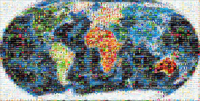
Map of the World 2.0


This world mosaic is created from 1,001 Web 2.0 icons/logos and each one is a clickable link to its respective site.  It was created using AndreaMosaic photo software, by the team at AppAppeal.

Thanks Jelle for sending in the link!

Wednesday
Jul092008

The Map of Scientific Paradigms


One of the projects from Information Esthetics, the Map of Scientific Paradigms by Kevin Boyack, Dick Klavans and W. Bradford Paley shows how scientific papers in different fields are connected through their citations.

As to what the image depicts, it was constructed by sorting roughly 800,000 scientific papers into 776 different scientific paradigms (shown as red and blue circular nodes) based on how often the papers were cited together by authors of other papers. Links (curved lines) were made between the paradigms that shared common members, then treated as rubber bands, holding similar paradigms closer to one another when a physical simulation forced them all apart: thus the layout derives directly from the data. Larger paradigms have more papers. Labels list common words unique to each paradigm.

 Thanks for sending in the link Alwyn!

Tuesday
Jul082008

The Internet's Undersea World

An infographic map from the The Guardian in the UK, a map showing the few underwater cables that connect the world.

Found on digg.com

Friday
Jul042008

U.S. Flag Infographic

For the 4th of July, I wanted to post a new link to the U.S. flag as an infographic, but it looks like the "Meet The World" brazilian website that I posted about in February 2008 is down right now.  I still have the image, and its from the flag series by artist Icaro Doria. 

Icaro Doria is Brazilian, 25 and has been working for the magazine Grande Reportagem, in Lisbon, Portugal, for the last 3 years. He is part of the team (with Luis Silva Dias, João Roque, Andrea Vallenti and João Roque) that produced the flags campaign which has been circulating the Earth in chain letters via e-mail.

Friday
Jun272008

Big Blue Marble: Water and Air

Found on infosthetics.com, phiffer.com and boingboing.net

Global water and air volume. Conceptual computer artwork of the total volume of water on Earth (left) and of air in the Earth's atmosphere (right) shown as spheres (blue and pink). The spheres show how finite water and air supplies are. The water sphere measures 1390 kilometers across and has a volume of 1.4 billion cubic kilometers. This includes all the water in the oceans, seas, ice caps, lakes and rivers as well as ground water, and that in the atmosphere. The air sphere measures 1999 kilometers across and weighs 5140 trillion tonnes. As the atmosphere extends from Earth it becomes less dense. Half of the air lies within the first 5 kilometers of the atmosphere.

Credit: Adam Nieman / Photo Researchers, Inc

I'd love to see one more showing all of the oil in the world.

The original appears to be here at PhotoResearchers.com

Tuesday
Jun032008

The Infographic that Saved a Million Lives


Great story from 37signals.com about a very simple infographic that motivated Bill and Melinda Gates to change the focus of their charity spending.

“No graphic in human history has saved so many lives in Africa and Asia,” says NY Times columnist Nicholas Kristof about an infographic in a ‘97 Times article that spurred Bill and Melinda Gates to take action on public health.

...But then bill confessed that actually it wasn’t the article itself that had grabbed him so much—it was the graphic. It was just a two column, inside graphic, very simple, listing third world health problems and how many people they kill. but he remembered it after all those years and said that it was the single thing that got him redirected toward public health.

Wednesday
May282008

The world as you've never seen it before


Check out WorldMapper! Above is a map of the world based on true Land Mass, but with WorldMapper, you can adjust the size of the countries based on whatever data you are trying to convey.

This is the world map based on Total Population:


This is the world map based on Total Computer Exports:


Alisa Miller, head of Public Radio International, talks about why -- though we want to know more about the world than ever -- the US news media is actually showing less. She uses WorldMapper to communicate her point about the state of today's news in the US.

Wednesday
May212008

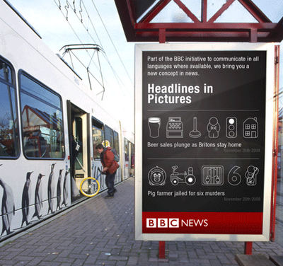
Outdoor Pictogram Headlines


Neat experiment by Dave Bowker over at Designing The News. The idea is to use pictgraphics to visualize news headlines in public places. Specifically in Europe, you could establish a universal set of icons over time that people who speak different languages could interpret and understand.