


Friday
Aug102007
World's Most Dangerous Drugs
 Randy
Randy
Another good one from Healthbolt. Color coded by class, and ranked by overall harm to the human body.

![]()

Join the DFW Data Visualization and Infographics Meetup Group if you're in the Dallas/Fort Worth area!

The Cool Infographics® Gallery:
How to add the
Cool Infographics button to your:

- iPhone
- iPad
- iPod Touch
Read on Flipboard for iPad and iPhone
Featured in the Tech & Science category


Another good one from Healthbolt. Color coded by class, and ranked by overall harm to the human body.

This interactive infographic from the New York Times website is really impressive. Using weekly data reported by the Federal Election Commission, it plots the contributions on a map of the U.S. and sizes the bubbles based on contributions from that city. It has data from every week since January 1st, so it will also "play" and animated version showing the contribution as time progresses (similar to the Trendalyzer that Google purchased from GapMinder).
You can also search for specific contributors to see which candidate campaigns they have contributed to, and how much they gave.
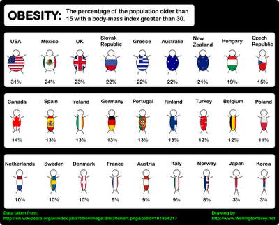
Another good one from Wellington Grey. Obesity across the world shown visually. The size of the little person’s body represents the percentage of people in that country with a body-mass index over 30.
Wow…are we fat or what? Are you going to finish those fries?
Another graphic from Jonathan Harris from his time at Princeton with the International Networks Archive. It's a couple years old, but absolutely still relevant. I believe this is from around 2003.
Added: Recently popular on Digg.com
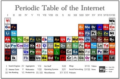
Wellington Grey has created a graphic representing some of the internet's most popular sites in a familiar layout. The Periodic Table of the Internet groups the most popular sites on the web in categories like Search Engines, Aggregators, Operating Systems, Blogs, Social Networking, etc. Each individual block links to its respective site.

Portfolio.com has a number of good interactive infographics on their News & Markets/Multimedia page.
This Salary Comparison is simple but hugely informative showing the difference in number and visual representation of size, but also over time as you move the slider on the left. In 2005 the difference between the average worker and the CEO is so large it doesn't fit on the screen anymore. But that is down from 2000 when the difference was the largest at 548x.

Ten dimensions are really hard for most people to understand. Especially since our lives are constrained to only four dimensions. This video from tenthdimension.com does an EXCELLENT job of using pretty simple animation and illustrations to explain the 10 dimensions of our universe.
This video is really good, even if you're not a physicist.

Our friends over at InformationArchitects.com have updated their WebTrends poster showing the...
...200 most successful websites on the web, ordered by category, proximity, success, popularity and perspective. We have done it again – and better. Upon popular demand – here is iA’s next Web Trend Map:Thanks to Brian Johnson from the Microsoft Mac BU for pointing this one out.
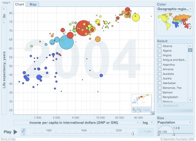
Here it is! Live on Google. Gapminder is the Trendalyzer software used by Hans Rosling and acquired by Google. It's now online at Google, but it looks like an early test. I'm not sure if you can use your own data yet or not, but that is one of the goals.
Check out all of the Gapminder tools, and see more presentations using the Gapminder software at www.gapminder.org
Here's part two, when Hans Rosling followed-up his 2006 presentation with updated software in 2007. It looks like he's been able to get more data from the UN also.
He gets really excited while describes what's happening as the software animates the data about world health.
