About
Randy Krum
President of InfoNewt.
Data Visualization and Infographic Design

Infographic Design

Infographics Design | Presentations
Consulting | Data Visualizations

DFW DataViz Meetup

Join the DFW Data Visualization and Infographics Meetup Group if you're in the Dallas/Fort Worth area!

Search the Cool Infographics site

Custom Search

Subscriptions:


Feedburner

The Cool Infographics® Gallery:

How to add the
Cool Infographics button to your:

Cool Infographics iOS icon

- iPhone
- iPad
- iPod Touch


Read on Flipboard for iPad and iPhone

Featured in the Tech & Science category

Flipboard icon

Twitter Feed
From the Bookstore

Caffeine Poster

The Caffeine Poster infographic

Tuesday
Sep272011

Client Infographic: The Hotel Price Index

Hotels.com The Hotel Price Index infographic

Twice-a-year, Hotels.com updates their Hotel Price Index, and this year I was contacted to design some new infographics to go along with the report.  InfoNewt worked with designer Jeremy Yingling to create two infographics for the current set of data from the first half of 2011.  Since the research is global, we created one infographic based on American travelers and one based on Canadian travellers.

The hotels.com® Hotel Price Index™ (HPI™) is a regular survey of hotel prices in major city destinations across the world. The HPI is based on bookings made on hotels.com and prices shown are those actually paid by customers (rather than advertised rates) for the first half of 2011. The report largely compares prices paid in 2010 with prices paid in 2011.

The research is extensive, so we had to keep the information shared in the infographics fairly focused on only a few categories.  This keeps the design clean and easy to read, but also whets the reader’s appetite for more.

We varied the visual designs for each category.  The monument silhouettes attached to locations on the globe was a unique way to show map data and not look like a standard map.  The silhouettes also help the reader recognize the cities faster than reading the text.  It’s subtle, but the lines are color-coded by continent as well.

The Canadian data was a little bit different, so the design had to adapt:

Hotels.com The Hotel Price Index Canadian infographic

You can see the complete report data on The Hotels.com Hotel Price Index page.

Monday
Sep262011

App Store Wars infographic


The App Store Wars infographic comes to us from WebpageFX.com and shows us a comparison between smartphone app stores available today.

We compared the Apple App Store, Android Market, Blackberry App World, and the Nokia, Palm and Windows Phone 7 application directories. Statistics include OS distribution, percentage of paid vs. free apps in each directory, average apps downloaded by device, average app cost, and total 2010 revenue from all apps sold.

A couple things I like and don’t like about thius design.  Of course, I like the Star Wars reference in the design, and the timeline is simple and easy to comprehend. 

I like the appropriate phone icons lined up to show the Smartphone Distribution, but it’s hard for the reader to understand when you line them up 18 across.  We all think in base-10, so they should be 10 across, or even 20 if you want to make it that wide.  Not 18.

I do think they missed a number of opportunities to visualize the comparisons when they only used numbers.  Big numbers don’t qualify as a data visualization in a good infographic.  How many apps used per phone?  Average price paid per app on each phone platform?  The total 2010 Mobile App Revunue comparisons to provide scale are lost without visualizations.

Thanks to Trevin for sending in the link.  Also found on MacTrast!


Friday
Sep232011

The Blog Tree: New Growth infographic and Q&A


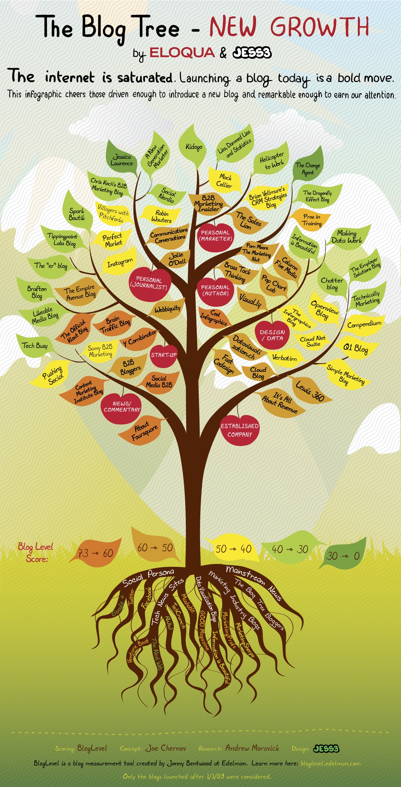
Eloqua and JESS3 have partnered again to design The Blog Tree: New Growth (building on the success of the original Blog Tree infographic project from last year).  The new version focuses on new blogs from the last few years (INCLUDING Cool Infographics!) and uses the Edelman BlogLevel as the scoring system (a ranking system I hadn’t heard of before). They are also using SlideShare.net as an embedded PDF viewer so you can interact with the clickable version that takes you to any of the blogs by clicking on any particular leaf.


The Blog Tree: New Growth
View more documents from Eloqua


A couple things worth mentioning about the project:

  • The clickable version is available on SlideShare.net or as a downloadable PDF file.
  • They are using Facebook photos in a unique way.  They are asking anyone interested in being a part of the next version to “Like” the Eloqua page and tag themselves in the image of this year’s Blog Tree.
  • They’ve added the concept of site badges this year for anyone listed on the tree.  From a content stance, this is a great way to encourage long-term links from influencial blogs.


From the Eloqua blog post:

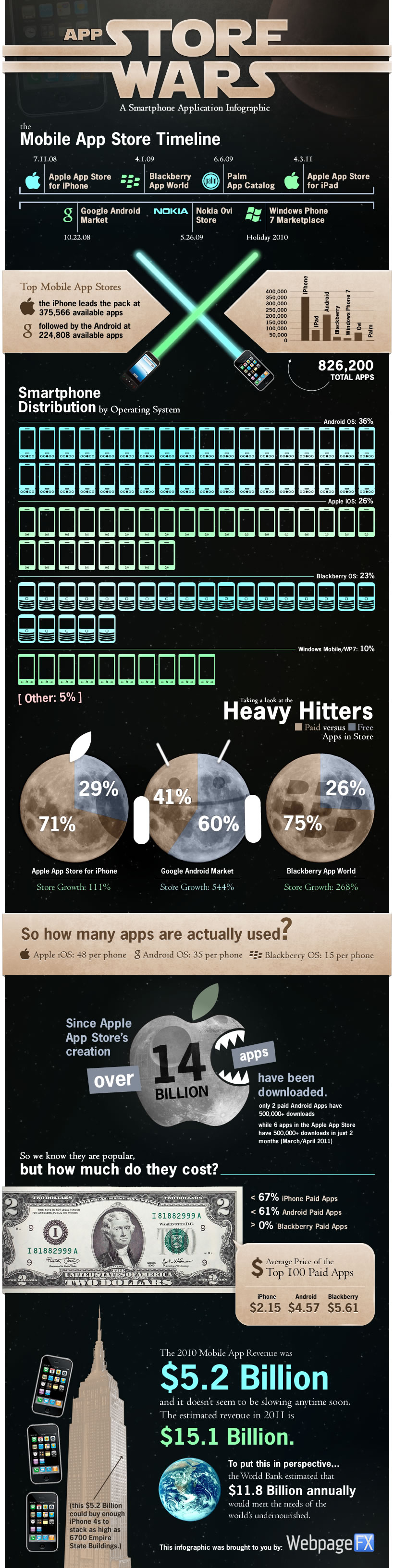
We’re calling today’s visual is The Blog Tree: New Growth edition because it celebrates a very important group of bloggers. New ones.  All gene pools benefit from healthy DNA, and if the blogosphere is going to continue to evolve, it’s important that new voices are heard. The Blog Tree: New Growth cheers about 60 active, insightful blogs launched (or significantly re-engineered) after January 1, 2009.  It’s truly a collection of the freshest voices on the Web.

After combing through the feedback we received on the original Blog Tree, we made two significant changes in this version:

  1. Interactivity: Today’s infographic is interactive. Every leaf links to the corresponding blog. Interactivity was a popular request in the wake of last year’s visual, and when we shared a draft with the bloggers featured on the New Growth version, they too asked for it. The result is an infographic that fulfills its promise of making it easier for you to discover blogs we think you’ll love.

  2. (Much) Better Ranking System: Last year’s version looked only at Web traffic, and we received a bit of pushback on that ranking model. So we turned to one of the world’s most reliable sources of trust and influence: Edelman. We used Edelman’s BlogLevel tool as our sole data supplier because it gave us the most holistic view of each blog’s relative influence, popularity, engagement and trustworthiness.


I asked Joe Chernov, VP of Content Marketing at Eloqua, a few questions about the project:

Cool Infographics: You’ve partnered with JESS3 on a number of infographic projects now.  What do you see as the biggest benefit of designing infographics as online content?

Joe Chernov: Marketing today is all about having strong “fast twitch” muscles. It’s about creating content, lots and in rapid succession, that appeals to viewers with short attention spans. It’s a hell of a challenge, especially for a business-to-business technology company, like Eloqua, whose story typically takes a little longer to tell. The benefit of an infographic is that it’s like a Trojan Horse: The visual captures attention, giving the marketer time to convey a message.

Cool Infographics: What did you learn from the original Blog Tree that changed how this one was designed?

Joe Chernov: We learned what worked. It’s funny, in “post-mortem” meetings, companies often focus on what didn’t work. But it’s also important to inspect what did work. When we released the original Blog Tree, I hesitated. I thought people might accuse it of being too high concept or pandering. Neither accusation was made. My hope was that the public recognized that we put thought into the selection, that it was truly a meritocracy. So what we learned going into the New Growth edition is that the key to success was found in the quality of the curation. Sure there were some improvements that needed to be made at the margins. Using traffic as the sole metric was a ridiculous oversimplification — and one that was 100% my fault — and, as you pointed out insightfully, the leaves absolutely should link through to more content, preferably the blogs themselves. So we made those changes.

Cool Infographics: What would you tell companies considering infographics as part of their marketing strategy?

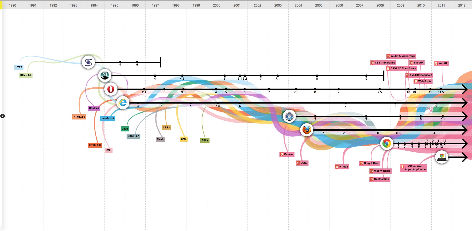
Joe Chernov: Respect the medium. Simply calling a bunch of Excel line graphs and bar charts an infographic doesn’t make it one. Stuff like this (http://blog.marketo.com/blog/2011/09/attention-b2b-marketers-embrace-the-mobile-web.html), I believe, damages the medium because it eliminates art and nuance, which are essential elements of a good infographic. Before we publish any infographic I ask myself, “What would David McCandless (http://www.davidmccandless.com/) say if he saw this? Would I be proud to show it to him?” Try to be an ambassador for the medium, because it’s under duress.

Cool Infographics: I had never heard of the Edelman BlogLevel before.  Why did you use that as your blog metric in the design?

Joe Chernov: We needed a better metric than the simple traffic data that we used to grade blogs in the original Blog Tree. Not only was that metric one-dimensional, it was also a poor measure of the quality of a new blog, which we were trying to highlight in the New Growth version we just released. After all, it takes a while to build up traffic to a blog. So we looked for a multidimensional blog “grader” from a trusted, independent source. Edelman and trust are synonymous, at least in the communications world. And their BlogLevel tool evaluates much more than traffic. It looks at engagement and the soft science of trust. I have also collaborated with David Armano, one of Edelman Digital’s leaders, in the past so I welcomed the chance to partner with him again.

Cool Infographics: In your opinion, why do blogs continue to be relevant online?

Joe Chernov: Because this is the era of transparency. Buyers want to know, really know, who they are doing business with. The blog, or at least should be, a window into the organization.


Also, check out Joe’s presentation about infographics that he gave at this year’s Content Marketing World conference, and available on SlideShare:


Infographics in 15 Minutes
View more presentations from Eloqua
Thursday
Sep222011

The Evolution of the Web


The Evolution of the Web is a cool, interactive visualization from the Google Chrome team (along with Hyperakt and Vizzuality) that explores the evolution of web browsers over the last 20 years.

Over time web technologies have evolved to give web developers the ability to create new generations of useful and immersive web experiences. Today’s web is a result of the ongoing efforts of an open web community that helps define these web technologies, like HTML5, CSS3 and WebGL and ensure that they’re supported in all web browsers.

The color bands in this visualization represent the interaction between web technologies and browsers, which brings to life the many powerful web apps that we use daily.

Clicking on any of the browser icons brings up a cool visual history of the window design for each version.

Although there is a lot of data showning the version releases along the timeline, part of this design is just pretty.  The flowing colored bands seems to grow bigger over time implying increased usage of each technology, but their placement behind the broser lines doesn’t actual show which technologies were used by each browser. 

In fact, there’s a subtle marketing spin that has all of the lines converging behind the Google Chrome logo in 2008 and then exploding into the future.  And the HTML5 line seems to imply that it will take over the Internet in 2012.

Found on Flowing Data.


Wednesday
Sep212011

The Genealogy of U.S. Airlines


A new infographic poster designed by Larry Gormley at HistoryShots.comThe Genealogy of U.S. Airlines visualizes over 90 years or corporate history of airline mergers, acquisitions and closures.  Over 100 different airlines have consolidated down the seven shown still in existence today. 

The carriers are color coded and line widths represent market share for any particular year.

Over its short history, the US airline industry has experienced many dynamic phases of expansion and consolidation. From its origins in the 1920s, when air mail carriers started to transport passengers, to the creation (with the not so gentle prodding of the government) of the Big Four (American, United, TWA, and Eastern), from the rise of the local service carriers to deregulation and the most recent wave of mergers and acquisitions, the industry continues to fascinate both the casual traveler and the aviation buff.

The purpose of this graphic is to uncover and explain how the industry was created and how it arrived at its present form. At the core is a full genealogy of over 100 US airlines from the major airlines to the small local service carriers. Folded into the genealogy is the relative market share of passenger traffic for each airline. This allows the viewer to understand how the industry was controlled for many decades by the Big Four and how this dominance was quickly replaced by a number of other airlines.

You can buy a copy of the poster for $29.95 over at HistoryShots.com

Tuesday
Sep202011

The Internet of Things


Intel has designed a large infographic, The Internet of Things that explores the growing number of devices connected to the Internet since 1960 through predictions up to 2020.  (NOT to be confused with The Internet of Things infographic released by Cisco earlier this year with the same name)  High-Resolution PDF version, additional information and the data files are available here.

The Internet is evolving, again. Every day, billions of people connect to the Internet through billions of devices – PCs, smartphones and TVs to name just a few. While the PC remains at the centre of this evolution, Internet connectivity is now embedded into cars, fitness equipment, factory robots and vending machines. This smarter, connected world has the potential to change how we live.

We’re entering a new phase of Internet evolution. It is expanding much more rapidly than it has done in the last decade. Increasing numbers of everyday appliances are connecting to the Internet, their environment and to each other. Cars, fitness equipment, factory robots, retail signage and vending machines are becoming ‘smart’ thanks to tiny embedded computer processors and sensors, just like those in your laptop or mobile phone.

I have mixed feelings about this one.  It’s visually attractive, and would make a really nice printed poster.  The data is valuable and interesting, apparently gathered from a large number of disparate sources, but the URL listed at the bottom to view the sources didn’t work for me.

However, all of the colored lines aren’t actually connecting any events or actually combining to create a visualization of the values on the left side of the page.  While it visually implies the growing connections to the Internet and complexity, it doesn’t have any connection to the actual data.

I like the circle diagram at the bottom of the growing millions of PCs sold every day, but the “80% of of all PCs shipped today have Intel Inside” turned a fun, informative infographic into an ad and could turn off some readers.

Thanks to Emma for sending in the link!

Monday
Sep192011

US/China Trade Infographic [Making-of Video]


Back in 2009 Jess Bachman designed the Visualizing the US/China Trade infographic for Mint.com.  This design uses a sankey diagram visual that has line widths representing the relative size of all the country values.

Like it or not, the US and China have a trading relationship that has global repercussions. The plastic US flags that say Made in China don’t tell the whole story. No, not everything is made in China. In fact the US manufactures and exports almost as much as China but it consumes a great deal more. Hence, the trade imbalance. What’s interesting is exactly what the US imports, stuff like machinery and toys and as much steel and iron as it does shoes. And what we export — high-tech stuff like airplanes and medical equipment and, for some reason, 7 billion dollars worth of oleaginous fruit which is used to make cooking oil, presumably for Chinese food.

A cool infographic all by itself, but even better is that Jess captured screen shots every 10 seconds automatically using Snagit (a process he calls flowcapping), and recently put them together into a behind-the-scenes video and blog post showing his design process.  10-hours of design work, compressed down into a couple minutes.  View the high-resolution version if you can so you can actually read what’s on the screen.  This is the short version.

And the longer, 7-minute version let’s you see even more details behind his process.

Jess (ByJess.net) is best known for his annual Death & Taxes infographic poster of the U.S. Federal Budget, and recently joined the team at Visual.ly as Creative Director.  Great job Jess, and thanks for sharing your process with the world!

Friday
Sep162011

HBO Recycling Program

The HBO Recycling Program is a visualization by Craig Robinson that shows many of the actors and actresses that HBO has used in multiple series.  This was posted as part of an article on Grantland.com.

Actors who have appeared in three or more episodes of multiple scripted, live-action, original, HBO series since OZ (excluding miniseries).

Inspired by the original visualization, an interactive version was created by Zack Grossbart that allows you to highlight either the show, or the actor, and it will display the connections.


Click on two shows, and the interactive version will highlight only those actors in both shows.


Zack’s interactive infographic is made with PaperJS, underscore.js, and a little JQuery.  He has made the code open source, and it can be used to display the connections between other groups as well, if anyone has the motivation to map their own connections. 

Wednesday
Sep142011

Google in 2011: Courtroom & Boardroom

Google in 2011: Courtroom & Boardroom is a new infographic from Search Influence.  At it’s heart, this is a timeline history of acquisition and courtroom events through the first nine months of 2011, but there is a lot going on here.

Events are laid out in a psuedo-calendar format for each month, flagged by country and shaded to indicate win or loss.  The change in stock price is also shown for the actual day of each event, but even though this implies the event’s impact to stock price, there are always many more factors driving price changes.  Events are connected by colored lines to indicate on-going events and the related division of Google’s business.

I hope they keep evolving this design.  In it’s current state, it’s a little hard to follow, but I love the multiple layers of data represented.  This design could evolve to be more easily readable, and even be applied to other companies as well.

Thanks to Matt for sending in the link!


Tuesday
Sep132011

The Flipped Classroom infographic


From Knewton comes and infographic about The Flipped Classrom.  It’s a good explanation of one theory behind changing the classroom environment.  I don’t know how widespread it is, but the results from Detroit look impressive.

Many educators are experimenting with the idea of a flipped classroom model.  So what is it and why is everyone talking about it?  The flipped classroom inverts traditional teaching methods, delivering instruction online outside of class and moving “homework” into the classroom.

Thanks to Krista for sending in the link!