About
Randy Krum
President of InfoNewt.
Data Visualization and Infographic Design

Infographic Design

Infographics Design | Presentations
Consulting | Data Visualizations

DFW DataViz Meetup

Join the DFW Data Visualization and Infographics Meetup Group if you're in the Dallas/Fort Worth area!

Search the Cool Infographics site

Custom Search

Subscriptions:


Feedburner

The Cool Infographics® Gallery:

How to add the
Cool Infographics button to your:

Cool Infographics iOS icon

- iPhone
- iPad
- iPod Touch


Read on Flipboard for iPad and iPhone

Featured in the Tech & Science category

Flipboard icon

Twitter Feed
From the Bookstore

Caffeine Poster

The Caffeine Poster infographic

Entries in charts (150)

Wednesday
Oct202010

Brazilian Presidential Elections infographic

From TwitRadar.com is a cool tracking map of Twitter posts during August 2010 related to the Brazilian Presidential Election and the candidates.  Data is captured from www.twiteleitoral.com.br

It describes the daily variations on the number of quotations for the top 2 more mentioned candidates, Dilma and Serra. It also points out “of the curve” campaign or media events that took affect on the twitter chattering.

Norton Amato Jr. and his team were gracious enough to translate it into English for readers of Cool Infographics, and here is the original:

Big thanks to Norton and his team!  Great job!

Tuesday
Oct192010

Video: Hans Rosling: The good news of the decade?

I love the Hans Rosling videos from TED.  This new video “The Good News of the Decade?” comes from TEDxCHANGE in Sep 2010.

Hans Rosling reframes 10 years of UN data with his spectacular visuals, lighting up an astonishing — mostly unreported — piece of front-page-worthy good news: We’re winning the war against child mortality. Along the way, he debunks one flawed approach to stats that blots out such vital stories.

I love how passionate and excited he gets about statistics!

Wednesday
Jul072010

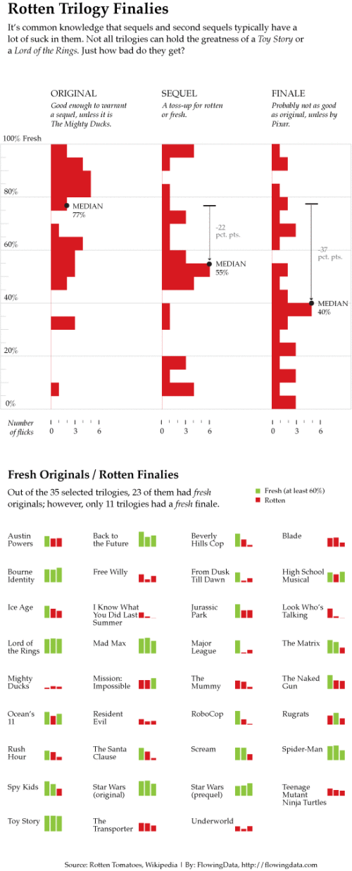
Rotten Movie Trilogies Comparison

Nathan Yau from Flowing Data Designed this new underload infographic: Movie Trilogy Comparison.

The third installment of Pixar’s Toy Story is making a killing at the box office (rightfully so, because it’s Pixar-tastic), but not all trilogies have the same luck. They can’t all be Lord of the Rings epics (all over 90% fresh), unfortunately.

Who knew Free Willy was a trilogy?!?


Thursday
Jun032010

Which Retailers are Closing their Doors?

From Milo.com, Which Retailers are Closing their Doors? is an infographic showing which retail chains in America have closed the most locations.

Although the recession is technically now over, it was not without its victims. And while independent mom-and-pop stores certainly suffered, many chain stores across the country also felt the heat. Few retailers were safe from layoffs and store closings, but the entertainment and apparel industries in particular seem to have bore the brunt of the pain. Below are the retailers that had no choice but to close some, or all, of their doors.

Created by Column Five Media.

For our most recent infographic for Milo, we took a look at which of America’s largest retailers were closing up shop(s). This graphic illustrated the fifty retailers that were closing the most store locations.

Thursday
May272010

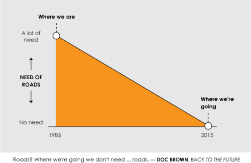
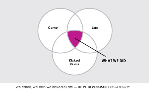
5 SciFi Movie Quotes...made into infographics

Nathan Yau has designed these humorous infographics representing five famous sci-fi movie quotes for SciFi Wire.

You can see Nathan’s explanation on his website, FlowingData.com, and all of the quotes on SciFiWire.com.  I hope you do more of these Nathan!

In something of a Data Underload, special edition, I played with famous science fiction quotes for Sci Fi Wire. My favorite is obviously from Back to the Future, the greatest movie of all time.

Tuesday
May182010

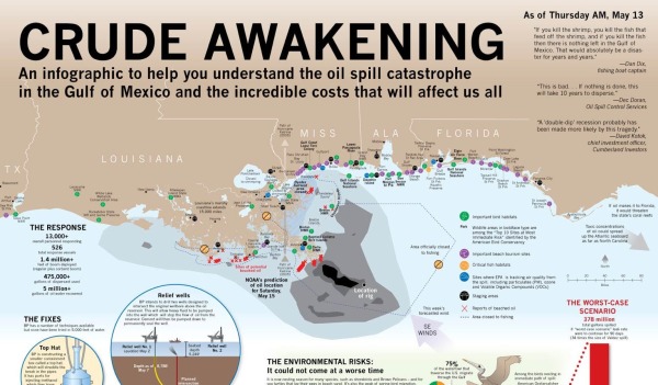
Crude Awakening - Gulf Spill Infographic

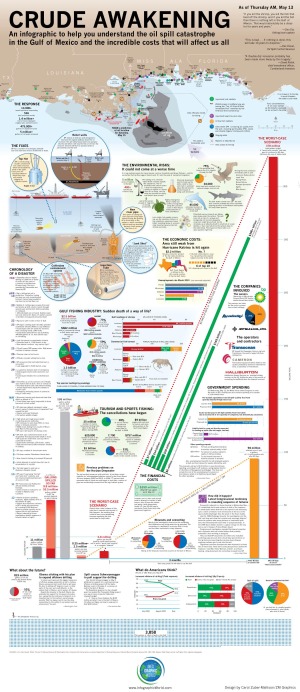
This is a very comprehensive, detail-heavy infographic designed by Carol Zuber-Mallison at ZM Graphics for InfographicsWorld.com.  Including map data, a timeline, a few pie and bar charts, a schematic of the different fix scenarios and a visual of almost 4,000 squares.

“I usually do print work; this is my first piece specifically for social media.  It just kept getting bigger and bigger as things continued to get worse in the Gulf.

I built it in four frantic days.  There’s some things O would have done differently but when you’re working that fast you’re just putting stuff together with prayer and duct tape.  Design takes a back seat to trying to get the information right.

This is an ongoing news event so things are constantly changing and I hope to update it at least once a week.  (If you’ve found an error, please e-mail me so I can fix it.)”

— Carol Zuber-Mallison

Thanks to Justin Beegel from InfographicsWord.com for sending in the link!

Thursday
May062010

Fanboys: A Visual Field Guide

From PCWorld.com, the Visual Field Guide to Fanboys is a humorous look at techie fanboys of all types.

What is a fanboy? Here’s one definition from the Urban Dictionary: “A passionate fan of various elements of geek culture (e.g. sci-fi, comics, Star Wars, video games, anime, hobbits, Magic the Gathering, etc.), but who lets his passion override social graces.”

For each one we give you 14 key attributes, such as what sort of clothing they wear, what they drink, what they drive, what turns them on, and what enrages them. We give you just enough to differentiate between species quickly and accurately.

Link found on Chemicalism

Tuesday
May042010

The Music Industry and Online Piracy, infographic by the numbers


Music And Piracy Infographic by =curseofthemoon on deviantART

Great infographic by D. Israel Peralta, The Music Industry & Online Piracy by The Numbers does a good job at examining at the different ways that online music has impacted the music industry.

You can see more of Israel’s work on DeviantArt.  A high-resolution version is also available.

Link found on Chemicalism

Monday
May032010

Create Your Own Personal Infograph


Answer nine questions and ionz will create your own Personal Infograph, showing how you compare to everyone else who has also answered the questions.  You can then personalize your infograph by changing the colors, adding a personal message, change the layout, change the background color and add a picture.  Then you can save the image as your wallpaper.

So far, over 35,000 people have created their own infograph wallpaper.

Thanks to Simon Hinchco (@x_chemicalism_x) on Twitter for the link

Monday
May032010

Lies, Damned Lies and Statistics (about TEDTalks)

Very funny video from TEDActive, by Sebastian Wernicke that analyses the best and worst of TEDTalks using statistics and word analysis.

In a brilliantly tongue-in-cheek analysis, Sebastian Wernicke turns the tools of statistical analysis on TEDTalks, to come up with a metric for creating “the optimum TEDTalk” based on user ratings. How do you rate it? “Jaw-dropping”? “Unconvincing”? Or just plain “Funny”?

Found on ILoveCharts.tumblr.com