About
Randy Krum
President of InfoNewt.
Data Visualization and Infographic Design

Infographic Design

Infographics Design | Presentations
Consulting | Data Visualizations

DFW DataViz Meetup

Join the DFW Data Visualization and Infographics Meetup Group if you're in the Dallas/Fort Worth area!

Search the Cool Infographics site

Custom Search

Subscriptions:


Feedburner

The Cool Infographics® Gallery:

How to add the
Cool Infographics button to your:

Cool Infographics iOS icon

- iPhone
- iPad
- iPod Touch


Read on Flipboard for iPad and iPhone

Featured in the Tech & Science category

Flipboard icon

Twitter Feed
From the Bookstore

Caffeine Poster

The Caffeine Poster infographic

Entries in charts (150)

Wednesday
Oct172012

Fast Fourier Transforms: An Infographic Study Guide

Fast Fourier Transforms: An Infographic Study Guide

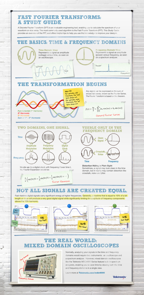
Fast Fourier Transforms: A Study Guide from Tektronix is a great example of using data visualization and infographic design principles to visually explain the math behind their oscilloscopes.

Most engineers don’t remember the complex algorithms and concepts of the Fast Fourier Transform (FFT) and Discrete Fourier Transform (DFT) that they learned in college. Instead of dusting off your textbooks, check out this Fast Fourier Transform visual from Tektronix. It boils down the key tips and practical knowledge for Engineers and their designs. With this visual, we hope you can skip digging up your old text books and get back to your designs.

The design does a good job of telling a story top-to-bottom.  Starting with the basics, moving into the more complicated math and finally applying the math to how the oscilloscope product works.

Definitely a design focused on their target audience, and not the general public.  However, using infographic design to simplify your message to customers is one of the most effective ways to clearly communicate your marketing message.  It’s more memorable to your audience when they come to a purchase decision, and communicating clearly builds your brand credibility with the subject.

At the bottom of the design, they should have included some type of license (copyright or Creative Commons) and the URL to the original infographic landing page.  Nothing wrong with listing the URL to the product page, but help readers interested in the information from the infographic find the original full-size version easily.

Thanks to Matt for sending in the link!

Tuesday
May292012

Hans Rosling TEDTalk: Religions and Babies

Another great TEDTalk from Hans Rosling called Religions and Babies about the growth of the world population.

Hans Rosling had a question: Do some religions have a higher birth rate than others — and how does this affect global population growth? Speaking at the TEDxSummit in Doha, Qatar, he graphs data over time and across religions. With his trademark humor and sharp insight, Hans reaches a surprising conclusion on world fertility rates.

In Hans Rosling’s hands, data sings. Global trends in health and economics come to vivid life. And the big picture of global development—with some surprisingly good news—snaps into sharp focus.

Wielding the datavis tool Gapminder, Professor Rosling is a master at using data visualization to tell his story.

The video is also avilable on YouTube for portable devices:

Monday
Jan092012

An Intimate Look at Infographics

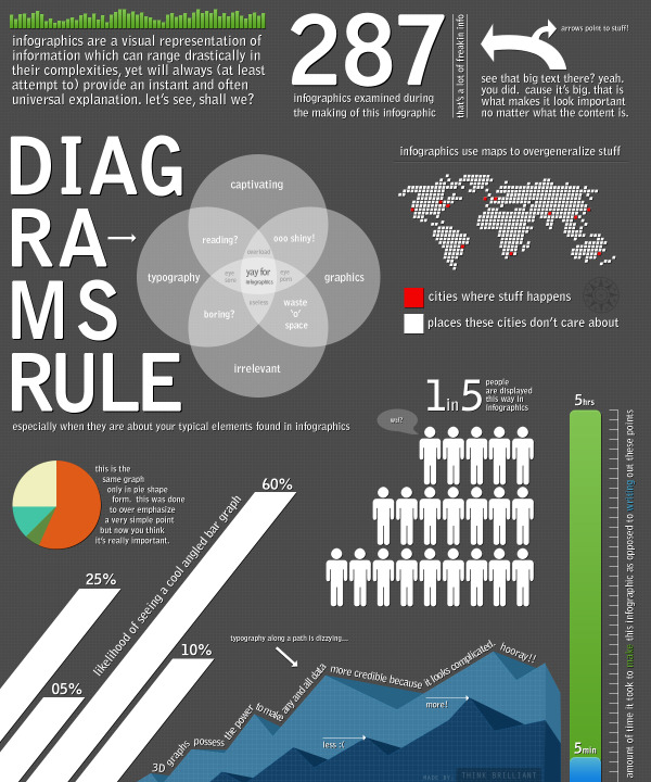
An Intimate Look at Infographics is a fun, satirical look at infographics from Think Brilliant that comes in the form of an infographic!

A well done infographic has the power to capture one’s acute attention span and convey information that would have taken longer to simply read (oh no, not reading!). However, for every brilliantly thought out and well executed mashup of art and data, there now seems to be an influx of mundane and formulaic counterparts infesting the very internet that we hold so near and dear.

Here we have an infographic that explores commonalities between the seemingly vast expanse of contrived infographics that appear to have spawned in mass over the past year. If you’re an infographic purest, view at your own risk.

This one is not new, but it did make me smile!

Thanks to David for sending in the link!

Thursday
Jun302011

Humor: Corporate Organizational Charts

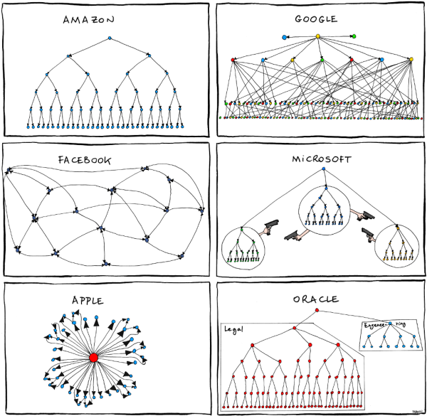
From Bonkers World, Organizational Charts is a very funny look at the corporate cultures and structures for some very high-profile tech companies using hand-drawn organization charts as the visual language.

Found on Daring Fireball.

Monday
Apr112011

Evolution of the Cell Phone #infographic

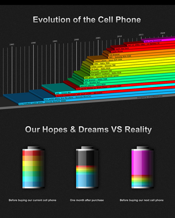
A cool infographic design, the Evolution of the Cell Phone by Zitron takes a light-hearted look at the timeline of phone features and the phones that first had each feature.  The second part of the infographic, Our Hopes and Dreams, takes a humorous stab at how the reality of our cell phones rarely lives up to our expectations (until the next Buzzword comes along!).

Monday
Mar212011

BT Financial Infographic Commercials

BT Financial Australia created a series of video commercials called The Bigger Picture using florescent light tubes to animate growth charts in the infographic ads.

I’m very impressed that the design group BT used, The Glue Society, went out looking for a visual way to convey the data that was interesting, but also created a unique look for BT.

They also published a cool Making-Of video looking behind the scenes at setting up the physical light structures and filming the ad spots.


Found on Information Aesthetics and Fast Company.

Tuesday
Mar152011

Hans Rosling: Visualizing Mortality History [video infographics]

Hans Rosling, known for some of his famous TED Talks, here tries a little augmented reality with his animated charts showing life expectancy and wealth all over the world for the last 200 years.  120,000 data visualized in this 4 minute video clip from his The Joy of Stats documentary for the BBC.

Hans Rosling’s famous lectures combine enormous quantities of public data with a sport’s commentator’s style to reveal the story of the world’s past, present and future development. Now he explores stats in a way he has never done before - using augmented reality animation. In this spectacular section of ‘The Joy of Stats’ he tells the story of the world in 200 countries over 200 years using 120,000 numbers - in just four minutes. Plotting life expectancy against income for every country since 1810, Hans shows how the world we live in is radically different from the world most of us imagine.

Thanks Udi for sending in the link!

Friday
Mar112011

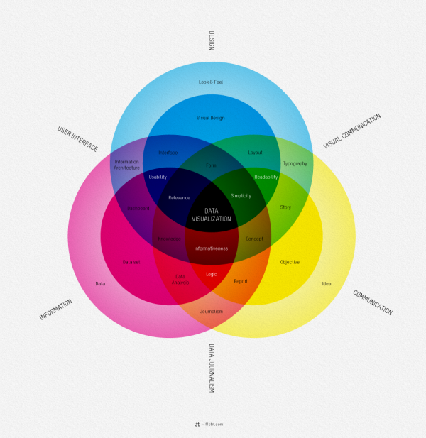
What is Data Visualization?


I love this map of What Is Data Visualization? from Sébastien Pierre, founder of ffunction.  It lays out the different aspects of information design, and acts as a fantastic guide to the vocabulary used in the design community.

ReadQWriteCloud has a good interview article with Pierre on his thoughts behind designing the infographic.

Pierre:

“Will it be interactive or static? Will it be used as a tool or to illustrate something? Depending on how we position the visualization, it will be more demanding on UI aspects or on visual aspects. Dashboards, online reports and interactive web visualizations need a solid understanding of UI design, while infographics and print reports require a strong foundation of typography, layout and visual communication.”

Found on ReadWriteCloud and ChartPorn

Wednesday
Mar092011

The Present and Future State of Music

A State of the Art, The Present and Future State of Music (long title, I know) from 3GM.hu looks at the current statistics behind music streaming and consumption.

Personally, I can’t believe the statistic that 85% of listening is still consumed from the Radio?!?  I haven’t listened to an actual radio station for years!  I listen to everything through my iPhone.

Wednesday
Mar022011

Blood Simple: Designing Infographic Health Reports

Blood Simple, by Steven Leckart, is a great article in the recent issue (Dec 2010) of WIRED magazine, and is also available to read online.  Three visual designers were challenged to design a better lab report to help make health information more approachable and understandable by patients.

…lab reports don’t have to be unintelligible. With some thought and design-minded thinking, tests can be as informative to patients as they are to physicians. With a little context and color, we can make sense of the numbers. And with a bit more understanding, patients can become participants in their own health.


These designs certainly aren’t perfect, but they very clearly illustrate the point that we should be able to help patients get a better grip around their own health information.  The last few decades have seen a tremendous shift in pushing the responsibility of a patient’s health back onto the patient without giving them a better way to understand the information. 

We consulted with Lisa Schwartz and Steven Woloshin, physicians at the Dartmouth Medical School Institute for Health Policy and Clinical Practice and experts in communicating data to patients, to make sure the right information gets onto the forms and the irrelevant stuff stays off. And we tapped three exceptional designers to reimagine how this information can be presented—limiting them to one printed page per report. Consider these a proof of concept, a refutation of the argument that ordinary people can’t handle their health (and inspiration, we hope, for the medical establishment).


I want my own Visual Health Report!