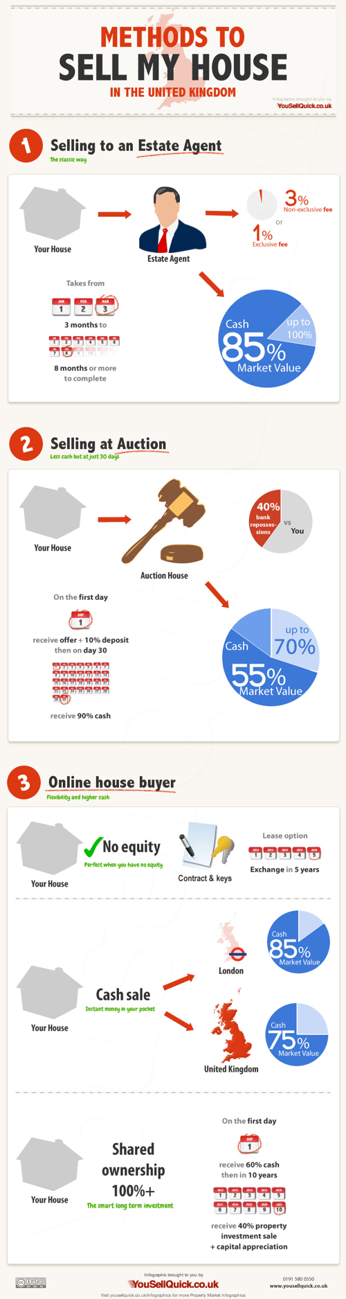
When looking to sell your home you may not realise that there are a variety of different options available. Not all are as favourable as others and there are different pros and cons for each. Such as how long will it take to sell my home and what amount of cash can I receive. Should I sell my house at an auction or would it be better to use an on-line property buyer?
I like the diagrams that explain the different processes, but the pie charts have really been used poorly in this design. I think I nderstand what they were trying to explain, but it won’t be obvious to most readers. Many readers will think they got the pie chart data wrong because the percentages shown don’t add up to 100%.
A hypothetical startup will get about $15,000 from family and friends, about $200,000 from an angel investor three months later, and about $2 Million from a VC another six months later. If all goes well. See how funding works in this infographic:
Is dilution bad? No, because your pie is getting bigger with each investment. But, yes, dilution is bad, because you are losing control of your company. So what should you do? Take investment only when it is necessary. Only take money from people you respect. (There are other ways, like buying shares back from employees or the public, but that is further down the road.)
This is a great design that uses pie charts correctly and effectively! This is in contrast to the many designs that use pie charts inappropriately. This is a great example of a visual explanation that uses a combination of data visualization, illustration and text to tell a clear story.
The color coding is also effective, but for some reason they didn’t color the co-founder icon character green to match his portion of the pies. The URL link to the original infographic landing page is also missing in the footer, so it makes it hard for readers to find the full-size original version when they see it posted on other sites. People aren’t always good about creating links back to the original, so the URL should be included in the infographic image file itself.
Are you looking for a new car? The Most Reliable Cars infographic from MoneySupermarket rates how reliable the manufacturers are as well as specific car models. The lower the score, the more reliable the car is. If your current car isn’t on the list. Maybe it is time to get a new one.
It is never a pleasant experience to find yourself stranded next to a broken down vehicle at the side of the road, particularly during the winter. Breakdown cover can help to reduce the pain somewhat, but it is still worth making sure that you pick the most reliable car available.
MoneySupermarket.com has therefore teamed up with Warranty Direct to put together the following lists which highlight the most reliable cars on the road. This is decided upon by taking into account overall reliability and the average cost of repairs for these manufacturers and models – coming up with an overall Reliability Index (RI) score. Just for reference- the average RI is 100, and the lower the score the better.
We’ve broken this down by both car make and by individual vehicle models to come up with a definitive list which could prove invaluable to you during the car buying process.
This is a really good use of bar charts. The company logos or car photos and the relevant data is built directly into the chart so there is no need for a chart legend. Very easy to read and understand.
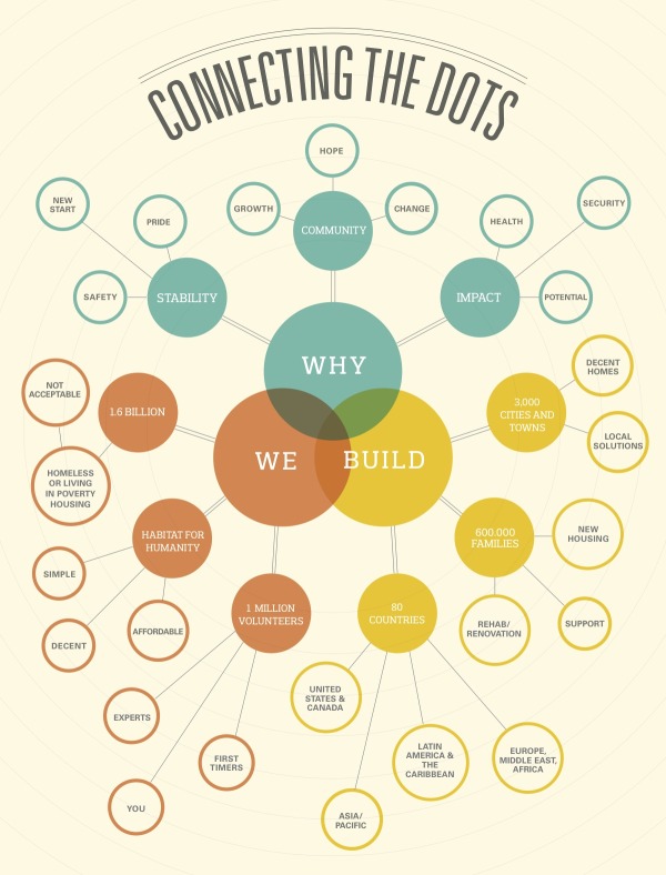
Learn more about how Habitat builds homes, communities and hope.
I really like the combination of the Venn diagram in the center and the mind map nodes that extend outward. The sizes of the circles doesn’t have any meaning, just sized to fit the text. This is a really good way for Habitat for Humanity to tell their story with a visual explanation.
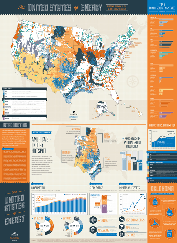
Finally… After almost 50 years of dependence on foreign sources to meet our growing energy needs, our country is finally in a position to begin reversing the trend. Through advances in drilling technology, discoveries of new oil and natural gas reserves and swift progress in the renewables sector, the United States is setting a course for energy self-sufficiency.
What began as a simple graphic showcasing America’s energy riches quickly grew into a two-sided, folded map concept displaying thousands of individual data points.
The #USofEnergy map visualizes our country’s energy potential by charting current sources of energy production and identifying future resources and known deposits. Energy resources surveyed include: natural gas, oil, coal, nuclear, hydroelectric, wind, geothermal, solar and biomass.
This is actually designed as two landscape posters as the front and back, but when put together, they make one very detailed portrait orientation poster. I love the main U.S. map that is the primary focus, and the designers took on the challenge to visualize the many different energy sources as represented with the overlapping colors. You’ll notice that the smaller area coverage shapes are always on top, so the small circles aren’t completely hidden by the larger area shapes. I would have attempted making the colored areas slightly transparent to let the underlying shapes show through, and removing the text names of all the states might have helped to reduce the visual noise.
My power contract for InfoNewt here in Texas is 100% Wind Power, but I had no idea that Texas is the national leader in wind power production!
I’m not sure what to call them, but I like the paired 180° doughnut charts showing how the sectors and sources of energy have changed from 1949-2011. However, I don’t like the chart legends that makes them hard for the reader to figure out what each color represents. Legends are evil! It would have been nice for the nine types of energy to be shown with icons (along with the color-coding), and the icons or text could have been shown along with the larger 2011 doughnut segments.
The statistics shown at the bottom are shown as just text numbers. In contrast to all of the data visualizations throughout the rest of the design, this makes these numbers seem unimportant to the reader.
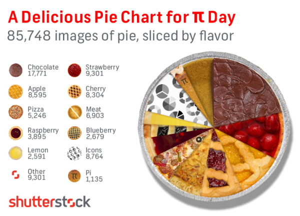
In honor of Pi Day (3/14) we took a dive into our library to suss out some Pie Knowledge, and ended up with the above appetizing infographic revealing the flavor breakdown of the 85,748 “pie” search results from our library. Yes, we know that “Pi” equals 3.14159… and not “Pie,” but we couldn’t resist the delicious comparison. Any way you slice it, this is some tasty data, and our mouths water for data here at Shutterstock.
I can’t wait! 3D Printing: How Long till the Revolution? from the Farnell/Newark Group and designed by Neo Mammalian Studios takes a stab at predicting the rise of 3D printing. Seriously, I want the day when I can print out my own coffee cup design, custom LEGO shapes and a new iPhone case! Download the model, and print! That flimsy plastic piece from the vacuum broke again?!? Just print a new one!
3D printing has slowly started to get popular in use in the industry, by the hobbyists and ordinary individuals in their homes. If you can design it, the 3D printer can build it. However, we are still in the early stage of owning and using 3D printer. So, what is the length of time before it will become mainstream like the PC? The infographic will show when will every American own a 3D printer and how it affects the profit of those who are selling consumer objects and more.
The doughnut charts are colorful and unique in that hexagon shape. The use of Roger’s Diffusion of Innovations line charts is actually very easy to understand. The comparisons to the PC market and to music sales online are great analogies.
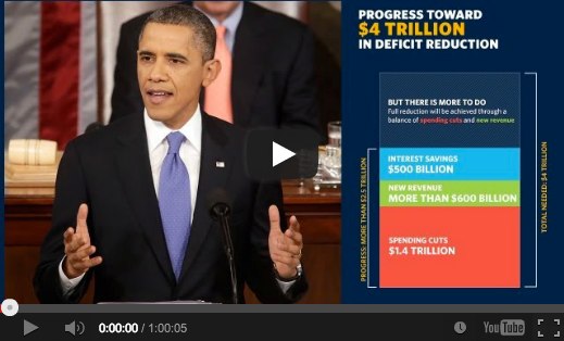
On February 12, 2013, President Obama gave his annual State of the Union speech, but this year it was “enhanced” with charts, data visualizations and additional information in a sidebar of the display (full video above). The team at NPR (@nprapps) published a great review a few days later called Chart Check: Did Obama’s Graphics ‘Enhance’ His Big Speech? They also included opinions from a couple of the best data visualization experts Stephen Few (PerceptualEdge.com) and Nathan Yau (FlowingData.com)
I will say that I think the use of the charts was very successful and does make the President’s speech more effective. By their very nature, the charts imply that the President has data behind his message, and that can be a very persuasive, compelling tactic. You’ll also notice the wide array of chart styles so they are each memorable for different topics in the speech. We didn’t get 27 bar charts, because the audience wouldn’t have been able to tell them apart after the speech. We got different data visualizations for different types of data. Stacked bars, line charts, area charts and grids colored icons.
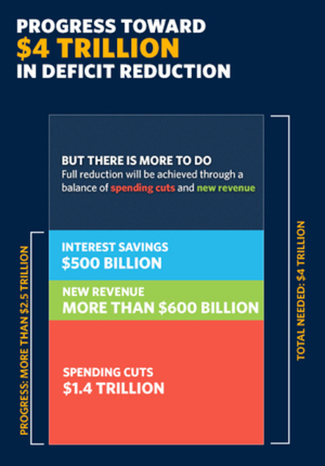
The key frame from the video (above) is what first caught my eye. This is the still image shown before you start playing the video. I was instantly concerned about all of the charts after seeing this one about Deficit Reduction. It may be because I work with data visualizations every day, but I could see instantly that the chart was wrong. How can the $500 Billion part of the stacked bar be larger than the $600 Billion part? That can’t be right! Seriously, I look at this stuff all the time, and this jumps out at me in a big way. Welcome to my life.
Here’s the full chart:
One of the biggest risks with data visualizations and infographics is what I call the Risk of Negative Impression. The idea is that while good visuals can quickly leave a good impression with your audience, if your visualizations are incorrect or flawed, you can leave a bad impression just as quickly and effectively. The audience thinks, “if they messed up this chart, why should I trust anything else they have to say?” Then they feel like they have to carefully scrutinize every chart, and you have lost all credibility with your audience.
The NPR piece does a great job of breaking down 14 of the 27 charts from the speech, and even created some corrected charts to show a more realistic real visualization of the data. I highly recommend you read the whole article on the NPR site.
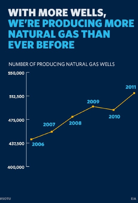
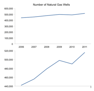
I’ll mention one more example. By visualizing data, the designer adds context and bias to the information. The best designers try to minimize the bias, but even the choices about what data to include in the visualization help frame the audience’s understanding. One common way to skew perception of the data is to change the scale of one or both of the axes. A number of slides from the speech don’t start at zero, so the chart exaggerates the changes. This is a common practice when charting stock values so the audience can see the small changes, but they often make the changes feel much bigger than they actually are. That was the intent with this chart that only shows the range of values from 400,000 to 550,000.
Stephen Few redesigned this corrected chart for the NPR piece, and I think he nailed it. By expanding the y-axis to start at 0, he puts the changes over time into a different perspective for the audience.
The White House has published all of the 107 slides as a scribd.com presentation:
Eloqua has teamed up with infographic design firm JESS3 again to create Modern Marketing Insights, a series of 40 infographics using big data analysis that can help marketers anywhere.
Did you know that dynamic content can improve conversions by 50%? Or that emails sent on a Saturday get the highest number of click-throughs? Were you aware that when influencers share your content on social it can result in a dramatic increase in traffic and conversions?
That’s why we produce a chart every week that modern marketers can easily learn from and use. And it’s why we’ve gone back with our friends at JESS3 to reproduce the most indispensable data points, coming up with 40 understandable, actionable charts. Wide-ranging in scope, the charts hit the most important topics hitting marketers today – from social media to email.
With that in mind, we offer the charts in two forms. You can head over to the custom-made website and explore the charts by topic, getting to the data that matters most to you. Or you can download all 40 charts in a free eBook. It’s well worth keeping near your desk.
Even those each of these is only exploring one data set, these are actually good infographic designs that follow some important design rules.
First, each one tells one story really well, and the Key Message is easy to understand. Most readers of infographics are only looking at a design for less than 5 seconds, and a good infographic design will successfully communicate their primary message in that short time.
Second, each design is easy to share. Each of the 40 designs has it’s own landing page on Eloqua’s site, and their own dedicated social media sharing buttons. This is fantastic for SEO, and much easier to utilize the information for users. So, if you’re interested in a data set about email to customers, you can share that information with colleagues without also sharing a data set about Pinterest.
You can read more about the series on the Eloqua blog.
A couple things I do think are missing from each design that would help Eloqua in the future.
Since these are being shared individually, the URL back to the original on Eloqua site should be included in the image.
A copyright statement to clarify usage rights. Does everyone have permission from Eloqua to include these charts and data in their own presentations?
Much of the data is proprietary to Eloqua, so the raw data behind the designs isn’t available to the public. It would be great for Eloqua to make the data behind each chart available publicly (like in a Google Docs spreadsheet) since they are making the data public in the charts.
A conclusion. I think the subtle implication is that companies should call Eloqua for help using this information, but a short statement suggesting what action companies should take based on each data set would close each design nicely.


 Randy
Randy