About
Randy Krum
President of InfoNewt.
Data Visualization and Infographic Design

Infographic Design

Infographics Design | Presentations
Consulting | Data Visualizations

DFW DataViz Meetup

Join the DFW Data Visualization and Infographics Meetup Group if you're in the Dallas/Fort Worth area!

Search the Cool Infographics site

Custom Search

Subscriptions:


Feedburner

The Cool Infographics® Gallery:

How to add the
Cool Infographics button to your:

Cool Infographics iOS icon

- iPhone
- iPad
- iPod Touch


Read on Flipboard for iPad and iPhone

Featured in the Tech & Science category

Flipboard icon

Twitter Feed
From the Bookstore

Caffeine Poster

The Caffeine Poster infographic

Entries in charts (150)

Tuesday
Apr072015

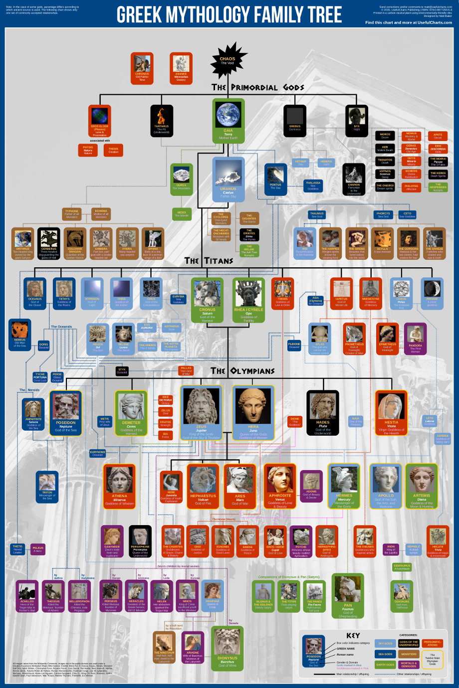
Greek Mythology Family Tree

Greek Mythology Family Tree chart

Keeping track of Greek mythology’s genealogy can cause a headache. But now, Useful Charts has released a new update to the ultimate cheat sheet called the Greek Mythology Family Tree chart poster! The tree starts with Chaos from the Primordial gods, and finishes through the last of the Olympians.

The poster is available for purchase on Amazon for $24.95

Fans of Rick Riordan’s Percy Jackson books will love this poster! Covering all three generations of Greek gods (Primordial, Titans, and Olympians), it displays both the Greek and Roman names for the gods as well as their titles or functions. It is also color-coded to distinguish between sea gods, sky gods, earth gods, underworld gods, personifications, monsters, demigods, and mortals.

This is a great network map design, and way more complicated than your standard family tree. The images help tremendously.

Created by Matt Baker at UsefulCharts.com

For a detailed look at the poster, check out Matt’s video:

Wednesday
Dec242014

The Graphic Continuum - Desktop Version

The Graphic Continuum - Desktop Version

Jon Schwabish and Severino Ribecca have released a full-color, double-sided, laminated 8.5”x11” desktop version of The Graphic Continuum, available for only $10 until the end of the year when the price will go up to $13. This is a smaller version of The Graphic Continuum poster they released earlier this year.

Nearly 90 graphic types grouped into 6 categories on a laminated 8.5”x11” sheet. It does not include every type of graphic, nor does it display every type of link between visualization, but it serves as a thought-starter. Use it to develop ideas, consider different options, or simply as a piece of art.

A fantastic reference of data visualization methods to give you some ideas for ways you can visualize your data differently.

The Graphic Continuum - Desktop Version Page 1

The Graphic Continuum - Desktop Version Page 2

Thursday
Dec042014

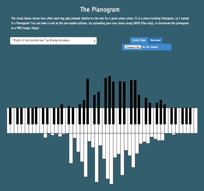
The Pianogram

The Pianogram Joey Cloud infographic

The Pianogram is a histogram using the design style of a piano keyboard to show the frequency of notes in a given song. Designed by software programmer Joey Cloud, the site has a handful of preloaded songs, but you can upload the MIDI file for any song to create a custom pianogram.

The visual below shows how often each key gets pressed relative to the rest for a given piano piece. It is a piano-looking histogram, so I named it a Pianogram! You can take a look at the pre-loaded options, try uploading your own piano songs (MIDI files only), or download the pianogram as a PNG image. Enjoy!

This a fun visualization tool. Here’s Billy Joel’s Piano Man, just because it seemed the most appropriate:


The Pianogram Billy Joel Piano Man

Found on FlowingData and FastCo Design

Friday
Oct102014

5 Great Online Tools for Creating Infographics

Professional infographic designers rely primarily on a core vector graphics software program to create their infographics designs. The main advantage is that all the icons, charts, images, illustrations, and data visualizations are treated as separate objects that can be easily moved, resized, overlapped, and rotated. No matter where you create the individual design elements, the final infographic design is usually put together in a vector graphics program.

Creating infographics using online tools has never been easier. In the last few years a number of online tools have emerged that allow anyone to create great visual content.  Whether you are working on a project for work, personal use, or social media, each new project starts with a template. With the dimensions laid out for you, you can focus your attention on quickly creating effective designs. Search, drag, and publish - it can be that simple.

These new tools are vector graphics applications that run in your browser as a replacement for using an expensive professional desktop application like Adobe Illustrator to put your infographic design together.  Each one offers different tools, image libraries, charts, fonts and templates as a starting point.  None of these have the full capabilities of a professional desktop application, but you probably don’t need that much power to create a simple infographic.

In this article, we take a quick look at 5 of the best online tools for creating infographics: Visme, Canva, Easel.ly, Piktochart, and Infogr.am. All of these tools are evolving quickly, and this is just a snapshot of their current capabilities.
 

Visme screenshot

1) Visme (visme.co)

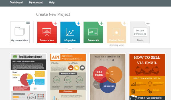
Visme allows you to create interactive presentations, infographics and other engaging content. With tons of templates, and huge library of free shapes & icons to choose from, Visme has you creating awesome visual content right away.

The templates are set up simply and beautifully. If you wanted, you could just edit the placeholder text, insert your own, and publish your infographic.

One of the greatest aspects of this service is changing percentages within the charts. All you have to do is click on the graphic you would like to change, enter a new number, and the chart changes to reflect the new information automatically. Saving you hours of frustration trying to do it on your own.

Pros:

  • Creates infographics, presentation, animations, ad banners, and custom layouts.

  • Insert and edit chart objects directly by changing the data values.

  • Large library of icons and images.

  • Embed YouTube videos directly into designs.

  • Special pricing for students & teachers.

Cons:

  • The basic free version is limited.

    • Only 3 projects.

    • Must include the Visme logo.

    • Limited access to charts and infograph widgets.

  • JPG download is still in Beta, with a few bugs.

Price: Basic version is free with pricing plans available
 

Canva screenshot

2) Canva (canva.com)

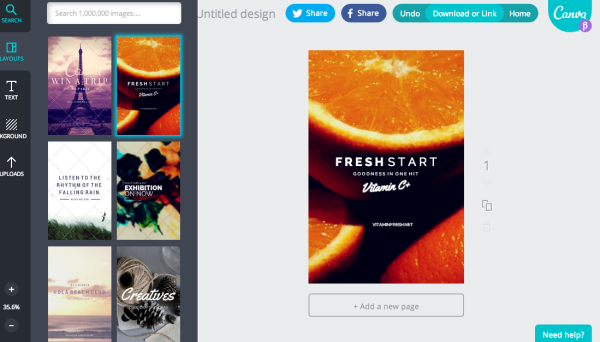
Canva just celebrated their 1-year anniversary last month, and has made a big splash in the online design space.  Your experience kicks off with a great "23 Second Guide to Beautiful Design," where they walk you through a brief introduction to their design program.

After finishing the brief tutorial, you can start a new design. Canva is filled with options, whether you are working on a project for work, personal, or social media. Each new project comes with a template for the project you choose to work on. With the dimensions done for you, you can focus your attention on creating beautiful designs in seconds.

Pros

  • Excellent (and short) intro tutorial to get you started, and many more on advanced concepts.

  • Templates for social media, blogs, presentations, posters, business cards, invitations, and more.

  • Easy and intuitive to use.

  • Large library of images to choose from.

Cons

  • No editable chart objects. You need to import your own data visualizations as images.

  • Have to pay for different image assets individually, instead of a monthly subscription.

Price: Free, but you have to pay for Pro quality design assets individually
 

Easelly screenshot

3) Easel.ly (www.easel.ly)

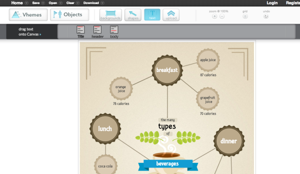
Easel.ly is a great program, but lacks some of the guidance, and features, that come standard in other programs.

Easel.ly lacks a "How-To" introduction section to their program, and just kind of throws you into the design process right away. Their focus seems to be primarily based on infographic design. Whereas other programs offer a plethora of design project options.

If you're just looking to design an infographic, this program will work well. If you want more variety, you'll have to utilize one of the other programs in this list.

Pros:

  • Free.

  • Very basic design layouts and assets.

  • New charts feature allows some basic editable charts in your design.

  • Easy downloads for JPG and PDF versions.

Cons:

  • Not a very large selection of themes, called “Vhemes”.

  • Small library of image assets. You’ll want to upload your own images and icons.

Price: Free
 

Piktochart screenshot

4) Piktochart (piktochart.com)

Piktochart is one of the best looking programs on this list. All the information you need to get started is provided in their tour.

Their program is easy to use, and offers tons of freedom in building and editing your infographic using their simple graphic tools. They have categorized icons, resizable canvas, design-driven charts, and interactive maps to utilize.  

Their intuitive user interface is where Piktochart truly excels. All the tools you need to create are laid out intelligently, making your new job as a "designer" so much easier.

One of the coolest aspects of this program is that they show how versatile infographics are for different projects. Whether you're creating for a classroom, office, website, or social media setting - Piktochart gives you the heads up on how to use infographics effectively.

Pros:

  • Themes and templates are of high design quality.

  • Intuitive. Allows you to edit anything and everything with ease.

  • Create infographics, reports, banners and presentations.

  • Embed videos from Youtube and Vimeo in your design.

Cons:

  • Limited selection of free templates. Higher quality templates are available with a Pro account.

  • $29 per month is a high subscription price compared to the others.

Price: Start for free with pricing packages available
 

Infogram screenshot

5) Infogr.am (infogr.am)

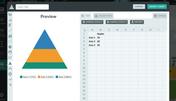
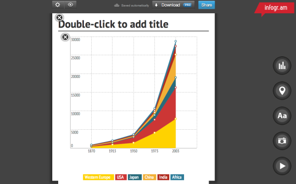
Infogr.am has got the best charts. For illustrating data, there are more than 30 different types of charts to choose from. Anything from bubble charts and tree maps to simple pie charts.

Editing data can be easily done in Infogr.am's built-in spreadsheet, or you can import your own XLS, XLXS and CSV files.  Once your infographic has been edited and beautifully designed, you can save it to your computer as a PNG or PDF file with a paid subscription.

Pros:

  • Ability to create and edit great charts by changing data

  • Built-in Spreadsheet. Can also import your XLS, XLXS and CSV files

  • Widest variety of available chart types

  • Educational and Non-profit pricing plans available

  • Embed videos from Youtube and Vimeo in your design.

Cons:

  • Only creates infographics and charts

  • Small selection of infographic templates

  • No image library, you must upload your own image assets

  • Download options require paid subscription

  • The White Label subscription service is the most expensive options of the group

Price: Basic version is free with pricing plans available


Which design sites have you tried? Which tools are your favorites? Post in the comments.

Friday
Oct032014

The Graphic Continuum

The Graphic Continuum data visualization poster

The Graphic Continuum is a new poster of data visualization styles and methods from Job Schwabish and Severino Ribecca. Available as a printed poster for $25 on Mimeo.

The Graphics Continuum shows several ways that data can be illustrated individually or combined to show relationships. Use of various shapes, chart types, and colors can help identify patterns, tell stories, and reveal relationships between sets and types of data. Bar charts, or histograms, for examples, can illustrate a distribution of data over time, but they also can show categorical or geographic differences. Scatterplots can illustrate data from a single instance or for a period, but they also can be used to identify a distribution around a mean.

This set of charts does not constitute an exhaustive list, nor do the connections represent every possible pathway for linking data and ideas. Instead, the Graphic Continuum identifies some presentation methods, and it illustrates some of the connections that can bind different representations together. The six groups do not define all possibilities: Many other useful overlapping data types and visualization techniques are possible.

This chart can guide graphic choices, but your imagination can lead the way to other effective ways to present data.

The Graphic Continuum data visualization poster closeup 1

I’ve seen a few other attempts to gather and categorize data visualization techniques, and I really like this poster. One of the biggest challenges for people is to break out of the Big Three chart styles: bar charts, line charts, and pie charts. It doesn’t matter if they’re designing an infographic or a PowerPoint presentation, I am often asked to help clients find new ways to visualize their data.

The Graphic Continuum data visualization poster closeup 3

Jon Schwabish has posted a great article on Visual.ly about the development process and includes images of some other arrangements they attempted during the design process.


Tuesday
Mar182014

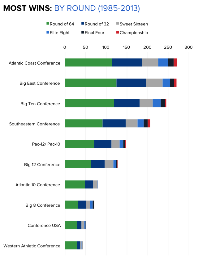
The Power of ACC Basketball

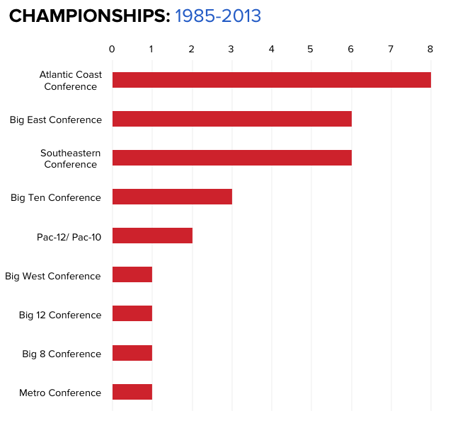
The Basketball Staff at CBS Sports has put together a handful of really good data visualizations showing the 29-year history of the NCAA Tournament since the field expanded to 64 teams.  The chart above shows Most Wins won in the Tournament by conference, color-coded by round.  These aren’t complicated designs, but the story they tell is very powerful.

Go N.C. State Wolfpack!  Fantastic win over Xavier tonight!  The Big East looks pretty strong too, but there’s nothing like ACC Basketball.  These data visualizations tell that story much better than text and numbers.  In Texas (Big 12), they just don’t seem to understand the importance of basketball.  Football is what you play in the off-season!  They have it reversed here in Texas, where football is much more important.

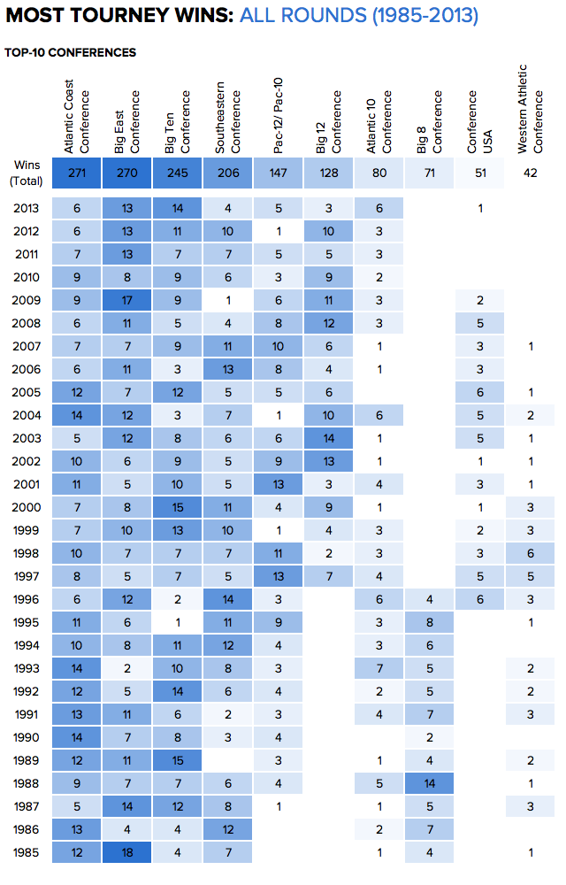
Here is that same data shown as a color-coded table that spells out the Most Tournament Wins by Year by year.  This looks like it could have been designed with Conditional Formatting in Microsoft Excel, but it’s done very well.  The simple color-coding adds context and makes the entire table easier to understand.

As an infographics design, the PNG image file itself should include a little more information, in case it gets shared online without the rest of the article (like this blog post).  It should list CBS Sports as the publisher/designer and the URL back to the original article.  I also would have used the conference logos along the y-axis instead of text.

Here’s their chart of overall NCAA Championship Wins over that same 29 year period.


Friday
Jan242014

Famous Movie Quotes as Charts - the Poster

Famous Movie Quotes as Charts infographic poster

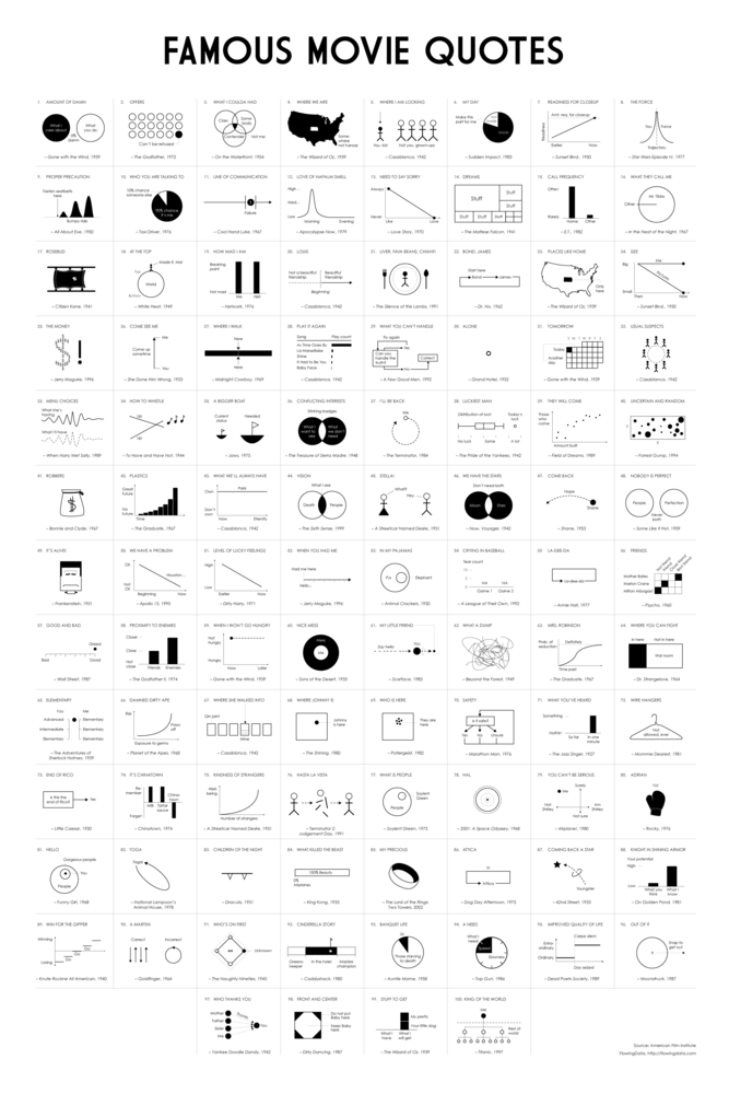
Dr. Nathan Yau, PhD from FlowingData.com has charted the 100 most memorable quotes from American movies, as selected by the American Film Institute, into a data visualization series called Famous Movie Quotes as Charts.  He had designed the first handful of them a few years ago, but only recently got back into the project and completed all 100.  

These have now been compiled into a beautiful 24”x36” poster available for a limited time before the one-and-ONLY print run for $19.00.  Pre-order your copy this week here!

This 24” by 36” poster is printed on 80lb cover with a matte finish, each signed and hand-numbered.

There’s only going to be one printing, so take advantage of the special pre-order price while it lasts.

Shipping February 2014.

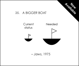
Each chart is a clear visualization of the movie quote, and easy for the audience to understand.  They are beautiful in their simplicity and can be very funny in their interpretation.

Famous Movie Quotes as Charts Jaws Chart

Here’s a link to the big version for all of the detail.

Friday
Sep062013

Visualizing the Microsoft-Nokia Deal

Visualizing the Microsoft-Nokia Deal

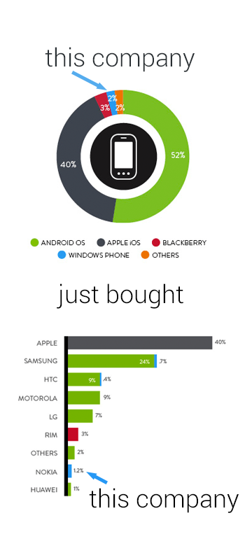
Good data visualization uses visuals to put data into context for the readers, making the information easier to understand.  This simple infographic takes a couple charts previously published by Nielsen, and uses them to provide context to the news story of Microsoft acquiring Nokia’s handset devices unit for $7.2 Billion.

Combining data visualization with text and images should make the information easier and faster to understand, and this design does a great job.

Designer unknown.  Thanks to Mike Elgan for posting on Google+ and Luke Millar (@ltm) for posting on Twitter.

Wednesday
Aug072013

Don't Design by Committee!

Design by Committee chart

Rule #5: Avoid branding by committee or focus group.  This is true for most design projects.  It doesn’t matter if the project is a logo, and advertisement, a product or an infographic.  The number of people may be off though.  I find a small number of people can create a fantastic design, but it goes downhill quickly beyond that.

From 7 steps to create a killer brand, by Jim Price, posted on StockLogos.com

It’s good to be inclusive and seek opinions and ideas. But if you form a committee and put everything to a vote, you’re likely to end up with a least-common-denominator brand that’s bland, uninspired, and may look more like a hybrid camel-elephant than the thoroughbred you’d hoped for.

Found on the Brands of the World Facebook feed.

Friday
Aug022013

The 2012 Feltron Annual Report

The 2012 Feltron Annual Report

The 2012 Feltron Annual Report is a report by information designer Nicholas Felton whose numbers were gathered with a custom-built iPhone app called Reporter. At random intervals each day the app sent reminders to complete a survey. The results of these questions were saved alongside background measurements to form the basis of this document. You can see the examples of the report at Feltron.com and buy it at the shop.

An extensive write up can be found on Fast Co Design:

Today, you probably know Nicholas Felton best for his most widely seen work, Facebook’s Timeline. But since 2005, he’s been working on a cult-favorite project all his own, the annual Feltron Report. The 2012 version is out now for $28.

As always, the report is a meticulously documented year in review of everything he’s done, presented in a series of rich infographics that push the boundaries on personal data quantification. With a glance, you’ll learn some of Felton’s most intimate details. Each day, he consumes coffee around 10:40am and booze around 8:38pm. He spends about 4x as much time with his girlfriend as his mother. And on June 20, he shot a Glock 22.


Found at http://feltron.com