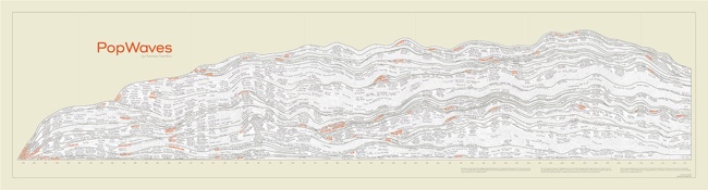
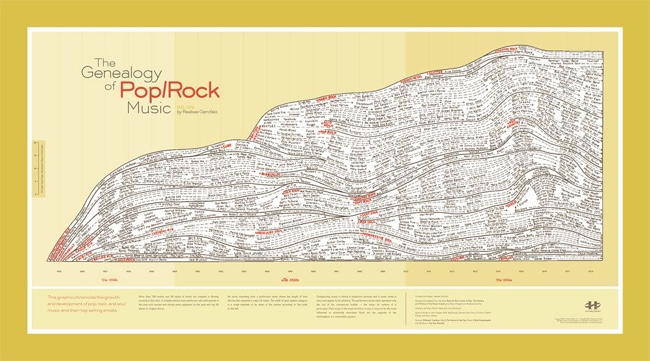
This is one of my favorite designs! PopWaves is a fantastically detailed, hand-drawn poster that visualizes over 60 years (1955-2015) of the evolution of Pop and Rock music. It's a huge poster, measuring in at 89" x 24", over 7ft long! Released in 2015, PopWaves is a massive update to the original Genealogy of Pop/Rock Music design by Reebee Garofalo and printed posters are distributed by HistoryShots. When it was released, I sent Reebee and Larry Gormley (HistoryShots) a number of questions about creating the poster.
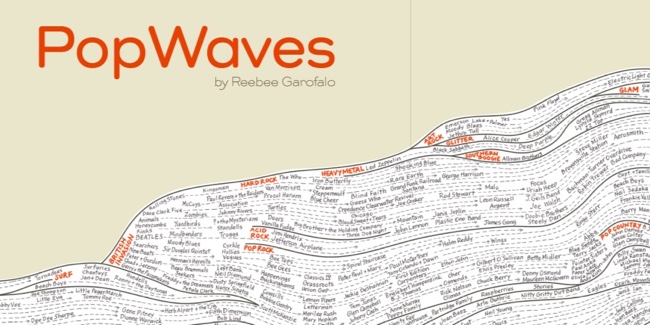
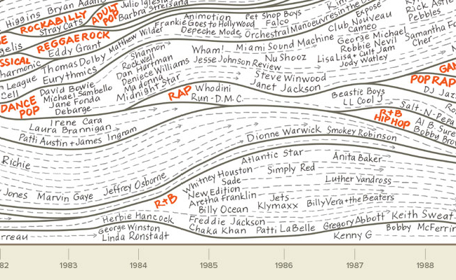
60 years of music! 1200 music artists! 75 genres! Two years in the making. PopWaves picks up where the classic Genealogy of Pop/Rock Music left off; it maps the top pop artists of each year since rock ‘n’ roll began by style. Bolded titles and genre boundaries show the flow and interrelationships among styles; artist names and dashed arrows represent moments of peak popularity.
Meticulously researched, reviewed by experts, and subjectively categorized, this humongous, carefully hand-lettered, 7 foot long beast of a chart will provide you with endless hours of musical memories and arguments with your friends. Perfect for music lovers and owners of large walls everywhere.
 PopWaves: close up
 Even closer!
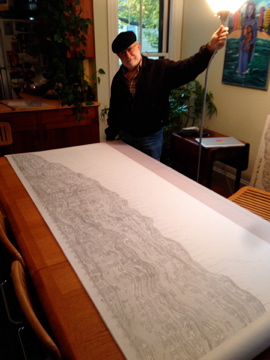 Reebee Garofalo with his complete design
Cool Infographics: What were your thoughts and reasoning behind the new PopWaves poster design?
Reebee Garofalo: The original version of what is now called PopWaves grew from my love of pin striping on cars and my desire to capture the contours and flow of the mid-20th century pop/rock/soul market in graphic form, as part of the research I was doing for Rock 'N' Roll is Here to Pay: The History and Politics of the Music Industry by Steve Chapple and myself. I first got the idea from a rough drawing that Charlie Gillett did on the cover of the 1970 paperback edition of his seminal The Sound of the City. It first appeared as a three-page fold-out called Marketing Trends and Stylistic Patterns in Pop/Rock Music in early printings of the book, which was published in 1977, (and then was reduced to smaller sizes in subsequent printings). This is the version that appears in Ed Tufte’s Visual Explanations.


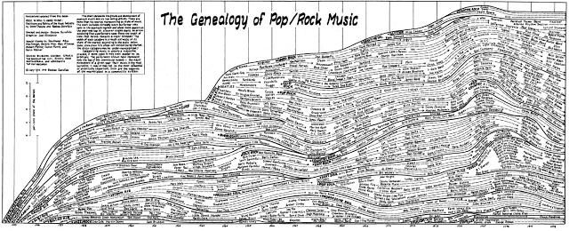 Original chart: Click to see in detail
Reebee Garofalo: In 1979, I was commissioned by NBC Radio to update the chart to 1978, at which point I renamed it The Genealogy of Pop/Rock Music. This is the version that is displayed on the HistoryShots website. In the interim, this graphic has had a long and venerable history of popping up in some very interesting places.
Reebee Garofalo: Although PopWaves is essentially an extension and an update of the Genealogy, the construction of PopWaves not only occasioned the creation of dozens of new genre names, it also necessitated some refinements in the original graphic. The soul categories were further subdivided to include southern soul and funk. Art rock, glam, and southern boogie were added to the rock lexicon.
Larry Gormley and I talked about updating and greatly expanding my original chart for many years. Finally, in 2013, the openness of my schedule and my enthusiasm to tackle such a large project aligned and I started work that spring. I once estimated that the original graphic took me about 100 hours to complete. PopWaves clocked in at around 300 hours. In both instances, I did all the initial design work and the original drawings myself, then brought in artists with calligraphy skills to do the final lettering. Larry spent another few hundred hours on graphic design creating the production-ready version of the chart.
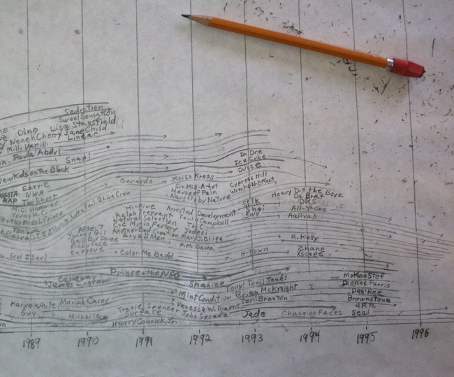 Reebee's hand-drawn design in progress
Reebee Garofalo: From the beginning I used the year-end pop charts of leading trade magazines like Billboard that Larry and I researched to compile the basic data, and consulted music encyclopedias, the rock press, and, more recently, any number of online databases, as well as a team of experts in the field (academics, radio personalities, music journalists, etc) to help me craft genres names and categorize hard-to-place artists. Still, the results are quite subjective, much more an art than a science.
It is worth noting that the various inputs that determine the chart position of a given recording have changed over time. What was once a straightforward, if notoriously corrupt, tabulation of record sales and radio play, has become an unruly assemblage of new formats and platforms, and new ways of accessing and sharing music. As a result, it is unclear whether chart position in 2014 is measuring quite the same thing as chart position in 1967.
It is also important to note that the data I am using captures the top of the commercial bubble. These are not necessarily the most interesting or talented artists, or even the most influential musically. They are simply the most broadly popular at a given moment. So there are any number of other interesting graphic representations that could be made. But this is the one I wanted to make. All its contradictions notwithstanding, it attempts to tell the story of US popular music culture, writ large.
Cool Infographics: The poster is a large, odd size when compared to standard 24"x36" posters. Why the unusual size and will it cause complications?
Larry Gormley (HistoryShots): From the beginning we realized that in order to do it right, PopWaves needed to be big. We understood that some people may not have the necessary wall space (that’s why we’re going to continue to sell the original chart), however, we know that many people are looking for large-format statement pieces. Also, we’ve been selling over-sized graphics for many years so we feel comfortable with all the marketing and production complexities associated with selling large charts. We’re in the process of working with our framing partner to develop a canvas-wrapped triptych version that is going to be amazing.
Reebee Garofalo: More History of the Chart
As soon as the chart hit the market in Rock ‘n’ Roll is Here to Pay, it started generating buzz in the music community. Early on, the Rock and Roll Hall of Fame wanted to use it as a permanent installation. It was actually displayed in the original architect’s model for the Rock Hall that was made by the Burdick Group of San Francisco. The Rock Hall even sent me a contract. But then there was a complete staff turnover, and a more active Board of Directors decided that it would be difficult to decide on an appropriate genealogy for this music. You can bet there was a back story there.
In May 1978, Steve Chapple and I had a piece in Mother Jones magazine on “The Rise and Fall of FM Rock.” It was accompanied by an uninspiring artist rendering of the chart that ran as a graphic over the story. I thought it was a rather lackluster interpretation that did no justice to the original, but there it was, in the pages of Mother Jones.
The following year, NBC Radio commissioned me to update the chart for a marketing campaign they were contemplating, which I did. The woman who contracted me, however, abruptly left her job and her marketing campaign sank without a trace. But this exercise led to the version of the chart that is now available through HistoryShots.
When WGBH-TV, Boston’s PBS television station, was first developing the idea for what became the 10 part series Rock and Roll, I was called in by the Executive Producer as a possible consultant to the project. I think I talked myself out of a potentially lucrative consulting gig when I criticized the original proposal for its overproduction of Britrock and lack of attention to black artists and particularly disco. Still, they were interested in using the chart for their marketing proposal. Since they were going after big time corporate bucks, however, they didn’t want to use the original, which they thought of as . . . I think the word they used was “primitive.” Instead they created a computer generated, high tech version of the chart with circles and arrows and curlicues all over the place. Imagine Keith Haring working in an early draw program. I guess it worked though; their proposal got mega-funding.
The last time that I was brought in as a rock ‘n’ roll consultant to a major project was when Paul Allen was building the Experience Music Project in Seattle. His team of curators was interested in creating a huge sculpture in the middle of the building that depicted the “Roots and Branches” of rock ‘n’ roll — a sort of three-dimensional version of the rock chart. Having gotten hold of a reproduction of my chart, they pulled me in to help develop the concept. Umpteen staff changes later, they still couldn’t agree on a concept, and the “Roots and Branches” idea was ultimately abandoned in favor of that gigantic guitar sculpture that now ascends dramatically to the second level. While it works well enough as an abstract sculpture, it provides little in the way of useful music history.
If WGBH didn’t like primitive and EMP couldn’t figure out how to incorporate information into its central sculpture, graphic design guru Edward Tufte touted the virtues of the chart on both counts. He decided to use the original 1974 version of the chart in his seminal graphics text Visual Explanations (1997). For those of you who have seen his road show, he uses the chart as an example of an effective design for capturing lots of information in a graphically pleasing way. “Your chart brings my book to a stop,” he once told me, “at least for those of us of a certain age!”
Los Angeles Artist Dave Muller was so taken by the chart that when he was asked to contribute an installation of his own choosing to the 2004 Whitney Biennial, the signature exhibition of New York’s Whitney Museum, he blew up the reproduction in Tufte’s book and made it the centerpiece of a 30 foot wall mural. Muller’s “appropriation” moved the chart into the realm of fine art. Muller has since mounted versions of this installation in Rome, London, Paris, Melbourne, Australia, and elsewhere, all without ever asking my permission. This has outraged many of my friends, who feel I should sue him, especially after he installed it again in 2008 in my backyard at the Institute for Contemporary Art in Boston. There it defined the public wall at the ICA’s entrance for almost all of 2008. I thought about suing, even talked to a lawyer, who assured me we could make big bucks. Ultimately, however, I decided that public access to information was more important than lining my pockets. I wonder if Muller knows how narrowly he dodged a bullet.

 I included a copy of the original drawing as a two-page fold-out in the third edition of my book Rockin’ Out: Popular Music in the USA (2005). Also in 2005, I was approached by Marco Ferrari, a journalist working with the Italian magazine Focus, with a proposal “to compile in just one graphic timeline a (very rough) history of popular music, by genres,” using my chart as the basis for their work. The result: “River of Music,” a graphic that extends my original chart in a most engaging way to the year 2000. It appeared as an eight flap, full color, centerfold poster in the June 2005 issue of Focus.
For me, creating this chart was a labor of love that drew equally from my love of popular music (for content) and my attraction to the contours of “pinstriping” on customized 1950s cars (for graphic design). Along the way, I enjoyed the company and able assistance of many friends and acquaintances. I still remember the night that Dianne Dion (then Carasik) spilled Scotch on the original while surveying my placement of artists. When my calligraphy skills were not up to the task, my friend and former college roommate, the late Damon Rarey, stepped in with a major assist in the graphics department. (Damon was an accomplished artist in his own right; check out his legacy at www.rarey.com) For the 1978 update presented here, artist Jean Nicolazzo, my girlfriend at the time, took over Damon’s graphics role. When decisions about artists and categories seemed too complicated to manage, I was fortunate to have Sam Kopper, Allan MacDougall, Beverly Mier, Rory O’Connor, Robert Plattner, and Norm Weiner to talk to.
PopWaves picks up where The Genealogy of Pop Rock Music left off. This update could not have happened without the help of others. I am beholden to my crack team of advisors—Murray Forman, Wayne Marshall, Steve Waksman, and Elijah Wald—for their invaluable assistance in helping me to name styles and position artists. Hats off to Jan Boyd for her awesome calligraphy in the final rendering of artists’ names. And, finally, I am deeply indebted to Larry Gormley (who convinced me to take this on) for his pixel-level interventions and tasteful aesthetic choices in turning PopWaves into an appealing poster. All of the above should get some of the credit for these projects; I’ll take all of the complaints.


 Randy
Randy