About
Randy Krum
President of InfoNewt.
Data Visualization and Infographic Design

Infographic Design

Infographics Design | Presentations
Consulting | Data Visualizations

DFW DataViz Meetup

Join the DFW Data Visualization and Infographics Meetup Group if you're in the Dallas/Fort Worth area!

Search the Cool Infographics site

Custom Search

Subscriptions:


Feedburner

The Cool Infographics® Gallery:

How to add the
Cool Infographics button to your:

Cool Infographics iOS icon

- iPhone
- iPad
- iPod Touch


Read on Flipboard for iPad and iPhone

Featured in the Tech & Science category

Flipboard icon

Twitter Feed
From the Bookstore

Caffeine Poster

The Caffeine Poster infographic

Entries in design (479)

Tuesday
May242016

Massive Infographic of Star Wars A New Hope

Star Wars A New Hope Infographic

This is a massive infographic depicting the entire story of Star Wars IV: A New Hope. Printed it measures 123m long (over 400ft). Online this infographic is 1,024 pixels wide by 465,152 pixels long! Designed by illustrator and graphic novelist Martin Panchaud, it was designed in Adobe Illustrator CC.

SWANH.NET is an adaptation of Star Wars Episode IV in a style that was inspired by infographics. One story in one piece of 123 meters length.

It was created with Adobe Illustrator CC in 2016. Its exact measures are: 1024 x 465152 px / 27 x 12307 cm / 10.6 x 4845.3-inch

This long ribbon reminds the ancient Chinese script rolls that had to be rolled in and rolled out simultaneously in order to be read. I like this stretch between ages, cultures, and technologies.

However, internet likes short stories and summaries, quickly understandable contents. With my work I aimed to create a contrast to that.

These are only a few small pieces. You go immediately to the SWANH site to view the entire, fantastic infographic!


Martin also posted a number of great images as a Making Of feature to show the development process of the infographic.

Tuesday
May172016

Even Major News Outlets Get DataViz Wrong


Data visualization can be the most powerful, inspiring, and effective tool of a storyteller—as long as it’s accurate. However, a visualization can go horribly wrong if the designer uses the design tool incorrectly or gets the math wrong.

All too often, the underlying data is correct, but the visualization doesn’t accurately represent the corresponding values. Most of the time, it’s safe to chalk up the false visualization to an honest mistake by the designer, because it’s actually easier than you think.

Take a bubble chart, for example. A great visualization method, but it’s a common source of flawed dataviz. The reason is that design software only allows scaling or width and height adjustments to size shapes. So designers, upon reviewing the data, will sometimes mistakenly scale a circle's diameter instead of the circle’s area. This, in turn, produces radically incorrect sizes. The approach has logic to it (to some degree), but it’s inherently wrong. What should instead be done takes a bit of geometry and a spreadsheet.

“Just think about it: if you tell a software tool to scale something 200 percent, it will make it twice as tall and twice as wide. Therefore, you aren’t doubling the size of your original circle. You’re making it four time larger.”

- The Truthful Art, Alberto Cairo (@albertocairo)

For a real-world example of this problem, take a look at CNN’s recent “ISIS goes global: 90 attacks in 21 countries have killed nearly 1,400 people,” an insightful article, serious topic, credible source with inaccurate data visualizations. Unsurprisingly, it’s a bubble chart at fault. Assuming the data gathered by CNN is accurate, the maps included in the article don’t match the data and are way off.

CNN ISIS Goes Global Incident Map Bad DataViz

Take a close look and the size key. The circle size for five incidents is clearly shown as five times the diameter of the circle for only one incident, which creates a circle for “5 incidents” that is actually 25 TIMES LARGER, not five times larger. This drastically over emphasizes the locations on the map for the Middle East! I’ve designed the correct sizes so you can see what the bubble sizes should be.

CNN ISIS Circles DataViz Key Corrected

“It’s key for data visualization designers to understand that we visually compare the sizes of objects based on the their area (not their height). Numerical values are one-dimensional, but objects on a page or screen are two-dimensional. This is where designers need to remember to use the math learned from high-school geometry class. If you didn’t do well in geometry, it’s time to take another look.”

- Cool Infographics, Randy Krum (@rtkrum)

Bubble charts are in no way the only kind of dataviz that lends itself to mishaps. In print, broadcast, and online, you’ll see a variety of charts incorrectly showing the data — pie charts not adding up to 100%, logo sizes that don’t match the data, lines of icons with a different quantity than the data, etc.

Inaccurate dataviz certainly doesn’t always happen by accident either. Creating deceptive visual context is an unethical tactic employed by researchers, companies and publications alike, typically to promote a persuasive argument. Differences can be blown out of proportion or hidden by changing the axis scale or ignoring relevant data.

Once you start looking at data visualizations as a critical thinking reader, you’ll start notice many charts that don’t match the data. Always look to make sure the designer accurately represented the information before you take any data visualization at face value.

Tuesday
May102016

What's Your Ideal Workplace?

What's Your Ideal Workplace? infographic

Based on your own individual personality, the What's Your Ideal Workplace? infographic from Quill.com examines the best types of office environments to maximize your work performance.

Are you looking for a new position in a more fitting workplace? Or are you attempting to create an office setup that will maximize your employees’ skills? This infographic will help you match common work personality types with their ideal office spaces, from cubicles and open workspaces to co-working and work from home options.

Don’t know your work personality? Take the test.

Many companies are just beginning to realize that workplace design directly impacts employee performance, yet research shows that 3 in 4 U.S. workers are not in optimal workplace environments.

I love the connection to taking your own work personality test. This makes the infographic design personal and relevant to each individual reader. It's informative, but personal.

The illustration of each different workplace layout helps readers understand the differences almost instantly. It's a design with conceptual illustrations, but the statistics are also visualized, making them easier to understand as well. The personality color-coding is consistent throughout the design.

Great layout on the infographic landing page as well. Descriptive text with links, social sharing buttons, the full infographic and embed code at the bottom. The URL of the landing page is also included in the infographic image file itself, to make it easy to find the original, full-size version from sites that share but don't link. Everything needed to make it easy to find and easy to share.

Thanks to Cheryl for sharing the link!

Friday
May062016

The Mother of All Mother's Day Infographics

Your Guide to the Business of Mother's Day may be the reigning Mother of All Mother's Day infographics from TheShelf.com covering practically everything you'd ever want to know about the business of Mother's Day. However, the data visualization portions need some help.

Mother's Day is right around the corner, creeping up on both consumers and brands alike. And even though, year after year, the majority of presents are bought super last minute, our spending on Mom is off the charts! 

...And why shouldn't it be, the wonderful women in our lives are worth everything that we can throw at them (assuming it's good) on their special day, and that's why we've created this pretty huge rundown of all things Mother's Day.

This is a data-heavy infographic that breaks my 5-second rule. Instead of trying to tell one story really well, they threw in every bit of data they could get their hands on. They have so many sections, it's worth taking a closer look at a few to see what we can learn from the design choices.

The dedicated landing page is very well put together! Plenty of text for SEO and custom wording in the social sharing buttons and even custom social images to make sharing the infographic super-easy for readers! My only complaint is that they aren't sized for the social media sites. Twitter needs images with an aspect ratio of 2:1.

Let's take a closer look at one of the sections:

When you mix some data visualized and some data shown in text alone, the visualized data is perceived as more important to readers. These data points shown in just text is usually ignored by readers because it wasn't important enough to visualize.

If you follow me, you'll know that I have a specific pet peeve with designers getting the sizes of circles wrong when used to visualize data. [See False Visualizations: Sizing Circles in Infographics]

The circles is this design don't match any of the data. I'll demonstrate here. The total area of Greeting Cards at 80% should be exactly four times the area of the The Books circle at 20%. However, you can see here that I can easily fit seven of the Books circles in the Greeting Cards circle with much more room to spare!


The data may be good, but the visualization is all wrong. It looks like the designer was eye-balling the sizes instead of actually visualizing data. Things like this make me skeptical, and begin to question every other visualization in the whole design. 

Let's look at another section:

The flower is a pie chart, so it needs to follow the Golden Rule of Pie Charts! It MUST add up to 100%! However, this flower/pie chart adds up to 129%! What??? The 63% section by itself should be more than half of the flower, but it's shown as less than half.

One you start looking you'll find more problems. Why is 84% represented by 51 out of 56 people icons? That's 91%. Separately, why would you choose 56 icons to represent the total of 100%? Use 100 icons!

Lots of good data included in this infographic, but the design needs to go back to the drawing board.

Thanks to Sabrina for sending in the link!

Thursday
May052016

Next Generation Interactive Scientific Poster

The Next Generation Scientific Poster project by The Muthesius Academy of Fine Arts and Design in Kiel, Germany takes scientific data visualization and designed a physical, interactive interface for audiences. As a result, they founded The Science Communication Lab as a spin-off from the academy so they could offer this expertise to researchers in the scientific community all over the world.

Check out this video demonstration on YouTube:

From their description:

The classical poster does often not offer enough space for the sheer complexity of the contents – texts, pictures, graphs and tables – used to convey scientific research today which causes inability to communicate contents and statements concisely. The classical poster also lacks an appropriate possibility for continuous updates which are necessary to include newer research results and would do justice to today‘s constant changes of information. 

The interactive poster is a a new method of presenting scientific topics in an attractive way, offering the user an easier access to the contents and a clearly improved possibility of comprehension. The illustrated topics are supposed to function self-explanatory and long-lasting which means that the viewer can decide on the depth and duration of the information process.

The interactive poster can be used for various purposes: For the internal demonstration of the research projects (poster sessions), on expert conferences and conventions in an international context. The newly developed technology -LED displays with a touch frame- can be used in a more reliable and long-lasting way than conventional projection technologies.

Thanks to Pieter Torrez from Scigrades for the link and his interview article with Professor Tom Duscher

Friday
Apr152016

The Truthful Art by Alberto Cairo: Interview & Giveaway

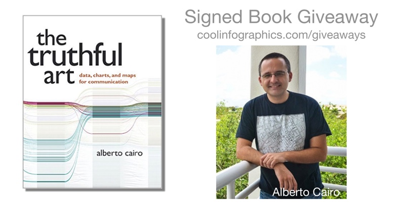
The Truthful Art is the newest book by Alberto Cairo, and the second book of a longer, planned series. Following the huge acclaim and success of his last book, The Functional Art, Alberto expertly dives into getting data visualizations both accurate and designed for effective communication. 

This month I am giving away one signed copy of The Truthful Art! Register on the Giveaways Page by April 30th to be entered.

The Truthful Art explains:

• The role infographics and data visualization play in our world

• Basic principles of data and scientific reasoning that anyone can master

• How to become a better critical thinker

• Step-by-step processes that will help you evaluate any data visualization (including your own)

• How to create and use effective charts, graphs, and data maps to explain data to any audience

Alberto Cairo is the Knight Chair in Visual Journalism at the University of Miami, where he teaches courses on infographics and data visualization. He is also director of the Visualization program of UM's Center for Computational Science, and Visualization Innovator in Residence at Univisión, besides being a consultant for several tech companies. He is the author of the books The Functional Art: An Introduction to Information Graphics and Visualization (2012) and The Truthful Art: Data, Charts, and Maps for Communication (2016).

Everyone should follow Alberto Cairo on Twitter (@albertocairo)! He is one of the most vocal dataviz experts online, and shares his wisdom and insights openly. Also, you can download a sample of the new book with the first 40 pages of the book available on Google Drive.

I sent Alberto a handful of questions about The Truthful Art:

Who is the book intended for?

In the Epilogue I joke that I wrote 'The Truthful Art' for my past self, 8 or 10 years ago. As a journalist and designer, I didn't receive appropriate training in data reasoning in college, and that led me to make many mistakes in my career. The book is for communicators of any kind (journalists, graphic designers, marketing folks) who need to deal with data on a regular basis. It's certainly a book about data visualization and infographics, but it also covers the steps that come before you start designing anything: Getting your information as right as possible.

How do you define the difference between a visualization and an infographic?

In the book I explain that the boundary between these and other genres is very fuzzy. For me, an infographic is a combination of words and visuals (charts, maps, diagrams, illustrations) that makes a certain story understandable for people. The designer decides what data to show, and how to structure it, sometimes as a narrative or story. A data visualization doesn't necessarily tell a story, but it enables people to come up with their own conclusions, by letting them explore the information. Infographics emphasize explanation, data visualizations emphasize exploration.

What does it mean for a visualization to be truthful?

The whole book deals with this topic. In general, it requires a proper, honest, and thorough exploration of your information; asking people who know more than you do about it; and then a proper choice of visual forms to represent it.

Why are we more likely to accept visual information as truth?

It's not just visual information, it's any kind of information. We human beings aren't skeptical by nature. Our default is belief.

It is only when we become aware of the multiple ways our own brain, and other people, can trick us that we begin questioning what we see, read, hear, and feel. It is true, though, that recent research has shown that visualizations make messages more credible; this is something that can be used for good or for evil.

I don't know why many of us tend to take visualizations at face value, but it may have to do with the fact that most of us unconsciously associate charts and data maps with science. Those graphics look so precise, so crisp, so elegant! They must be accurate and truthful, right? --Well, perhaps not!

How difficult is it to choose the right chart style?

Not that difficult if you think about the message that you want to convey, or the tasks you want to enable, instead of relying just on your personal aesthetic preferences. I love maps, and I wrote an entire, long chapter about them for the book, but that doesn't mean that everything should be a map. A map may give you certain insights, but may also obscure others. In many cases, a chart may be better.

How can we become better skeptics and critical thinkers when we see data visualizations?

The key is to remember a maxim that I repeat in the book: A visualization is not something to be seen, but something to be read. Approach data visualizations and infographics not as beautiful illustrations (although beauty is a very important feature) to be looked at quickly, but as visual essays. Read them carefully, ask yourself if the designer is showing everything that needs to be shown. Remember that a single number or variable means very little on its own. In infographics, context is everything, and comparisons are paramount.

Is complexity the enemy of good data visualization design?

Far from it. Many designers believe that data visualizations and infographics are intended to “simplify” data. As my friend, the designer Nigel Holmes, has repeatedly said, infographics shouldn't simplify, but clarify. Clarification in some cases means reducing the amount of information you present, but in many others it requires you to increase it. In the book I show some examples of graphics that fail because their designers reduced the data so much that they rendered it meaningless. If a story is complex, its representation will necessarily be complex as well.

This said, it is good to be reminded of that old maxim commonly attributed to Einstein: Everything should be as simple as possible, but not simpler. Over-complicated visualizations are also problematic. If your message is simple or trivial, why creating an extremely intricate graphic?

What’s available for readers on the book website: http://www.thefunctionalart.com/p/the-truthful-art-book.html?

For now, www.thefunctionalart.com contains my blog, contact information, information about both books, and some other resources. I have added software tutorials, and will soon post some of the data from the book. My professional website, http://www.albertocairo.com/, which will be launched soon, will contain more resources.

Are you speaking at any upcoming presentations or webinars?

Yes. I post most of my speaking engagements and consulting gigs here: http://www.thefunctionalart.com/p/speaking-schedule.html

Where’s the best place to follow you online?

My blog and Twitter. I use Twitter (@albertocairo) to take notes for myself, and save interesting resources, so if you want to see what I see or read what I read, that's the place to go!


Thursday
Mar312016

A New Visme: Huge Update to the Online Design Tool

The new Visme is here. Following eight months of dedicated work to address more than 30 user requests, Visme now gives its users an even smoother workflow. By improving user experience, development infrastructure, and scalability, the new Visme enables faster deployment and increased productivity with a familiar interface.

Of course, the best way for a design platform like Visme to share the new features is with an infographic designed using their own tool! You can see the infographic and all of the update features in this Visme blog post.

If you're not already familiar with Visme, it's an easy-to-use online visual content editor that allows you to create stunning presentations, reports, infographics, interactives, and more. Used by designers worldwide as their vector design platform that replaces the need for traditional software apps like Adobe Illustrator or Microsoft PowerPoint. With Visme, you can visualize stories and data, which is why it’s trusted by 300,000+ marketers, communicators, executives, educators, and nonprofits from 50+ countries.

With the upgraded Visme, you can:

  • Produce an alluring narrative with the revamped text editor and updated text widgets. Custom styling and padding, along with a spread of lively fonts, give your words an illustrative charm that bounces off the screen, transforming dull text blocks into something to see.

  • Move multiple objects and copy to them to slides to reorganize your story without hassle. No need for tedious work when you can duplicate and tweak rather than constantly starting anew or pasting too much and working backwards.

  • Create a global color palette to guarantee consistency throughout a complex project. This allows you to keep track of colors in a visual language in order to design quicker without guesswork or extra steps.

  • Choose from millions of free images to present a more striking take on your content. Don't spend hours online looking for the right picture and if you can even use it. Brighten up your work with ease and efficiency to grab your audience's attention without entering a labyrinth.

  • Record audio, upload your own or choose from a collection of high-quality music clips to strengthen a presentation with a narration or background music. Audio gives your content an extra level of exciting depth. Manage timing and fade control from one intuitive panel.

  • Expand your data storytelling tactics with new chart types and a selection of thousands of adjustable vector shapes and icons. Go far beyond standard and avoid being repetitive with new data visualization capabilities. You can even make them animated.

  • Get started quickly with a vastly expanded library of templates and themes, tailored for specific industries and purposes. You'll have the right look for exactly what you're doing.

I recently had the opportunity to interview Visme Founder Payman Taei in this webinar for Visme members, where he also demonstrated the new capabilities of the updated Visme design platform:

It's time to step up your game and make your presentations and infographics more impactful and effective. Try Visme for FREE, and when you're ready to subscribe, use the discount code VISME30 for 30% OFF for the lifetime of your account!

Thursday
Mar032016

Weather Portraits 2014 US Cities

Weather Portraits 2014 US Cities

Weather Portraits 2014 US Cities infographic poster is Nicholas Rougeux's project for visualizing weather data. The poster shows diagrams of daily wind and temperatures during one year for the most populated city in each state. He tried many different ways to visualize his data, a process that he outlined in his blog post, Making of the Weather Portraits poster. The final infographic poster can be seen above.

Each diagram includes five daily measurements for an full year in a city: wind direction, wind speed, high temperature, low temperature, and range of temperatures. 


Poster prints for 2014 and 2015 are available for purchase.

Colorful diagrams display five daily measurements for an full year in each city: wind direction, wind speed, high temperature, low temperature, and range of temperatures. Data were collected from the Quality Controlled Local Climatological Data (QCLCD) provided freely by the National Oceanic and Atmospheric Association (NOAA).

Thanks to Nick for sending in his project!

Saturday
Feb272016

Using Visuals to Enhance Your Credibility

Infographics and visuals have become the lifeblood of storytellers, be it marketers, professors, presenters, etc. They are constantly battling short attention spans, information overload, and little vested interest from their audience. The smart marketer knows their target, and comes with a battle plan to defend against all of these things. This is where visuals come in.

Reasons to Use Visuals

We’ve relied on visuals for everything from street signs and movie banners to websites and presentations. Using visuals to express information has long been a part of our history. Here are just a few more reasons to use them in your presentations and marketing efforts:

1.     Getting Attention

A visual makes information stand out more than just text alone. Studies estimate that between 50-80% of the human brain is dedicated to forms of visual processing.

On social media, they simply take up more real estate than their text only counterparts. A post with some type of visual content has 94% more total views on average than content without images, according to MDG advertising.

2.     Simplicity

As humans, we’re simply wired to receive rich visual information, and can understand more complex information when it is presented visually. Infographics are a great way to provide your audience with context when displaying statistics that are otherwise meaningless.

3.     Credibility

Credibility is one of the biggest reasons to use visuals. Put a statistic in an article and it is questioned. Put a statistic in a visual and it is fact.

In fact, every form of visual information lends credibility to what is presented. 46.1% of people say a website’s design is the number one way to determine the credibility of a company, according to the Stanford Persuasive Technology Lab.

This works the same way in presentations. In 1986, a 3M-sponsored study at the University of Minnesota School of Management found that presenters who use visual aids are 43% more effective in persuading audience members to take a desired course of action.

Use This Power Responsibly

In light of this information, it is important to use this responsibly. Providing accurate information is the most important thing content marketers and visual storytellers will do. No matter how beautifully crafted your infographic or visual is, it can be destroyed by one misrepresented fact, or out-of-context statistic.


Wednesday
Feb172016

Great DataViz Design: Justice Scalia's Ideology

Great DataViz Design: Justice Scalia's Ideology visualization infographic

The Upshot at the New York Times consistently does a great job visualizing data. How Scalia Compared With Other Justices is a fantastic example of clean, effective storytelling with chart design!

The death of Justice Antonin Scalia will leave the Supreme Court with equal numbers of conservative and liberal justices. Justice Anthony M. Kennedy is likely to be the swing vote in most cases.

For social media, they published a simplified version that just shows the current Justices:

Justice Scalia's Ideology infographic

Why is this design so good? Here are my thoughts on why this chart design is great:

  • Minimal chart legend. The color key shows only 2 colors to designate the party of the nominating President. The names of all the Justices are built into the chart itself, which keeps that important information tied to the data in the reader's field of view. Default charts in MS Office would have created a different color for every Justice, and made this chart confusing and visually noisy.
  • Minimal axis labels. Notice the x-axis only shows a label for each decade. You don't need to know where 2004 is specifically. I think they could have minimized further to just the first and last years.
  • Use of opacity. Justice Scalia is the main story of the visual, so his line is heavier weight and bright color. This is a great use of preattentive attributes! All of the other Justices are shown is lighter colors for reference, and the main story stands out.
  • Minimal grid lines. There are a lot of lines on this chart, so only a few gridlines are included to keep the chart as simple as possible.
  • Minimal Text on the page. The chart is connected to a full article, but on this landing page the data visualization tells the story all by itself. The description text on the page is only two sentences long, leaving the visual as the visual centerpiece.