About
Randy Krum
President of InfoNewt.
Data Visualization and Infographic Design

Infographic Design

Infographics Design | Presentations
Consulting | Data Visualizations

DFW DataViz Meetup

Join the DFW Data Visualization and Infographics Meetup Group if you're in the Dallas/Fort Worth area!

Search the Cool Infographics site

Custom Search

Subscriptions:


Feedburner

The Cool Infographics® Gallery:

How to add the
Cool Infographics button to your:

Cool Infographics iOS icon

- iPhone
- iPad
- iPod Touch


Read on Flipboard for iPad and iPhone

Featured in the Tech & Science category

Flipboard icon

Twitter Feed
From the Bookstore

Caffeine Poster

The Caffeine Poster infographic

Entries in design (479)

Monday
Sep132010

FarmVille vs. Real Farms infographic

Designed by Shane Snow (@shanesnow) for Mashable.com, FarmVille vs. Real Farms takes a look at how the statistics behind the FarmVille phenomenon on Facebook compares to real world statistics about farming.

With all those millions of Facebook and iPhone users tending to virtual crops and sharing them with friends, have you ever wondered how their toils stack up against actual real-life farmers?

How does our output of digital (and decidedly less tasty) tomatoes compare with our worldwide production of real tomatoes? And perhaps most importantly, who are these casual croppers, and are they anything like their plow-toting counterparts?

We broke it down by the numbers and put some of these FarmVille trends in perspective for you.

Found on VizWorld 

Tuesday
Sep072010

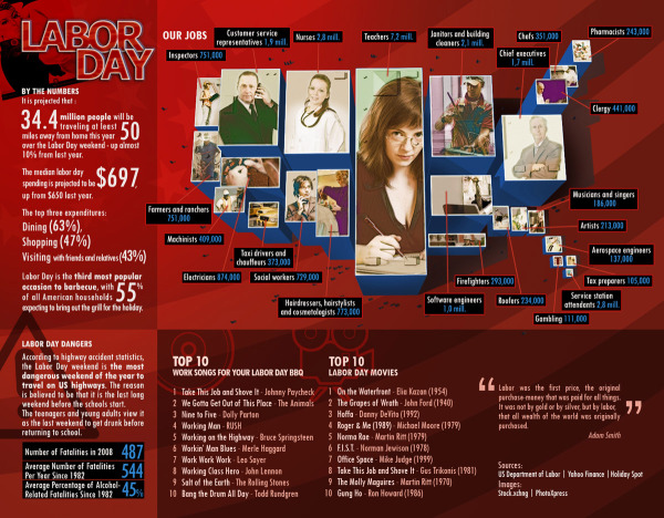
Labor Day by the Numbers

Appropriate for this week in the U.S., Labor Day by the Numbers takes an infographic look at labor statistics, top jobs in the U.S. and facts about the Labor Day holiday.  From fixr.com.

Thanks to Andreas and Thussa for the link!

Monday
Aug302010

Icons of the Web

Icons of the Web is a massive image that portrays icons of the top websites on the Internet.  Sizing their favicons based on the site traffic according to Alexa, they were able to get 288,945 good icon images out of the top 1,000,000 sites.

A large-scale scan of the top million web sites (per Alexa traffic data) was performed in early 2010 using the Nmap Security Scanner and its scripting engine.

We retrieved each site’s icon by first parsing the HTML for a link tag and then falling back to /favicon.ico if that failed. 328,427 unique icons were collected, of which 288,945 were proper images. The remaining 39,482 were error strings and other non-image files. Our original goal was just to improve our http-favicon.nse script, but we had enough fun browsing so many icons that we used them to create the visualization below.

The area of each icon is proportional to the sum of the reach of all sites using that icon. When both a bare domain name and its “www.” counterpart used the same icon, only one of them was counted. The smallest icons—those corresponding to sites with approximately 0.0001% reach—are scaled to 16x16 pixels. The largest icon (Google) is 11,936 x 11,936 pixels, and the whole diagram is 37,440 x 37,440. Since your web browser would choke on that, we have created the interactive viewer below (click and drag to pan, double-click to zoom, or type in a site name to go right to it).


You can use the online search engine to locate a particular site icon, and OF COURSE I had to look for the Cool Infographics icon.  Found it!


Programming and design was done by David Fifield and scanning performed by Brandon Enright.

Found on Social Media Graphics

Thursday
Aug262010

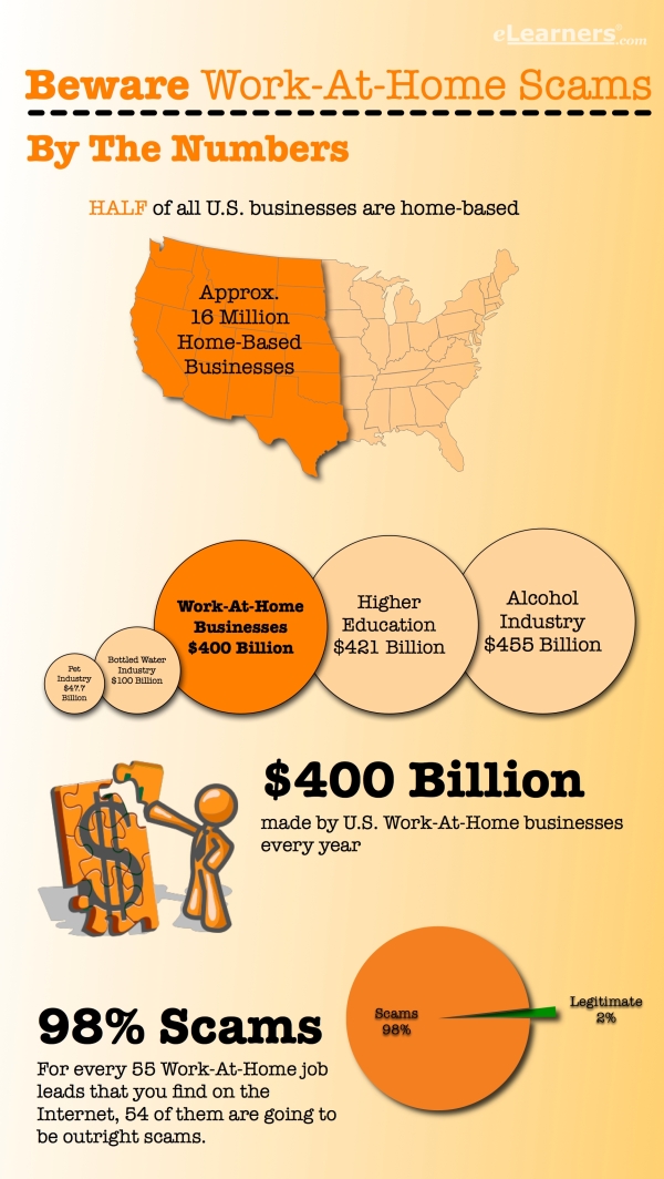
Client Infographic: Beware Work-At-Home Scams!

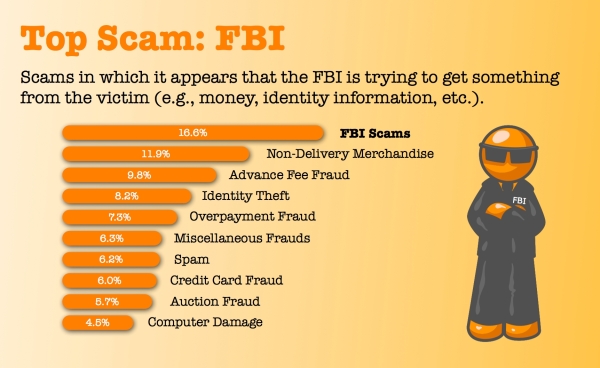
Beware Work-At-Home Scams is a recent project InfoNewt (my company) designed for elearners.com to visualize how prolific work-at-home scams are, which jobs to avoid and how individuals can protect themselves.

The data is actually fairly difficult to find and very dry.  I had to read through a number of reports from the FTC, the SBA, the IC3 (I had never heard of the Internet Crime Complaint Center!) and other news reports.  Even after reading through those reports, there was very little hard data.  To create the infographic, I needed to use the figure of Orange Man as a character figure to help visualize the information.


Done in OmniGraffle, I think the topic was a perfect example of when an infographic is really useful.  Information that is incredibly difficult for consumers to find (let alone understand), so it wouldn’t normally reach the general public.

Feedback?

You can help Digg It! 

Tuesday
Aug242010

TEDTalk: David McCandless: The beauty of data visualization

Our friend David McCandless, from InformationIsBeautiful.net, gave a great presentation at TEDGlobal in July 2010 on The Beauty of Data Visualization.

David McCandless turns complex data sets (like worldwide military spending, media buzz, Facebook status updates) into beautiful, simple diagrams that tease out unseen patterns and connections. Good design, he suggests, is the best way to navigate information glut — and it may just change the way we see the world.

Thanks to John and Susan for sending me the link!  Also found on VizWorld and the VizThink Blog.


The video is also available on YouTube:


Wednesday
Aug112010

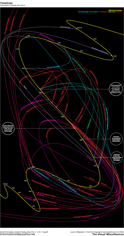
Time Travel in Popular Movies and TV infographic

I couldn’t believe that I hadn’t posted this one by David McCandless from InformationIsBeautiful.net.  Timelines: Time Travel in Popular Film and TV is one of my favorites, and you can tell how much effort went into the design and getting the details right.

Here’s a visualisation of time travel plots in various films and TV programs. I had a lot of fun doing this!

This is a straight data visualisation, rather than information design. That is, it’s not particularly useful, nor useable, nor meaningful. The inspiration was the coolness of the idea, really. I was excited to see what shape all the plots would make, and whether it could be shaped into something beautiful.

What I really love about this image, though, is the idea that this information has never been seen before. Despite the fact that it exists, in some way,somewhere, wrapped in various plots, it’s never been given form. I have to say, it was a joy to untangle it all :)

David, I would love to help design one for Dr. Who!


Friday
Jul232010

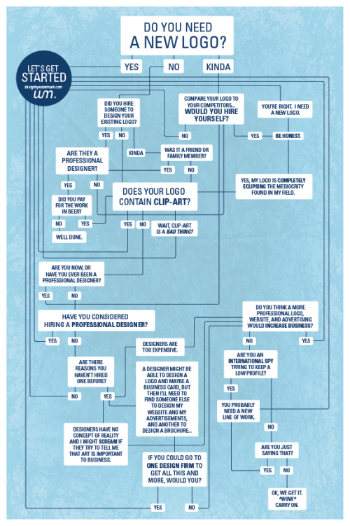
Do You Need a New Logo?

A fun infographic from Watermark Design, Do You Need a New Logo? is a humorous decision chart.

“wink”

Wednesday
Jul212010

GE open position: Leader, Data Visualization

GE is looking to hire a Leader of Data Visualization located in Fairfield, CT.  It’s very interesting to watch the data visualization field become an official function within mainstream companies.

Although, I think the the job description should be an infographic instead of text for this one…


Job Number: 1182874  
Date Posted: 08 July 2010  
Function: Marketing - Advertising and Brand Marketing  
Business: GE Corporate - Corporate Commercial and Communications  
Career Level: Experienced  
Location: Fairfield, Connecticut, United States


Role Summary/Purpose

Over the past year, GE has worked to build the brand and competitive advantage by using design to simplify complex data, i.e. data visualization. Examples of GE’s data visualization work to-date can be found on the healthymagination web site: http://www.healthymagination.com/stories/decoding-data/

Essential Responsibilities

GE’s data visualization strategy consists of four separate work streams: 

  • Developing proprietary data visualization applications to tell the GE story, focused on the pillars of the brand and advertising strategy: ecomagination, healthymagination, and innovation.
  • Supporting communications and PR about flagship business initiatives with data visualization.
  • Incorporating world-class data visualization into product design and user experience.

Developing an open source visualization site.

The Leader, Data Visualization will be part of GE’s Corporate Commercial and Communications team and will be responsible for execution of the corporate data visualization strategy, including the development of interactive data visualization applications and information graphics for brand building, customer-focused data visualization applications and ongoing support of the new data visualization web site. 

GE businesses may also be managing Data Visualization projects independently. The Leader, Data Visualization will be responsible for providing consultative support to businesses working on their own data visualization projects.

Key responsibilities include:

  • Interpreting data to develop a storyline and creative brief consistent with GE’s overall brand strategy and priorities.
  • Identifying and obtaining GE’s proprietary data and relevant third-party data. 
  • Managing several creative agencies simultaneously, to ensure projects are aligned to the goals of the brand, on budget and on time.
  • Presenting GE’s data visualization strategy to marketing, communications and design teams throughout GE.
  • Coordinating timely launch of data visualizations across functions, including legal, IT, public relations.
  • Monitoring discussion of data visualization in traditional media and blogsphere to identify emerging trends and new design partners.
  • Managing awards submissions to ensure GE is recognized for leadership in visualization.


Qualifications/Requirements


  • Bachelors degree, undergraduate experience in design, advertising or communications.
  • Ability to analyze and interpret large data sets.
  • Strong design sense, ability to lead creative teams.
  • Ability to work in a matrixed environment.
  • Creative thinker who thrives in a collaborative setting.
  • Excellent written and verbal communication skills.
  • Strong project management skills with an ability to manage multiple projects in a fast-paced environment.
  • Ability to meet tight deadlines and work under pressure.
  • Strong organizational and problem-solving skills.
  •  Must be a team player with an ability to work independently.


Wednesday
Jul142010

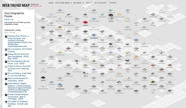
Cool Infographics People on Web Trend Map!

As a visual treat, I took my Twitter list “Cool-Infographics-People” and visualized the entire list on the interactive tool Web Trend Map from iA and Craig Mod.  Visit often, and you can see the hot trends being tweeted that day by some of the best infographics people.

I don’t know how Twitter lists are doing in general, but I know that with 436 followers, the “Cool-Infographics-People” list is one of the most followed lists in the design community.  Out of the 228 lists I’ve been included on, this one is the most followed, and I see that for many other designers too.  I’d love to see (and visualize) the stats from Twitter, but most lists I see have under 10 followers.

Tuesday
Jul132010

The Entrepreneur's Visual Guide to Tech Startups

HackFwd is a European tech investment firm, and they posted this flowchart on their front page to help startup companies see what it’s like to work with them.

We’re experienced tech entrepreneurs looking to support and invest in Europe’s most passionate geeks. We’re a pre-seed investment company designed to enable great people to launch great ideas. Our start-up and support process accelerates the route to beta, profitability, and success.

We want you to feel good at every step along the way. Here’s how your experience might look:

Apply-Rinse-Repeat

Found on FlowingData.com