About
Randy Krum
President of InfoNewt.
Data Visualization and Infographic Design

Infographic Design

Infographics Design | Presentations
Consulting | Data Visualizations

DFW DataViz Meetup

Join the DFW Data Visualization and Infographics Meetup Group if you're in the Dallas/Fort Worth area!

Search the Cool Infographics site

Custom Search

Subscriptions:


Feedburner

The Cool Infographics® Gallery:

How to add the
Cool Infographics button to your:

Cool Infographics iOS icon

- iPhone
- iPad
- iPod Touch


Read on Flipboard for iPad and iPhone

Featured in the Tech & Science category

Flipboard icon

Twitter Feed
From the Bookstore

Caffeine Poster

The Caffeine Poster infographic

Entries in design (479)

Monday
Nov012010

World Series Infographic Comparison


What makes an infographic, an infographic?  

It’s commonly understood that infographics visualize data.  But the question is: at what point data becomes information is where the grey area begins. The following two submissions from CoolInfographics.com readers allow a clearer comparison between interesting presentation of information vs. infographic.  As a Dallas-area resident, I couldn’t be happier to present two visualizations about the World Series between the Texas Rangers and the San Francisco Giants.  Go Rangers!


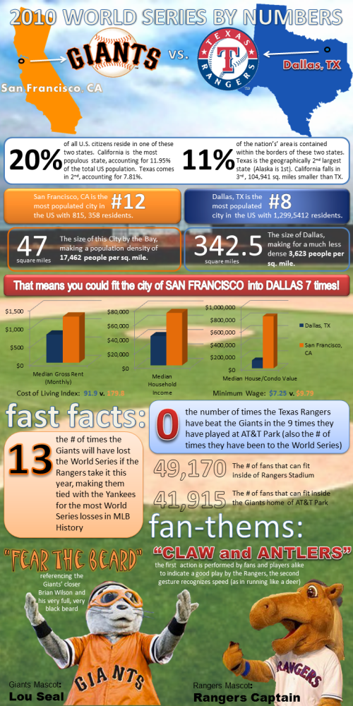
Lillian Smith of VerticalBrands.com created the first in our series: 2010 World Series By Numbers (above).  A look at the home cities of the two teams dueling it out in the 2010 World Series, the San Francisco Giants and the Texas Rangers from Dallas.

In the spirit of the World Series, MyCheapApartments.com has decided to take a closer look at the two bustling metropolises that this year’s championship contenders call home.

Posted on mycheapapartments.com, this one does a better job of visualizing data.  The cities are located on visuals of the states, some housing statistics are in bar charts and even the mascot visuals add to the comparison.  There are certainly other statistics included that could also have been visualized, but are only included as text (Show me the map of San Francisco inside the map of Dallas for size comparison).  I do like that most of the comparisons are side-by-side for the cities, so the reader can understand the comparisons quickly.


On the other hand is a blog post from the folks at Sterling Satellite: 14 Things You Didn’t Know about the World Series.


My opinion is that this one doesn’t actually qualify as an infographic, because there isn’t any data being visualized.  It’s a list of interesting facts presented in a graphic format, but many of the statistics included would have been better understand if they had been visualized (i.e. graph the comparison of advertisement costs).

The World Series is one of the premier events in all of sports, and it is steeped in fascinating facts and figures that will amaze anyone.  Here are the 14 things you didn’t know about the World Series (as if you need anything to make you more excited):


What do you think?


Thanks for submitting these.  And… Go Rangers!

Monday
Nov012010

The Infographic Pumpkin, one last Halloween infographic


One final Halloween infographic this year is the Infographic Pumpkin from InfographicWorld.com.  

Whats better than a pumpkin carving? A pumpkin carved with Lasers, that’s what. Having carved pumpkins most of my life, and getting heavily into it in 2008 with my Obama pumpkins. I decided to combine my love of information and pumpkin carving to create the first infographic pumpkin. Long story short, doing it with stencils and by hand was a good waste of three 40lb pumpkins, a dozen hours and a few exacto knife war wounds. As luck would have it though, the very day i was about to throw in the towel I stumbled upon a Microsoft employee who carves pumpkins with lasers. Being that lasers are just about the most awesome thing in the world, i couldn’t pass up seeing if something could be arranged.

11 days, a few setbacks and a trip to the Microsoft campus to deliver a pumpkin and the fruit(that’s right, pumpkin is a fruit) of our labor was complete:
(click to enlarge)

What a fun project.  Great job Justin!

Friday
Oct082010

Client Infographic: Tech Upgrades for Geeks

A new infographic for Fixr.com designed by InfoNewt (my company), the Tech Upgrades for Geeks looks at a handful of home improvements that anyone can do to their house to upgrade their technology quotient.  Upgrades range from small ($100) to large ($82,000), and the images surrounding the floor plan are sized appropriately.


Most of the data comes from the Fixr.com Cost Guides, but some of the projects can be DIY, so the costs are just for parts (like the keyless entry pads).  

A big thanks to Raul, Andres and everyone at Fixr.com 

…excuse me while I go setup Good Eats in the kitchen.

Wednesday
Oct062010

Who’s Suing Whom: Lawsuits In The Telecoms Trade infographic


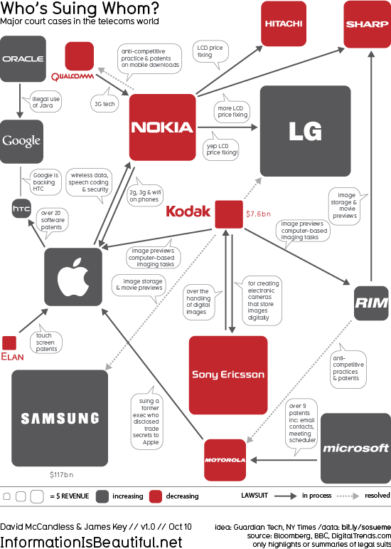
Who’s Suing Whom is a great infographic design improvement by David McCandless from InformationIsBeautiful.net.  David took existing diagrams (which were pretty poor) from The Guardian and the NY Times, and created a much more compelling and information-rich infographic.  My feeling from the news is that there are many more lawsuits that these, but I don’t know the data.

Based on these diagrams from Guardian Tech and the NY Times.

I thought those charts generated more questions than they answered. So, as ever, I tried to answer the obvious questions and convey various contexts simultaneously.

I wondered, too, if I could design the connections so the lines didn’t cross. Almost managed it!

And see if there was a relationship between dropping revenues and litigiousness. What do you think? Is there?

Data: http://bit.ly/sosueme


Great job David!

Monday
Oct042010

SoTech Infographic v1.0 - your feedback requested

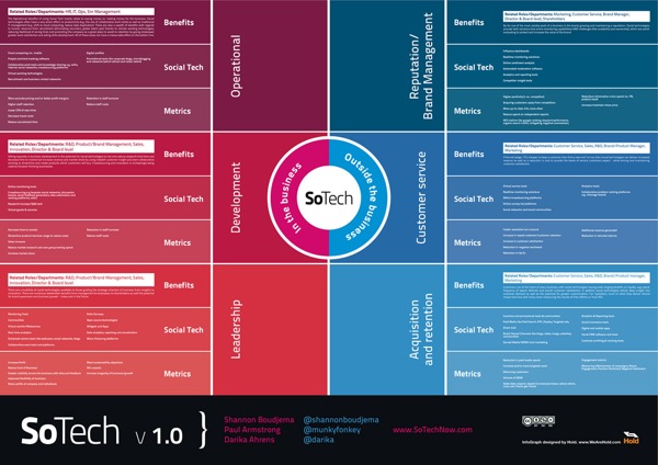
The SoTech Infographic v1.0 was released during the Social Collective 2010 Conference in London last week as a visual way to show how social networks interact with the different functions of business.  The infographic was created by Hold, a Brighton based graphic design studio.

Introduced at Social Collective, Darika Ahrens, Shannon Boudjema + Paul Armstrong presented an infographic (created by http://www.wearehold.com) that demonstrates how social technologies work within a business + outside a business - 

The infographic is available in a number of formats, like PDF and JPG, Scribd and Slideshare.  An online copy of the presentation from the conference is below (using Prezi, a great visual presentation tool!).  I agree with their thoughts on using infographics as a conference tool as well.


Both on the SoTech Now website, and the email I got from Paul Armstrong, is the invitation to heavily critique this v1.0 of the infographic.  They would like to develop and release v2.0, but are looking to incorporate all of the feedback they can get.  Leave comments below or on the SoTechNow site with your own reactions.

Here are some of my initial thoughts (mainly on the design):

  • Very text heavy.
  • Readability is low.  I’m a fan of big infographics that allow you to zoom in and dig deeper into the details, but in this version, by the time you zoom in close enough the read the text, you’re too close to understand the context.
  • Use icons, at least for the different business functions
  • Show examples of sites in each of the “Social Tech” sections.  Otherwise it seems like wishful thinking that there is a product that successfully does each of these functions.
  • Show examples of the metrics.  Are these actually quantifiable?

I think the infographic does provide a great framework to either develop a social plan, or to evaluate an existing plan.  It would be fascinating to review a company’s efforts using this framework as an example of social media being used successfully (or not) by a corporation.

What do you think?

Friday
Oct012010

"How Do I Become President?" Infographic Contest for Kids

From Challenge.gov and Kids.gov is an infographics contest for kids up to age 17.  “How Do I Become President?” invites kids to design an infographic or poster before the deadline on November 3, 2010. The Best Overall Infographic will win $2,500 in prize money, and a printed version will be sent to schools and libraries around the country.

Kids.gov is frequently asked, “How can I become the President when I grow up?” Help answer this question by creating an infographic or a poster that explains the process.

The winners will be featured on Kids.gov and the Best Overall Infographic will be printed as posters and distributed to schools and libraries across the country.


The judging lineup should be familiar to followers of CoolInfographics.com, I have posted many infographics from some of the infographic judges.

Ali Felski

Ali Felski is Sunlight Labs Senior Designer. Having previously worked for design agencies, WashingtonPost-Newsweek Interactive, and in the United States intelligence community, she brings a wide array of design experience and perspective to the projects in the Labs. Her work has been featured in widely-read Web design publications including Smashing Magazine, numerous CSS Galleries and her personal portfolio website won a South by Southwest award in 2009. She earned her BFA at the Savannah College of Art and Design.

Nicholas Felton

Nicholas Felton spends much of his time thinking about data, charts and our daily routines. He is the author of several Personal Annual Reports that collate countless measurements into a rich assortment of graphs and maps reflecting the year’s activities. He is the co-founder of Daytum.com, a site for counting and communicating daily data, and frequent designer of information graphics for numerous corporations and publications. His work has been profiled in publications including the Wall Street Journal, Wired and Creative Review.

Arlene Hernandez

Manager of Kids.gov

Sarah Slobin

Sarah Slobin has been a Visual Journalist for more than 15 years. She began her training at The New York Times where she spent over a decade working as a Graphics Editor across all the major new desks, as well as running the BusinessDay graphics department. Sarah left the Times to be the Infographics director for Fortune Magazine and Fortune.com. Currently, she is a Senior Graphics Editor at The Wall Street Journal.

Mike Wirth

Mike Wirth is a designer, educator and artist, who utilizes technology as his central medium. Mike is an assistant professor of New Media Design at Queens University of Charlotte and holds a Master of Fine Arts degree in Design and Technology from Parsons School of Design. He also owns and operates mikewirthart.com, where he produces interactive, print and motion media projects for clients of various industries.


Thanks to Jess and Arlene for sending in the link!

Tuesday
Sep282010

The Display Ad Tech Landscape


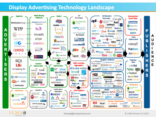
Developed by Terence Kawaja of LUMA Partners, the Display Advertising Technology Landscape makes an attempt to map out the companies involved in this ever-changing business.  This is his latest version, but even he admits that his chart is far from perfect.

By definition the chart will never be final since the space is so dynamic. I am still discovering companies.

A few things to bear in mind. This chart is far from perfect. Organization of such a fragmented and dynamic industry is flawed by its very nature. Many companies operate across several categories and there are distinctions within categories. This chart does not include many of the search players which are increasingly overlapping with display nor does it reflect whole categories such as lead generation and ecommerce which likewise utilize display advertising in their funnel, not to mention international companies which are barely reflected. At some point in the future I may construct an uber landscape which captures these and other players.

I believe we are in for some interesting times as the space rationalizes and consolidates along with the advent of new strategic entrants.

I applaud Terence in his attempt to visualize this complicated business environment that he works with.  Even if it’s not perfect, it certainly helps readers understand this business better by making it visual.  You certainly don’t have to be a graphic artist to make useful infographic, and I think Terrance has made a step in the right direction.  I look forward to seeing future versions.

Found on AllThingsD.com and AdExchanger.com

Monday
Sep272010

Infographics Feature: Advanced Photoshop Mag


Issue #73 of Advanced Photoshop Magazine (on sale now in the U.S.) includes a special feature on infographics starting on page 90.  There’s the feature article, and a separate step-by-step tutorial by Josh Overton.  Sadly, the article isn’t available online anywhere that I can find.


I did an interview for the feature article, including my thoughts on why infographics are growing in popularity and the process of creating infographics.  The article also includes thoughts from designers Mike Sudal, Bryon Thompson, Jude Buffum, Vic Kulihin, Samuel A. Minick and Raj Kamal.

Sadly, as sometimes happens in the editing process, none of my infographic images were included in the final article, and at least one of my responses was attributed to another designer. :(


I did find that Josh Overton has posted a scan of the tutorial on his site, and the source PSD file is available from the Advanced Photoshop tutorials website.

Thursday
Sep232010

Client Infographic: The Good News for Online Degrees


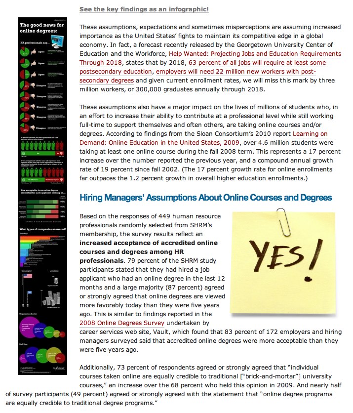
Good News for Online Degrees is a recent project InfoNewt (my company) designed for elearners.com to visualize the results of a survey of Human Resources professionals worldwide.

The results are good, as online degrees continue to gain credibility and popularity.  Designed as a companion infographic to the article “How Employers View Online Degrees” on the elearners.com website, the visual not only supports the article, but also stands on its own for posting on blogs.

I used a blend of pie charts, bar charts, circles and images to tell a story as you move down the visual.  The different visuals help separate the different questions that were asked in the survey, but always include the actual numbers as well.  For survey results, you want to be as transparent as possible by citing the source material, repeating the questions that were asked and using specific numbers to validate your visuals.

Personally, the most interesting results are in the stacked bar chart in the middle.  Online degrees have dramatically different levels of acceptance based on what level of role the applicant is applying for.

Available as a high-resolution GIF and PDF from the elearners.com site.

Cheers to Helen and everyone at elearners.com!

Tuesday
Sep212010

Your Coming Tax Cut (or Not)


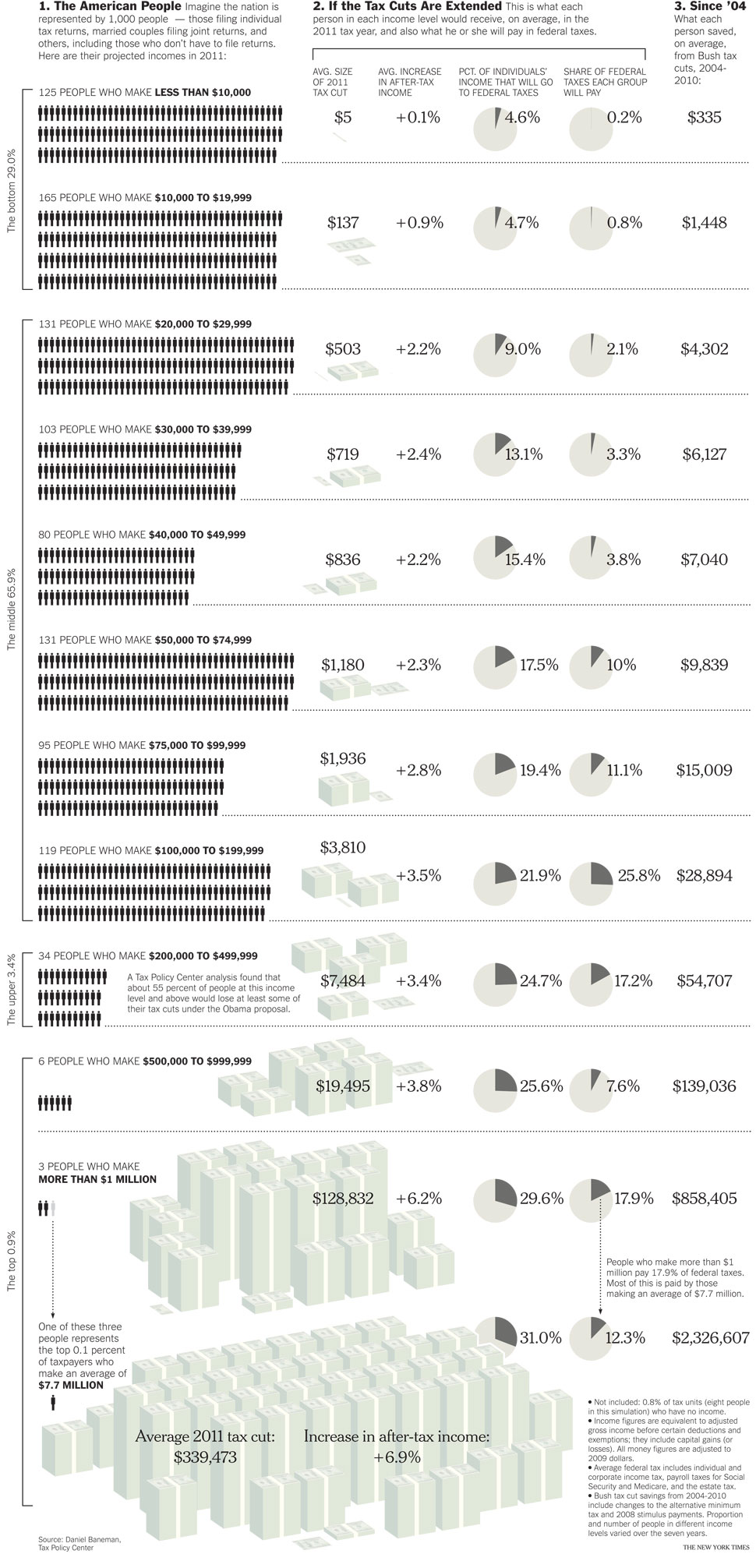
From the NYTimes.com comes a very clean infographic look at the debate around renewing the U.S. tax cuts.

The Bush tax cuts of 2001 and 2003 are set to expire at the end of this year, and the fight is on to renew some or all of them. Many Democrats want to scrap future cuts for the wealthiest taxpayers — individuals whose income after deductions is more than $200,000 and couples at $250,000 or more. The Republican leaders insist that all taxpayers should get relief, even those in the highest income strata. Wealthy Americans, they say, can use their tax savings to create jobs.

In either case, the extensions would be expensive: perhaps $2.7 trillion less for the Treasury through 2020. Here is a guide to who will get what if the cuts are extended, and who got what from the last seven years of cuts, according to an analysis by the Tax Policy Center, a nonpartisan research organization. 

 Found on Chart Porn