About
Randy Krum
President of InfoNewt.
Data Visualization and Infographic Design

Infographic Design

Infographics Design | Presentations
Consulting | Data Visualizations

DFW DataViz Meetup

Join the DFW Data Visualization and Infographics Meetup Group if you're in the Dallas/Fort Worth area!

Search the Cool Infographics site

Custom Search

Subscriptions:


Feedburner

The Cool Infographics® Gallery:

How to add the
Cool Infographics button to your:

Cool Infographics iOS icon

- iPhone
- iPad
- iPod Touch


Read on Flipboard for iPad and iPhone

Featured in the Tech & Science category

Flipboard icon

Twitter Feed
From the Bookstore

Caffeine Poster

The Caffeine Poster infographic

Entries in design (479)

Tuesday
Oct152013

The Power of Colorful Customers

The Power of Color infographic

The Power of Color infographic from Pega is about treating each customer as an individual. Each individual has their own colors and CSPs can paint their customer processes to make them more specific, more relevant, more proactive, and more effective for the individual customer.

By applying color to all of their customer processes at the moment of truth, communications service providers can take the next best actions relevant to each customer. Doing this over the life times of their subscribers delivers exceptional value to both customers and service providers.

There’s a lot of text in this design, and the use of the colors as metaphor for specific customer attributes is a little bit confusing.  Otherwise this is fantastic information, and easy for the reader to follow.  The footer should include a copyright statement, and the URL link back to the infographic landing page som readers can find the full-size original version.

Thanks Caitlin for sending in the link!

Friday
Oct112013

xkcd - Tall Infographics

xkcd - Tall Infographics

The Tall Infographics design from Randall Munroe at xkcd literally made me laugh out loud.  As he mentions in the text:

“‘Big Data’ doesn’t just mean increasing the font size.”

Very similar to something I repeat here on Cool Infographics all the time.  “Big fonts are not data visualizations!”

However, the format of the Tall Infographic is here to stay.  The tall format fits nicely in the content area of most websites and blogs, and the user experience of scrolling vertically is much easier than scrolling horizontally.

Found on Gizmodo and Stats Chat

Monday
Oct072013

The Color Emotion Guide

The Color Emotion Guide infographic

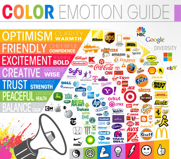
The Color Emotion Guide arranges well known company logos into a rainbow of emotion to help readers understand which logos are using color to create a perception of their brands.

Logo designers have several puzzles to solve when presented with a new logo design project. One of the main considerations that a designer must deal with is to understand what it is that the client wants to achieve with the logo design.

The designer asks the client a series of questions that illicit answers helping to bring the parts of the puzzle together. A typical question might be “What qualities does your business want to be known for?” The answer might be for a doctor for instance, “I want to be known as someone you can trust”. So the question and answer begs: How does the designer portray trust in the logo design?

Scientists have been studying the way we react to colors for many years.  Certain colors make us feel a certain way about something. As long as the designer knows what these colors and emotions are, the designer can use that information to help present the business in the right way. These are not hard and fast rules but smart designers use the information to their clients advantage.

This fun infographic lays out the emotions and qualities that well known brands like to be known for. The color psychology is only one part of the puzzle but I think you will agree it is a very important part of it.

As far as I can tell, this appears to be a design from The Logo Company, but it was very hard to track down.  Infographics are usually shared without the accompanying articles, so designs need to include basic information like their own company logo, a copyright statement and the URL back to the original design in the actual image file.

Found on Laughing Squid

Saturday
Sep282013

Gone To Press!

It’s out of my hands!

This week, my project editor at Wiley told me that Cool Infographics the book has officially “gone to press!”  That means that all of the electronic layout files have been sent to the printer, and the book is in the printing schedule.  The official release date is October 28th, from online book retailers and should even include your local bookstore!

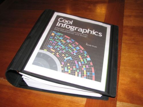
Over the last 12 months I’ve been gathering all of the materials together into the binder you see above, but I’m super excited to see the complete printed book.  I can’t wait to see the printed copy and share it with everyone.  You’ll love the full-color infographics and data visualization examples included.  The final book will be close to 380 pages!

Intended for everyone, not just designers, the book explains how to utilize infographics effectively as part of a content marketing strategy.  Things like how to structure your information flow, how to choose a topic, how to be credible to your audience, and how to publish and promote your final infographic design.  Just like this site, the book includes visual examples from designers and companies all over the world.  I designed a bunch of custom data visualizations for the book, but most of the examples are some of the coolest infographics from the web.

You can find out more about the book on the dedicated landing page I setup here: coolinfographics.com/book

To receive the book as fast as possible, pre-order your copy today from Amazon, Barnes & Noble or directly from Wiley!


Monday
Sep162013

Introducing Cool Infographics, the book

Introducing Cool Infographics, the book


Today I’m excited to introduce my new book, Cool Infographics: Effective Communication with Data Visualization and Design!  This project has taken up an enormous portion of my time over the last 12 months and will be available at the end of October 2013 from all major booksellers (print and ebook).

This book is written for anyone that wants to learn how to use infographics and data visualizations more effectively.  Whether you design your own or work with a designer, the tactics and tips included will help you create better infographics and effectively publish them online.  Using over 100 visual examples from designers all over the world, I explain how companies are successfully using infographics every day.  It is an accumulation of knowledge and experience from designing infographics and running the Cool Infographics blog over the last seven years.

Seven major areas are covered in depth:

  • The Science of Infographics: Why do infographics work?  Humans are visual creatures.  Any information that we can communicate visually will get more attention, is easier to understand and is more likely to be remembered.  Infographics tell stories with data using a combination of data visualizations, images, illustrations and text.  Used effectively, infographics can be one of the most powerful forms of communication.
  • Online Infographics: The use of infographics online has grown exponentially in the last few years.  Why are infographics so popular as online content and how are infographics being used successfully by companies?  Are you trying to build your brand equity, drive traffic to your website or explain product features to your customers?  Different goals require different types of infographics, so make sure you know how to plan your infographics for success.
  • Infographics and SEO: Why do some infographic go viral and others flop?  Infographics and Search Engine Optimization (SEO) go hand in hand, but you have put some effort into releasing an infographic.  Issues like keywords, embed code, online lifespan, meta data and landing pages all have an impact on the success of your infographic online.  A complete infographic release strategy is outlined that covers the entire process from releasing the infographic to getting posts and links from other sites.
  • Infographic Resumes: The use of data visualization design to improve job candidate resumes is still new, but is growing rapidly.  Good infographic resumes combine the best practices from traditional resume design and viral online infographics.  Learn to design a cool infographic resume of your own.
  • Internal Confidential Infographics: There’s a secret world of data visualizations and infographics being used inside companies using confidential data.  Unlike online infographics, these internal designs are often included in presentations or shared as printed handouts.  Take the best parts of online infographics, and adapt them for your own use in presentations.
  • Designing Infographics:  Will your infographic pass the 5-second rule?  This chapter will help you design great infographics with clear data visualizations, transparent data sources and engaging topics.  We look at some best design practices as well as some common mistakes to avoid. 
  • Design Resources: Ready to get started?  Designing infographics is a combination of visualizing data, creating custom illustrations, editing images and putting together the complete design.  I’ve gathered together the major tools used by infographic designers to help you find the right software for your project.  I’ve even included a number of sources for finding data and websites that can be used to design complete infographics.

Pre-order now to get your copy as soon as it’s released!

Wednesday
Sep112013

Information is Beautiful Awards Deadline Friday Sep 13th

Information is Beautiful Awards

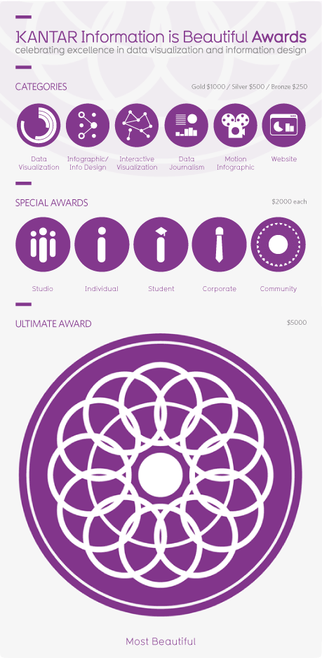
The deadline for submitting design entries to the Information is Beautiful Awards is this Friday, September 13th.  Anyone can enter and the available categories are:

  • Data journalism
  • Data visualization
  • Infographic/information design
  • Interactive visualization
  • Motion infographic
  • Website

The Kantar Information is Beautiful Awards celebrate excellence and beauty in data visualizations, infographics and information art.

Last year we awarded 26 prizes across 6 categories and 8 special awards with entries from more than 20 different countries. The standard was exceptionally high and we really appreciate the effort people put into entering the awards.

The Awards were set up in 2012 by David McCandless, journalist and datavisualizer,  in collaboration with Aziz Kami, Creative Director, Kantar.

The Awards are non-profit and community-driven – that means you don’t need to shell out a big wedge of cash to enter your work, and if you’re successful, you won’t need to shell out again for a fancy sit down dinner awards night.


Information is Beautiful Awards Prizes


Friday
Sep062013

Visualizing the Microsoft-Nokia Deal

Visualizing the Microsoft-Nokia Deal

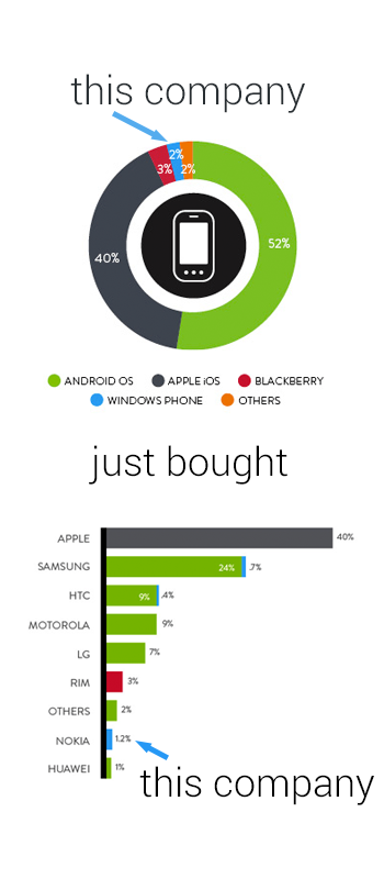
Good data visualization uses visuals to put data into context for the readers, making the information easier to understand.  This simple infographic takes a couple charts previously published by Nielsen, and uses them to provide context to the news story of Microsoft acquiring Nokia’s handset devices unit for $7.2 Billion.

Combining data visualization with text and images should make the information easier and faster to understand, and this design does a great job.

Designer unknown.  Thanks to Mike Elgan for posting on Google+ and Luke Millar (@ltm) for posting on Twitter.

Friday
Aug302013

Infographic Cookbook - Picture Cook

Picture Cookbook infographic

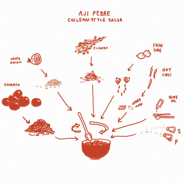
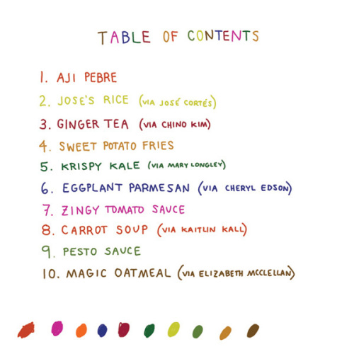
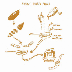
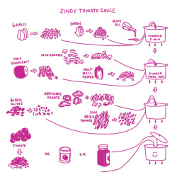
A new way to take directions for cooking, the Picture Cookbook infographic from Katie Shelly. It is an easy step by step visual explanation design that will get you to the desired tasty product, with very little use of words!

The following recipes are not intended as precise culinary blueprints. Instead they are meant to inspire experimentation, improvisation and play in the kitchen.

Great design work by Katie to create recipes as visual explanations.  The hand-drawn style also helps reinforce the flexible methods.  They aren’t strict, rigid recipes with sharp images and corners, but instead are more casual which allows for interpretation and change.  I love the color-coding for easy navigation within the book too.

Found on Fast Company

Available soon for purchase in print in October 2013.  I’ve already pre-ordered my copy.

Wednesday
Aug212013

A Website Design Process

A Website Design Process infographic

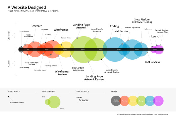
A Website Designed is a process explanation infographic, created by John Furness of Simple Square, highlights the phases of creating a website for a designer and the client. 

A Website Designed is an infographic of the average website’s creation. Feel free to download and share this, or link directly to it here on our blog.

Great visualization design of a business process.  The sequential events are arranged along a straight timeline, but a number of additional elements of information have been added.  Color-coding, sized circles and milestones all add valuable information to the reader.

A high-resolution PDF is available in multiple languages: English, French, Russian, Spanish, Italian, Hebrew and Dutch.

Found on Simple Square!

Monday
Aug122013

Design Client Engagement Poster

Design Client Engagement Poster

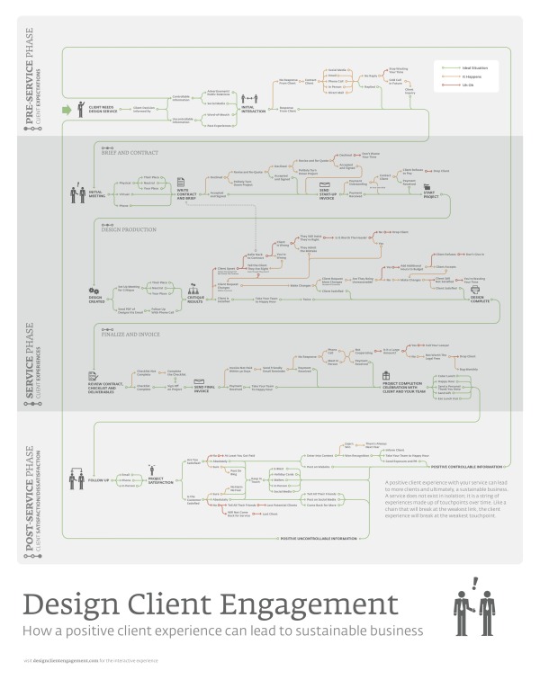
The Design Client Engagement Poster argues that a positive client experience can lead to a sustainable business. The poster separates the experience into 3 phases. The Pre-Service Phase is about client’s expectations, the Service Phase is about the client’s experiences, and the Post-Service Phase is about client satisfaction/dissatisfaction. This poster can be found on Design Client Engagement.com and is available for purchase for $25 + shipping here.

A positive client experience with your service can lead to more clients and ultimately, a sustainable business. A service does not exist in isolation; it is a string of experiences made up of touchpoints over time. Like a chain that will break at the weakest link, the client experience will break at the weakest touchpoint.

Cool visual explanation design created by Matt Pasternack from Nack Creative can be found on www.designclientengagement.com!