About
Randy Krum
President of InfoNewt.
Data Visualization and Infographic Design

Infographic Design

Infographics Design | Presentations
Consulting | Data Visualizations

DFW DataViz Meetup

Join the DFW Data Visualization and Infographics Meetup Group if you're in the Dallas/Fort Worth area!

Search the Cool Infographics site

Custom Search

Subscriptions:


Feedburner

The Cool Infographics® Gallery:

How to add the
Cool Infographics button to your:

Cool Infographics iOS icon

- iPhone
- iPad
- iPod Touch


Read on Flipboard for iPad and iPhone

Featured in the Tech & Science category

Flipboard icon

Twitter Feed
From the Bookstore

Caffeine Poster

The Caffeine Poster infographic

Entries in history (262)

Wednesday
Dec262012

Star Trek: The Original Series

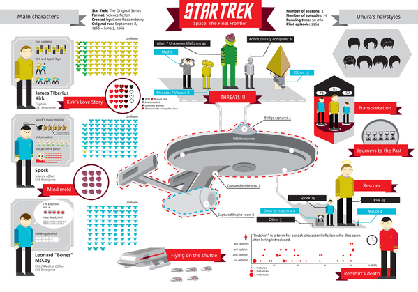
The Star Trek infographic designed by Natalya Platonova was originally designed in Russian for Svinovik.ru. This infographic is a visual overview of some quirky statistics from the complete original series (three seasons).

Overall, very well done!  As a Trekkie myself, the visualizations are fun facts about the series, and well designed.  I like that the quantitative values (like the uniforms worn) are shown as the actual numbers and not scaled. 

A couple of framing pieces of information would have been helpful.  The original design is published along with a text article, but some introductory text in the infographic itself would be nice because the image file gets shared without any of the text from the article.  The fotter should include some type of copyright or Creative Commons license and the URL for readers to be able to find the original, full-size versions.

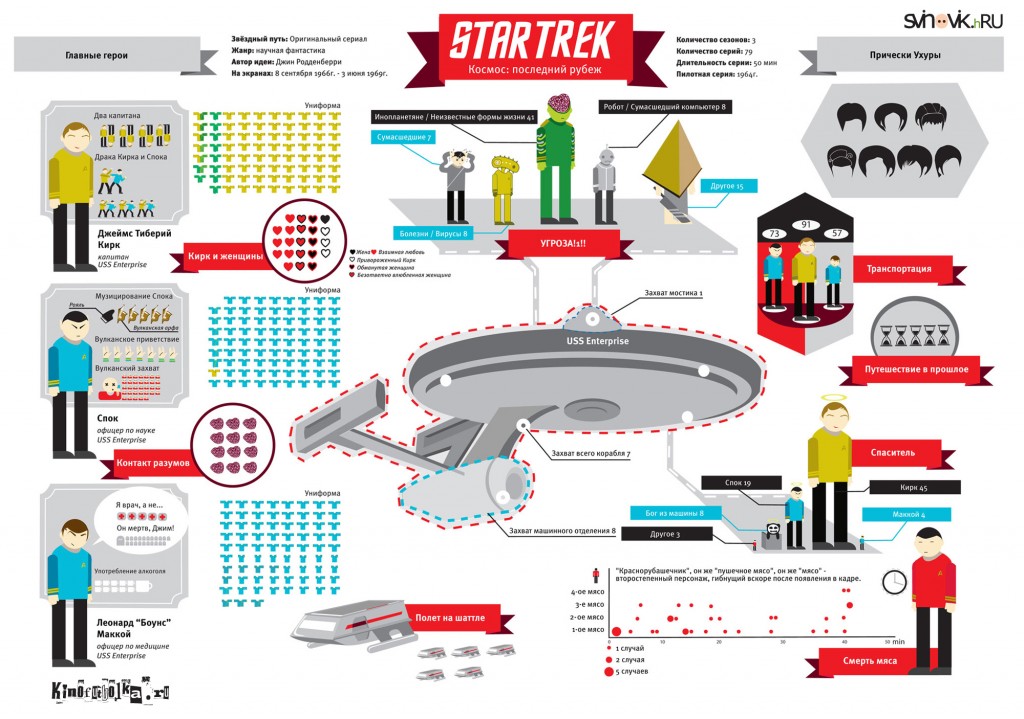
Here’s the original version in Russian:

Found on Visual Loop!

Monday
Dec242012

Evolution of the Batman Logo

Evolution of the Batman Logo infographic

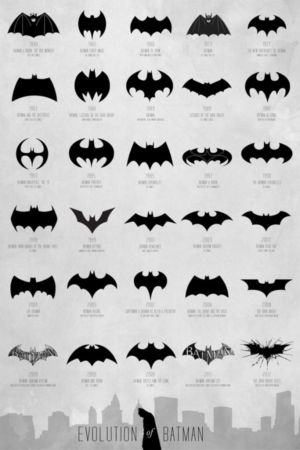
The Evolution of Batman poster designed by Cathryn Lavery from Calm the Ham is a visual history of the Batman symbol over the years.  I can’t think of any consumer logo that has changed this much, but the Batman logo remains a very powerful and recognizable brand.

A comprehensive and extensive chart of the Batman logo evolution, spanning over 72 years from 1940 - 2012 to map the transformation of a timeless hero.  Thanks to DC Comics for creating this cultural icon that we can all obsess over, all logos belong to them.

The infographic timeline covers 72 years (1940-2012) and shows different version of Mr. Wayne’s logo so the reader can easily distinguish the different iterations.  Additional information like the year and media publication format are listed in text.  I would have liked to see them spaced out along an actual timeline, but this design format fits better on a standard poster.  Three different size posters are available from the Calm the Ham site.

I found this design on the FastCoDesign site, but a few other designers have also tackled this specific history.  Cathryn Lavery mentions this 2008 video from Rodrigo Alejandro Rojas Sandoval as being the first one she knows of that had attempted this:

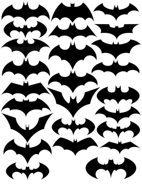
I saw this design on Nathan Yau’s FlowingData site in 2010, but he wasn’t able to cite the original source.  This one shows fewer versions, and doesn’t include any additional information.


Monday
Dec172012

Eat Like A Caveman With The Paleo Diet

Eat Like A Caveman With The Paleo Diet infographic

The Paleo Diet infographic from DrVita.com shows readers what it would take to eat like a caveman!

For those of you who keep asking yourself, “is there a diet that is right for me?” There are hundreds of diets to pick and choose from. One popular diet is Paleo. Below is Paleo in a nutshell.

The paleo diet, sometimes referred to the caveman diet is based on the diet of ancient humans. Getting nutrients from vegetables, fruits, nuts, seeds, meats, and fish, this diet helps you achieve a healthy and nutritious diet. This infographic helps you understand why the paelo diet is healthy, what foods to eat and avoid, and how it works. Give it a try and see if this diet is right for you.

The design is a good, short explanation of the Paleo Diet, and what it would take eat only natural foods like our ancestors.  Intuitively it makes sense, since processed foods and grains are a relatively recent discovery in the history of mankind.

Mostly just a visual explanation, there are a couple statistics included that would have have been better if they had been represented as data visualizations.  The footer should include both a copyright statement and the URL directly to the original, full-size infographic so readers can find the high-resolution version.

Thanks to Mat for sending in the linK!

Friday
Dec072012

Nobel Prizes and Laureates Timeline Visualization

Nobel Prizes and Laureates Timeline Visualization 

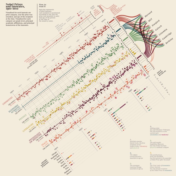
Nobel Prizes and Laureates is great visualization from the Milanese design firm Accurat.  From 1901-2012 this information design breaks down the winners by category, age, principal university affiliates and even hometowns.

The high-resolution version is available on Visualizing.org

The visualization explores Nobel Prizes and Laureates from 1901 to 2012 analyzing the age of recipients at the time prices were awarded, average age evolution through time and distribution among categories, grade level, main affiliation universities and principal hometowns of the laureates.

Designed as a part of an ongoing series for the Milanese newspaper Corrierre della Sera, La Lettura is a culture supplement.  You can see this design and the rest of the series in the collection on Visualizing.org.

The timeline takes a lot of information, and makes it easy to understand for the readers.  I especially appreciate the transition from line chart of ages to the bar chart of education grade levels to the sankey diagram of universities at the right end of the timeline.  Beautifully done.

Each dot represents a Nobel laureate, each recipient is positioned according to the year the prize was awarded (x axis) and age of the person at the time of the award (y axis).

Found on FastCoDesign

Monday
Dec032012

The History of the Christmas Tradition

The History of the Christmas Tradition infographic thumbnail

The History of the Christmas Tradition infographic timeline from Balsam Hill visually lays out the events from Culture, Decorations, Traditions and Historical Characters that over hundreds of years have shaped the current Christmas holiday.

Across the world, Christmas is celebrated in a multitude of rich and cherished traditions. Their origins are wonderfully varied, emerging out of cultures and beliefs throughout history. This illustrated timeline, brought to you by Balsam Hill, captures the flow of some of the most popular Christmas traditions and figures and traces their simple lineage from St. Nicholas’ humble beginnings to today.


The History of the Christmas Tradition infographic

This design is a great example of Online Lifespan for infographics.  The topic is timely and popular during the month of December, but not tied to a specific trending topic from 2011.  Therefore, this design will generate ongoing traffic, links and views every year for Balsam Hill as new readers discover it each year for years to come.

Designed by InfoNewt with designer Jeremy Yingling, the design takes a more classic approach the the illustrations on the timeline by using historical images that instantly make the events relevant and recognizable to the readers.  The four, parallel timelines show the reader how events combined over time, combined into the Santa Claus and Christmas we know today.  The layout makes it easier for the readers to see how separate songs, books and parades began to converge into one story.

Monday
Nov192012

The Difference Between the United Kingdom, Great Britain, and England

The Difference Between the United Kingdom, Great Britain, and England infographic

Do you know the Difference Between the United Kingdom, Great Britain, and England? This infographic from sa-la.jp spells out the differences. It also includes a timeline of major events and some ideas for the future.

The terminology of the UK is quite complicated, so it’s no wonder that people get confused. Are Great Britain, the UK and England the same thing? Is Ireland part of the UK? What’s Wales!? To help explain things, I put together this infographic to define the parts that make up the UK and how it came about. If you still have any questions by the end of it, feel free to ask in the comment section below.

Really good infographic design that uses different visualization methods in the visual explanation.  Maps, icons and a subway map style timeline are easy to understand, and give the reader a basic understanding of the UK.

The sources should be more specific, linking to specific web pages, and there should be a URL to the original infographic landing page in the footer.

Thanks to Tim for sending in the link!

Wednesday
Nov142012

Total Solar Eclipse 2012

Total Solar Eclipse 2012 infographic

Today (Nov 14th) will be a total eclipse of the Sun, and the Solar Eclipses infographic from turu does a great job with visually explaining eclipses and sharing the statistics from prior eclipses.

The total solar eclipse of 2012 is set to be a spectacular event. Occurring just after sunrise on November 14 (local time), the eclipse will be best viewed from Cairns in Australia. Already a popular tourist destination, the 2012 eclipse is expected to flood the coastal city with thousands of domestic and international visitors.

The infographic provides a definition of a solar eclipse as well as information on the Australia 2012 eclipse. It offers an insight into past solar eclipses, noting duration of totality and effects on local tourism.

With a number of events scheduled such as the Solar Eclipse Marathon and the Eclipse 2012 Festival, Cairns aims to cater to this expected influx of tourists. Renowned for its sunshine, Cairns is expected to be a prime location to view the 2012 eclipse. The next opportunity to view a total eclipse in Australia will be in the year 2028, making this year’s event truly special.

A good design that tells a good story.  In the footer should be a Copyright statement, and the URL to the infographic landing page so readers can find the origial full-size version.

Friday
Nov092012

Car Sizes Through the Years

Car Sizes Through the Years infographic

It has been a gradual change, however it is definitely there. Our cars have gotten bigger. Automotive.com walks us through some of our favorite car’s growth spurts in the Car Sizes Through the Years infographic.

One of the great joys of living in Los Angeles is the wide variety of cars you see on the road. It provides a great contrast, especially when comparing between generations.

For example: a while back, news director Keith Buglewicz was driving down the freeway when he found himself behind a 2013 Ford Mustang, and its 1967 fastback equivalent. The modern Mustang dwarfed its predecessor in every dimension; comparatively speaking, it was mammoth.

When did cars get so big?

I really like this design.  It’s very focused on telling one story about the growing size of cars, and the design style is superb.  By using images and outlines of the actual cars, it tells the story much better than a bar chart would have because the images are recognizable to the reader which improves comprehension.

The design is missing some form of copyright statement and the URL link to the original infographic landing page so readers can find the high-resolution version when they see this posted on other sites.

Thanks to Chris for sending in the link

Wednesday
Oct312012

60th Anniversary of the Bar Code

60th Anniversary of the Bar Code infographic

Wow!  This year is the 60th Anniversary of the Bar Code, and I remember when checkout clerks at the grocery store had to key in every price!  OK, I only barely remember that as a kid.

The barcode is a fundamental part of how we obtain goods—from scanning items for price comparisons, adding goods to a wish lists and checking out purchased products. We use barcode scanners on a daily basis, but have you ever asked yourself how the barcode came to be? Would you believe that the first barcode was printed on a pack of Wrigley’s gum, and originally created to help grocery stores track inventory? 

Today is the 60th Anniversary of the barcode; and if you’re interested in learning more fun facts like the ones above as well as how the barcode came to be, its practical uses, and how industries have implemented the technology today, check out the infographic below.

Even without any data visualizations, this design does a good job of leading the readers through a short history, and visually shows the reader the different types of bar code technologies and bar readers.

In the footer, the design is missing both a copyright statement, and a URL to help the readers find the original full-size version on Wasp Bar Code’s landing page.  They include the home page URL, but a reader won’t find any mention of the infographic on the home page.

Thanks to David for sending in the link!

Monday
Oct292012

Halloween Statistics 2012: Creepy Calculations

 Halloween Statistics 2012: Creepy Calculations infographic

It is that time of the year again! Halloween is the perfect time for costumes, scary movies, and Charlie Brown! How do you spend your halloween? Halloweencostumes.com has put together some Creepy Halloween Statistics to show some of this holiday’s most popular happenings. 

What are you most looking forward to this Halloween? Collecting copious amounts of your favorite candy? Dressing up in a trendy  costume? Enjoying a horror movie marathon? Find out what other Americans will be up to this year, with our Ultimate Visual Guide to Halloween Statistics! You’ll discover popular costumes for you and fido, a count-down of the best sweet treats, suggestions for a Halloween playlist and more spooktacular stats!

I really like this design.  The color scheme, the design style, and the easy-to-understand top-to-bottom progression of information.  There are a few statistics that I would like to see visualized, like the Trick-or-Treating By The Numbers section where the values are only shown in big fonts.  I really like the different moon phases to visualize the stats at the top.

The Top 5 lists are a little text-heavy, and it would have been nice to see movie posters or CD artwork to go along with the entries.

In the footnote at the bottom, missing are both a copyright statement (or Creative Commons) and a URL link to the original infographic landing page so readers can find the full-size version.

Thanks to Elise for sending in the link!