About
Randy Krum
President of InfoNewt.
Data Visualization and Infographic Design

Infographic Design

Infographics Design | Presentations
Consulting | Data Visualizations

DFW DataViz Meetup

Join the DFW Data Visualization and Infographics Meetup Group if you're in the Dallas/Fort Worth area!

Search the Cool Infographics site

Custom Search

Subscriptions:


Feedburner

The Cool Infographics® Gallery:

How to add the
Cool Infographics button to your:

Cool Infographics iOS icon

- iPhone
- iPad
- iPod Touch


Read on Flipboard for iPad and iPhone

Featured in the Tech & Science category

Flipboard icon

Twitter Feed
From the Bookstore

Caffeine Poster

The Caffeine Poster infographic

Entries in Infographic (45)

Friday
Dec212012

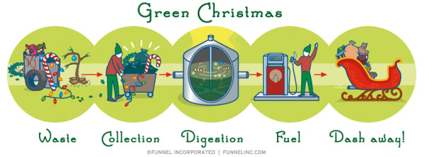
Infographic Holiday Cards 2012

Infographic Holiday Cards 2012


This is a limited time offer!  

Funnel Incorporated is offering a FREE 4-pack of infographic holiday cards to everyone that submits a request (while supplies last) through a giveaway on Facebook.  You must request your free pack of cards through the Facebook page by Noon CT on Saturday December 22 (Tomorrow!).

U.S. and Canada only, but anyone can download the infographic holiday themed wallpaper designs from the Funnel website at http://www.funnelinc.com/holiday

Tuesday
Sep112012

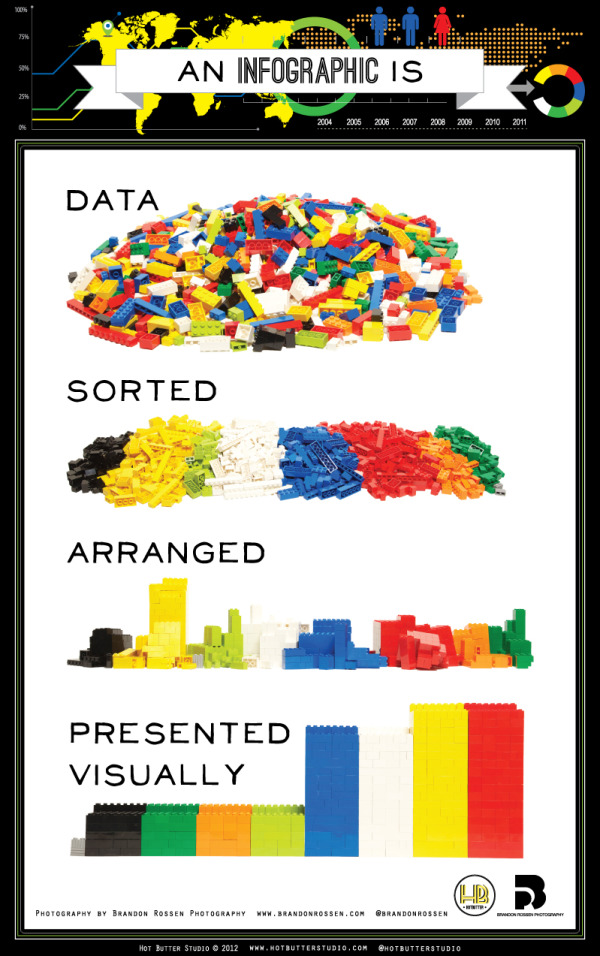
What is an Infographic? (explained with LEGOs)

 What is an Infographic? infographic

This infographic from Hot Butter Studio presents the idea of infographics in, well, an infographic! What is an Infographic? Data sorted, arranged, and presented visually! (And in a fun LEGO design!)

This is an infographic about what is an infographic. Using Lego blocks and photography we wanted to show that.a good infographic is simple and requires very little text.

Simple and fun, this is a really good design that has had some phenomenal success in social media sharing.

Thanks to Karyn for sending in the link!

Monday
Aug202012

ROI = Return On Infographics

ROI Return On Infographics


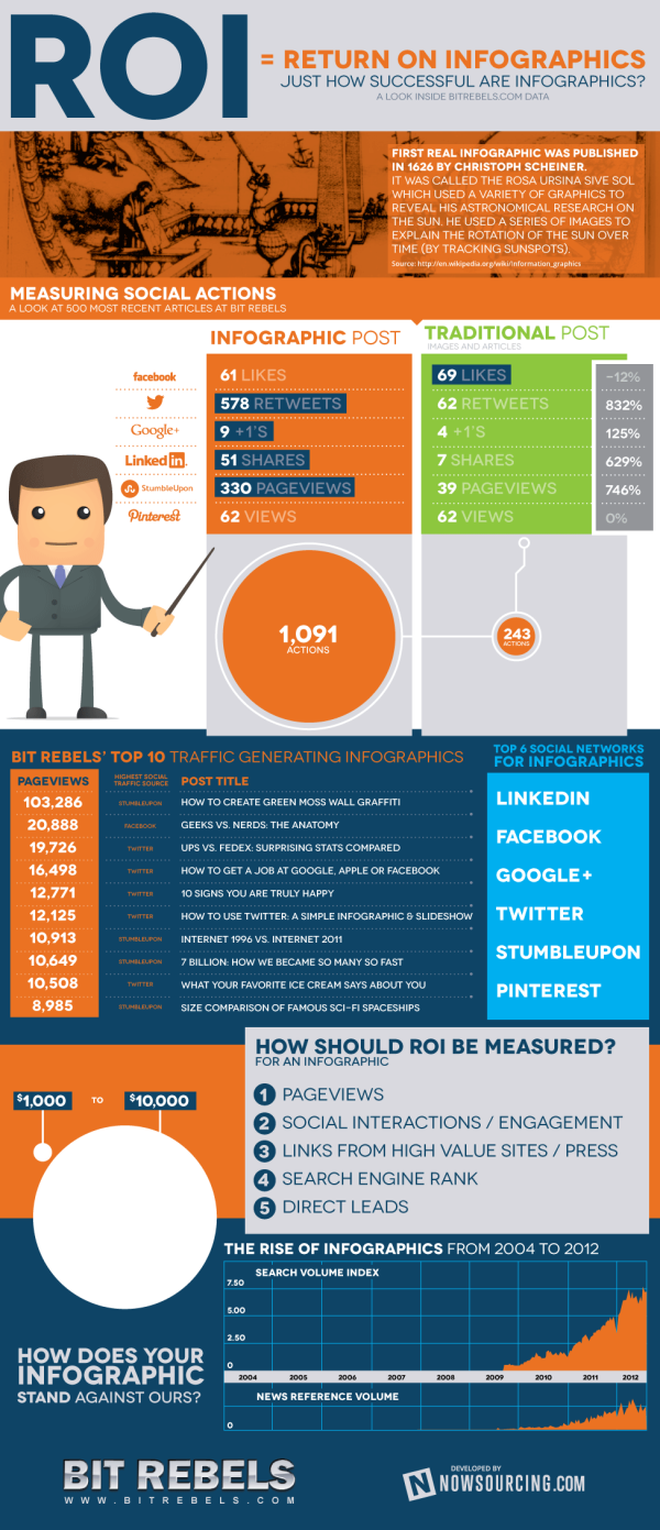
Infographics about infographics are always fun.  Return on Infographics by Bit Rebels and NowSourcing takes a look at some of Bit Rebels’ own data from releasing infographics as part of their marketing.

The impact of an infographic can be measured on many levels, which makes it all just a little bit more complex and complicated to present. With the help of NowSourcing, we have been able to produce an infographic that will compare the traffic and social action impact of an infographic post with a traditional post that does not involve an infographic. It’s through social media analytics that a clear image slowly emerges to tell a story that for some has just been a question without an answer.

They’re pretty clear about this, but remember that this design is completely based on internal data from Bit Rebels.  It may be a good indicator of infographics in general, but we don’t know for sure.

Bit Rebels has shared some fantastic data from their internal tracking, which will be of interest to the you, the readers of Cool Infographics.  However, the design makes a few mistakes, and we’re all here to learn how to make infographics designs better.

  • One of my pet peeves, the design messed up the size of the circles in the comparison table.  Based on the full-size infographic they released at 975 pixels wide, the smaller circle for 243 Actions is about 55 pixels in diameter.  Doing the match for the area of a circle, the diameter of the larger circle for 1,091 Actions should be about 117 pixels wide.  In the design, it’s actually about 256 pixels wide!  So instead of visually showing a shape roughly 4x larger, it’s actually showing a circle about 22x larger!  This is a “false visualization” and mis-represents the data.
  • Are these comparison data points an average or a total of the 500 posts?
  • How many infographic posts are compared to how many traditional posts?
  • Love the use of the actual logos from the social networks in the comparison table, and they should have continued that with the rest of the design instead of just text later in the design.
  • The blue bars behind the higher comparison value look like bar charts, but obviously don’t match the data.  They just fit the text, and have no visual relevance to the data.  An indicator icon or highlighting the entire column width would have been better than the bars.
  • Are the Top 6 Social Networks in rank order?  LinkedIN is the top social network for infographics???
  • The circles near the end of the design are also incorrect.  Instead of showing a 10x comparison to match the dollar values, the circles show an over 100x comparison!

Found on WebProNews, MediaBitro’s AllTwitter, and Visual.ly.  Thanks to everyone that also submitted it and tweeted links to it!

Monday
Aug062012

New Feature: DataVis & Infographic Designer Job Openings

Infographic Designer Jobs

I recently added a new feature page here on the Cool Infographics blog called Cool Jobs.  The Jobs page is open for anyone to post freelance, part-time and full-time opportunities for data visualization and infographic designers.  Posting an opening on the Jobs page is FREE, and you should include a job description, a link to the opportunity, and contact information in the main body of your post.

Tuesday
Jun192012

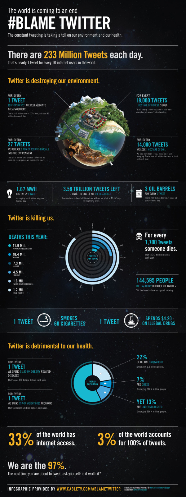
Infographic Contest Winner: #Blame Twitter

A big congratulations to Tim Cooley!  Tim won the PosterBrain Design the Future contest with the entry above called #Blame Twitter, which is essentially a parody infographic.

From Tim:

All claims in this infographic are obviously false in nature and are solely intended for the comedic entertainment of readers. We <3 Twitter.

From PosterBrain:

We are sending a HUGE shout out to Tim Cooley for winning our Design the Future Infographic Contest! His infographic, #Blame Twitter, is very creative, informative, visually pleasing, and incredibly well done! We will definitely think twice about what, and how often, we tweet! Congrats again Tim, and thanks to everyone who participated!

Tim took the real data provided for the contest, but fictitiously correlated it to Twitter statistics.  In a classic example that “Correlation does not imply causation”, Tim visualized the real-world statistics as if they were caused by Twitter.  For example, it is true in the real-world that nearly 13,000 hectares of forest is lost every day, but it has nothing to do with the 233,370,615 Tweets every day.

Tim won an iPad2 for his winning infographic!  You can see all of the contest entries on the PosterBrain Facebook Contest Photo Album.

Please fell free to retweet this post without harming the environment…

Monday
Jun112012

It's All About The Images

It's All About The Images infographic

Here’s some irony for you. It’s All About The Images infographic from MDG Advertising relays information visually about the importance of relaying information visually.  Yes, it’s very meta.

Some say image is everything, and that’s especially true on the Internet where the shift to visual optimization is playing an increasingly important role in the recent phenomenon of photo marketing. In light of their numerous benefits for brands of all kinds, MDG Advertising developed an insightful infographic that illustrates the influence of images on a company’s business, branding, search, and social media efforts. For insight on optimizing images for content and commerce, along with advice on image optimization techniques, take a look at the following infographic to see why images can help make success a snap.

In our world, this information is true for posting infographics as well as photo images.

Thanks for sending in the link!

Tuesday
Apr242012

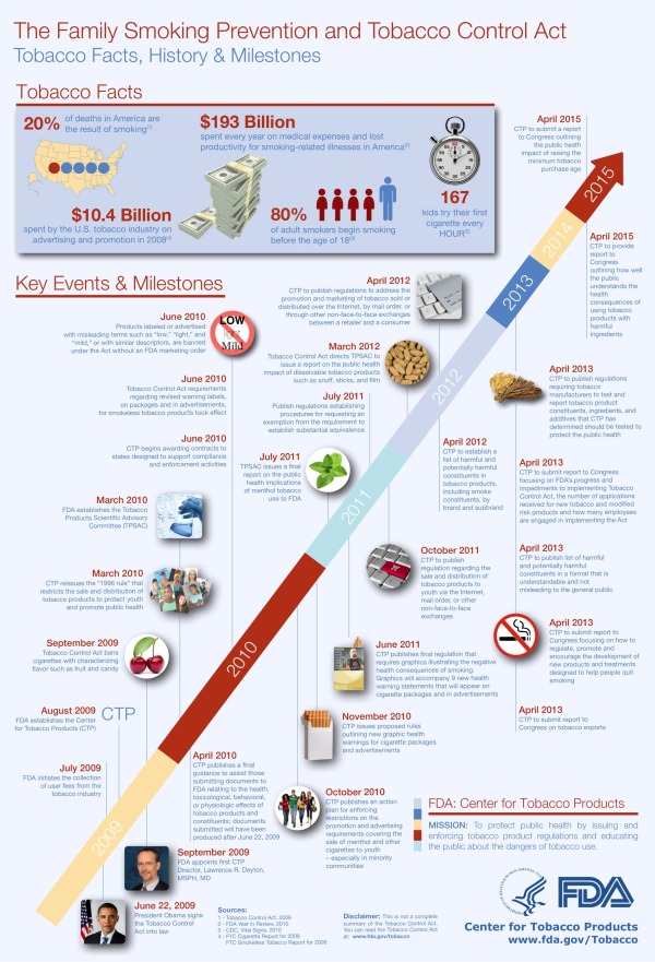
Gov 2.0 Infographic: Bringing the Tobacco Control Act to Life


In 2011, Enspektos, a health marketing communications innovation consultancy, invited InfoNewt (my company) to be involved in a special project the firm was leading on behalf of the Food and Drug Administration’s (FDA) Center for Tobacco Products (CTP).  As a new federal agency, the CTP is tasked with regulating tobacco products and preventing tobacco use – especially among youth.

During the project, we collaborated with the CTP to help create The Family Smoking Prevention and Tobacco Control Act: Facts, History and Milestones, an infographic timeline that covers the past and future actions related to the Tobacco Control Act passed in 2009.

The Family Smoking Prevention and Tobacco Control Act (Tobacco Control Act) is an important piece of legislation with many requirements. This infographic illustrates the history, rationale and major events associated with the Act. The Tobacco Control Act provides all of the events, deadlines and requirements in full and should be used as the final resource for information about the Act.

The infographic is yet another example of Gov 2.0, or the effort to utilize a range of digital technologies to improve government transparency and public understanding of how federal agencies function.  The original Tobacco Control Act is a 68-page document available online, but in actual practice that isn’t easily accessible or understandable by the general public.  The FDA has created several tools to help the public understand the Tobacco Control Act, like a snapshot overview of the Act, an interactive scrolling timeline viewer, a searchable interface and the infographic timeline.

On Wednesday, April 25th, the FDA is holding a LIVE webinar to share the different tools they have created to help everyone access and understand specific information from the 68-page law. 

Attend Our Live Webinar!

As you might expect from an official government publication, the design went through many iterations of review and revisions.  In my opinion, the final infographic is text-heavy, but strikes a balance between optimal design and content that was vetted and approved by many different individuals at the CTP. 

Fard Johnmar, Founder and President of Enspektos agreed to answer some questions about the project.

Cool Infographics: How do you think the infographic and other tools will aid public understanding of the Tobacco Control Act and the CTP? 

Fard Johnmar:  I think the infographic and other tools are an important step for the federal government.  Transforming dense and complicated legislation into simple, visually appealing information products is a very difficult process.  You have to balance the wish to make things clear and concise with a requirement that information be as accurate and complete as possible.  

We had two primary goals: The first was to improve the public’s understanding of the Tobacco Control Act.  The second was to get people within FDA comfortable with using new tools that help visually communicate important regulatory and public health information.  Now that this project is complete, I think FDA will be looking for other ways to communicate about its mission and activities in more visually appealing ways.

Cool Infographics: Do you see other health and medical organizations using visual communications techniques? 

Fard Johnmar: Absolutely.  In fact, since we published the Empowered E-Patient infographic a few years ago, I’ve seen a number of health organizations using infographics to communicate about a range of topics, including GE for its Healthymagination project (click here for a few sample infographics).

Cool Infographics:  How difficult was it to push the infographic through the FDA approval process

Fard Johnmar: As you can imagine, getting final approval for a novel visual project like this can be difficult for large organizations.  However, there was a real passion for the project from Sanjay Koyani, Senior Communications Advisor at the CTP and other members of his team.  They helped to successfully meet all of the legal requirements and answer the numerous questions posed by colleagues at the CTP.  Now there is a higher comfort level at the agency with utilizing these types of visual tools to tell the CTP story.

I truly appreciated being involved in the project, and think this is a really big step towards making the often overly complex information released through official government channels more understandable to more people.

Thanks to Enspektos and the team at the Center for Tobacco Products!

Monday
Mar262012

What About Me? - Intel's Infographic Generator


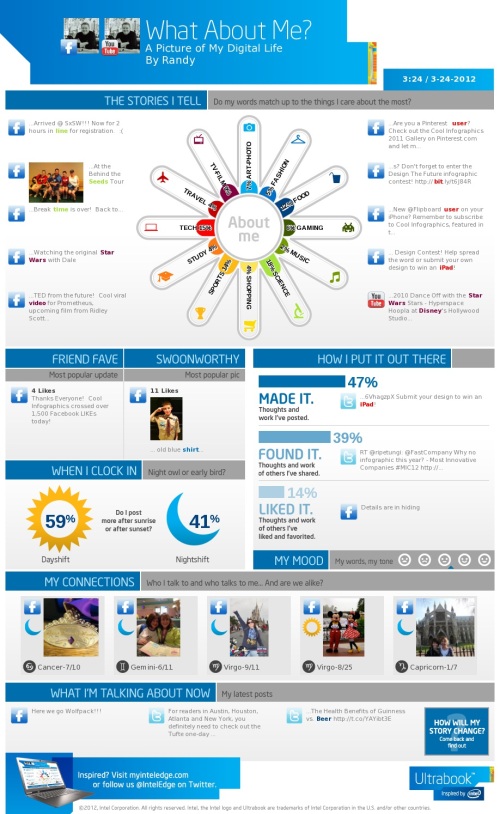
Intel has released What About Me?, an automatic infographic generator that connects to your own Twitter, Facebook and YouTube accounts to create a profile infographic about you.

Social media users know that discovery is half the fun. With What about Me? you can capture a snapshot of your social media life and create your own colorful image, full of clues and facts about one of the most fascinating subjects in the world — YOU!

In general, I’m not a fan of automatically generated infographics.  I find them repetitive, like PowerPoint templates, and that makes everyone’s information look the same.  This one at least incorporates a few photos of your own to give a little personal touch, but not much.

From a design perspective, the “About Me” section is the big central visual element.  I like the color spectrum and the simple icons used for the dominant categories.  It may be just my own data, but all of the percentages are small and fairly close to each other, so visually you don’t see much difference at all.  Am I really that well balanced???

In the “How I put it out there” section, the bars are all portions of the total 100%, so a pie chart or a stacked bar would have been a better chart style to use in the design.  Again, in the “When I clock in” section, these two values are portions of the total 100%, so some type of visualization that shows that would have been helpful to the reader.

I really like the simplicity of the “My Mood” section, and I think they actually made it too small in this design.  As a completely visual element it could reall be much larger and more prominent.  I would really like to have some type of editing capability, like choosing which images are included.

I think they setup the sharing function poorly.  You can save a JPG file of your own design (like mine above) to your own computer.  If you share on Facebook or Twitter it will post the infographic as a photo in your account, but the link it generates will just take someone else back to the front page to design their own.  That’s confusing because the link should be sharing your own design with others, so they would have the option to like or share your design.

If you create your own design, share post the link to your image in the comments!

Found on Mashable

Monday
Jan092012

An Intimate Look at Infographics

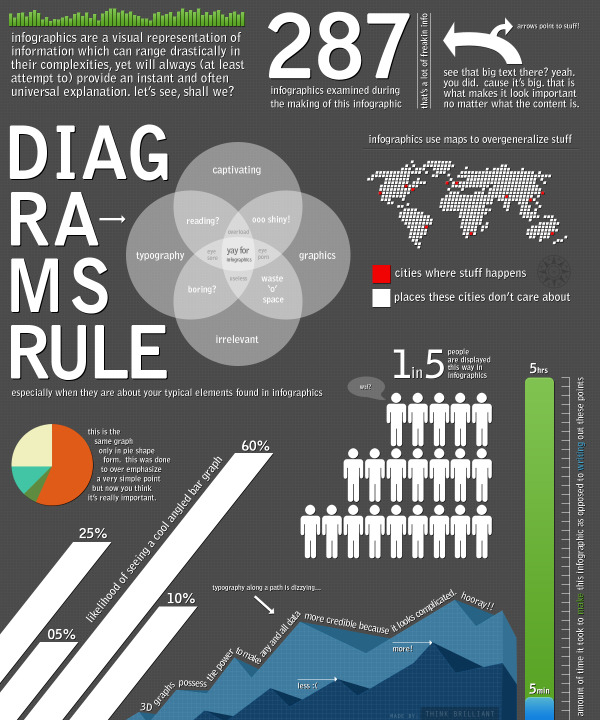
An Intimate Look at Infographics is a fun, satirical look at infographics from Think Brilliant that comes in the form of an infographic!

A well done infographic has the power to capture one’s acute attention span and convey information that would have taken longer to simply read (oh no, not reading!). However, for every brilliantly thought out and well executed mashup of art and data, there now seems to be an influx of mundane and formulaic counterparts infesting the very internet that we hold so near and dear.

Here we have an infographic that explores commonalities between the seemingly vast expanse of contrived infographics that appear to have spawned in mass over the past year. If you’re an infographic purest, view at your own risk.

This one is not new, but it did make me smile!

Thanks to David for sending in the link!

Wednesday
Nov232011

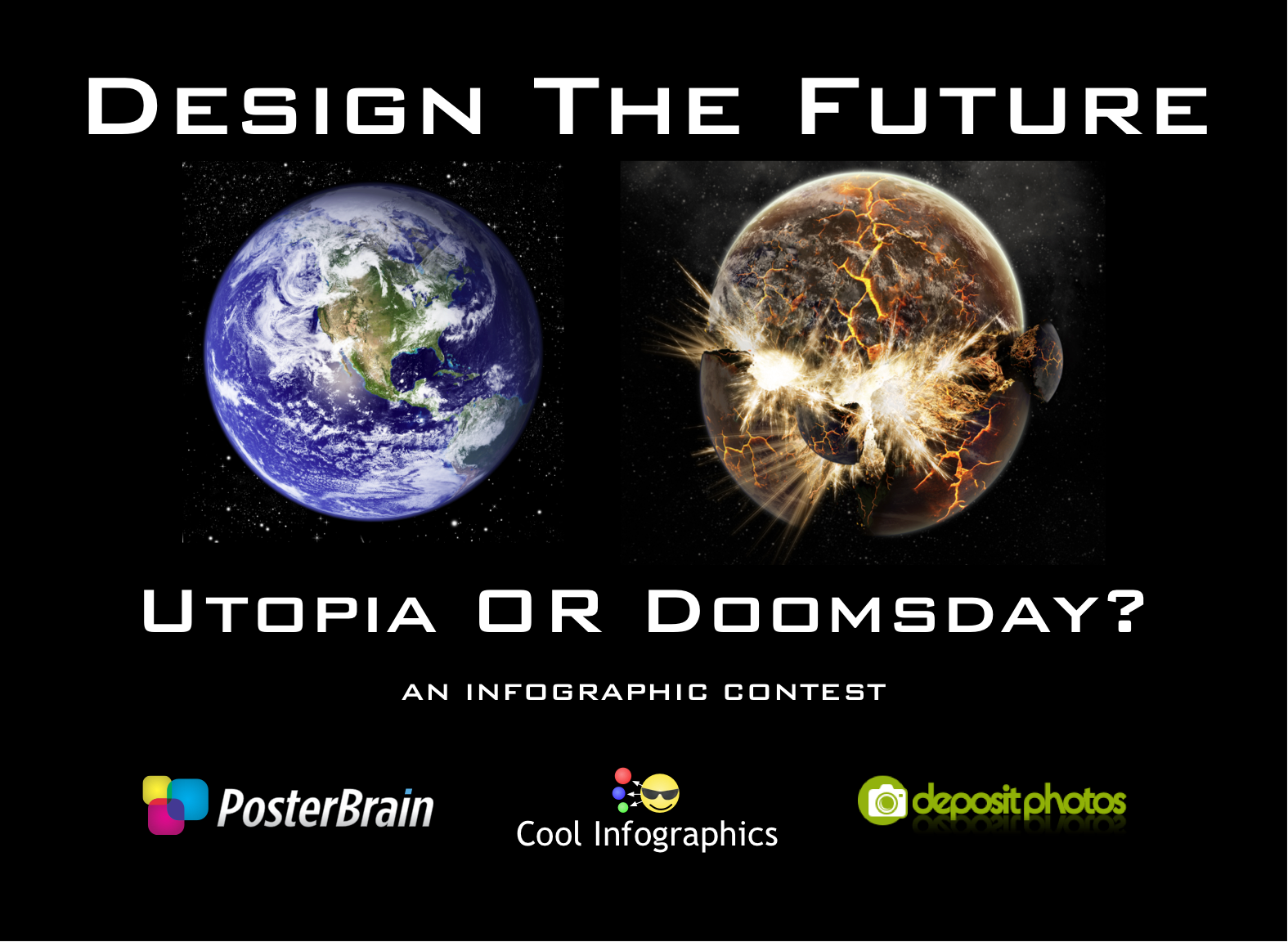
Design The Future - Infographic Design Contest!


Calling All Infographic Designers!


Hosted here on Cool Infographics, PosterBrain.com is sponsoring the Design The Future infographic contest for the best Utopia or Doomsday infographic poster.  The grand prize will be a 16GB iPad2.  Plus random prizes will be awarded throughout, no matter what everyone will get something.  Instead of giving you a subject for the infographic we will provide the data and you will create your own subject.  Data MUST be pulled this data spreadsheet available on Google Docs.  THIS IS THE ONLY SOURCE you can gather data for your infographic from.  Judging will be based on creativity, aesthetics, clarity and the story that your infographic tells.

Contest will end when they receive 50 Entries!  So act fast!


Of course you can create you own illustrations and visualizations, but DepositPhotos.com is offering a free, PROMO CODE to all designer participants.  This promo code gets you FIVE FREE images to use in your design!


Click here for all of the Official Contest Page with of the details.


Once you submit your entry, 33% of the judging criteria will be on how many people “LIKE” your image on our Facebook contest page.  Once you email in your entry, PosterBrain will post them on the Facebook page so you can start gathering LIKEs.

Everyone is encouraged to enter, so even if you have never designed an infographic before, this is your opprtunity.  Plus, PosterBrain will be awarding some random prizes to participants