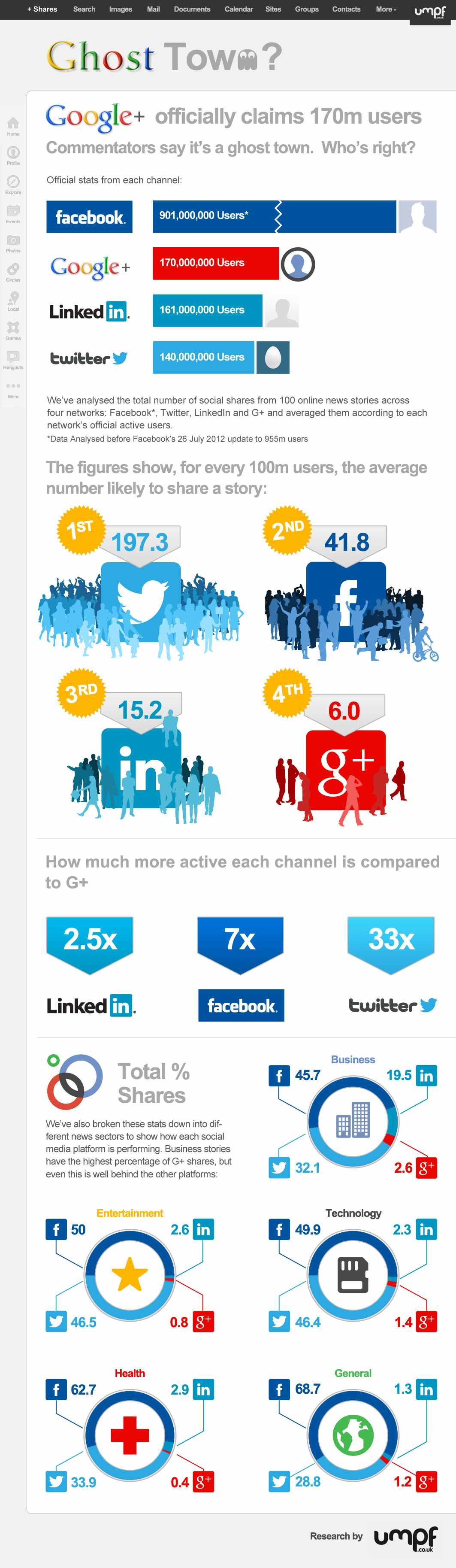
Google+, The newest trend? Or the newest flop? Umpf gets to the bottom of this mystery with a little research and reports it’s results with an infographic! The Google+, Ghost Town? infographic does more than just report the Google+ statistics, it compares them to other key social networks.
There’s been many articles written about how good, bad and indifferent Google+ is. But our favourite debate is the ongoing It’s Really Popular Vs It’s A Ghost Town one.
So what’s the truth? Our findings and infographic (see below) appear to suggest the latter: despite its large number of accounts, G+ is bottom of the list of social network users’ favoured channels.
Google, of course, claims it is fast-growing and really popular. Why wouldn’t they? And, of course, there is research to support that argument. But does this chart, left, for example, which shows the rise in G+ unique visitors, tell the whole truth?
So, we decided to do our own research. It is by no means exhaustive and is only meant as a snapshot view, so judge for yourself.
Certainly a trending topic lately, but also a really good infographic design. Of course it’s framed in a Google+ news feed style layout. Easy to read and colorful. I like the color coding related to the different social network logos, even though some of those blue colors are hard to differentiate.
In the Users bar chart, I love the use of color, putting the data right in the bars and using the logos on the axis to eliminate any need for a legend. Good data visualizations design!
In the “Users Likely to Share” I would have liked to see some sizing of the icons to match the data. Instead, they put the icon illustrations into rank order, continued the consistent color coding and clearly identified 1st, 2nd, 3rd, etc.
The section with all of the doughnut charts (reminiscent of the Google+ Circles icon) also continues the consistent color coding. I’m sure it a rounding issue, but many of the charts only add up to 99.9% instead of 100%.
At the bottom, the two things missing are some type of copyright license as well as the URL linking back to the original infographic landing page.
Infographics about infographics are always fun. Return on Infographics by Bit Rebels and NowSourcing takes a look at some of Bit Rebels’ own data from releasing infographics as part of their marketing.
The impact of an infographic can be measured on many levels, which makes it all just a little bit more complex and complicated to present. With the help of NowSourcing, we have been able to produce an infographic that will compare the traffic and social action impact of an infographic post with a traditional post that does not involve an infographic. It’s through social media analytics that a clear image slowly emerges to tell a story that for some has just been a question without an answer.
They’re pretty clear about this, but remember that this design is completely based on internal data from Bit Rebels. It may be a good indicator of infographics in general, but we don’t know for sure.
Bit Rebels has shared some fantastic data from their internal tracking, which will be of interest to the you, the readers of Cool Infographics. However, the design makes a few mistakes, and we’re all here to learn how to make infographics designs better.
One of my pet peeves, the design messed up the size of the circles in the comparison table. Based on the full-size infographic they released at 975 pixels wide, the smaller circle for 243 Actions is about 55 pixels in diameter. Doing the match for the area of a circle, the diameter of the larger circle for 1,091 Actions should be about 117 pixels wide. In the design, it’s actually about 256 pixels wide! So instead of visually showing a shape roughly 4x larger, it’s actually showing a circle about 22x larger! This is a “false visualization” and mis-represents the data.
Are these comparison data points an average or a total of the 500 posts?
How many infographic posts are compared to how many traditional posts?
Love the use of the actual logos from the social networks in the comparison table, and they should have continued that with the rest of the design instead of just text later in the design.
The blue bars behind the higher comparison value look like bar charts, but obviously don’t match the data. They just fit the text, and have no visual relevance to the data. An indicator icon or highlighting the entire column width would have been better than the bars.
Are the Top 6 Social Networks in rank order? LinkedIN is the top social network for infographics???
The circles near the end of the design are also incorrect. Instead of showing a 10x comparison to match the dollar values, the circles show an over 100x comparison!
You put a lot of thought, energy and sometime money into your long-format post or infographic, and you want to get the most traffic out of it you can, right? Not only is it good SEO practice, but it feels good when someone “likes” your post on Facebook. So why not give yourself the best chance at receiving them? The Best Times to Tweet or Post on Facebook infographic from Raka has the inside scoop!
This handy infographic highlights bitly’s data on the best times to share content on Twitter or Facebook if you’re looking to drive traffic to your site (or any site). Bitly found the best times to tweet for click-throughs are early afternoon Monday – Thursday, while Facebook content posted Wednesday at 3 p.m. generates the highest click-through rates, according to bitly’s data.
But why read words when you can look at pictures? Here’s the best-time-to-tweet-or-post-to-Facebook infographic created by digital agency Raka with data provided by bitly:
I really love designs like this. The data visualization is big and center, and doesn’t need a lot of text to explain the key findings. I would have reversed the color gradient so the the low times are mostly white and the highest times are dark red, but that’s just me.
At the bottom should be some type of copyright or Creative Commons statement, and the URL to the original infographic should also be included in the infographic design itself.
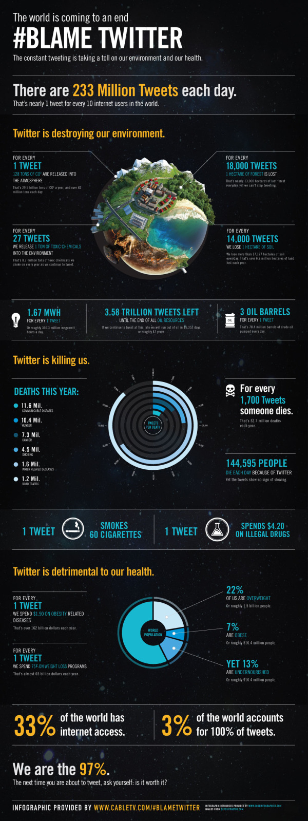
All claims in this infographic are obviously false in nature and are solely intended for the comedic entertainment of readers. We <3 Twitter.
From PosterBrain:
We are sending a HUGE shout out to Tim Cooley for winning our Design the Future Infographic Contest! His infographic, #Blame Twitter, is very creative, informative, visually pleasing, and incredibly well done! We will definitely think twice about what, and how often, we tweet! Congrats again Tim, and thanks to everyone who participated!
Tim took the real data provided for the contest, but fictitiously correlated it to Twitter statistics. In a classic example that “Correlation does not imply causation”, Tim visualized the real-world statistics as if they were caused by Twitter. For example, it is true in the real-world that nearly 13,000 hectares of forest is lost every day, but it has nothing to do with the 233,370,615 Tweets every day.
Ever had this feeling that you were a Slacktivist? Well wonder no more! The Rise of the Slacktivist infographic from sortable.com will put a rest to all your questions!
Is there any value in a Slacktivist? Can 500,000 people on twitter actually change something? Is hitting the streets and protesting the only real way to cause social change? Sortable takes a look at the rise of slacktivism, and the power this movement has.
This design does a good job of telling a story to the reader that is easy to understand in a linear fashion top-to-bottom. It starts with the background of “What is a Slacktivist,” then shares a number of behavioral stats about Slacktivists, a few successful Slacktavist campaigns and finally the “10 Signs you might be a Slacktivist” is a self-check for the readers.
The illustrations are mostly relevant, and the overall design isn’t too crowded with information. I don’t understand some of uses of the social media icons, like why is Twitter representative of volunteering and Facebook representative of taking part in events? They missed the opportunity to visualize some of their data point too, like the Red Cross stats related to the Haiti earthquake. Even at least an illustration of five days on a calendar would help.
Even though there are a lot of Sources, they were thorough and correctly included them in the infographic design. They are also listed on the landing page, but none of that text gets carried along when someone reposts the infographic.
The bottom of the design is missing a copyright statement, and it would be nice to give the designer credit. Readers are generally more receptive to a design when the designer is mentioned because it comes from somebody and not just a corporation.
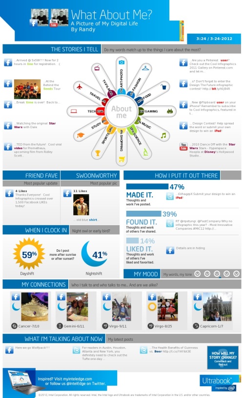
Intel has released What About Me?, an automatic infographic generator that connects to your own Twitter, Facebook and YouTube accounts to create a profile infographic about you.
Social media users know that discovery is half the fun. With What about Me? you can capture a snapshot of your social media life and create your own colorful image, full of clues and facts about one of the most fascinating subjects in the world — YOU!
In general, I’m not a fan of automatically generated infographics. I find them repetitive, like PowerPoint templates, and that makes everyone’s information look the same. This one at least incorporates a few photos of your own to give a little personal touch, but not much.
From a design perspective, the “About Me” section is the big central visual element. I like the color spectrum and the simple icons used for the dominant categories. It may be just my own data, but all of the percentages are small and fairly close to each other, so visually you don’t see much difference at all. Am I really that well balanced???
In the “How I put it out there” section, the bars are all portions of the total 100%, so a pie chart or a stacked bar would have been a better chart style to use in the design. Again, in the “When I clock in” section, these two values are portions of the total 100%, so some type of visualization that shows that would have been helpful to the reader.
I really like the simplicity of the “My Mood” section, and I think they actually made it too small in this design. As a completely visual element it could reall be much larger and more prominent. I would really like to have some type of editing capability, like choosing which images are included.
I think they setup the sharing function poorly. You can save a JPG file of your own design (like mine above) to your own computer. If you share on Facebook or Twitter it will post the infographic as a photo in your account, but the link it generates will just take someone else back to the front page to design their own. That’s confusing because the link should be sharing your own design with others, so they would have the option to like or share your design.
If you create your own design, share post the link to your image in the comments!
Brand Madness! Using Bracketology to Crown a Social Media Champion is a fun infographic design during the NCAA basketball tournament that uses social media scores to determine winning match-ups. From UltimateCoupons.com, this design is a great example of taking boring data (Facebook likes and Twitter followers are available to anyone) and using infographic design to make it fun and engaging to the readers.
March Madness has officially arrived, but the UltimateCoupons.com team has Brand Madness! While everyone else’s mind is on basketball, we decided to fill out a bracket pitting 32 of the world’s most popular brand names against each other with the winners and losers being decided by social media popularity.
This is a great use of the visual company logos and the bracket structure to show the readers all of the match-ups, and you can look closer to see the actual numbers if you want to. Only a year or two ago, this type of blog post would have been all text and a table of numbers, but this is a simple and very effective use of design to grab the readers’ attention.
This is a LONG one, but a good one based on statistics recently published in AdAge. Social Media Stats of the Day from Dream Systems Media visualizes some fo the recent stats about Favebook Twitter and general Social Media usage.
I really like the coloring in this design that visually ties the data to the Facebook and Twitter brands instantly for the readers. Although, big fonts don’t make a data visualization, and a number of percentages included could easily have been visualized as simple pie charts or stacked bar charts. I do think there is too much text in the design, but I can appreciate how specific you have to be when describing the research data and where it came from.
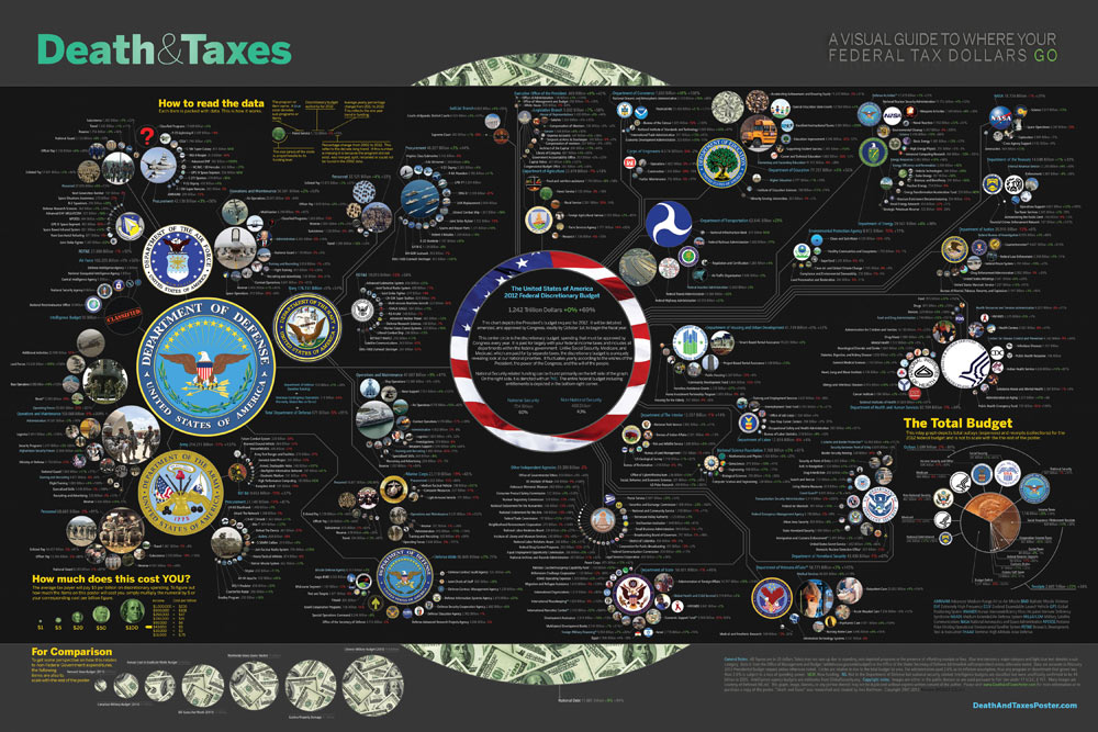
The new 2012 Death & Taxes poster has been released, and this year it’s better than ever. Designed by Jess Bachman (ByJess.net) this poster visualizes the 2012 proposed U.S. Federal Budget. The Death & Taxes poster is one of the best infographics I’ve ever seen, and it gets better every year.
“Death and Taxes” is a large representational graph and poster of the federal budget. It contains over 500 programs and departments and almost every program that receives over 200 million dollars annually. The data is straight from the president’s 2012 budget request and will be debated, amended, and approved by Congress to begin the fiscal year. All of the item circles are proportional in size to their funding levels for visual comparison and the percentage change from both 2012 and 2002 is included so you can spot trends.
PURCHASE: This year, Jess also had the opportunity to partner with Seth Godin and his Domino Project to make the full-size 24” x 36” poster available for purchase through Amazon. Currently, you can purchase a copy of the poster for $19.99. Also, check out Jess’s video introduction on the Amazon page.
POSTER GIVEAWAY: Cool Infographics is giving away one FREE copy of the poster. The free poster will go to one randomly chosen person that tweets a link to this blog post on Twitter and includes the hashtag: #deathandtaxes. I included the hashtag in the post title, so any retweets will be automatically eligible. NOTE: you must also be following me on Twitter (@rtkrum) so that I can send you a direct message if you have won!
I will choose the winner at 12 noon (Central Time) on Friday, November 11, 2011 (11/11/11). I will contact the winner, and order the poster from Amazon to be delivered to the winner.
INTERVIEW: Similar to last year, Jess was willing to answer some behind-the-scenes questions about this year’s poster:
Cool Infographics: What’s the most interesting thing you learned from the 2012 data?
Jess Bachman: Lots of reductions in the military side. It’s mostly from the OCO war funding, but its interesting to see what actually is getting cut the most. Mostly Army funding and RDT&E across the board. I would think the OCO was mostly Operations and Procurement.
Cool Infographics: Has you design process changed at all this year? What software did you use to help dig through the data and create the design?
Jess Bachman: Well this year I tried to work exclusively within the official spreadsheets, rather than pick out the numbers from the paper (PDF) budget. I think it’s more accurate and easier to get totals. Mainly just used excel and photoshop as always.
Cool Infographics: When did the 2012 data become available, and how long did it take you create this year’s poster?
Jess Bachman: It was supposed to be released in February but it was a month late. I started moving on it at a full clip then got involved with Amazon/Godin and the timelines shifted quite a bit, so while I usually get the post out in April, it was released in September this year.
Cool Infographics: How did working with Seth Godin and the Domino project come about?
Jess Bachman: Seth just emailed me out of the blue. We talked and it seemed like a no-brainer.
Cool Infographics: How does working with Amazon and the Domino project change how you print and distribute the poster?
Jess Bachman: Well previously my Mom did most of the shipper and I also had a 3rd party do fulfillment and shipping. It’s a rather time consuming and frustrating process. Sending out orders, doing customer support, paying vendors, etc. Now it’s all in Amazon’s hands. They got it printed and of course are warehousing and shipping it too. I’m quite glad as they do a much better job of shipping than I do. Of course they also take their cut of the profits. As for Domino, they have their own distribution channels and lists and also work closely with Amazon to make sure the product page is well presented too. This year it reached #18 on the best sellers list. I guess that makes me a best selling author. I don’t think I could have accomplished that without Domino/Amazon.
Cool Infographics: I see you made a video to include on the Amazon page, how was that experience?
Jess Bachman: Seth told me they needed a video ASAP so I just made one that afternoon. I suppose I would put more effort into it next year but videos help sell products and i think it does a good job of that.
Cool Infographics: Any new design features added to the poster this year?
Jess Bachman: I wanted to include some non-governmental items in the poster this year for reference. They are in the bottom left and include things like the size of the video game industry, bill gate’s net worth and other such things. When talking about billions of dollars all the time, sometimes you need to get out of government-mode to put those figures into further context.
Cool Infographics: The past posters have been shared very heavily in social media, which social sharing sites have you found most successful?
Jess Bachman: Well, Digg has traditionally been a big asset, but then Digg fell apart so I no longer pay attention to it. In general, I have abandoned the traditional accelerants like Digg, reddit, etc. and instead focus on my network of bloggers and influencers. Combine that with Facebook liking and you can really spread something.
Cool Infographics: Last year we talked about some favorite places that have the poster on display. Any new ones this year?
Jess Bachman: Well, with a larger audience and hopefully more sales, the poster will be everywhere. Unfortunately, I get lots of requests for discounts for schools with tight budgets, but I have no control over price anymore. I can say that an iOS app is in development so that will be interesting. My ultimate goal is to get on the Daily Show to talk about the poster in April. People constantly tell me I need to be on there, and I’m a huge fan, so I figure I have a good shot, just need to nag the right people.
We then analysed the results to bring what we believe is the most up-to-date snapshot of social media usage in the UK. If you like statistics, you can view them all here.
Our infographic, created by Vapour, helps visualise statistics; it outlines the gender and age differences in social media usage.
It needs a title.
I love that they included a link to the data file in GoogleDocs in the original posting.
I like the idea of the Man/Woman stacked percentages. Although, I’m guessing they didn’t calculate the icon shape areas to get the section sizes right, which makes the visualization false. They probably just calculated the height of each section, which visually misinterprets the data. YouTube is shown to be much bigger than it really is because the shape is widest there.
They don’t need the Key/Legend at the bottom (“Legends are Evil”). The social media icons were clearly used in the first bar chart, and could have been included in them all for clarity. Build the data right into the charts, and you don’t need a legend.
At the bottom should be a copyright (or creative commons license), the URL to the original infographic, the Umpf company logo, the sources listed and the designer credit. Once this infographic is posted elsewhere on the Internet (like here on the Cool Infographics blog) all of the information that was included in the original posting is lost. (unless a good blog author, like me, includes the links)


 Randy
Randy