About
Randy Krum
President of InfoNewt.
Data Visualization and Infographic Design

Infographic Design

Infographics Design | Presentations
Consulting | Data Visualizations

DFW DataViz Meetup

Join the DFW Data Visualization and Infographics Meetup Group if you're in the Dallas/Fort Worth area!

Search the Cool Infographics site

Custom Search

Subscriptions:


Feedburner

The Cool Infographics® Gallery:

How to add the
Cool Infographics button to your:

Cool Infographics iOS icon

- iPhone
- iPad
- iPod Touch


Read on Flipboard for iPad and iPhone

Featured in the Tech & Science category

Flipboard icon

Twitter Feed
From the Bookstore

Caffeine Poster

The Caffeine Poster infographic

Entries in web (190)

Thursday
Apr242014

Smart Ways to Combine Content Marketing With SEO

Smart Ways to Combine Content Marketing With SEO infographic

The Smart Ways to Combine Content Marketing With SEO infographic is essentially a big list of the most popular online services in a number of different categories.  Published by blogmost, it’s meant as a reference tool for Marketers to help plan out their content strategies.

Trying to build High Quality Links without paying anyone? This infographic reveals techniques to build them and complete details of good website + mentioned Great SEO & SMO tools for better Marketing.

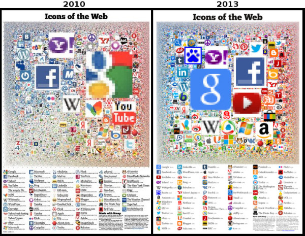
No data or numbers, the most prominent sites and companies are shown for 26 different online service categories.  The randomness of circle sizes appears to visualize some type of information, but there’s no data behind them.  It’s just the designer sizing them to fit the different logos and icons.

The design does a fantastic job of using logos and icons in place of text.  This makes the overall design faster and easier for the audience to read through.  It’s a much more enjoyable experience than reading the text name of all the different companies, brands and sites.

Some description at the top would be helpful to describe how the sites were chosen for readers that find the infographic on other sites.  The URL of the infographic Landing Page on the blogmost site in the footer would also be helpful for the readers to be able to find the original full-size version and associated text.

Found on Visual.ly

Monday
Mar312014

Map of the Internet 2.0 Poster

Map of the Internet 2.0 Poster

Designer Martin Vargic has released an updated version of his Map of the Internet 2.0 that creates what looks like a vintage-style map.  However, this version plots out the major websites and technology companies, with related sites grouped together on the same continent.  The sizes of the websites on the map are scaled relative to their number of visitors, so bigger sites show as bigger geographic regions.

Second version of our flagship project, the Map of the Internet.

This conceptual work of cartography treats major internet sites and enterprises such as Google, Yahoo, Microsoft, HP, and Apple like sovereign states, on a classic map of the world. To explain the dominance and relationships of these entities, they were all given a visual hierarchy that gives prominent treatment to companies with the most users (or sites with the most visitors), surrounding them with smaller countries representing related websites and services.

This poster includes one full map of the internet, 4 minimaps showcasing NSA surveillance, most used social networks, most used internet browser, and worldwide internet penetration, list of Alexa Top 500 websites, quick timeline of the Internet History, top software companies and much more!

The map includes more than 250 separate websites/enterprises as sovereign states, and more than 2000 separate labels.

A high-resolution version is available online, and you can also order 24” x 36” printed posters on Zazzle.

This what I call a 2nd level design, which means it’s a highly detailed design that is meant to present a ton of information to the audience.  This type of design isn’t trying to communicate a key message in a few seconds, but is intended for readers to zoom-in and explore.

Map of the Internet 2.0 Poster Zoom


Found on Business Insider

Tuesday
Feb112014

The "Perfectly Optimized" Page

 The Perfectly Optimized Page infographic

The “Perfectly Optimized” Page infographic states that there is no such thing as a “Perfect Page”. But don’t be discouraged! Moz.com presents 3 key points to be followed to increase user happiness and outreach.

One important takeaway from this post should be that modern on-page SEO is about juggling competing priorities. In general, my recommended ordering of those priorities is as follows:

  1. Create a page that is uniquely valuable to your targeted searchers.
  2. If at all possible, make the page likely to earn links and shares naturally (without needing to build links or prod people).
  3. Balance keyword targeting with usability and user experience, but never ignore the critical elements like page titles, headlines, and body content at the least.

There’s no such thing as a “perfectly optimized” page, but I took a stab at drawing up the mythical beast anyway.

Over time, what’s “perfect” might change, and new services, platforms, and areas of optimizational opportunity could arise. But for the past few years (notwithstanding some newer tactics like Google’s rel=author), the model described in this post has held relatively stable. The “O” in SEO is getting broader, and I think that’s a wonderful thing for marketers of all stripes. Targeting an algorithm instead of people is far worse than hitting both birds with the same handful of optimization stones.

This is a great us of infographics and data visualziations as part of a larger article.  The infographics can stand on their own and be shared online, but also fit inn perfectly with the text article.  This specific design is more of a blueprint diagram without showing and data, but has been very popular by itself.

Found on Hubspot.com and Hombrehormiga1

Monday
Feb102014

The Internet Map

The Internet Map is an interactive, zoomable design that uses a combination of algorithms and the Google Earth API to display 350,000 websites as sized circles representing their overall traffic.

Designed by Ruslan Enikeev, the color-coding shows the country affiliations.

Like any other map, The Internet map is a scheme displaying objects’ relative position; but unlike real maps (e.g. the map of the Earth) or virtual maps (e.g. the map of Mordor), the objects shown on it are not aligned on a surface. Mathematically speaking, The Internet map is a bi-dimensional presentation of links between websites on the Internet. Every site is a circle on the map, and its size is determined by website traffic, the larger the amount of traffic, the bigger the circle. Users’ switching between websites forms links, and the stronger the link, the closer the websites tend to arrange themselves to each other.

Semantic web

The map of the Internet is a photo shot of the global network as of end of 2011 (however, baloons show actual statistics from Alexa). It encompasses over 350 thousand websites from 196 countries and all domain zones. Information about more than 2 million links between the websites has joined some of them together into topical clusters. As one might have expected, the largest clusters are formed by national websites, i.e. sites belonging to one country. For the sake of convenience, all websites relative to a certain country carry the same color. For instance, the red zone at the top corresponds to Russian segment of the net, the yellow one on the left stands for the Chinese segment, the purple one on the right is Japanese, the large light-blue central one is the American segment, etc.

I even found Cool Infographics on the map!

Found on Fast Company

Monday
Jan062014

The Evolution of Reddit

The Evolution of Reddit Through Time infographic

The Evolution of Reddit Through Time infographic from Randal Olson.com covers the history of Reddit for the past 7 years. With thousands of active subreddits, the visual above displays the 24 most active. Track the popularity of each subreddit through the years!

The graph below shows how 24 of the most active subreddits have changed over time. I ordered the subreddits by the time that they first appeared on Reddit. I recommend zooming in so you can see it better.

(I should note that I purposely excluded /r/reddit.com from this graph because it dominates the entire graph until about 2008, then screws things up again when it got closed down in late 2011.)

The biggest thing that you may notice is that there were very few subreddits from 2006-2008. In fact, there was only one subreddit before 2006 (/r/reddit.com). The majority of the content in 2006-2008 was focused on more techie-friendly subjects: programming, science, politics, entertainment, and gaming. Major subreddits dedicated to solely picture and video content started becoming popular in mid-2008, and even then their posts only comprised less than 1/4 of Reddit’s content. It wasn’t until 2011 did the picture-related subreddits really start taking over, and Reddit never looked back after that.

This graph covers so many changes in the Reddit community that it can’t explain what happened by itself. In the following sections, I will take a closer look at how the Reddit community evolved on a year-by-year basis.

Love these data visualizations of the reddit’s evolution over time from Randy, a 3rd year Computer Science graduate research assistant at Michigan State University.  In his original post, he actually visualizes each year separately, and you can see some major milestones and clear changes in the reddit universe.

The Great /r/reddit.com Spike of 2009

The total growth of reddit over the years is lost in the 100% Stacked Area chart; however, you can clearly see the growth of subreddit content as a portion of the whole.

Found on Flowing Data!

Monday
Dec302013

The State of Social Media 2013

The State of Social Media 2013 infographic

The State of Social Media 2013 summarizes some of the major milestones and events in social media that happened during the last 12 months.

What a wild year it’s been. You could say that 2013 was the year of social media and you’d be correct. What was once a novelty for people bored and surfing on the ‘net has risen to be an industry in and of itself that companies large and small have embraced around the world as a powerful cornerstone of their marketing initiatives.

In case you got lost in the details of 2013, we’ve laid out all the notable moments of the year, month by month, in this handy infographic.

There are a handful of statistics listed in the design that should have been visualized instead of just shown in text.  The use of logos and images from the web do a good job of showing the specific events.

Designed by Infographic Promotion UK

Friday
Dec202013

Icons of the Web 2013

Icons of the Web 2013 infographic poster

Icons of the Web from the open source Nmap Security Scanner Project (http://nmap.orgis an update to the hugely popular project from 2010.  This update brings all new data, a n updated interactive viewer and printed posters available for sale through Kickstarter for a limited time (until January 17th!)

The Nmap Project is pleased to release our new and improved Icons of the Web project! Since our free and open source Nmap Security Scanner software is all about exploring networks at massive scale, we started by scanning the top million web sites for 2013 (as ranked by the analytics company Alexa). We then downloaded each site’s favicon—the small icon displayed next to a site title in browser bookmarks and tabs.

We scaled the icons in proportion to each site’s monthly reach (popularity) and placed them in a giant collage. The smallest icons—for sites visited by only 0.00004% of the Internet population each month—are 256 pixels square (16x16). The largest icon (Google) is 394 million pixels. The whole collage is 5 gigapixels.

This is an update to a similar project we performed in 2010. That edition proved very popular. It was written up in the New York Times and other sites, exhibited at the Newseum in Washington D.C., and even found its way into the Guinness Book of World Records (see the press section for more). It is interesting to compare the new data with the old to see how the Internet has evolved in recent years.

Since your web browser would likely choke on a 5 gigapixel image, we’ve created the interactive viewer below. It’s divided into 813,200 small files which are only loaded as needed based on your location and zoom level. Click and drag to pan and use the mouse wheel (or toolbar) to zoom. For mouse wheel zoom, you may need to interact with the viewer first (e.g. drag something). A new feature this year allows you to hover your mouse over an icon to see the site name. You can also click on icons to visit the actual sites, but be careful with that! Even even sites with cute icons (like the cartoon Hamster) can be pornographic or worse. We have also added a fullscreen viewing option.

To find your favorite site (or your own site), type in the domain name (example: reddit.com) and hit search.

Our most common request in 2010 was for a physical poster version. We only printed them for Nmap developers last time, but now we’re making them available to anyone who orders by January 17.

An update to a very cool design.  I ordered a poster!

Check out the comparison to the 2010 poster!

Icons of the Web 2013 poster comparison

Cool Infographics is in there too!  See if you can find it.

Thanks to Fyodor for sending in the link!

Tuesday
Dec172013

Robots Rule the Internet

Bot Traffic Report 2013 infographic

The Bot Traffic Report 2013 from Incapsula clearly shows that robots already rule the world…I mean the Internet.  Humans are now just a minority of the traffic online.

We see a 21% growth in total bot traffic, which now represents 61.5% of website visitors. The bulk of that growth is attributed to increased visits by good bots (i.e., certified agents of legitimate software, such as search engines) whose presence increased from 20% to 31% in 2013.

31% of Bots Are Still Malicious, but with Much Fewer Spammers

While the relative percentage of malicious bots remains unchanged, there is a noticeable reduction in Spam Bot activity, which decreased from 2% in 2012 to 0.5% in 2013. The most plausible explanation for this steep decrease is Google’s anti-spam campaign, which includes the recent Penguin 2.0 and 2.1 updates.

Nice infographic with a focus on telling one story really well.

Thanks to Jordan for posting on Google+


Monday
Dec092013

Google’s 200 Ranking Factors

Google’s 200 Ranking Factors infographic

Google’s 200 Ranking Factors is a very detailed list of the known 200 aspects that Google considers in their ranking formulas.  The overall length of the infographic is the major visual feature that catches your attention, and communicates a clear message about Google’s immensely complicated algorithm and how difficult SEO can be.  The second level of of the design is the actual details about each and every one of those ranking factors that the audience can read if they want specific information.

Google has confirmed that they use approximately 200 ranking signals in their algorithm. However, they’ve never publicly listed them all. While this infographic is by no means official, it aggregates the best information we have about how Google ranks pages and websites.

The infographic was published on Entrepreneur.com, designed by Single Grain and based on information collected and published by Backlinko.

Found on Holy Kaw! and Search Engine Journal

Friday
Dec062013

29 Powerful Tools for a Social Media Marketer

29 Powerful Tools for a Social Media Marketer infographic

A Productive Day in the Life of a Social Media Marketer from Razor Social is a great use of an infographic design within a larger content strategy online.  The larger piece is an article that lists out all 29 tools, with links and descriptions, but the infographic shows a character using all of the tools throughout the day.  So the infographic grabs the attention of the audience and gets shared frequently, with links back to the full article.

The demands on us to market our products and services using social media is constantly increasing and the technology/tools required to support this is also increasing.

We start early morning and we finish late at night.  How many of you check your Twitter or Facebook account last thing in the evening and first thing in the morning?

So we thought it would be a good idea to take a look at a very busy day in the life of a Social Media Marketer.  During the  day there are so many tools and tasks.  If you work alone then we certainly wouldn’t expect you to do everything listed here or use all the tools we suggest, but if you are part of a team then you could share out the tasks and tools to make it easier.

A special thanks goes to Donna from Socially Sorted who is my go to person when I want anything visual done.  Thanks Donna.

The infographic design does a good job of removing most of the text descriptions and just using icons and logos to represent the various tool.  Interested readers can dig into the full article for more information.

The footer is missing the URL link back to landing page with the article.  When people post infographics on blogs and social media sites, they aren’t always good about linking back to the original.  By including the text URL in the infographic itself, you can make sure all of the readers can find the landing page.