About
Randy Krum
President of InfoNewt.
Data Visualization and Infographic Design

Infographic Design

Infographics Design | Presentations
Consulting | Data Visualizations

DFW DataViz Meetup

Join the DFW Data Visualization and Infographics Meetup Group if you're in the Dallas/Fort Worth area!

Search the Cool Infographics site

Custom Search

Subscriptions:


Feedburner

The Cool Infographics® Gallery:

How to add the
Cool Infographics button to your:

Cool Infographics iOS icon

- iPhone
- iPad
- iPod Touch


Read on Flipboard for iPad and iPhone

Featured in the Tech & Science category

Flipboard icon

Twitter Feed
From the Bookstore

Caffeine Poster

The Caffeine Poster infographic

Tuesday
Aug202013

The History of Music Media - From Vinyl To Bitstreams

The History of Music Media infographic

A creative timeline view of The History of: Music Media infographic from Indigo Boom. The colors track the popularity of each new and old source of music media through the years. From left to right it goes 0% popular to 100% popular. 

Selling music as recordings first became possible in 1877 with the introduction of the phonograph cylinder. Since then media formats have developed and radically changed the way we listen, and recently even where we can listen to music. We have looked at the last 30 years of music format development and popularity in the infographic below.

Beautiful, colorful design. This is a vertical stacked area chart covering the last 30+ years of music sales. You can see that in 1980 (where the chart begins) vinyl was already in decline. CDs have had a big run, but downloads are obviously growing to become the new dominant method to get music.

I like that the design tells one story really well, and doesn’t get into a whole bunch of extra data points. It’s a simple, clear story to the readers who can understand the content quickly and then move on.  

The source listing of The RIAA is too vague.  Source listings should include a link to the specific data so others can examine the original dataset if they wish.  I went to the RIAA site, and it appears that they are selling this information in a report. Publishing the data publicly in an infographic may be a violation of the terms of service or copyright of the report, but I can’t tell because I can’t determine where the specific data originated.

The URL to the infographic landing page should be included in the footer of the design so readers can find the original when they come across a smaller version posted on another site.  Not all sites are good about linking back to the original.

Thanks to Bogdan for sending in the link!

Monday
Aug192013

Evening Etiquette: A Gentleman's Guide

Evening Etiquette: A Gentleman's Guide infographic

Gentleman is not just a title, it is a way of life. The Evening Etiquette: A Gentleman’s Guide infographic created by Boisdale explains the finer points to being a Gentleman. The infographic shares tips on how to look the part, what to wear, and dinner advice.  A great follow-up to the last post about matching ties.

Being a gentleman is more than opening the door for the ladies. For men to truly live up to this title, they must look and act the part in all areas of life -  from grooming, style and culture to knowledge of food and booze and the proper treatment of women.  Making these gestures a natural part of one’s behaviour is how a true gent stands out from the boys.

In order to help lads mature into men of virtue, Boisdale has created an evening etiquette guide. From knowing one’s tweed and collars to the proper table setting and whiskey protocol, this infographic will turn those willing into a man ladies want and other men aspire to be.

Another great visual explanation, that shows the reader the information with illustrations and images instead of spelling out the information with too much text.

Thanks to John for sending in the link!

Tuesday
Aug132013

How to Match Shirt and Tie Patterns

How to Match Shirt and Tie Patterns infographic

If you have some trouble balancing your serious business side with your fun side, a look at the How to Match Shirt and Tie Patterns infographic could be helpful. The infographic from Beckett Simonon shows a few examples of complicated patterns that work together, and then some to definitely stay away from.

So you’ve been wearing solid ties and shirts for a while, you think you look great but you feel is time to earn some extra style points by adding some patterns? No worries, we got you covered! Shirt and tie patterns are great if you want to stand out from the crowd, they are also fun and will bring a new life to your look. Just make sure your pattern groupings are far from making people dizzy and fall hypnotized. We made this cheat guide so you can learn the basics and develop your own combinations and style from there. Enjoy!

Great visual explanation design that stays focused, and tells one story really well.

Thanks to Nicholas for sending in the link!

Monday
Aug122013

Design Client Engagement Poster

Design Client Engagement Poster

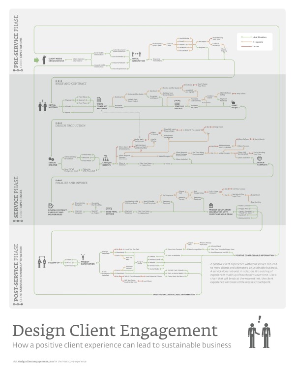
The Design Client Engagement Poster argues that a positive client experience can lead to a sustainable business. The poster separates the experience into 3 phases. The Pre-Service Phase is about client’s expectations, the Service Phase is about the client’s experiences, and the Post-Service Phase is about client satisfaction/dissatisfaction. This poster can be found on Design Client Engagement.com and is available for purchase for $25 + shipping here.

A positive client experience with your service can lead to more clients and ultimately, a sustainable business. A service does not exist in isolation; it is a string of experiences made up of touchpoints over time. Like a chain that will break at the weakest link, the client experience will break at the weakest touchpoint.

Cool visual explanation design created by Matt Pasternack from Nack Creative can be found on www.designclientengagement.com!

Wednesday
Aug072013

Don't Design by Committee!

Design by Committee chart

Rule #5: Avoid branding by committee or focus group.  This is true for most design projects.  It doesn’t matter if the project is a logo, and advertisement, a product or an infographic.  The number of people may be off though.  I find a small number of people can create a fantastic design, but it goes downhill quickly beyond that.

From 7 steps to create a killer brand, by Jim Price, posted on StockLogos.com

It’s good to be inclusive and seek opinions and ideas. But if you form a committee and put everything to a vote, you’re likely to end up with a least-common-denominator brand that’s bland, uninspired, and may look more like a hybrid camel-elephant than the thoroughbred you’d hoped for.

Found on the Brands of the World Facebook feed.

Tuesday
Aug062013

How Big Are The Biggest Waves Ever Surfed?

How Big Are The Biggest Waves Ever Surfed? infographic

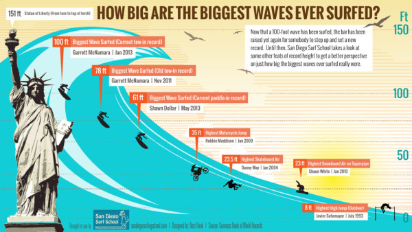
By using a well recognizable symbol like the Statue of Liberty, the How Big Are The Biggest Waves Ever Surfed? infographic from San Diego Surfing School can show you how much higher you can get with surfing than other sports.

Now that a 100-foot wave has been surfed, the bar has been raised yet again for somebody to step up and set a new record. Until then, we take a look at some other feats of record height to get a better perspective on just how big the biggest waves ever surfed really were.

Clear design that tells one story really well.  The visual comparison to the Statue of Liberty is instantly recognizable to readers.

Thanks to Melissa for sending in the link!

Tuesday
Aug062013

It's Time to Empower Moms

It's Time to Empower Moms infographic

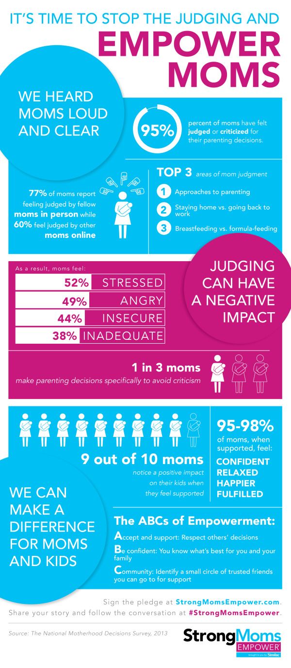
The verdict is out; Support mother’s decisions on how they raise their children. Based on the StrongMoms Empower, The National Motherhood Decisions Survey from Strong Moms Empower, many mothers make decisions on how to raise their kids to avoid criticism!

In conjunction with the StrongMoms Empower program, the National Motherhood Decisions Survey was conducted to gauge how moms feel supported or judged. This infographic illustrates the survey findings, which include: 95 percent of moms have felt judged or criticized; one in three moms makes parenting decisions to avoid criticism; nine out of ten moms notice a positive impact on kids when they feel supported. For more information please visit StrongMomsEmpower.com

Good design.  The key message is very clear.  You don’t have to read the whole infographic to understand that the infographic wants you to support moms in a positive way.  Also, a very clear call-to-action at the end with the link to signing an online petition.

Found on http://visual.ly

Friday
Aug022013

The 2012 Feltron Annual Report

The 2012 Feltron Annual Report

The 2012 Feltron Annual Report is a report by information designer Nicholas Felton whose numbers were gathered with a custom-built iPhone app called Reporter. At random intervals each day the app sent reminders to complete a survey. The results of these questions were saved alongside background measurements to form the basis of this document. You can see the examples of the report at Feltron.com and buy it at the shop.

An extensive write up can be found on Fast Co Design:

Today, you probably know Nicholas Felton best for his most widely seen work, Facebook’s Timeline. But since 2005, he’s been working on a cult-favorite project all his own, the annual Feltron Report. The 2012 version is out now for $28.

As always, the report is a meticulously documented year in review of everything he’s done, presented in a series of rich infographics that push the boundaries on personal data quantification. With a glance, you’ll learn some of Felton’s most intimate details. Each day, he consumes coffee around 10:40am and booze around 8:38pm. He spends about 4x as much time with his girlfriend as his mother. And on June 20, he shot a Glock 22.


Found at http://feltron.com

Thursday
Aug012013

Choosing a CMS for Your Business

Choosing a CMS for Your Business infographic

This graphic will help you figure out what is the best Content Management System (CMS) for you and your business. Discover what a CMS is, types of CMS, popular CMS, market shares and advantages with, The Most Popular CMS for Your Business Needs infographic posted on Dot Com Infoway

Chennai, India Dot Com Infoway (DCI), a premier IT company providing offshore IT outsourcing solutions to businesses across the globe, has announced the release of its latest infographic, titled “Content Management Systems: Choosing the Right One for Your Business Needs”. The infographic provides a top to bottom look at various CMSs and chalks out a road map for organizations, businesses and individuals looking to choose content management systems perfect for their needs.

The infographic outlines the fundamentals of content management systems, the industries in which they find use and the types of CMSs available. It is replete with information, data, statistics and illustrations such as the date of initial release, the platform used, the latest version, the number of themes it has, average setup and customization cost, average monthly maintenance cost, the number of websites using the CMS, the popular websites that use the platform and the top industries using the CMS.

“With the recent exponential growth of nightly builds of CMSs’ modules and plugins, we thought this would be the perfect time to showcase the CMS industry with an infographic that provides users with an all-around perspective. Our run through of key aspects of various CMSs, will help firms make better business decisions by taking advantage of all the information at their disposal,” said Venkatesh C. R., CEO of Dot Com Infoway.

The infographic also provides statistics on the market share of various content management systems. Based on the analysis and research data, WordPress, with a market share of 54.4%, has a competitive advantage over other top CMSs. Following WordPress, (with margins of difference of more than 45%) are Joomla and Drupal with market shares of 8.9% and 7% respectively.

Personally, I run this site on the Squarespace.com CMS platform, and I’m very surprised that it wasn’t listed in the infographic.  I realize there are over 1,200 CMS platforms, so they had to make some hard choices about which ones to include.

The design does a good job of using the platform logos to clearly identify the different players.  I wish the numerical data associated with each platform was visualized instead of just shown in text.  It very hard for a reader to compare the costs or stats between the platforms when all of the data is only in text.

Also, the data is not clearly sourced.  The sites where the data was gathered from are listed, but no specific links the pages with the actual data used, like market share numbers.  Most of the source sites are actually lookup and comparison tools, so it would be hard to list specific URLs for some of the data.

Found on bestinfographics.co

Tuesday
Jul302013

What Do 7 Billion People Do?

What Do 7 Billion People Do? infographic

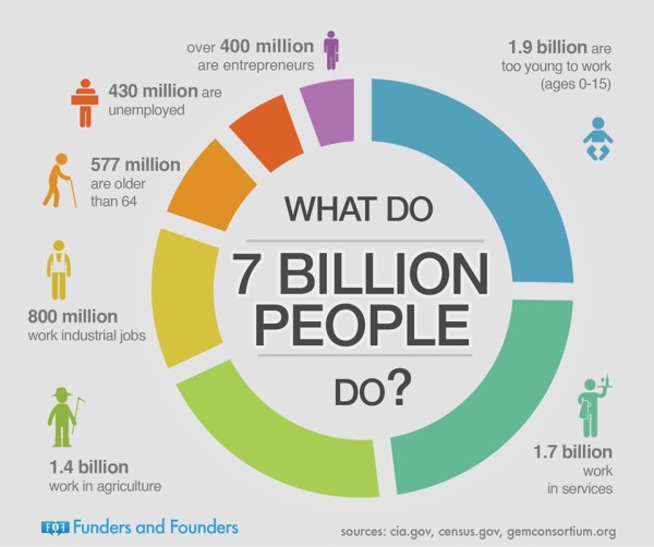
This is a page out of Funders and Founders future book. It is a circle graph of the population of the world. The What Do 7 Billion People Do? infographic simplifies the worlds jobs into broad groups. Entrepreneurs are still the smallest group!

We explain entrepreneurship and startups visually through infographics. Here you can see draft notes from our future book.

Found on Funders and Founders!