About
Randy Krum
President of InfoNewt.
Data Visualization and Infographic Design

Infographic Design

Infographics Design | Presentations
Consulting | Data Visualizations

DFW DataViz Meetup

Join the DFW Data Visualization and Infographics Meetup Group if you're in the Dallas/Fort Worth area!

Search the Cool Infographics site

Custom Search

Subscriptions:


Feedburner

The Cool Infographics® Gallery:

How to add the
Cool Infographics button to your:

Cool Infographics iOS icon

- iPhone
- iPad
- iPod Touch


Read on Flipboard for iPad and iPhone

Featured in the Tech & Science category

Flipboard icon

Twitter Feed
From the Bookstore

Caffeine Poster

The Caffeine Poster infographic

Wednesday
Sep042013

The Guide to Star Trek Uniforms

The Guide to Star Trek Uniforms infographic

The Gude to Star Trek Uniforms infographic from Costume Supercenter. Make sure you know what uniform your wearing!

When the original Star Trek television series started, male and female officers wore similar outfits. The male Star Trek uniforms consisted of black pants, black boots and a velour shirt with the symbol on the left side. Females wore the same type of shirt, with black boots and tights, and a black skirt, although in some cases they wore black pants. The color of shirt worn identified the branch the crew member belonged to. Those in green shirts worked for command personnel, while beige stood for operations, and blue was for medical personnel only. The velour shirts were changed to nylon shirts starting in the third season. You can find many of the Star Trek Costumes here.

Don’t be the red-shirted ensign!

The footer of the design should include the copyright information and the URL to the original infographic landing page so readers can see the full-size infographic.  The Costume Supercenter logo should also be somewhere on the design to connect the infographic to the publishing company.

Found on Visual.ly

Tuesday
Sep032013

The Racial Dot Map

The Racial Dot Map Chicago

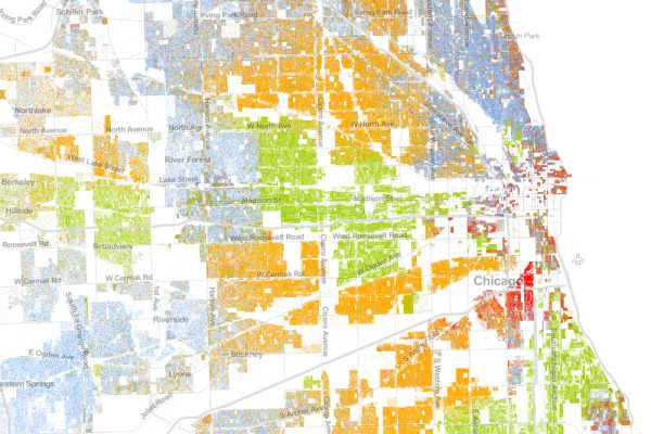
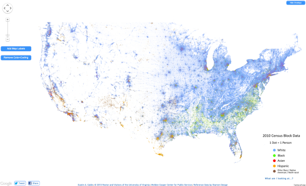
The Racial Dot Map visualizes the 2010 U.S. Census data, where every individual person is represented by a single, color-coded dot.  The color coding shows the racial groupings gathered by the census.

This map is an American snapshot; it provides an accessible visualization of geographic distribution, population density, and racial diversity of the American people in every neighborhood in the entire country. The map displays 308,745,538 dots, one for each person residing in the United States at the location they were counted during the 2010 Census. Each dot is color-coded by the individual’s race and ethnicity. The map is presented in both black and white and full color versions.

The map was created by Dustin Cable, a demographic researcher at the University of Virginia’s Weldon Cooper Center for Public Service. Brandon Martin-Anderson from the MIT Media Lab deserves credit for the original inspiration for the project. This map builds on his work by adding the Census Bureau’s racial data, and by correcting for mapping errors.

Each of the 308 million dots are smaller than a pixel on your computer screen at most zoom levels. Therefore, the “smudges” you see at the national and regional levels are actually aggregations of many individual dots. The dots themselves are only resolvable at the city and neighborhood zoom levels.

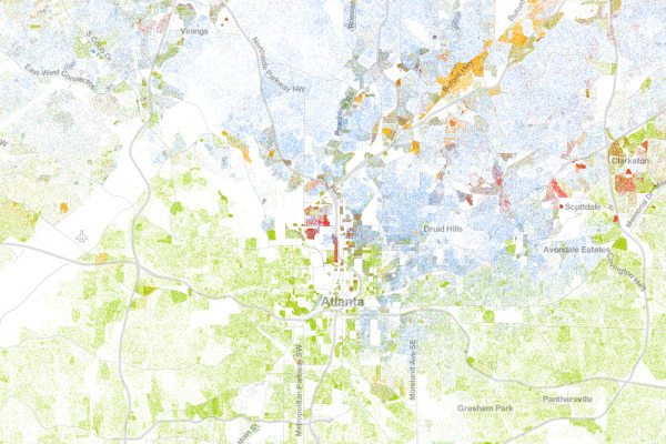
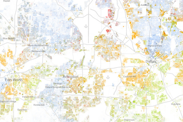
Each dot on the map is also color-coded by race and ethnicity. Whites are coded as blue; African-Americans, green; Asians, red; Hispanics, orange; and all other racial categories are coded as brown.

The map is an interactive, zoomable map online of the entire country, and allows you to explore any U.S. locations.  Chicago is show above.

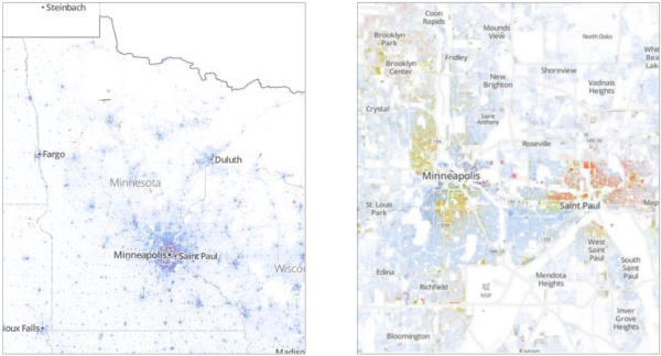
Since the dots are smaller that screen resolutions where the viewer zooms out, the data is aggregated to pixels at each level of zoom.   The Minneapolis-St. Paul metro area is highlighted on the site as an example of the aggregation.  You can see the more detailed dot pattern on the right at the higher zoom level.

The Racial Dot Map Minneapolis

I would love to see this added as a layer in Google Earth!  Wouldn’t that be cool?

Thanks to Renee for sending in the link!  Also, found on Wired.

Atlanta:

The Racial Dot Map Atlanta


Dallas-Fort Worth:

The Racial Dot Map Dallas Fort Worth


The entire U.S.

The Racial Dot Map USA

Friday
Aug302013

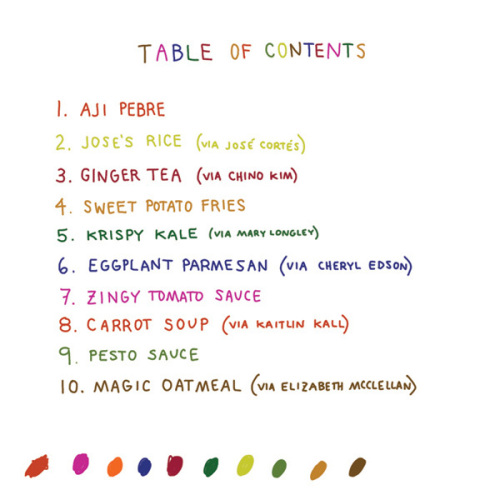
Infographic Cookbook - Picture Cook

Picture Cookbook infographic

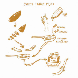
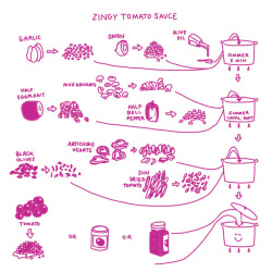
A new way to take directions for cooking, the Picture Cookbook infographic from Katie Shelly. It is an easy step by step visual explanation design that will get you to the desired tasty product, with very little use of words!

The following recipes are not intended as precise culinary blueprints. Instead they are meant to inspire experimentation, improvisation and play in the kitchen.

Great design work by Katie to create recipes as visual explanations.  The hand-drawn style also helps reinforce the flexible methods.  They aren’t strict, rigid recipes with sharp images and corners, but instead are more casual which allows for interpretation and change.  I love the color-coding for easy navigation within the book too.

Found on Fast Company

Available soon for purchase in print in October 2013.  I’ve already pre-ordered my copy.

Thursday
Aug292013

Comic Tribute to Bill Watterson (Calvin & Hobbes)

Comic Tribute to Bill Watterson

Calvin & Hobbes is easily my all-time favorite comic, and Bill Watterson was able to beautifully offer thousands of life lessons through the 10 years of C&H comic strips.  Freelance cartoonist Gavin Aung Than has designed this fantastic Comic Tribute to Bill Watterson, and posted it on his site, Zen Pencils.

The quote used in the comic is taken from a graduation speech Watterson gave at his alma mater, Kenyon College, in 1990. Brain Pickings has a nice article about it. The comic is basically the story of my life, except I’m a stay-at-home-dad to two dogs. My ex-boss even asked me if I wanted to return to my old job.

My style is already influenced by Watterson, but this is the first time I’ve intentionally tried to mimic his work. It’s been fun poring through Calvin and Hobbes strips the past week while working on this comic and it was a humbling reminder that I still have a long way to go.

The quotes I’ve used in the write-up above are taken from the introduction to The Complete Calvin and Hobbes collection, which sits proudly on my desk.

So, why am I posting this on Cool Infographics?  I want to pose the question: Should we consider this to be an infographic?

There’s no numeric data.  No charts.  No data visualizations.  No call to action.

However, there is information.  The information source is Bill Watterson’s speech from 1990, and the illustrations do a great job of communicating the message visually.  The image layout follows the tall infographic style that is easy to share online.

My own opinion is that “Yes” this is an infographic.  What do you think?

Found on LifeHacker


  I miss Calvin & Hobbes…

Thursday
Aug292013

Consumer Attitudes to SMS Marketing and Texts Alerts

Consumer Attitudes to SMS Marketing and Texts Alerts infographic

The Consumer Attitudes to SMS Marketing and Texts Alerts infographic is the results of a survey done by Text Marketer. The survey was conducted to find out the consumers’ view on receiving text alerts from companies. 

The infographic is based on an exclusive survey of over 1,350 consumers in to their attitudes to SMS marketing. 

The results highlight that 84% of customers want to receive appointment reminders, 61% want order confirmations and 89% would like delivery notifications via text; showing there are a lot of ways to market through this channel that customers love. 

48% of consumers are also likely to respond to a text from a company they have previously purchased from. Consumers love special offers by text and like to be able to ask questions to companies via text messages.

Since the data is from their own survey research, there are no additional data sources cited.  The purpose of the first section is to establish the credibility of the data, but the total number of respondents alone isn’t enough.  Surveys like this target specific consumers, and use screener questions to target a specific portion of the population.  What type of consumers were surveyed for this report?

The visualizations of the data are clear, and the iPhone illustrations for the results of each question break apart the data nicely.  It’s a little hard for readers to understand that the lineup of iPhones is meant to add up to the total of 100% of respondents for each question.

The footer should include a copyright notice, and the URL back to the original infographic landing page so readers can find the full-size version if a link is not available.  A link to the source data would increase the credibility of the data too.  Instead, the landing page has a link to the home page of Text Marketer as the data source link, which means public access to the numeric data is not available.

Thanks to Mike for sending in the link!

Tuesday
Aug272013

World's Biggest Data Breaches Visualization

World's Biggest Data Breaches Visualization

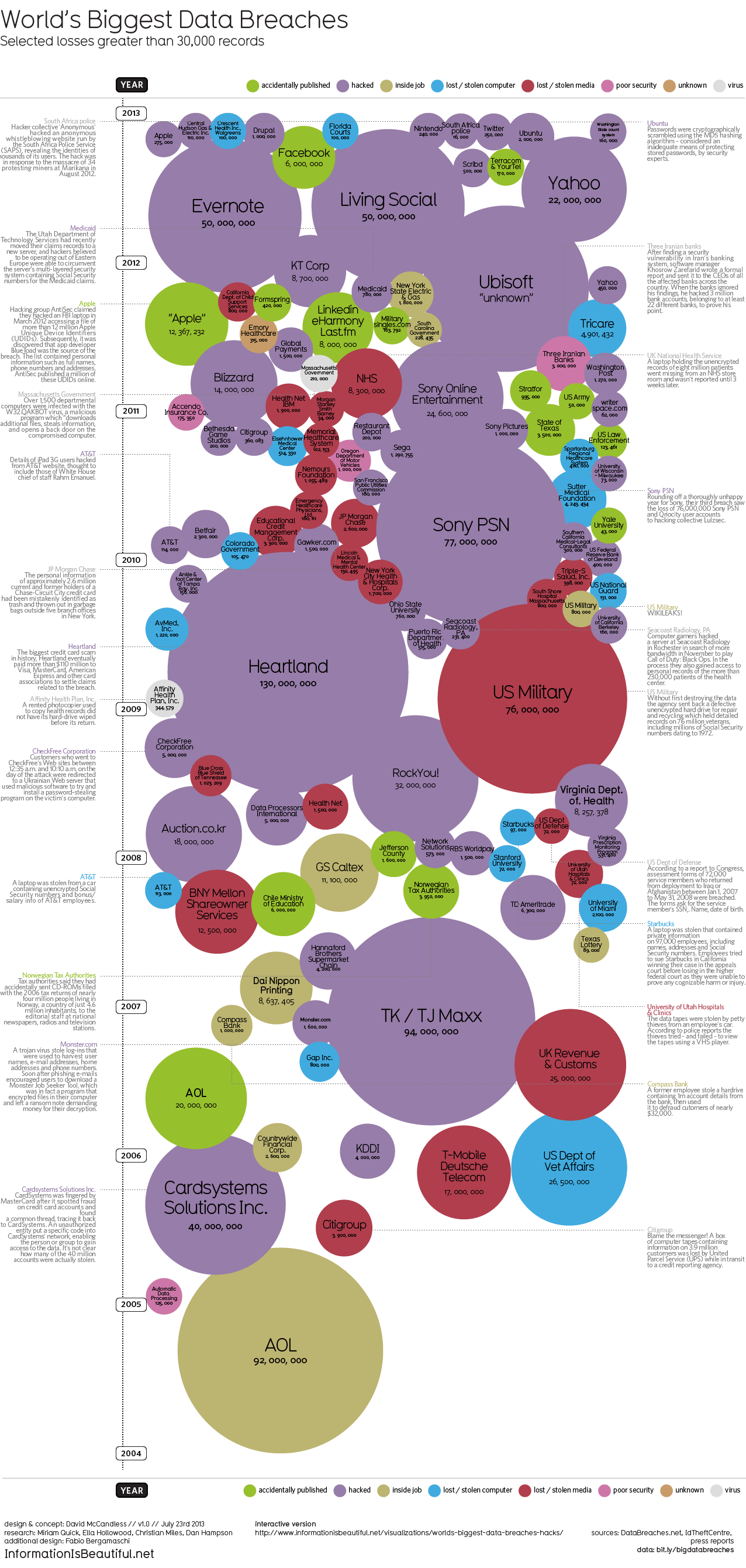
David McCandless and the team from Information Is Beautiful recently released both static (seen above) and interactive versions of the new World’s Biggest Data Breaches visualization.

This weekend, Apple’s developer site was hacked. 275,000 logins, passwords and other records potentially compromised. Two days before that, popular open-source operating system Ubuntu had its forums hacked. 1.82 million records stolen.

Are those big data breaches? Or just pin-points in the big data universe?

We’ve pulled out the interesting and funny stories out of the data. Click on the bubbles to read.

A fantastic design, the interactive version allows you to adjust the sorting, circle size and color-coding parameters.  It’s very easy for the reader to understand how one data breach fits into the overall history of stolen data.

In a move for transparency, the entire data set gathered and used in the design is available publicly to anyone through a Google Docs Spreadsheet.  Anyone can access the source data to verify the visualization or to create their own.

Found on Fast Company

Monday
Aug262013

Where Does the Money Go?

Where Does the Money Go? infographic

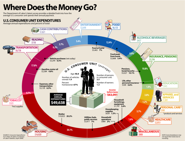
Where Does the Money Go? from LifeHacker breaks down the average spending habits of U.S. consumers.

The graphic above breaks down how the average US household spends their paycheck, according to the US Department of Labor. As you can see, housing, transportation, and food are the biggest costs. Because they take so much out of our paychecks, it makes sense to concentrate on reducing spending in these areas.

Designed as a infographic piece of a larger article, the design does a good job of focusing on one data visualization.  It also has minimal text because the additional details are all included in the text of the article.

Because the graphic can be shared separately from the article, the infographic should include a mention of the article, LifeHacker’s logo, and the URL back to the original.

Friday
Aug232013

The Periodic Table of Alcohol

The Periodic Table of Alcohol infographic

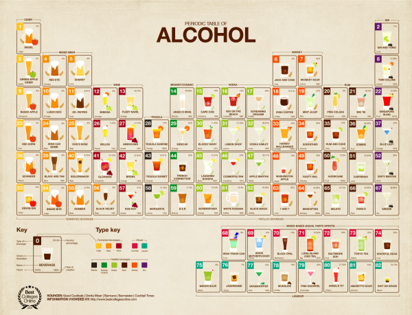
The Periodic Table of Alcohol infographic does a good job of organizing popular alcoholic drinks in the periodic table design format.  Posted on Visual.ly by designer Mayra Magalhães (mayra.artes), 

This infographic shows important information about the most famous alcoholic beverages.

It’s unclear who the infographic was designed for.  The footer of the infographic lists BestCollegesOnline.com, the landing page on Visual.ly lists the Consumer Media Network and the URL actually links to CarInsurance.org.  It looks like this design is a modification of a design from 2011 done for Best Colleges Online called the College Student’s Guide to Boozing.  I’m guessing Mayra uploaded this recently to be included as a part of her design portfolio.

The infographic has been heavily shared, and I found this version on Laughing SquidBusiness Insider, Popular Science, This is Happiness, Geekologie, and Gizmodo.

Thursday
Aug222013

Worldwide ATM Cyber Attack

World Wide ATM Cyber Attack infographic

The Worldwide ATM Cyber Attack infographic from 41st Parameter talks about the international internet heist that stole $45 Million in May 2013. The infographic centers around how they did it, what they took, and then how it could of been stopped.

Most people gasped at today’s headlines about the massive, $45 million ATM heist, which was engineered by a highly-organized gang of cybercriminals. Consumers and banking executives alike have the same worry today: Is their money and account information safe?

Here at 41st Parameter, the news simply highlighted what we already knew – financial institutions are extremely vulnerable to increasingly sophisticated cyber criminals who, as in this case, are able to steal data from pre-paid ATM cards and then quickly loot machines across the globe.

Most banking systems today are connected directly or in-directly to the Internet. This brings about a multitude of unintentional exposures, all of which allows criminals to exploit them to their advantage.

Given the scale of the global credit card networks, it is almost impossible to detect every kind of attack. Similar to fighting terrorism, you can be successful in preventing something 100 times, but the bad guys only need to be successful once.

Banks and financial institutions should use all of the available data and fraud detection solutions to fight fire with fire – and build better defenses for the 21st Century. Indeed, the shocking $45M price tag for banks should be a call to action to put better protections in place. This attack is NOT the last one, and if the modus operandi proves to be successful, crooks will exploit it time and again.

Good use of an infographic as a step-by-step visual explanation.  Good source listing with the URL directly to the detailed news article.  The footer should include a copyright statement and the URL to the original infographic landing page so people can find the full-size version after seeing the infographic on other sites. 

Thanks to Caroline for sending in the link!

Wednesday
Aug212013

A Website Design Process

A Website Design Process infographic

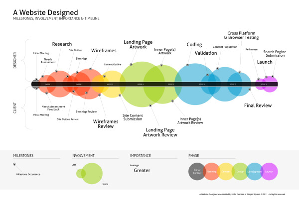
A Website Designed is a process explanation infographic, created by John Furness of Simple Square, highlights the phases of creating a website for a designer and the client. 

A Website Designed is an infographic of the average website’s creation. Feel free to download and share this, or link directly to it here on our blog.

Great visualization design of a business process.  The sequential events are arranged along a straight timeline, but a number of additional elements of information have been added.  Color-coding, sized circles and milestones all add valuable information to the reader.

A high-resolution PDF is available in multiple languages: English, French, Russian, Spanish, Italian, Hebrew and Dutch.

Found on Simple Square!