About
Randy Krum
President of InfoNewt.
Data Visualization and Infographic Design

Infographic Design

Infographics Design | Presentations
Consulting | Data Visualizations

DFW DataViz Meetup

Join the DFW Data Visualization and Infographics Meetup Group if you're in the Dallas/Fort Worth area!

Search the Cool Infographics site

Custom Search

Subscriptions:


Feedburner

The Cool Infographics® Gallery:

How to add the
Cool Infographics button to your:

Cool Infographics iOS icon

- iPhone
- iPad
- iPod Touch


Read on Flipboard for iPad and iPhone

Featured in the Tech & Science category

Flipboard icon

Twitter Feed
From the Bookstore

Caffeine Poster

The Caffeine Poster infographic

Wednesday
Jul102013

Matthew Dunn - What Makes an Infographic Cool?

Guest Post by Dr. Matthew Dunn

What Makes an Infographic Cool?  Beer.

Beer is cool.

So is an infographic on beer cool?

I think this one is cool:

The Very Many Varieties of Beer infographic poster

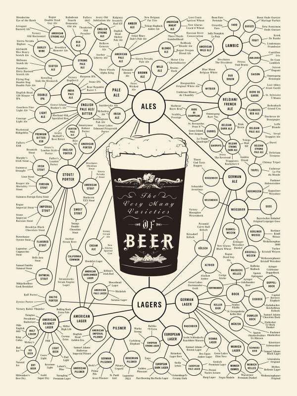
But, unfortunately for the guys at Pop Chart Lab:

  • First Rule of Cool: “The act of discovering what’s cool causes cool to move on.”

Dang, if I think this is cool, it must not be, because

  • Second Rule of Cool: “Cool cannot be manufactured, only observed.”

plus

  • Third Rule de Cool: “…can only be observed by those who are themselves cool.”  *

I discovered this, and I’m not cool. (Never have been. Never will be.) So, Pop Chart Lab guys, I apologize for thinking The World of Beer infographic is cool, and killing you on #1 and #3.  But leaving aside my fondness for the subject matter, here’s why it’s cool.

1) Show More In Less. 

This shows me much more about beer varieties on one page than could be written in one page.  It makes effective use of a few visual-communications principles - connection, clustering, scale and typography - to help me traverse, relate and generally make sense of 300+ different beers and about 100 varieties. That’s thousands of relationships in one page; if they’d have typed all that, I’d have gone out for a sample instead.

Many of the awful constructs that set out to be “infographics” manage to say in one large page what could be said in one short paragraph. They’re long on decoration and stylistic flourish, short on substance. Not cool.

2) Structure Is Chancellor **

The visual design here is driven by the structure of the subject matter.  They didn’t draw a bunch of circles and lines and say “Hey, let’s fill these in with beer varieties!”.  Likewise, the aesthetic choices - color, line, typography for example - serve the subject matter instead of overriding it.  (The quasi-Victorian look underlines the historical longevity of beer varieties, for example.)  It’s also worth pointing out that visualization is more effective with this structure than language.  Describing all of these formal relationships in English (or your language of choice) would be ponderous and far, far longer. 

Run-of-the-mall infographics tend to impose style on structure. Not cool.

3) The Goal Is Understanding

A very old-fashioned criterion for cool, admittedly, but absolutely key IMHO.  I happen to like Arrogant Bastard Ale (top-left); understanding that it’s an American Strong Ale, which is an offshoot of Strong Pale Ale, in the flick of an eye…is cool. It delivers on that criterion called “utility value” in the intellectual-property world - ‘does something useful’ - because it helps me understand more, more quickly - at least up to the limits of consumption in this case. (Will I remember all of it? No. Is it in Evernote for future brewpub visits? Yes.)

Not-cool infographics tend to aim at goals external to understanding of the subject matter - goals like SEO ranking, keyword packing, and branding.  These are fine business goals, but pretending to inform me is an Arrogant Bastard move, really. It’s a trick of the form - “look at our cool infographic” masking “look at us.”  It’s interrupt advertising masquerading as content marketing and that’s not cool.

Infographics (a portmanteau nobody should carry) tend to split along data-rich and decoration-rich. The World of Beer isn’t a Big Data set - but it’s a respectably difficult subject to tackle.  There’s some real design integrity to this piece - no CGI trickery or typographical back-flips because that would be wrong for the subject.

It’s a personal bias, to be sure, but I find the coolest infographics tend to have that kind of restraint and class. They aim more at connecting me to the subject matter than the subject maker.  That’s me; may not be you.  Cool, like beer, is a matter of taste.

* Malcolm Gladwell, The Coolhunt, New Yorker, 1997.

** There are too many “content is king, ______ is queen” tropes, you don’t need another.   Where content is king, structure is the power behind the throne.


Matthew Dunn is Chief Explainer at Say It Visually, the Explanation Agency.  

He holds the first PhD in Digital Media, which he created at the University of Washington (just before the Web was invented), and an MFA in Directing from the University of Texas.  He’s been a teacher, professor, a 9-year Microsoft veteran, a Fortune 1000 Senior VP & CIO and a tech-startup CEO.  He’s also an award-winning writer, designer, director, frequent public speaker, and an inventor, with 15 patents to date.  He launched Say It Visually with a business partner in 2008, and lives with his family in Bellingham, WA, a town of superb brewpubs.


LINKS:

Website: sayitvisually.com

Twitter: @DrMatthewDunn

Google+: DrMatthewD

LinkedIn: drmatthewdunn


Tuesday
Jul092013

What Is Autism?

What Is Autism? from Global Medical Education is a long, informational infographic that covers the symptons, signs, types, treatments and history of diagnosing autism.

Autism Spectrum Disorder is very common. About 1 in 50 school aged children had parent reported ASD in 2011-2012. There have been changes in DSM-5 with the category of Autism Spectrum Disorder being introduced  which includes Autistic disorder, Asperger’s disorder, Rett’s disorder and Pervasive Developmental Disorder-NOS from DSM-IV. Researchers have studied several important questions in this disorder.

This is a big design with a bunch of good information.  However, I think it’s way too much text for an infographic.  Infographics should make information easier to understand, and most readers won’t stick around to read this much information.  In fact, many readers won’t read any of the information because that much text is intimidating and implies an investment of time and attention by the reader.

The information is fantastic, and should have been broken up into multiple infographics to cover the different topics.  This would make the information easier to digest, and would also spread out links and views to the hosting site over a longer period of time.

Thanks to David for sending in the link!


Tuesday
Jul092013

Methods to Sell My House in the UK

Methods to Sell My House in the UK is an infographic from YouSellQuick.co.uk that looks at the different ways to sell a house and the financial implications.

When looking to sell your home you may not realise that there are a variety of different options available. Not all are as favourable as others and there are different pros and cons for each. Such as how long will it take to sell my home and what amount of cash can I receive. Should I sell my house at an auction or would it be better to use an on-line property buyer?

I like the diagrams that explain the different processes, but the pie charts have really been used poorly in this design.  I think I nderstand what they were trying to explain, but it won’t be obvious to most readers.  Many readers will think they got the pie chart data wrong because the percentages shown don’t add up to 100%.

Thanks to Mark for sending in the link!


Monday
Jul082013

Paws vs. Claws: Social Media Explained

Social Media Explained Cat infographic


Avalaunch Media is running the Paws vs. Claws infographic voting competition between these two infographic that explain the social media networks from the perspective of dogs and cats.  The campaign is raising money for charity, so place your vote now (before July 31st) and donate money if you are in a position to support the causes.

A Social Media Bark-off of Epic Purrportions!

Here’s how it works:

We’ve joined forces with two world-renowned, animal-focused, non-profit organizations — The Humane Society of The United States is being sponsored by the Claws (a.k.a cats) and NEADS/Dogs for Deaf and Disabled Americans is being sponsored by the Paws (a.k.a. dogs).

We’re inviting internet-and-animal-loving companies and individuals everywhere to join us in donating to a pot of charity-cash. We’re kicking off the sharing by pledging $500 to the to-be-determined winner of the Paws vs Claws showdown and we’re counting on you, our internet-and-animal loving friends, to join in donating to the charitable cause.

Social Media Explained Dog infographic


 Thanks to Matt for sending in the link!


Monday
Jul082013

How Startup Funding Works

How Startup Funding Works infographic

How Startup Funding Works from Funders and Founders co-founder Anna Vital does a great job of visualizing the split of equity at different stages of a company’s life.

A hypothetical startup will get about $15,000 from family and friends, about $200,000 from an angel investor three months later, and about $2 Million from a VC another six months later. If all goes well. See how funding works in this infographic:

Is dilution bad? No, because your pie is getting bigger with each investment. But, yes, dilution is bad, because you are losing control of your company. So what should you do? Take investment only when it is necessary. Only take money from people you respect. (There are other ways, like buying shares back from employees or the public, but that is further down the road.)

This is a great design that uses pie charts correctly and effectively!  This is in contrast to the many designs that use pie charts inappropriately.  This is a great example of a visual explanation that uses a combination of data visualization, illustration and text to tell a clear story.

The color coding is also effective, but for some reason they didn’t color the co-founder icon character green to match his portion of the pies.  The URL link to the original infographic landing page is also missing in the footer, so it makes it hard for readers to find the full-size original version when they see it posted on other sites.  People aren’t always good about creating links back to the original, so the URL should be included in the infographic image file itself.

Friday
Jul052013

The Conversation Prism 4.0 for 2013

The Conversation Prism 4.0 for 2013 infographic

Brian Solis has released the new Conversation Prism 4.0, with updated companies and categories for 2013.  This project series has been a favorite on Cool Infographics since version 1.0 was released in 2008, and we haven’t seen an update since version 3.0 was released in 2010.

What is The Conversation Prism?

Developed in 2008 by Brian Solis, The Conversation Prism is a visual map of the social media landscape. It’s an ongoing study in digital ethnography that tracks dominant and promising social networks and organizes them by how they’re used in everyday life.

Version 4.0 brings about some of the most significant changes since the beginning. In this round, we moved away from the flower-like motif to simplify and focus the landscape. With all of the changes in social media, it would have been easier to expand the lens. Instead, we narrowed the view to focus on those that are on a path to mainstream understanding or acceptance. The result was the removal of 122 services while only adding 111. This introduces an opportunity for a series of industry or vertical-specific Prisms to be introduced so stay tuned.

The Conversation Prism 4.0 for 2013 closeup

The design highlights the major companies in 26 different categories of social networking services.  This update loses the flower-like design style of the last three versions, and changes to a more straightforward circle with equal sized pie slices.

The inner circles have always been a little confusing for readers and marketers because the intent is that the inner labels can be adjusted depending on the user.  They don’t necessarily relate specifically to the services they are located near in the outer slices.

As a snapshot of the current social media landscape, this is a fantastic tool for marketers to consider the tools and services they want to engage for any particular campaign.  Three years was too long to wait for an update, since this landscape is changing and evolving very quickly.  That’s why 122 individual services were removed and 111 services were added. 

The Conversation Prism 4.0 for 2013 poster

The Conversation Prism 4.0 is available as a free high resolution JPG image download (great for computer wallpaper/desktop) of for purchase as a 22”x28” wall poster for $19.

Thanks to Jarred for sending in the link!  Also found on Mashable and The Next Web.


Thursday
Jul042013

5 Key Elements of Viral Content

Mark Smiciklas from Intersection Consulting and author of The Power of Infographics, designed this helpful infographic The Five Key Elements of Viral Content.

The goal of every content marketer is to have his/her information shared across digital channels by their audiences. This is often easier said than done. What factors contribute to people sharing the content they consume online?

In researching the content for this infographic I came across a post in my Delicious archive that helps answer this question. Leo Widrich over on the Buffer Blog wrote a great post about what makes content spread. In it, he analyzes some of the elements that helped one particular blog post get over half a million likes. He also references an interesting research paper about what makes online content go viral.

This infographic highlights five key elements of viral content: scarcity, share buttons, skim-ability, practical utility and consistency. Are there any others you would add? The comments are yours.

Originally posted on Social Media Explorer

I would like to see the URL links to the sources and to the infographic landing page in the footer of the design so they travel with the infographic image as it gets shared across the Internet.

Wednesday
Jul032013

Nathaniel Pearlman - What Makes an Infographic Cool?

Guest Post by Nathaniel Pearlman

Randy asked me to write a post on the topic “what makes an infographic cool?” 

Unfortunately, I hate the term infographic. The first four letters feels too casual to me, but maybe it’s a good fit for quick marketing infographics.  For my firm’s work, I prefer the terms “information graphic” or “data graphic” or “data visualization”… or “timeplot.” They seem more dignified. But then I’m a guy who insists on using the term “small, medium, and large” at Starbucks.

My quick answer is: an infographic is “cool” when it presents an important and complex story and does so with integrity and good looks. Important, because if the subject is not important, why bother? Complex, because it is complexity in information that requires visual treatment. Integrity is key for the long-term reputation of both client and design firm. By good looks I mean good aesthetic design, crucial for both pride in our work and the reception it receives from our audience.

(Perhaps an infographic graduates from “cool” to “warm” if it is especially good, and if one is really beautiful, which is quite rare, it could be called “hot” or “awesome” or “epic.” For this reason, I advise Randy to reserve warminfographics.com, hotinfographics.com, awesomeinfographics.com, and epicinfographics.com if they are not already taken).  [Randy: Most are already taken]

Maybe my history explains my resistance to the term infographic. My route to practitioner in this field was quite indirect. A class I took in 1987 with Professor Edward Tufte sparked my original interest. At the time he had written only one book of his four classic books on the visual display of quantitative information. For that class, I hunted for historical examples of good statistical graphics in the stacks of Sterling library, and got the bug.  But, though I continue to collect examples to this day, filling up my map drawers, it took me some twenty years of other activities (graduate school, founder of software company, CTO for presidential campaign, husband and father), before I started making Timeplots (www.timeplots.com).

Anyway, I’ve become pretty opinionated about what makes an information graphic cool. My strong preference leans to working with data and stories that have potential to impact public policy or to educate people about things they care about. In my view, this can be done by presenting information in a new way or pulling many threads together into a new tapestry. The form could be print, or a web-based interactive, or a motion graphic, but the work should fit the medium. The form of the graphic doesn’t have to be new or inventive, but should be the best fit for the information. I find it best to be attentive to others who are truly great at this craft, as I have much to learn.

I also prefer to work for the right side of an issue, as I see it, and to say something that matters. It’s not always possible (financially or otherwise) to find the right clients or projects to do this, but I much prefer to tell stories with data that hold the potential to make a positive difference in the world—not just to advertise a run-of-the-mill product or service. I aspire to execute work with integrity (to tell the truth with the data, to provide comparative context, to consider counterarguments, to truly explain).

We are currently working, for example, with the Center for American Progress to help show how immigration will be economically essential over the next twenty years, and how public policy ought to be shaped with that in mind. Happy to have that project.  My firm also provides yearly updates to the Death and Taxes poster on the Federal Budget. The 2014 version is just out and is available here: http://www.timeplots.com/collections/all

My consulting firm Graphicacy helps others tell complex stories visually(www.graphicacy.com). Our name (think literacy, numeracy, graphicacy) reminds us to take into account the abilities of our audience to understand the graphics we create.

Since we often work with complex data, this is particularly relevant, for unintelligible information graphics cannot be cool. 


Nathaniel Pearlman has been interested in visualizing data for more than two decades. Nathaniel majored in computer science at Yale and he finished all but his dissertation in MIT’s political science doctoral program. Nathaniel founded NGP Software, Inc. in 1997 (now NGP VAN, Inc.) to join his interests in politics and technology and grew that company into the market leader in fundraising and compliance software for progressive political campaigns. Nathaniel served as Chief Technology Officer for the Hillary Clinton for President campaign in 2007-8. In 2009, Nathaniel founded the information graphic products company Timeplots and reserved the name GRAPHICACY for information graphics consulting and services. Together, Timeplots and Graphicacy are dedicated to making the visual display of information more comprehensible and aesthetic.


LINKS:

Graphicacy: graphicacy.com

Timeplots: timeplots.com

Twitter: @timeplots

Facebook: facebook.com/timeplots


Tuesday
Jul022013

Can Washroom Soap Can Make You Sick?

Can Washroom Soap Can Make You Sick? infographic

Can Washroom Soap Can Make You Sick? from GOJO Industries brings to light a growing health risk in public restrooms everywhere.  Restaurants, offices, stores, hotels and more.  Those bulk soap dispensers (on the wall or built into the counter) that janitors refill by just pouring in more soap can easily become infected, and the bacteria can survive and grow inside the soap dispenser!  Yuck!

It’s hard to believe, but you could actually walk away with more bacteria on your hands after washing with soap from a refillable bulk soap dispenser in a public restroom. The contamination could even include fecal matter!

How could this be? Check out the infographic below to find out how this happens, discover smart alternatives, and see how you can help protect your family’s health by being a voice for change.

Designed by InfoNewt, this design walks the reader through a clear sequence of information.  It conveys a simple story with easy to understand information and clear sources for credibility.

  • What’s the problem? 
  • How does it happen?
  • What’s the specific risk?
  • What’s the solution to the problem?
  • What can the reader do?

This is a persuasive infographic design that ends with a very specific call-to-action.  Sign the e-petition online to support the cause or forward the infographic to someone that can make a difference.

Monday
Jul012013

How Apple Are You?

How Apple Are You? infographic

Do you think you’re Apple’s number one fan? Take the test on the How Apple Are You? infographic from mackeeper.com to see how you match up! Fancy a new tattoo soon? How about an Apple?

You think you know everything about Apple? Would you call yourself an Apple Fan? How about checking the level of Apple in your blood, would you be up for that? Check out our awesome info-graphics and find out how Apple you are! Make sure you share this with your buddies!

I’ll admit I scored a 155, so I’m a fairly hardcore Apple fan.

Where’s the URL to the original infographic landing page?!?

Thanks to Shelli for sending in the link!