About
Randy Krum
President of InfoNewt.
Data Visualization and Infographic Design

Infographic Design

Infographics Design | Presentations
Consulting | Data Visualizations

DFW DataViz Meetup

Join the DFW Data Visualization and Infographics Meetup Group if you're in the Dallas/Fort Worth area!

Search the Cool Infographics site

Custom Search

Subscriptions:


Feedburner

The Cool Infographics® Gallery:

How to add the
Cool Infographics button to your:

Cool Infographics iOS icon

- iPhone
- iPad
- iPod Touch


Read on Flipboard for iPad and iPhone

Featured in the Tech & Science category

Flipboard icon

Twitter Feed
From the Bookstore

Caffeine Poster

The Caffeine Poster infographic

Monday
Jul012013

The Geek Zodiac

The Geek Zodiac infographic poster

Very cool poster of the 12 aspects of geekdom.  The Geek Zodiac was designed by James Wright & Joshua G. Eckert from the GeekZodiac.com.  

Soon to be available as a poster on The Geek Zodiac Store.

I was able to find the poster image on the Doctor Who and the T.A.R.D.I.S. feed on Facebook, but not on the GeekZodiac.com site.

Friday
Jun282013

Ba-tee-nga: Sheldon Cooper Presents Fun With Tees

Bah-tee-nga: Sheldon Cooper Presents Fun With Tees infographic

Ba-tee-nga: Sheldon Cooper Presents Fun With Tees infographic from RIPT Apparel shows every t-shirt that Sheldon Cooper from Big Bang Theory wore each episode of every season.

We have all seen The Big Bang Theory, and its awesome cast of nerds. But did you ever wonder about Sheldon’s graphic tees and how many different ones there actually were? This weeks infographic takes a look at the many shirts of Sheldon Cooper titled “Ba-TEE-nga: Sheldon Cooper Presents Fun With Tees”. Much like RIPT Apparel’s graphic tees, this is a mash-up of the famous saying Sheldon made popular; “Bazinga”, coupled with his awesome web show – “Sheldon Cooper Presents Fun With Flags”. The graphic shows all of Sheldon’s shirts from the pilot episode through season 6 episode 7. Yeh that’s a ton of Tees!

An ideal topic for an infographic!  Can you imagine how boring this would have been as a text list in a blog post?!? 

Thanks to Bill for submitting the link via Twitter!  Bazinga!

Thursday
Jun272013

The Nearest Stars

The Nearest Stars infographic

The Nearest Stars infographic from Space tracks the 53 closest stars to the earth. Their classification and distance is also included.

The nearest stars to Earth are in the Alpha Centauri triple-star system, about 4.37 light-years away. One of these stars, Proxima Centauri, is slightly closer, at 4.24 light-years.

Of all the stars closer than 15 light-years, only two are spectral type G, similar to our sun: Alpha Centauri A and Tau Ceti. The majority are M-type red dwarf stars.

Only nine of the stars in this area are bright enough to be seen by the naked human eye from Earth. These brightest stars include Alpha Centauri A and B, Sirius A, Epsilon Eridani, Procyon, 61 Cygni A and B, Epsilon Indi A and Tau Ceti.

Barnard’s Star, a red dwarf 5.96 light-years away, has the largest proper motion of any known star. This means that Barnard’s Star moves rapidly against the background of more distant stars, at a rate of 10.3 seconds of arc per Earth year.

Sirius A is the brightest star in Earth’s night sky, due to its intrinsic brightness and its proximity to us. Sirius B, a white dwarf star, is smaller than Earth but has a mass 98 percent that of our sun. 

In late 2012, astronomers discovered that Tau Ceti may host five planets including one within the star’s habitable zone. Tau Ceti is the nearest single G-type star like our sun (although the Alpha Centauri triple-star system also hosts a G-type star and is much closer).

The masses of Tau Ceti’s planets range from between two and six times the mass of Earth.

Great data from Space.com.  The infographic focuses on visualizing the distance of the stars from Earth. In that process, it caused some of the visual to be cluttered.  It’s always hard to convey 3D information on a 2D image.

From a data visualization standpoint, the lower table is unnecessary.  All of that information could have been conveyed in the star map illustration.  The color coding of the names in the map doesn’t match the color coding of the star classifications, and that’s confusing to readers.  It would have also helped to provide an explanation of why star systems can have multiple classifications.

If they wanted to keep the detailed table below, it should include more visual elements. The stellar types with the classification are redundant and can be combined.  The distances could have included bars to show the light years from Earth.  The number of observed planets could have used icons.

Found on Visual.ly

Wednesday
Jun262013

Peter Sena - What Makes an Infographic Cool?

Guest Post by Peter Sena

Infographics, another problem solved through design 

As a designer, everything I see is a form of an infographic. Whether the packaging on the shelves of a grocery store, to the interface in my car, down to the websites I visit each day, being able to visualize and experience information easily is a critical part of design. Infographics were born for that very same purpose, to take the complex and simplify it or capture it in a way where the viewer can easily draw conclusions from the information. If you’ve been anywhere on the web you’ve likely seen a slew of infographics plastered all over Pinterest or your favorite websites and blogs.

Cool Infographics does a fantastic job at capturing some of the best and most interesting infographics so rather than talk about a problem that is already solved, I figure I’ll walk you through a few of my recent favorite examples of data visualizations that help tell a story, evoke an emotion or speed up ones access to research.


Infographics that make us remember

Storytelling is one of the oldest forms of sharing information and the thing that legends are made of. Making one remember their past is a sure-fire way to truly capture the attention of your viewer. Foursquare’s recent partnership with Samsung to launch their Time Machine is a great example of how data can be visualized in a way to make us remember not just where we are, but we’re we’ve been. Tapping into viewers’ memories is a key way to trigger emotion to your viewer. Their time machine let’s you login with your foursquare account and you can take a trip down memory lane to see all the places you’ve checked into and explore that data in a very intuitive, interactive fashion.  (https://foursquare.com/timemachine)

Foursquare Time Machine


Infographics as a research tool

With so much data at our fingertips one Google search away, being able to drill down to find the information we’re are after is a critical need. Google’s Consumer Barometer and Real-Time Insight Finder let you browse their databases in a very visual way and look into how consumers are using the Internet, searching for and buying products, and what ways they are connecting to the internet.

Google’s Real-Time Insight Finder: www.google.com/think/tools/real-time-insights.html

Google Real-Time Insight Finder

Google’s Consumer Barometer: www.consumerbarometer.com

Google Consumer Barometer


Our Facebook vs Twitter infographic, received almost 13 million page views since we posted it, with reshares, likes, tweets and pins all over the internet but aside from asking us to update it with new data, the biggest request from users was the ability to see it interactive and give the ability to segment and view the data in different ways. I feel Google is doing a fantastic job at making information fun and intuitive to access and doing it with the perfect blend of form and function.

Facebook vs Twitter infographic


Infographics that show you how it works.

I absolutely love these infographics because they take complex devices and break them down in a beautiful designed, easy to understand way in the form of a cross-section view while incorporating aspects of the popular flat-design visual style.

Imaginary Factory


Why they work so well?

We’re visual beings with almost 50% of our brains being used for processing visuals. People’s attention spans are decreasing by the day due to the sheer amount of information that they are presented with. Give someone the ability to quickly scan something and you are much more likely not to lose their attention.  The good folks at NEOMAM.com put together this great infographic on thirteen reasons why our brains crave infographics, which takes a much deeper dive into the science behind them.

What infographics and data visualizations are inspiring to you these days? Shoot me a tweet and lemme know.


Peter SenaPete Sena is the founder of Digital Surgeons, a digital-first creative agency that specializes in combining design and technology to connect brands and consumers.


LINKS:

www.digitalsurgeons.com

Twitter: @petesena

LinkedIn: petersena


Tuesday
Jun252013

Planets in Orbit Around Earth!

What if we had a planet instead of a Moon? Saturn

What if we had a planet instead of a Moon?  Photographer, space artist, illustrator and former art director for the National Air & Space Museum’s Albert Einstein Planetarium, Ron Miller, created a series of very cool images that visualize how the rest of the planets in our solar system would appear if they orbited Earth at the same distance as the Moon.  

I’ve posted a number of different data visualizations and infographics that help visualize the sizes of the different planets, and this is a very cool approach that might make the relative sizes more relevant and understandable to a bigger audience that is already used to seeing the Moon in our sky.  For comparison, here is the original photo of the Moon:

What if we had a planet instead of a Moon?

From Ron’s description:

At a distance of about 240,000 miles, the Moon occupies a space in the night sky about half a degree wide. By sheer coincidence, this is almost exactly the same size the sun appears, which is why we occasionally get total solar eclipses.

But it’s interesting to imagine what the night sky might look like if one of the Solar System’s planets were to replace our moon. (We’d have to ignore things like tides and gravitation, but that’s the advantage of doing things in the mind’s eye.)  Saturn would be an astonishing sight. Almost 35 times larger than the Moon, this golden globe would cover nearly 18 degrees of the sky. We’d be a little further away from Saturn than its satellite Dione. In fact, we’d be more likely to be a satellite of Saturn ourselves than the other way around. The rings would stretch nearly from horizon to horizon.

Of course, the gas giant Jupiter is downright scary!

What if we had a planet instead of a Moon? Jupiter

View all of the full size images in Ron’s post on io9!

Found on My Modern Met and The Daily Mail

Monday
Jun242013

Is Social Media Bad For Your Phone?

Is Social Media Bad for Your Phone? infographic

Is Social Media Bad For Your Phone? infographic from liGo gives us the price of being connected to social media on our phone.  Social media drains our phone, increases the number of car accidents, wears us down emotionaly, and has taken away some of our privacy.  You can stop the drain with a few of the infographic’s tips.

If you have a smartphone, then the chances are you’ve used social media on your mobile at one point or another. It’s great to be connected all the time, but what are the negative effects of social media on your mobile? We’ve developed an infographic to find out the answer…

Great design, with an unusual take on Social Media.

The doughnut charts are a little hard for readers to understand because they don’t start at one of the standard right angles (0, 90, 180 or 270 degrees).  By starting the segments at an odd location, it’s harder for the readers to understand how much of the permimeter is colored.

There should be the URL at the bottom that takes readers to the original full-size infographic.

Found on Infographic Journal

Friday
Jun212013

Smoothie Recipes For Everything

Smoothie Recipes For Everything infographic

Who knew that the solution to most our problems could be solved with a smoothie?! Smoothie Recipes For Everything infographic from Super Skinny Me gives you the ingredients and visually represents the amount of each that should put in. Trying to lose weight? Want to de-stress? Or maybe just want a bedtime drink. This infographic has it all.

Is there anything as versatile, adaptable and convenient as a smoothie? I doubt it. Nor are there many things as universally beloved.  Smoothies are scrumptious, indulgent concoctions that tickle the taste buds and, inexplicably, with every sip make you feel just a little bit happier and make the world a little bit friendlier. The smoothie is so much greater than the sum of it’s parts. And just to prove the smoothie can do no wrong, it can actually make you more awesome too.

Smoothies contain a smorgasbord of ingredients, and depending on what you throw in, smoothies can ascend from mere flavorsome delight and sweet-tooth satisfier to the dizzying heights of muscle-building, energizing, health-enhancing superdrink. Why eat just one superfood, when you can combine a load of goodness into one easily digestible drink? Plus, it’s super quick and absurdly easy to prepare, making it weirdly efficient not just nutritionally, but generally. Created in the 1940’s, but perfectly designed for 21st century living.

Smoothies can be tailored to suit your own needs. And while the flavors are virtually limitless, don’t just think about taste, but also why you’re making it. Do you want to lose weight or perhaps build muscle? Do you need a pick-me up or extra energy to power through an intense workout? Had a bad day and want to wind down? Or maybe you can’t get to sleep. With a little smoothie science, you can easily make a smoothie that doesn’t just taste good (or look pretty), but actually does something.

The major issue I have with this design is that the proportions visualized for each smoothie aren’t accurate to the recipe.  The sections are sized to fit the text, and have no relationship to the data.  Big mistake!

Also, the actual amounts of each ingredient aren’t shown.  The recipes are on the infographic landing page in the text portion, but aren’t included in the infographic itself.  The issue with infographics is that they need to include the complete information because they are shared all by themselves, without any accompanying description text.

Found on superskinnyme.com

Thursday
Jun202013

The Cost of a Road Trip to the Top 10 U.S. Vacation Cities

The Cost of a Road Trip to the Top 10 U.S. Vacation Cities infographic

I Drive Safely and Gas Buddy partner up to create the Cost of a Road Trip to the Top 10 U.S. Vacation Cities infographic. The infographic calculates the total cost of food, lodgings, and gas and then gives some money saving tips. This infographic can be found on idrivesafely.com.

Did you know that a road trip to the top 10 US vacation cities is more than 7,600 miles (12,231km) of driving? That’s the same distance as a flight from Alaska to Australia! Wondering if you could afford to pack up and leave on this awesome road trip? We partnered with our friends at GasBuddy.com to bring you the infographic below which breaks down the cost of a 25-day road trip including the cost of gas, food and lodging. We’ve also included some tips for saving money on your trip.

The top 10 U.S. vacation cities are based on a 2012 poll from U.S. News Travel and excludes cities not in the continental United States. Fun fact: 3 of the top 10 US vacations spots are in California: San Diego, Yosemite and San Francisco!

Fun topic idea, and certainly relevant to both Gas Buddy and I Drive Safely.  Relevance is super-important as the search engines would like to down-grade the value of links to irrelevant content.

I would have liked to see more of the actual data visualized in the design.  Why does the calendar icon have 8 days shown when the data is 5.2 days?  Because it’s just an icon, not a data visualization, and can be confusing to readers.  The costs would have been very easy to visualize as stacked bars to make them easier to understand.

Thanks to John for sending in the link!

Thursday
Jun202013

How to Create a Winning Email Marketing Campaign

How to Create a Winning Marketing Campaign infographic

Originally intended for the election year, VerticalResponse has created an infographic on How to Create a Winning Email Marketing Campaign

With over three billion email accounts open worldwide, numbers are showing that email marketing is a viable strategy to target and captivate potential customers. That number is expected to grow to a whopping 4.3 billion by 2016.

How do you make your email stand out from an inbox that receives an average of 112 emails per day? If stats citing click-through rates for 2011 are accurate, only 22 of those emails are opened, leaving the other 90 emails to become unopened, or worse, marked as spam (a four-letter word that strikes fear into the hearts of email marketers).

With election day coming up, we wanted to celebrate the occasion with a patriotic infographic on email marketing. From choosing the right “from” name to integrating your email with social networks, if email marketing has your vote, check out the infographic for five steps towards a winning email marketing campaign.

This is a good way to use an infographic as a visual explanation instead of a bullet list in text for a blog post.  It’s easier to share and includes the images to make it easier to understand.

They had some great data about the growing number of email accounts, but they didn’t include that in the infographic.  Any text description on the infographic landing page is usually lost when people share the infographic, so all of that information should be included in the infographics itself.

Thanks to Leigh for sending in the link!

Wednesday
Jun192013

Ben Harrow - What Makes an Infographic Cool?

Guest Post by Ben Harrow

Infographics are a visual representation of engaging and enlightening statistics or facts - as Randy puts it, “infographics turn data into information”.  Now, a lot of interesting people have said a lot of interesting things about what makes an infographic ‘cool’ - but sometimes, you just have to trust the numbers.  

Infographics aim to go ‘viral’ - to spread to and engage with as many people as possible. However, with the sheer amount being produced now, it’s incredibly difficult to stand out and it takes something special to really make a mark in the popularity stakes.

So, what’s wrong with going simple? Let’s look at the coolest infographics - by the views.

The Top 3 - News by Design

News by Design is (obviously) our project - and we basically want to show off the infographics that tell a newsworthy story in a beautiful way.

The most viewed pieces since our inception?

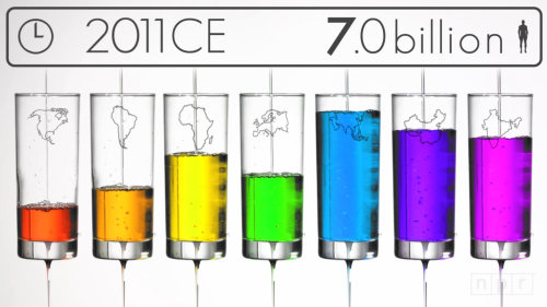
  1. How we hit 7 billion
  2. Beep - a f**king infographic (beware - it features lots of swearing)
  3. The ‘big infographic’ trend

The top 3 certainly cover the bases - with a video infographic with some real-world interaction and some huge, huge infographics featured - as well as a whole heap of swearing.  But, that number 1 definitely shouts out about one thing that can make an infographic cool - a totally unique approach.

I’m very happy that a video infographic (of sorts) topped the table - it immediately brings to light the benefits of doing something hugely creative and putting some thought (and love) into a project.

And yes, for an infographic to be cool, it doesn’t have to be a straight forward up and down affair - visualising the influence of birth and death rates simultaneously using drips and drops makes the constant ebb and flow of population a beautiful and instantly understandable thing.

The subject matter also brings to light another point - the rapid global population increase is a very serious topic, and covering important issues is a great way to immediately engage viewers and appeal to a specific audience, especially if you break it down in an attractive and digestible way.

In short, this infographic tells you that the very coolest examples are original, innovative, and can, of course, feature some serious or controversial subject matter. That, and creating something utterly beautiful always helps.

The Top 3 - Visual.ly

Visual.ly is one of my personal favourite resources for finding quality infographics - most designers worth their salt know that adding their designs to the giant Visual.ly database will help gather views and begin the sharing process.

The three most viewed pieces in the history of Visual.ly?

  1. What are the odds?
  2. Should I text him?
  3. 30 shots

Now, this makes for an interesting Top 3 - a somewhat standard-form infographic, a flow-chart and a poster all make the grade here.  Although not all ‘infographics’ per-say, the visual representation of jokes, stories and, well, alcohol, are massively engaging for an audience when done correctly.

But, Visual.ly’s own infographic nabbed the top spot - a sleek and slick design that mirrors the Visual.ly house style and colour scheme is a plus, and the vertical flow of the information, guided by the neon pink line, is nothing out of the ordinary but definitely effective.

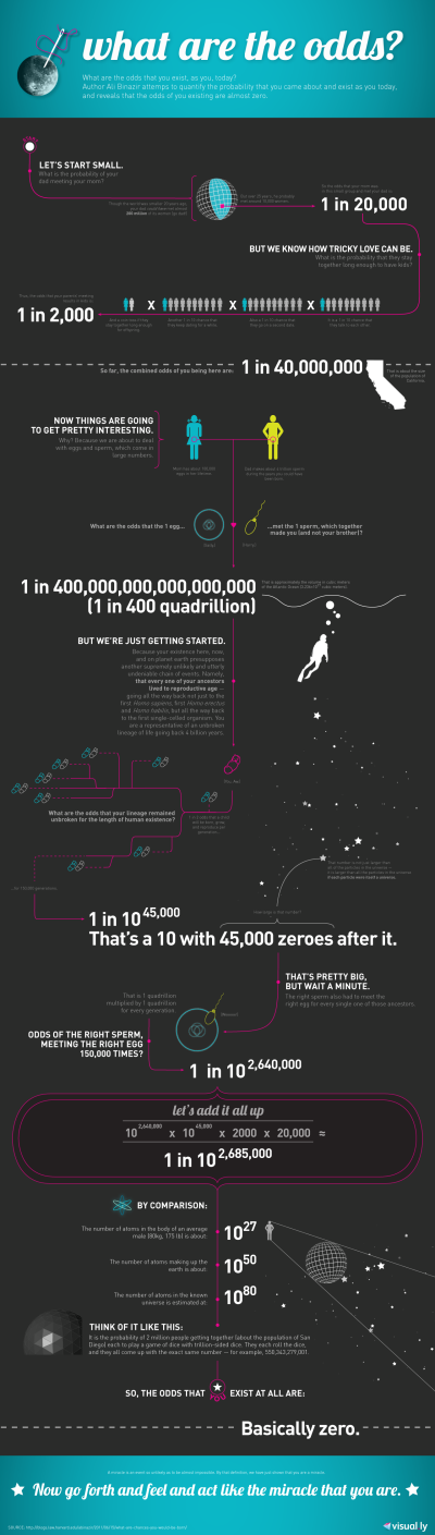
What matters here are the numbers - carefully explained and intricately entwined statistics that map out the likelihood that you exist as you are today. Now, ignoring the controversy in the math itself, (check the comments for some elaboration) it is a very cool concept, and philosophical content is always particularly engaging as it encourages the viewer to think rather than just read.

This infographic shows off the appeal of blowing the reader’s mind - introducing ideas and concepts that reflect on everyday life but will create endless amounts of talk value (as soon as 1 in 10^2,685,000 appears on page, you know you’re talking about something pretty intense).

However, a cool infographic definitely needs a helping hand - and Visual.ly owning the most viewed infographic on their entire site speaks volumes about distribution.  A great infographic won’t always sell itself, and it takes hard work to get the word out there.

The Top 3 - Cool Infographics

What kind of guest-blogger would I be if I didn’t hat tip to our gracious host?  You already know what Randy does, it’s why you’re here - Cool Infographics collects and reviews infographics to see if they cut the mustard.

And the three that really made the grade?

  1. The Caffeine Poster
  2. Guinness vs. Beer
  3. Comparing Hurricane Disasters: Sandy vs. Katrina

Now, despite more fun with alcohol, this Top 3 has something else of interest - the interpretation of official statistics and data. The comparing hurricanes graphic, although somewhat basic in design, looks at data that effects people and is newsworthy in itself - and presents it in a quick to digest format. Always appealing.

But one of Randy’s own doodles made the grade here - the already three-and-a-half years old Caffeine Poster.

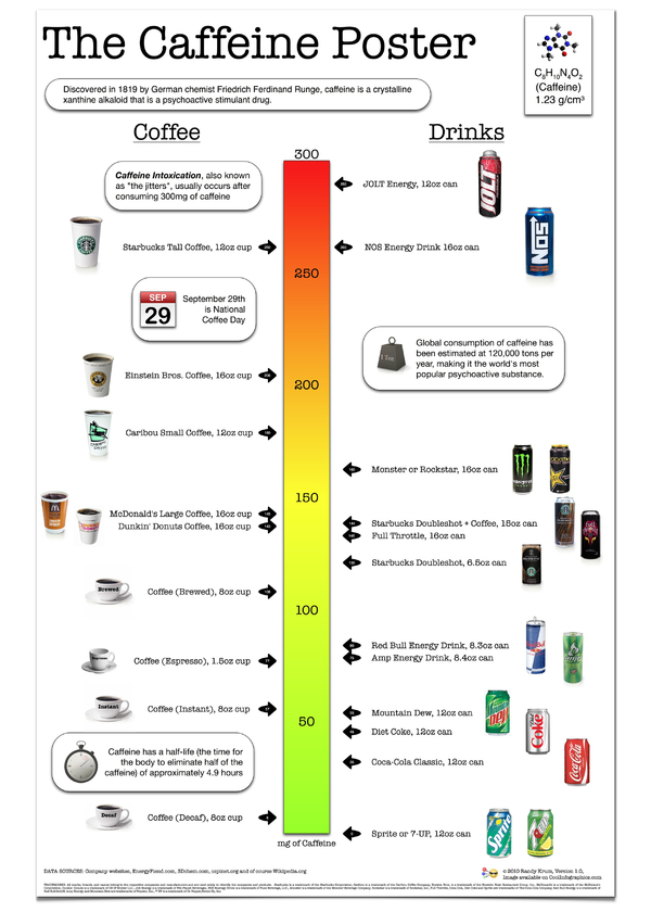
Randy admits in the ‘making of’ posts that he isn’t a graphic designer - but that isn’t what’s important in this graphic.

When it was produced, the art of the infographic was still a relatively new thing, and there weren’t many truly innovative pieces floating around. Randy took something that is a widely discussed media topic, is important in our everyday lives (or at least, influential and awakening - caffeine)  and is directly comparable from one product to another, and combined it to make something instantly shareable.

‘Caffeine intoxication’ is a terrifying prospect - otherwise known as the ‘jitters’ you get after ingesting 300mg of caffeine (or one can of Jolt energy!). That, and I had never thought of caffeine in terms of chemistry and biology - but its ‘half-life’ is an interesting topic (4.9 hours is the time it takes for your body to flush out half the caffeine ingested).

What makes this infographic cool is the talk value - looking at your friend who’s drinking a tall Starbucks coffee and going ‘you’re drinking 5 cans of coke in caffeine right there’, or looking at your second can of Monster and preparing for the jitters. That, and the real-world application - discussing something that is relevant to everyone in a way they have not seen or heard before.

Drawing comparisons helps too - allowing the reader to immediately compare and rank recognisable objects or themes is a tool that can never be under-estimated. Because it works so fiercely well.

So, what makes an infographic cool?

Let’s go back through the list.

Cool infographics are original, innovative and cover important subjects.

They provide talk-value, draw comparisons, focus on real-world topics and more often than not blow the reader’s mind.

Throw in some quality design, functional layout, and some healthy distribution, and you’re probably well on the way.

And of course, make it beautiful.

___

I have to admit, I’m surprised that innovative visual elements and really intuitive/interactive design didn’t feature particularly strongly in these lists - is the idea and the concept more important than the visual product? Is the story more important than the vehicle when it comes to making a really cool infographic?

I’d love to know your thoughts on those most viewed lists - do you think they reflect the world of infographics well, or is there something major missing?


Ben Harrow is the Digital Editor at UK-based national news agency 72point, selling in stories to the national newspapers and creating infographics alongside. He is also the co-founder of News by Design, which praises the infographics that tell brilliant stories in  an engaging visual way.


LINKS:

news-by-design.com

Twitter: @newsbydesignuk