About
Randy Krum
President of InfoNewt.
Data Visualization and Infographic Design

Infographic Design

Infographics Design | Presentations
Consulting | Data Visualizations

DFW DataViz Meetup

Join the DFW Data Visualization and Infographics Meetup Group if you're in the Dallas/Fort Worth area!

Search the Cool Infographics site

Custom Search

Subscriptions:


Feedburner

The Cool Infographics® Gallery:

How to add the
Cool Infographics button to your:

Cool Infographics iOS icon

- iPhone
- iPad
- iPod Touch


Read on Flipboard for iPad and iPhone

Featured in the Tech & Science category

Flipboard icon

Twitter Feed
From the Bookstore

Caffeine Poster

The Caffeine Poster infographic

Thursday
Jun062013

Most Reliable Cars

Most Reliable Cars infographic

Are you looking for a new car? The Most Reliable Cars infographic from MoneySupermarket rates how reliable the manufacturers are as well as specific car models. The lower the score, the more reliable the car is. If your current car isn’t on the list. Maybe it is time to get a new one.

It is never a pleasant experience to find yourself stranded next to a broken down vehicle at the side of the road, particularly during the winter. Breakdown cover can help to reduce the pain somewhat, but it is still worth making sure that you pick the most reliable car available.

MoneySupermarket.com has therefore teamed up with Warranty Direct to put together the following lists which highlight the most reliable cars on the road. This is decided upon by taking into account overall reliability and the average cost of repairs for these manufacturers and models – coming up with an overall Reliability Index (RI) score. Just for reference- the average RI is 100, and the lower the score the better.

We’ve broken this down by both car make and by individual vehicle models to come up with a definitive list which could prove invaluable to you during the car buying process.

This is a really good use of bar charts.  The company logos or car photos and the relevant data is built directly into the chart so there is no need for a chart legend.  Very easy to read and understand.

Thanks to Mark for sending in the link!

Wednesday
Jun052013

Dean Meyers - What Makes an Infographic Cool?

Guest post by Dean Meyers

Gun Deaths, Infographics, and Emotional Storytelling

How do we get emotionally connected to a story? By finding where we can relate or empathize at the personal level. The best infographics tell their stories with emotional impact, helping us relate to the facts or the results of actions rather than just displaying them. Otherwise, they become yet another collection of data, perhaps with some striking visuals to make them appealing, but not much better than the spreadsheets they come from. The most memorable infographics will have a strong storytelling component that resonates with us emotionally.

As an example, during the rush to expose data due to the heated battles over gun control after the Newtown shootings, I saw a lot of infographics where data is displayed on a map. This is typical of what I found:  (see http://www.motherjones.com/politics/2012/07/mass-shootings-map). 

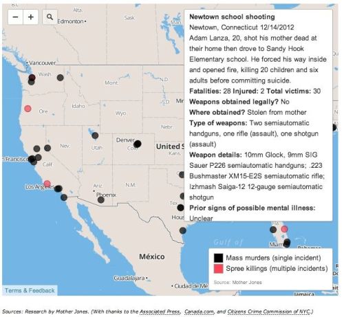
Even though there is some slight interaction with the map on this page, it’s still a pretty cold reading of data. Interactivity and facts, yes, but how can I connect with this information?

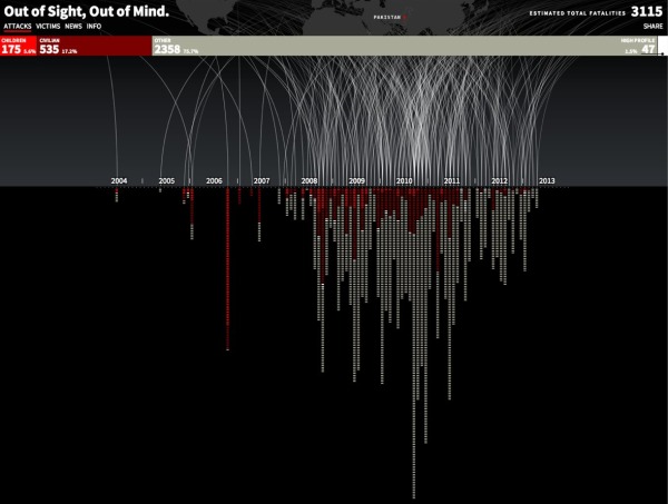
Here is an interactive infographic that tells us the effect of people killed by guns in a much more personal way: 

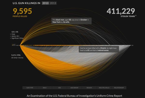
Stolen years from a life… Who wouldn’t be drawn into discover more about the facts shown here? We all think about our lifespan, and this infographic takes thousands of potentially anonymous datapoints and allows us to both see the mass effect or lets us drill down in a variety of ways to these very personal, relatable stories. 

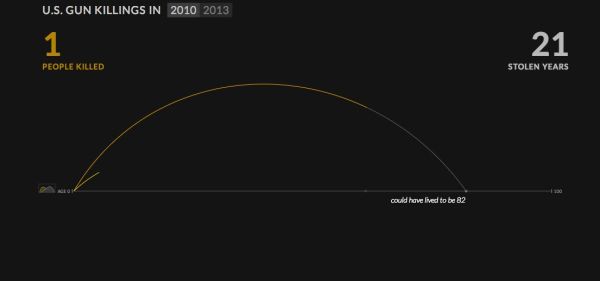
Another feature that heightens the emotional effectiveness of this infographic is the way it creates the display. The screen shot below shows how the image starts building, from a single arc representing one lifetime, which changes color at the point the victim loses his life. It’s like watching a shooting star, launching into its glowing path but losing its color the moment life ends before finishing the grand arc. Powerful and personal. The chart builds quite dramatically, showing the first three shootings one by one as arcs slowly shoot across the dark background. It then rapidly fills in the rest of the display in less than a minute, both to show us a flood of incidents and also keeping us from getting bored as thousands of curves are drawn and the numbers pile up.

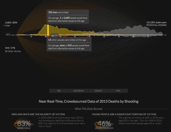
In another view, more information is revealed which, true to the storyteller’s intent, gives us yet more information that carries the emotional weight of “that could be me, or someone I know and love”. Here I have selected the data for fatal shootings of 21 year olds, to highlight how many deaths from guns have occurred so far this year to these young people. Without resorting to pictures, icons or symbols, the graph combined with the text highlights the sad fact that so many young people died that, otherwise would not have been at risk. Again, a powerful message, and one that is intended to reach us emotionally.

I recommend bookmarking the site (http://guns.periscopic.com/?year=2013) and revisiting every few weeks, as the data for 2013 is being updated regularly. The creators of the infographic, periscopic.com, have the motto, “do good with data—socially conscious information visualization”, and take storytelling to heart. They have avoided the cliches of trying to impress strictly with big numbers, or, from the other side, telling the stories of the killers. Instead, they focus on the story of the victims, people like us, and make the data that much more meaningful and memorable.

Whether static or interactive, an infographic will have the greatest resonance and be most memorable when it tells a story that touches our emotions. When we find ourselves within that story, either as the subject or when we can comprehend the information as it might relate to us, we are compelled to pay attention and remember. To create a powerful infographic, save the big graphics and clever images. Dig into the information and find the story that means something to us all.


Visual Problem-Solver Dean Meyers combines creativity, design, marketing and training experience to facilitate visual thinking in a wide variety of business, educational and strategic settings.  Dean has worked in the dual fields of graphic design and technology since the mid-80’s, when he worked for Apple Computer at the launch of the Macintosh in international markets. His career has taken him from leading ad agency graphic departments into web design and development in the mid-90’s to his current practice of improving communications in user experience, general business strategy and education through his work as a visual facilitator. His interest in infographics focuses on interactivity and better storytelling across multiple media. He has been seen giving workshops and graphically recording for events including South by Southwest, the World Innovation Forum, Picnic (Amsterdam), Business Innovation Factory, Pop!Tech, LeanUX NYC and TEDMED. 

LINKS:

www.vizbiztools.com

Twitter: @deanmeistr

Facebook: https://www.facebook.com/vizbiztools

Flickr: http://www.flickr.com/photos/deanmeyers/collections/72157622622863701/

Pinterest: http://pinterest.com/deanmeyers/

Curated content about Visual Innovation:  http://www.scoop.it/t/visual-innovation


Tuesday
Jun042013

Home Energy Savings

Home Energy Savings infographic

70% of electricity in the US is generated from non-renewable sources.  The Home Energy Savings infographic provided by Accent Building Products tells us how to have an energy efficient home without sacrificing comfort.

Today it is more important than ever to make our homes more energy efficient without sacrificing home comfort. An energy-efficient home will keep your family comfortable while saving you money. Unfortunately, a lot of energy is wasted through leaky windows or ducts, old appliances, or inefficient heating and cooling systems. You can use many tips to save money and energy! This infographic details many different money saving tips and shows how we spend the money on our homes.

Infographic provided by Accent Building Productsa direct distributor of the industry’s top accent home and building products.  All products are shipped to you directly from the manufacturers’ factory.

It’s interesting from an online marketing and SEO perspective that I can find the infographic on gallery sites like Infographics Showcase, Infographics Inspiration, and Visual.ly but I was unable to find the original anywhere on the Accent Building Products website or blog.  This means that any popularity in terms of links and visitors to the infographic itself will benefit the gallery sites, but not Accent Building Products.  Only indirectly will Accent get any benefit if readers separately visit their site, but they would have to manually type in the URL because none of the infographics have a link back to the site.

This is a fun visual explanation design.  The illustrations clearly put the suggestions and data into context of the areas in the house.  There is a lot of text, but the small callouts make it easy to read.  It would have been more effective to visualize the pieces of data that are included in the design.

Thanks to Chris for sending in the link!

Tuesday
Jun042013

The Makings of a Modern Home

The Makings of a Modern Home infographic

Keeping up with technology is always a full time job. Now even your home can have technology upgrades. The Makings of a Modern Home infographic from In Style Modern helps keep all of us current with information on updating your home with the newest technology.

There isn’t a text description on the landing page, or even in the infographic itself.  The reader is left to determine if these are real, current technologies or a forecast of what’s coming.  Personally I think it walks the line between the two.  The Nest Thermostat is very real, but self driving cars aren’t available to the public yet.

This design would have been better in landscape orientation, where the information could have connected more easily with the locations shown in the isometric house illustration.  I understand why they chose to use the Tall Format though, to make the display on the blog and in services like Pinterest easier.

Thanks to Therese for sending in the link!

Monday
Jun032013

The History of NFL Logo Designs

The History of NFL Logo Designs infographic

Football is extremely popular in the United States. People pick sides and cheer on their teams loyaly.  The History of NFL Logo Designs infographic posted on Visual.ly tells the story of each football team’s logo through the years.

In Infographics below we are going to show you some of the interesting logo design changes across the (NFL) community with their territory maps.

Cool design that shows visual evolution of various NFL logos.

Thanks to Rachael for sending in the link!

Friday
May312013

UK Income Tax and National Insurance

Income Tax and National Insurance - What are you really paying? is a new infographic video explanation from the team at See What You Mean that helps unravel the complexity of the UK tax system.

The UK’s taxes on people’s wages are needlessly complex and obscure. Produced with the team from See what you mean, the video highlights how National Insurance is a second income tax in all but name.

Previous YouGov polling for the TPA has shown that many people are not aware of how much tax they actually pay. The video makes clear the real rates of tax people pay when Employee’s National Insurance and Employer’s National Insurance are factored in.

Thanks to Richard for sending in the link!

Thursday
May302013

Drones Kill - Animated, Interactive Visualization

Drones Kill - Animated, Interactive Visualization

Great data visualization design from Pitch Interactive.  Out of Site, Out of Mind is an animated data visualization of every U.S. drone strike in Pakistan since 2004 and the associated kills reported in the news.  There is also an interactive element is that the readers can hover their pointer over the visualization an more details appear in a popup window.  Visit the original site to see the animation.

Since 2004, the US has been practicing in a new kind of clandestine military operation. The justification for using drones to take out enemy targets is appealing because it removes the risk of losing American military, it’s much cheaper than deploying soldiers, it’s politically much easier to maneuver (i.e. flying a drone within Pakistan vs. sending troops) and it keeps the world in the dark about what is actually happening. It takes the conflict out of sight, out of mind. The success rate is extremely low and the cost on civilian lives and the general well-being of the population is very high. This project helps to bring light on the topic of drones. Not to speak for or against, but to inform and to allow you to see for yourself whether you can support drone usage or not.

The visualization is created in HTML5 and JavaScript. We recommend Chrome for the best viewing experience.

The challenge with gathering the data and how drone attacks are represented in the news is shown by the large OTHER category of victims.  Also, it’s the largest category of victims.  A data visualization like this is a tremendously effective way to bring this issue to light.

The category of victims we call “OTHER” is classified differently depending on the source. The Obama administration classifies any able-bodied male a military combatant unless evidence is brought forward to prove otherwise. This is a very grey area for us. These could be neighbors of a target killed. They may all be militants and a threat. What we do know for sure is that they are targeted without being given any representation or voice to defend themselves.

The visualization was created by Wesley Grubbs, and there is a video interview of him about the data visualziation process by The Huffington Post.

Thanks to Ray for sending in the link!

Thursday
May302013

Water in the Anthropocene

Water in the Anthropocene is a very cool infographic video looking at the different ways we humans are changing the global water cycle.

Water in the Anthropocene is a 3-minute film charting the global impact of humans on the water cycle.

Evidence is growing that our global footprint is now so significant we have driven Earth into a new geological epoch — the Anthropocene.

Human activities such as damming and agriculture are changing the global water cycle in significant ways.

The data visualisation was commissioned by the Global Water Systems Project for a major international conference (Water in the Anthropocene, Bonn, Germany, 21-24 May, 2013). 
conference2013.gwsp.org

The film is part of the first website on the concept of humans as a geological force, anthropocene.info

Thanks to Owen for sending in the link!

Wednesday
May292013

Robin Richards - What Makes an Infographic Cool?

Guest Post by Robin Richards

Created a visual to show you instead of telling you.  Some thoughts on what makes an infographic cool along with some examples.

Robin Richards - What Makes an Infographic Cool?

Robin Richards

Robin Richards is a designer with a focus on visual storytelling and interaction design. He runs RIPETUNGI, a design studio based in Bristol, UK creating digital experiences for web, mobile and tablet and telling stories with data visualisation and infographics. 

LINKS:

ripetungi.com

Twitter: @ripetungi

LinkedIN: http://uk.linkedin.com/pub/robin-richards/2a/262/147

Tuesday
May282013

Wireframe, Prototype and Simulator Tools

Wireframe, Prototype and Simulator Tools infographic

So what is the difference between Wireframe, Prototype, and Simulator Tools? This infographic compares how the products preform in terms of design capabilities, mobile integration, collaboration features, and interactivity. From User Testing, this infographic  helps guide you through the design making process of what program is right for you.

If you’re into building websites, mobile sites, or apps, you probably use some type of mockup tool—prior to coding—to help you envision how a site will work and look. But do you get customer feedback on them? In this ultimate guide, we’ll explore leading mockup tools — wireframing, prototyping, and simulating –and show you how to run user tests with them.

Good design that puts the icons and information directly into the visuals.

Also available as a PDF download.

Thanks to Liz for sending in the link