About
Randy Krum
President of InfoNewt.
Data Visualization and Infographic Design

Infographic Design

Infographics Design | Presentations
Consulting | Data Visualizations

DFW DataViz Meetup

Join the DFW Data Visualization and Infographics Meetup Group if you're in the Dallas/Fort Worth area!

Search the Cool Infographics site

Custom Search

Subscriptions:


Feedburner

The Cool Infographics® Gallery:

How to add the
Cool Infographics button to your:

Cool Infographics iOS icon

- iPhone
- iPad
- iPod Touch


Read on Flipboard for iPad and iPhone

Featured in the Tech & Science category

Flipboard icon

Twitter Feed
From the Bookstore

Caffeine Poster

The Caffeine Poster infographic

Friday
May102013

Shark Attack!

Shark Attack! infographic

Shark Attack! is a great infographic design collaboration between Ripetungi and Joe Chernov.  Based on data from a Huffington Post article, 100 Million Sharks are Killed Annually.

Recently received a Facebook message from content marketing wizard Joe Chernov linking to the Huffington Post article 100 million sharks are killed annually.  This was an astonishing fact and the enormity of the number made it difficult to wrap your head around.  Joe also shared an idea for a graphic to add context to this fact making it easier to comprehend, while exposing the outrageous ratio of the number of people sharks kill to the number of sharks people kill.

Great data visualization that shows readers the magnitude and scale of how many sharks are killed by humans every hour.  It also puts the 11,417 sharks killed value into context by comparing it against the 12 humans killed by sharks every year.  [EDITED]

Don’t get me wrong.  I’m convinced that death by shark attack would be a horrible way to go, but some days it’s good to be at the top of the food chain on Earth.

Wednesday
May082013

Tiago Veloso - What Makes an Infographic Cool?

Guest post by Tiago Veloso

The ‘infographic explosion’ in the Internet began, as many of Cool Infographics readers probably know, around 2009. Since then, a whole new industry emerged, one that is dedicated to develop visual representations of information for organizations across pretty much all sectors.

It’s obvious that, as the number of marketing infographics grew, it became more difficult to achieve the link-bait impact we see so many agencies and SEO experts advertise, when defending the reasons why potential clients should include infographics in their marketing efforts.

Of course, a ‘viral infographic’ can have that impact, but the Internet user is getting more mature, I believe, in terms of what’s worth spending time reading. That means your infographic will have a couple of seconds to create an impression and captivate the reader – much like the ‘old’ newspapers headlines.

In fact, you can’t ask for a better reference of ‘what makes an infographic cool’ than the works published by many newspapers and magazines. And, from everything one can learn about infographics just by admiring some of best works in the world - like the ones awarded at Malofiej21, recently -, here are some of my favorite lessons:

Make it relevant to your audience, not to you

To be relevant, no matter in what context, implies to be correct. Nothing can be more destructive to an infographic than lack of accuracy. Dedicate enough time to research and instead of trying to mold the facts to an initial question or point of view, let the stories emerge from the data exploration process. Aim for that unique story everyone else missed. Concentrate on having a strong data-based story, in opposition of creating ‘lists of facts’.

Now, the problem with corporate clients is that usually you don’t have much data to work with in the first place. They just want an infographic, and if you’re an agency trying to make it in this market, you can’t afford to let any client escape, right?

However, poorly sourced and meaningless infographics tend to be less ‘viral’ – if they do go viral, it’s not usually good for the brand behind it. That just means it’s up to you to go after the sources – and I don’t mean just Wikipedia -, verify them, collect and explore the data, find the story before you even start drawing a chart or graphic.

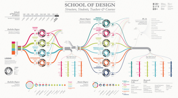
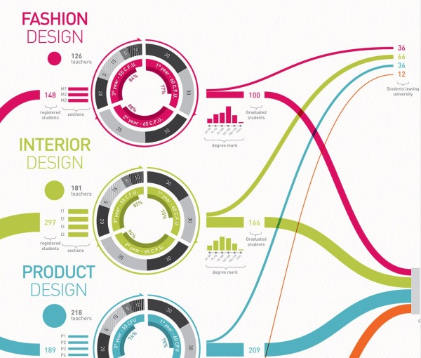
The ‘8 hats of data visualization design’, by Andy Kirk, showing the multiple dimensions of developing a data visualization. 

Make it easy to the brain, not the eye

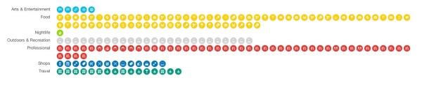
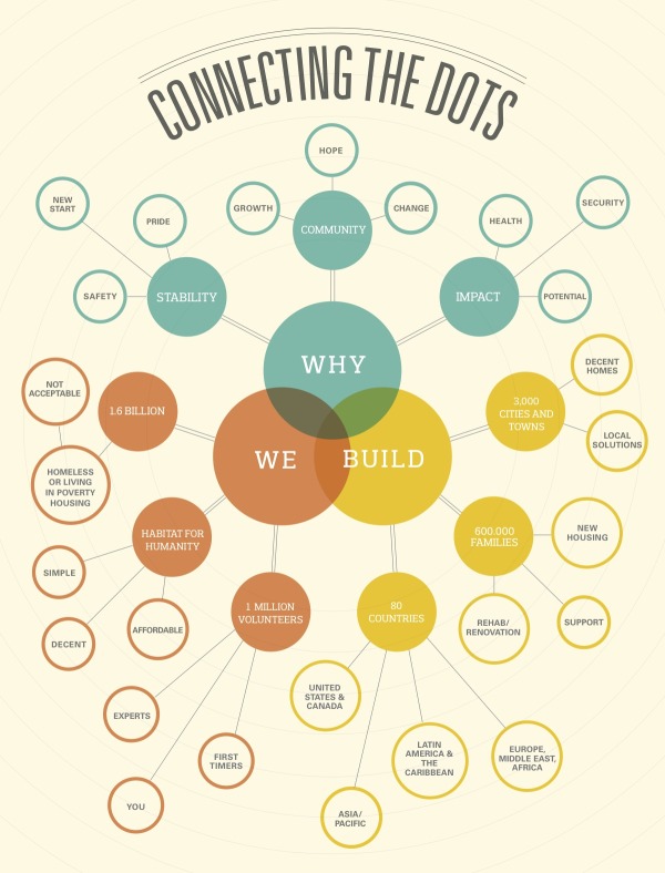
The ‘visual impact’ of an infographic it’s key in the Internet marketing business, a concept that has led to the premise that aesthetics means more to the general audience than the content itself. So, to create ‘awesome infographics’, graphic designers (most of them without any experience in visual journalism) run to vector illustrations, start playing with typography and colors, textures and even photos, adding elements that can fill up  the space of those widely adopted ‘tower’ formats that the client demanded.

This strategy helped the “Infographic Industry” to grow quickly, but like I said before, I think the information consumer is adapting, evolving, learning to process visual information more intuitively, and therefore, paying more attention to the content.

And what your brand really wants, ultimately, is a message that sticks to the brain, not only to the eye. Too many colors, fonts and vectors will only take away the reader’s attention from what really matters in an infographic: the layers of information, the multiple insights you’re not only saying (in text and numbers) but showing (with comparative graphics).

There are scientific principles applied to all dimensions of information design, and I must recommend Alberto Cairo’s book The Functional Art as the perfect starting point in that journey towards a deeper understanding of this topic. The important thing to have in mind is that if you focus on providing the best information display possible, and not the easiest or the most ‘eye-grabbing’ one, you’ll be heading in the right direction to get an infographic that will please both the eye and the brain.

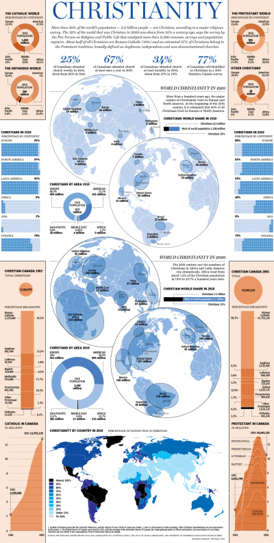
‘Tower infographics’ can be useful, and even newspapers use them. See this recent example from Canada’s National Post, designed by Richard Johnson.

Make it as an investment in branding, not sales

This third point is sort of a consequence of the previous ones. To create a ‘Cool Infographic’ you’ll have to make an investment in research, find the right balance between form and function and still have the proper connections to see it featured in major websites. Most of times, you’ll need to outsource these tasks.

Worst of all, infographics don’t sell. They’re not supposed to. They can generate lots of website traffic, perhaps even some leads, but if you’re thinking about investing in Infographics to rise sales or something like that, than my advice is that you channel those resources on to something else (please remember that we’re talking about a specific type of ‘infographic’, not all the uses for information design inside a company).

If you add to that the general lack of tolerance the internet user has to ads disguised of something else, the only truly good reason for a company to create an infographic is that it has something meaningful to communicate, that is better (not ‘easily’) understood through this specific form of visual representation.

Or, simply putted, instead of looking at infographics as ‘illustrated ads/press-releases”, think of them more as “summarized insightful white papers”.

Simple graphics can be picked up by major websites, if the content is relevant. Here’s one of many examples of charts provided by Statista that ended up in Mashable. 


Tiago Veloso is the founder of Visual Loop, a collaborative digital environment for everything related to information design and data visualization. He lives in Brazil, and you can connect with him online on Twitter and LinkedIn.


Tuesday
May072013

Visualizing the School of Design

Visualizing the School of Design infographic

Visualizing the School of Design is a very data dense infographic poster that analyzes the School of Design at the Politecnico di Milano.

Politecnico di Milano, in order to present the School of Design in its own stand at Salone del Mobile 2013, asked DensityDesign to realize a 4 mt x 2 mt poster showing the structure and the efficiency of the School of Design system at Politecnico. The visualization is a picture of the 2010 / 2011 academic year.

Definitely take a look at the full-size version to appreciate the thought and effort put into the design.  This project was amazingly developed in one week by the team at DensityDesign.

Visualizing the School of Design close up

Found on Datavisualization.ch


Friday
May032013

The Foursquare Visualizer

The Foursquare Visualizer interactive infographic

Foursquare has release a new Foursquare Visualizer, that creates an interactive data visualization of your own activity for the last 12 months.  I included the images from my own history.

At Foursquare, we’ve always known how very special our community is. Today, April 16 (4/4^2), marks the fourth annual 4sqDay. Each year, we take this opportunity to thank our amazing community for all that they do.

…take a peek back into your own history at foursquare.com/visualizeme. It’s just our small way of saying, “Thanks! We think you’re awesome.”

There are a handful of different visualizations of your own history of check-ins available.  The connection circle (shown above) is the best looking.  Other visuals include a Timeline and Categories.

Found on the Foursquare blog


Friday
May032013

Subways of North America

Subways of North America infographic

Now this is truly meta.  A subway map visualization of all the Subways of North America from Randall Monroe of xkcd.com.

For the pedantic rail enthusiasts, the definition of a subway used here is, with some caveats, “a network containing high capacity grade-separated passenger rail transit lines which run frequently, serve an urban core, and are underground or elevated for at least part of their downtown route.” For the rest of you, the definition is “an underground train in a city.”

About one in three subways stops in North America are in NYC

Another great design from Randall!

Thursday
May022013

Connecting The Dots

Connecting The Dots infographic Habitat for Humanity

Connecting the Dots is a mind map design from Habitat for Humanity.  It was published in the May 2013 edition of their own magazine, Habitat World, and made available online as a PDF download.

Learn more about how Habitat builds homes, communities and hope.

I really like the combination of the Venn diagram in the center and the mind map nodes that extend outward.  The sizes of the circles doesn’t have any meaning, just sized to fit the text.  This is a really good way for Habitat for Humanity to tell their story with a visual explanation.


Thursday
May022013

The United States of Energy

The United States of Energy infographic poster

The United States of Energy from Saxum, is a huge project to map domestic energy sources.  

Finally… After almost 50 years of dependence on foreign sources to meet our growing energy needs, our country is finally in a position to begin reversing the trend. Through advances in drilling technology, discoveries of new oil and natural gas reserves and swift progress in the renewables sector, the United States is setting a course for energy self-sufficiency.

What began as a simple graphic showcasing America’s energy riches quickly grew into a two-sided, folded map concept displaying thousands of individual data points.

The #USofEnergy map visualizes our country’s energy potential by charting current sources of energy production and identifying future resources and known deposits. Energy resources surveyed include: natural gas, oil, coal, nuclear, hydroelectric, wind, geothermal, solar and biomass.

This is actually designed as two landscape posters as the front and back, but when put together, they make one very detailed portrait orientation poster.  I love the main U.S. map that is the primary focus, and the designers took on the challenge to visualize the many different energy sources as represented with the overlapping colors.  You’ll notice that the smaller area coverage shapes are always on top, so the small circles aren’t completely hidden by the larger area shapes.  I would have attempted making the colored areas slightly transparent to let the underlying shapes show through, and removing the text names of all the states might have helped to reduce the visual noise.

My power contract for InfoNewt here in Texas is 100% Wind Power, but I had no idea that Texas is the national leader in wind power production!

I’m not sure what to call them, but I like the paired 180° doughnut charts showing how the sectors and sources of energy have changed from 1949-2011.  However, I don’t like the chart legends that makes them hard for the reader to figure out what each color represents.  Legends are evil!  It would have been nice for the nine types of energy to be shown with icons (along with the color-coding), and the icons or text could have been shown along with the larger 2011 doughnut segments.

The statistics shown at the bottom are shown as just text numbers.  In contrast to all of the data visualizations throughout the rest of the design, this makes these numbers seem unimportant to the reader.

Found on Visual.ly

Wednesday
May012013

Alberto Cairo - What Makes an Infographic Cool?

GUEST POST by Alberto Cairo

A ‘cool’ infographic is one that not only forces you to stop and stare at it with awe, but also —and above all— one that gives you insights that you would not get otherwise. ‘Cool’ infographics reveal patterns and trends that lie buried below mountains of data and facts. They make complexity clear without compromising its integrity.

To be truly ‘cool’, an infographic needs to be honest, truthful, deep, and elegant. It can be fun, too, but it needs first to respect the intelligence of its potential readers, and be designed not just to entertain them, but to enlighten them. A bunch of out of context numbers or grossly simplistic charts surrounded by pictograms or illustrations is never a ‘cool’ infographic. Quite the opposite is true. The primary goal of ‘cool’ infographics is not to ‘bring eyeballs’ or ‘go viral’. Those are by-products. If you design with just those objectives in mind, you will end up having not an infographic, but perhaps a colorful but ultimately worthless poster. Any truly ‘cool’ infographic is a tool for rational understanding, an instrument to discuss relevant ideas and phenomena.

Washington Post Homicides in the District cool interactive infographic

As an example, I would like you to visit this very simple but very smart interactive graphic by The Washington Post. See how carefully the information is layered and dosed in it. Notice how it first highlights some important facts (“Drug killings down”, “Most dangerous age…”) and then it lets you explore the data at will. It is beautiful, it is informative, it is useful. And it is extremely cool.


Alberto Cairo

Alberto Cairo teaches infographics and visualization at the School of Communication of the University of Miami. He is the author of the book The Functional Art: An Introduction to Information Graphics and Visualization (PeachPit Press, 2012). He has been a consultant and instructor with media organizations and educational institutions in more than twenty countries.

LINKS

www.thefunctionalart.com

Twitter: @albertocairo

School of Communication: http://com.miami.edu/ 

Tuesday
Apr302013

White House will be Posting More Infographics

White House Infographics

The White House has just started posting on Tumblr, and released the White House on Tumblr infographic you see above to kickoff the blog.  I’m pleased to see infographics as a large section of the content they are planning, but also a little bit worried.

We see some great things here at the White House every day, and sharing that stuff with you is one of the best parts of our jobs. That’s why we’re launching a Tumblr. We’ll post things like the best quotes from President Obama, or video of young scientists visiting the White House for the science fair, or photos of adorable moments with Bo. We’ve got some wonky charts, too. Because to us, those are actually kind of exciting.

They’re not kidding about the “Wonky charts!”  I look at this design and think “Huh?”  The infographic appears to be a stylized form of a coxcomb chart or rose diagram, but not really.  It’s definitely an aesthetic design all about style without substance.  The design is just supposed to imply the different types (and maybe the amounts) of content they intend to publish.  There isn’t any real data or numbers behind the chart, and the hand-drawn aspect reinforces that this is just suggestive of what we should expect to see in the future.  

Visually, I guess it also suggests that the content might cover multiple categories.  So posts about the FLOTUS (First Lady of the United States) might include photos, behind-the-scenes information and posts about Bo, the First Dog.

No real chart would have overlapping pie slices.  Slices of a true Rose Diagram (credited to Florence Nightingale) would have equal angles that add up to 360° or 100%, and with varying radii, the area of each slice would represent the value of each section.

The staff at the White House has posted infographics on the official White House blog before (which I critiqued here and here).  I love that this helps raise the awareness and credibility of infographics aas a whole!

Tuesday
Apr302013

Drowning in Big Data [infographic video]

Infographic video from 2011 by The Economist that uses animated data visualizations to tell the story about growing Big Data.

Digital data will flood the planet—and help us understand it better

Found on Visual Loop