About
Randy Krum
President of InfoNewt.
Data Visualization and Infographic Design

Infographic Design

Infographics Design | Presentations
Consulting | Data Visualizations

DFW DataViz Meetup

Join the DFW Data Visualization and Infographics Meetup Group if you're in the Dallas/Fort Worth area!

Search the Cool Infographics site

Custom Search

Subscriptions:


Feedburner

The Cool Infographics® Gallery:

How to add the
Cool Infographics button to your:

Cool Infographics iOS icon

- iPhone
- iPad
- iPod Touch


Read on Flipboard for iPad and iPhone

Featured in the Tech & Science category

Flipboard icon

Twitter Feed
From the Bookstore

Caffeine Poster

The Caffeine Poster infographic

Monday
Apr292013

New Guest Post Series: What Makes an Infographic Cool?

What Makes an Infographic Cool?


I’m very excited about this project!  This week I’m going to start sharing a weekly guest post series from prominent infographics designers about “What makes an infographic design cool?”  Each Wednesday, I’ll feature a different expert opinion (until I run out of experts).  I’ve invited these experts to draft their own posts, and share whatever examples they want to highlight.

I’ve been running the Cool Infographics site since 2007, and we have watched an amazing category of design being developed.  They didn’t exist when I started, but now we have an infographics design industry, and a number of well known infographics design experts.  The practice of visual storytelling has become a recognized design profession.

I receive around 30-50 infographic submissions to the site every day, and most of them don’t make the cut to be considered a “cool infographic” to be posted.  The process of filtering these designs is very time consuming, and my current backlog is up to at least 400 unread submissions.  Over the years, we have developed our own formula for filtering the infographic designs you see posted on the site, but I really wanted to hear and learn from other experts about what they consider to be “cool.”

Stay tuned, and let me know what you think of the series in the comments.

Monday
Apr292013

What Guests Want...at Hotels

What Guests Want at Hotels infographic

Hotels.com has released the 2013 version of their Global Hotel Amenities Survey, summarized in the infographic What Guests Want.  Part of an ongoing series from Hotels.com on their press site, the infographic takes a fun look at what hotel-stayers value most.  Apparently everyone wants free WiFi!

You just checked into your favorite hotel and are ready to enjoy all it has to offer. What kind of amenities inspire you? We surveyed travelers from all over the world to see what perks they valued most when spending a night away from home. 

The infographic is an additional content piece to the release of the complete survey, Global Travelers Want To Stay Connected And Comfy.  The Hotels.com press site is primarily targeted at an audience of hotel industry executives and the news media, and they maintain a dedicated infographics page.  The addition of the infographic to the press release helps to make the often dry survey data more engaging, and additional press releases were also published to highlight some of the hidden gems in the data: Danish Hotel Guests Most Honest; Americans Come In 23rd Place

Designed by Jeremy Yingling with InfoNewt, the infographic is essentially an executive summary of the much larger survey report that Hotels.com publishes each year.

I’ve posted a short, behind-the-scenes Q&A with Hotels.com about their experiences using infographics on the InfoNewt blog.

Friday
Apr262013

The Importance of Childhood Education

A helpful infographic for soon-to-be parents. The Importance of Childhood Education infographic from SchoolTutoring Academy takes information about kids with early childhood education and attention and compares them to kids who did not. But it isn’t all bad news for moms, the infographic gives a few tips on how to survive being a stay-at-home mom as well as some positive job information. Then see how the United States matches up with other countries on early childhood education.

While there can be no denying the heavy importance of early education for a child, this education infographic delves much deeper by looking at how future success in life can often be predetermined by the quality of early eduction.

It also explores the often overlooked importance the role the parent plays, especially the Mother. How important is it for Moms to stay at home with their children during early learning? What steps can working Moms take to secure the best educational foundation for their child? All these topics are researched presented in the infographic. The last segment compares the different education paths taken by countries from around the world. From birth to age 7, we look at the different educational institutions that counties from Canada to Germany to Italy to the United States use to start their children’s educations.

If you have any comments or thoughts on the information included in this infographic or education in general, please use our comment section below. You can also see our previous infographic discussing the cost of rising education.

Although the information included in the design is great, this infographic has a lot of text.  Too much text.  That much text in a design will turn away potential readers even before they start.

Thanks to Shell for sending in the link!

Friday
Apr262013

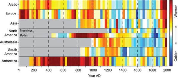
2,000 Years of Continental Climate Changes

2,000 Years of Continental Climate Changes

Climate change is a complicated, and sometimes controversial, global topic.  I really like this data visualization of 2,000 Years of Continental Climate Changes that was included as part of the report published by the “2K Network” of the International Geosphere Biosphere Program (IGBP) Past Global Changes (PAGES) project.

Thirty-year mean temperatures for the seven PAGES 2k continental-scale regions arranged vertically from north to south. Colors indicate the relative temperature. The most prominent feature of nearly all of the regional temperature reconstructions is the long-term cooling, which ended late in the19th century. North America includes a shorter tree-ring-based and a longer pollen-based reconstruction. Modified from: PAGES 2k Consortium, 2013, Continental-scale temperature variability during the past two millennia, Nature Geoscience, DOI:10.1038/NGEO1797.

Each color band represents a 30-year mean temperature found on each continent.  Their choice of data visualization method is very compelling, and visualizes a huge amount of data in a small space.

I also love that a good data visualization can attract attention and build awareness all by itself.

Found on the post by Andrew Revkin on the NY Times Dot Earth blog.

Thursday
Apr252013

The 2012 Adobe U.S. Digital Video Benchmark

Cool infographic video from the team at Adobe that shares the results of their own 2012 Digital Video Benchmark research.

As you relax at home, walk through stores, and sit in airports, you see people watching video on more screens than ever before. But don’t rely on the eyeball test. The Adobe Digital Index team looked at 19.6 billion video starts on media websites to confirm the growth of broadcast video consumption across connected devices. See the latest video trends they uncovered for device use, ad placement, social media, and more. 

Learn more about what they found here: http://adobe.ly/ZeXLoI.

Adobe Digital Index publishes research on digital marketing based on the analysis of anonymous, aggregated data from over 5,000 companies worldwide that use Adobe Marketing Cloud.

The information is about all videos and ad placements in online videos, but the data also applies to infographic videos.  Online videos are still on the rise, and have become a very effective content and advertising platform for companies.

Clean data visualizations that I would assume were created in Adobe After Effects.  The bar charts that change size and shape in multiple directions are disconcerting though.  I can’t tell if they were appropriately adjusting the area of each bar, but I doubt it.  It looks more like a designer thought it would look unique and different without realizing that it corrupts the visualization of the data.

Thanks to Jordan from Say It Visually for sending in the linK!

Wednesday
Apr242013

The Digital Dorm

Digital Dorm infographic

College is expensive and it is not getting any cheaper. Lucky for us, the advancement in technology and the introduction of apps could actually lower costs! The Digital Dorm infographic from CourseSmart can tell you the details.

College is getting more expensive but going digital helps students keep more money in their pockets in more ways than one. Check out our infographic on how students can save not just money but also time by moving to a digital dorm.

Not only saving money.  The visual story here is also how to save space and clutter in a student’s dorm room, which will help them find that missing homework assignment!

Thanks to Temple for sending in the link!

Monday
Apr222013

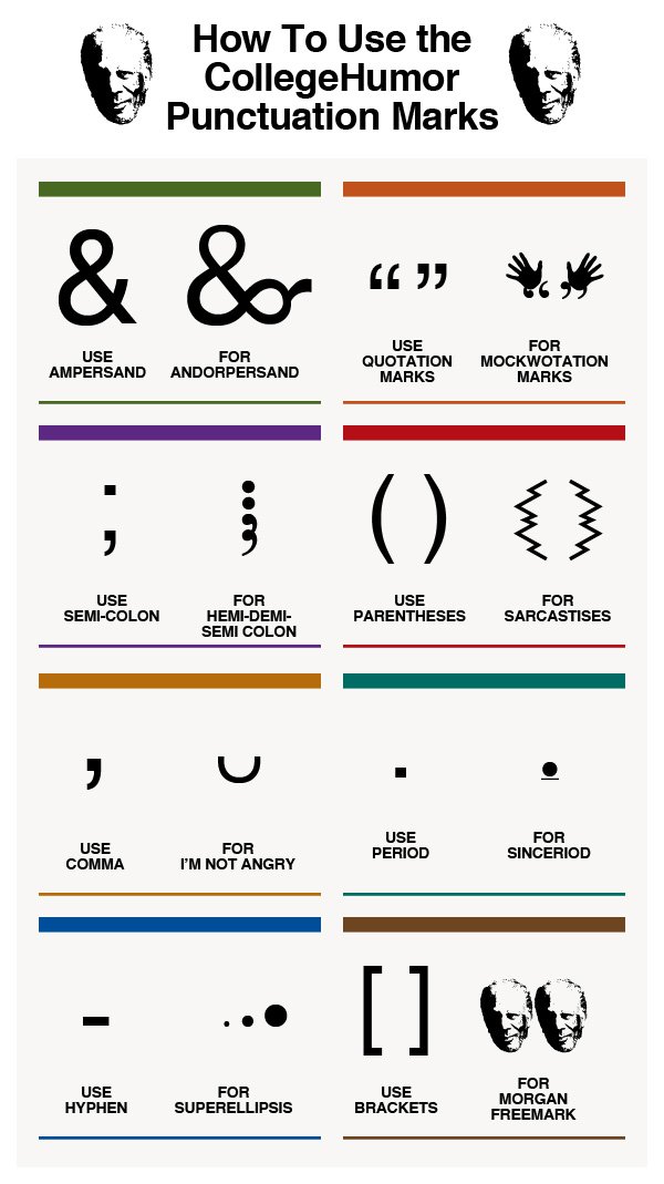
8 New Punctuation Marks We Need

8 New Punctuation Marks We Need infographic

Our punctuation choices could really use an update, and CollegeHumor.com is proposing we add these 8 New Punctuation Marks to our collective writing options.

A humorous look at some of the punctuation marks missing in the English language.

This is a borderline infographic.  Originally, all eight were designed as separate images, but then College Humor stacked them together into one image file so that it resembled a tall infographic .  There’s no data visualization or much in the way of illustration other than the symbols themselves.  However, it is informative, so like I said, I consider this to be a borderline infographic.

The response to the ideas was strong enough that they actually created the font, and you can download it from the College Humor site.  They created a separate infographic as the instructions on how to use the font in your desktop applications once you have it installed.  

UPDATE: Want to use these punctuation marks? Click here to download the CollegeHumor Punctuation font and get access to all of them.

The downloaded font won’t work on websites, just desktop applications, but I have seen a few people trying to make it available online as well.  For example, here’s a link to a Google Chrome extension that let’s you use the font on Facebook.

Found on Visual.ly

Thursday
Apr182013

Star Wars vs. Star Trek

Star Wars vs Star Trek infographic

Which one wins, Star Wars or Star Trek? This is one of the most heavily debated question of all time. The Star Wars vs Star Trek infographic from hark.com and TrekNews.net will not give you the answer on who is better… However, it will give you some concrete numbers on things like awards, social media followers, number of video games, and movies.

The war wages on. The battle between two of sci-fi’s most iconic franchises, Star Trek and Star Wars, is a battle that has been discussed by fans for over 30 years. The recent news of J.J. Abrams accepting the director’s job on the next Star Wars film, only fanned the flames.

Today’s infographic pits the two franchises against each other once again — with criteria including number of films, box office gross, number of Academy, Grammy and Emmy Awards, video games, books, toys, and social media followers.

This is a fun topic, perfect to incite discussion and links from the online community.  My only criticism of the design is the many of the statistics are not visualized.  Big fonts are not visualizations, so the infographic would be easier to comprehend if numbers like the Total Box Office Gross proceeds were visualized.

Found on infographicjournal.com

Tuesday
Apr162013

The Anatomy of the Social Media Command Center

The Anatomy of the Social Media Command Center infographic

Beingyourbrand.com has created The Anatomy of the Social Media Command Center so that you can learn more about a few of their favorite social media command centers, and how to construct your own.

In the recent months, many major brands have developed what they are calling “Social Media Command Centers.” These centers are state-of-the-art listening hubs that allow brands to monitor their presence on major social platforms and be ultra-responsive to conversations happening about their company. However, with all their glamor, are these command centers really capable of delivering results, or are they just for show?

The following infographic, looks at three of the most noteworthy examples of social media command centers:

  • The University of Oregon’s Quakecave in Autzen stadium
  • Gatorade’s Mission Control at their Chicago headquarters, featuring custom visualization from STRUCKUndercurrent, and Radian6
  • The American Red Cross Command Center powered by Dell

More of a visual explanation, the design does share some common points of data like number of employees and a relative scale of the amount of data being collected.  It’s a good design that clearly explains this new marketing function to readers.

The URL link to the infographic landing page on the should have been included in the footer to help readers find the original full-size version when the infographic is shared on other sites (like this one).  Especially a good idea since this was posted on their blog, and will get buried in the archive over time.

Thanks to Matt for sending in the link!

Wednesday
Apr102013

How Corporate Logos Evolve

How Corporate Logos Evolve infographic

How Corporate Logos Evolve, from The Logo Company, shows us how even iconic world-wide recognized company logos change over time.

We often get asked for a logo design that can stand the test of time. Something that will last forever. I mean, we look at all these “Mega Corporates” and their logos never change. Do they? Well, actually and surprisingly, they do….a lot.

This illustration depicts some of the biggest global brands and highlights the evolution of their logos from humble beginnings to the present day. It might strike you how some of the designs started out looking like their biggest rivals and others appear to of hardly changed at all. Timeless is certainly not the overriding characteristic of most of these early creations.

This is a perfect use of an informative infographic that ties directly into a company’s business, and makes for a great content tool for marketing.  The big challenge in the coming years will be the relevance of infographics to the sites that publish them, and this is the right way to do it.  Informative, entertaining infographic that is directly relevant to the hosting website without specifically being an advertisement for their business.

They should have included a copyright (or Creative Commons) license and the direct URL to the infographic blog post in the footer of the design.  That way the information travels with the infographic as it is shared and posted across different sites.

Found on Best Infographics