About
Randy Krum
President of InfoNewt.
Data Visualization and Infographic Design

Infographic Design

Infographics Design | Presentations
Consulting | Data Visualizations

DFW DataViz Meetup

Join the DFW Data Visualization and Infographics Meetup Group if you're in the Dallas/Fort Worth area!

Search the Cool Infographics site

Custom Search

Subscriptions:


Feedburner

The Cool Infographics® Gallery:

How to add the
Cool Infographics button to your:

Cool Infographics iOS icon

- iPhone
- iPad
- iPod Touch


Read on Flipboard for iPad and iPhone

Featured in the Tech & Science category

Flipboard icon

Twitter Feed
From the Bookstore

Caffeine Poster

The Caffeine Poster infographic

Wednesday
Mar202013

The History of Home Heating

The History of Home Heating infographic

Fun timeline of The History of Home Heating infographic by global home improvements. See how far we’ve come in home heating and the plans for the future. With the current heating technologies, we could reduce the harm that we are doing to the planet.

This is mostly a visual explanation using illustrations, but does a good job of clearly telling the story to the readers with the sequence of evolving heating images.  The isometric, video-game style illustrations draw in the reader and make the information more engaging and interesting to read.

Thanks to David for sending in the link!

Tuesday
Mar192013

Ink Costs More Than Human Blood

Ink Costs More Than Human Blood infographic

The Ink Costs More Than Human Blood infographic is a demonstration design by the team at Nuesion.

I think this is a fantastic design, but lacks some crucial elements for a successful infographic.  The overall design is telling one story very clearly, and that’s one of the best practices in infographic design.  Some of the best infographics have one Key Message that the audience can’t miss, and this design nails it!

The problem I see with this design is that it lacks credibility.  There are no sources listed, so the audience doesn’t know where the data came from or how current it is.  Why should they believe the data visualization?  Is it biased or skewed in any way?  Without doing a ton of research on their own, the audience has no way to tell.

Also, the footer of the design is missing both copyright information and a URL to the infographic landing page.  It lists the nuesion.com home page, but it took some digging on my part to find the original high-resolution infographic buried in one of their blog posts.

Tuesday
Mar192013

Serif vs. Sans: The Final Battle

Serif vs. Sans: The Final Battle

Ever have a problem deciding whether to use Serif or Sans? The Serif vs. Sans: The Final Battle infographic from webdesignerdepot.com has broken down when and why you should use each one. The final verdict? Serif is better for print and Sans is better for web.

First it was the Capulets versus the Montagues; then it was Coke versus Pepsi; and the latest epic battle? Serif versus sans-serif, of course.

Lucky for us, the crew at UrbanFonts has produced a nifty infographic to help clarify the age-old rivalry between serif and sans. Brief, yet information-packed, it covers everything from DPI to classification, and expertly explains why serif is better for print and sans serif is best suited for web.

This clever infographic — that smartly draws upon humor to drive home its points — offers a simple, insightful conclusion that designers should bear in mind: “The best font choices are ones where readers do not notice the font … but the message.”

Thanks to Jordan from Say It Visually for sending in the link!

Monday
Mar182013

See Conference April 20th

see#8 | 20 APRIL 2013 | SCHLACHTHOF WIESBADEN from Scholz & Volkmer GmbH on Vimeo.


I really wish I could make it to the See Conference (The Conference on Visualization of Information) in Germany (www.see-conference.org).  This year looks like they have a great conference lined up!

For eighth years now the see conference has been gathering the most creative people and exciting ideas on the topic of information visualization. The interdisciplinary platform brings together fields like design, art, architecture and new technologies. Our international speakers will show the latest ideas and approaches on how to deal with the current flood of information, on how to visualize it and turn it into something that can be experienced. Among our new speakers at see#8: Data journalist Francesco Franchi, Dutch design studio Catalogtree and British-born Antony Turner from Carbon Visuals. More info regarding program and tickets at www.see-conference.org

Event: see conference #8 
Date: 20 April 2013 
Location: Wiesbaden, Germany 
URL: www.see-conference.org

If you have a chance to make it to this conference, I would highly recommend it.  When I looked today, there were only 161 seats left!

Let me know what you think if you make it to the conference!

Thursday
Mar142013

A Delicious Pie Chart for Pi Day!

A Delicious Pie Chart for Pi Day infographic

A fun little Pie Chart for Pi Day from the team at Shutterstock that looks at the search results from their own image library.

In honor of Pi Day (3/14) we took a dive into our library to suss out some Pie Knowledge, and ended up with the above appetizing infographic revealing the flavor breakdown of the 85,748 “pie” search results from our library. Yes, we know that “Pi” equals 3.14159… and not “Pie,” but we couldn’t resist the delicious comparison. Any way you slice it, this is some tasty data, and our mouths water for data here at Shutterstock.

Now I’m hungry…

Thanks to Danny for sending in the link!

Wednesday
Mar132013

Beautiful Animated Wind Maps

The static image above doesn’t do these maps justice.  Go see the Wind Map on the Hint.fm site to truly appreciate the design work from artists Fernanda Viégas and Martin Wattenberg.

An invisible, ancient source of energy surrounds us—energy that powered the first explorations of the world, and that may be a key to the future. This map shows you the delicate tracery of wind flowing over the US. 

The animation is mezmerizing, and the interactive piece allows you to click-to-zoom in closer to any part of the map to see much more detail in a specific region.  The main page shows the map based on the most current weather information, but the Gallery page has some snapshots linked to specific points in time (like Hurricane Sandy).  I love that even the speed legend on the side is animated!

You can also buy a poster version as an art print.

Thanks to Jeff Jarvis for sharing this on Google+!

Monday
Mar112013

Wealth Inequality in America

The Wealth Inequality in America infographic video was posted on YouTube back in November 2012.  The video is a good example of what the best infographic designs accomplish: Make the complex understandable.  

Infographics on the distribution of wealth in America, highlighting both the inequality and the difference between our perception of inequality and the actual numbers. The reality is often not what we think it is.

The data visualization in the video is very powerful and effective.  It takes the huge numbers that our brains have trouble processing, and visualizes them in a way that we can understand.  Comparing numbers puts them into context for the viewer, and comparing the different fifths of the population works very well in this instance.

The data sources are clearly listed at the end of the video, and they are even made available as clickable links in the video description on YouTube (which is very helpful).  This helps the credibility of the video tremendously.  Not many viewers (4,336,254 views as of the day I post this) will click to the links to view the source data, but they’re there.  Transparency creates credibility.

However, it’s not clear who created and is publishing the video, and this hurts the credibility a little bit, at least to a skeptic like me.  The video was uploaded by the user politizane, whose account was created just to upload this video.  No history of other videos, and no links to a company or website.  The author/designer obviously has an agenda, and spent a lot of time or money creating the video.  It would enhance the credibility even more if the viewer knew who was publishing and promoting the video.

Thanks to Doug for sending the link!

Friday
Mar082013

Shutterstock: Annual Design Trends 2013 Edition

Shutterstock: Annual Design Trends 2013 Edition infographic

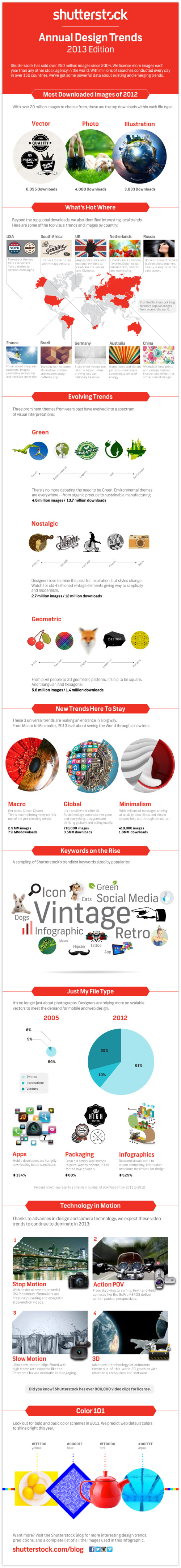
Shutterstock has created their Shutterstock: Annual Design Trends 2013 Edition infographic. From the infographic, we learn what was hot in 2012, as well as expected trend for the coming year of 2013. Interesting fact: Infographic downloads from Shutterstock are up 525% from 2011! 

Here at Shutterstock, if there’s one thing we obsess over as much as inspiring imagery, it’s data. Add that to the fact that we license more images than anyone else, and you have a recipe for some pretty insightful trend forecasting.

We created our first design-trends infographic last year; this time, we took things up a notch, incorporating a lot more data, a lot more images, and a more in-depth look at what we see heating up in the year ahead.


Check out the full infographic, then read on for 10 of our own favorite takeaways.

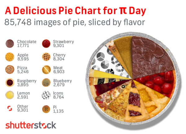
The use of stock vectors, especially for data visualizations, is on a huge upward trend as more and more people are designing their own infographics and data visualizations.  I am very excited about this trend, as people are breaking away from the chart templates in MS Office to visualize their new data in new and different ways.

I would prefer to see all of the statistics visualized using the stock vector data visualizations from Shutterstock.  That would have been more in line with the growth trend they are showing.  Much better than just showing the numbers in text they way they have in this design.

The footer of the infographic is missing both a copyright statement (or Creative Commons license), and the URL directly to the blog post with the high-resolution infographic.  The URL they did include is just to the main blog page, and six months from now the infographic will be buried in the past blog posts.

Thanks to Danny for sending in the link!

Wednesday
Mar062013

3D Printing: How Long Till The Revolution?

I can’t wait!  3D Printing: How Long till the Revolution? from the Farnell/Newark Group and designed by Neo Mammalian Studios takes a stab at predicting the rise of 3D printing.  Seriously, I want the day when I can print out my own coffee cup design, custom LEGO shapes and a new iPhone case!  Download the model, and print!  That flimsy plastic piece from the vacuum broke again?!?  Just print a new one!

3D printing has slowly started to get popular in use in the industry, by the hobbyists and ordinary individuals in their homes. If you can design it, the 3D printer can build it. However, we are still in the early stage of owning and using 3D printer. So, what is the length of time before it will become mainstream like the PC? The infographic will show when will every American own a 3D printer and how it affects the profit of those who are selling consumer objects and more.

The doughnut charts are colorful and unique in that hexagon shape.  The use of Roger’s Diffusion of Innovations line charts is actually very easy to understand.  The comparisons to the PC market and to music sales online are great analogies.

“3D printing is only gonna get more awesome.”

Found on Visual Loop!

Tuesday
Mar052013

The History of Prime Time Television

The History of Prime Time Television infographic poster


The History of Prime Time Television is a new infographic poster from HistoryShots co-founder and designer Larry Gormley.  Covering 70+ years of television history, the timeline plots out the most important/popular/trendsetting shows grouped by genre.

This graphic charts the history of prime time television from the origins of the industry in 1940s to the present day. More than 550 of the most important, popular, and trendsetting television shows are mapped into more than 20 genres. Shows selected have won critical acclaim according to recognized television critics or have wide audience appeal based on Nielsen ratings and awards won. The number of years each show has been aired is mapped allowing you to quickly see how long each show lasted.

This graphic was created by Larry Gormley. Reebee Garofalo’s Genealogy of Pop/Rock Music was a key inspiration for the design.

Compared to prior designs, it looks like this new project presented the additional challenge of visualizing multi-year television series, which were addressed with extended dotted lines showing the date range for each television show.

The History of Prime Time Television infographic poster

The design is available for purchase as a 41”x20” poster for $39.00 from the HistoryShots site.