Ever sink your teeth into a maple bar donut and follow it with a sip of straight black coffee? If you haven’t, you need to. The sweet and fat of a donut is the perfect compliment to bitter hot coffee. You’ll never want to add milk and sugar again. Sommeliers use opposing taste profiles such as sweet and sour all the time to create perfect food and wine pairings. Follow the simple set of guidelines below to make the best wine and food pairings at home.
This is the kind of infographic design you just want to hang up in your kitchen, because you’ll be looking at it so often. This design is deceptively simple. The color-coded connection lines are easy to follow, and it’s clear to the reader that they have good choices to drink with different foods. There isn’t one “right” answer.
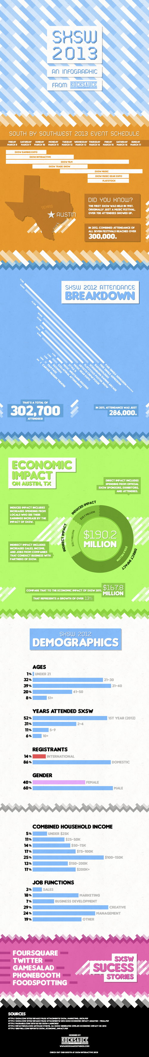
Rocksauce Studios has released SxSW 2013, an infographic looking at the basic statistics and demographic data around this year’s South By Southwest conference in Austin , TX.
The seven SXSW events — gaming expo, interactive, film, trade show, music, music gear expo and flatstock — attracted an audience of more than 300,000 last year (though only a sliver were badge holders). The PDF offers an attendance breakdown.
Demographics: the largest percentage of attendees are between the ages of 31 and 40; 86 percent of registrants are from the U.S.; 60 percent of attendees are male; and 29 percent of festival goers work in the creative industries.
Five companies to see success with SXSW include Foursquare, Twitter, Gamesalad, Phonebooth and Foodspotting.
The 2013 SXSW festival runs March 8-17.
300,000 attendees last year, and this year looks to be even bigger! Not sure why they released it as a huge, high-resolution PDF file, but the you can download it here.
HEY! I’m headed down to Austin on Friday for SxSW, so I would love to hear from anyone else headed down there as well. Should we have an infographics meetup?
The 2012 SEO Tactics infographic from Response Mine Interactive breaks down the tactics they use to get the highest rankings for their clients in 2012, and expect them to stay the same for the majority of 2013. The four main tactics are on-site influences, off-site influences, reporting & analytics, and keywords.
These are the components of a dominating SEO campaign. It’s a simple infographic listing and weighting every tactic we employ to gain top rankings for our clients and make them millions of dollars. Expect this chart to stay current through most of 2013.
A Little History
Since 2001, RMI has managed direct response digital marketing campaigns for world class companies like Rooms to Go, The Home Depot, Staples, Travelzoo and Hallmark.
But does it come in a poster?!
Yes! If you would like a FREE 36x24 color poster simply email your name and address to deborah.fisher@responsemine.com and we will send it to you.
Free Downloads
The poster and large format graphic was such a huge hit last year we’ve decided to take it a step further, Desktop Wallpaper. Simply choose the size that fits your monitor resolution. It should open in another tab/window then just right-click and save the file locally. Enjoy: 1024x768, 1280x800, 1280x1024, 1366x768, 1440x900, 1680x1050, 1920x1080, 1920x1200, 2560x1440.
If you like to ski, this is the infographic for you. Ski Holidays 2013 infographic from Home Away UK tells you where to find the best snow for skiing in Europe. Then as an added bonus, a few tips and facts to educate the reader about ski flags and types of snow.
Winter is here and the snow is starting to fall across the ski resorts of Europe and North America. Now is the time to start planning your next ski holiday, but before you do check out HomeAway’s fun guide to the slopes of Europe. We have also put together some interesting ski tips and advice including information provided by ski experts Nicola Iseard (Editor of Fall-Line Magazine) and Fraser Wilkin (Founder of Weathertoski.co.uk).
The information is well organized and the I like the simple, line-art illustrations. By keeping the illustrations simple, they don’t pull attention away from the data.
Designed by This Is Visual, they provided a URL link to the data sources in the infographic instead of listing them out. You can see the data sources at http://bit.ly/SpNJ1v, and the list extensive so I understand why they listed them separately.
The infographic should include both a copyright statement and the URL to the infographic landing page so readers can find the original when they see this infographic posted on other sites.
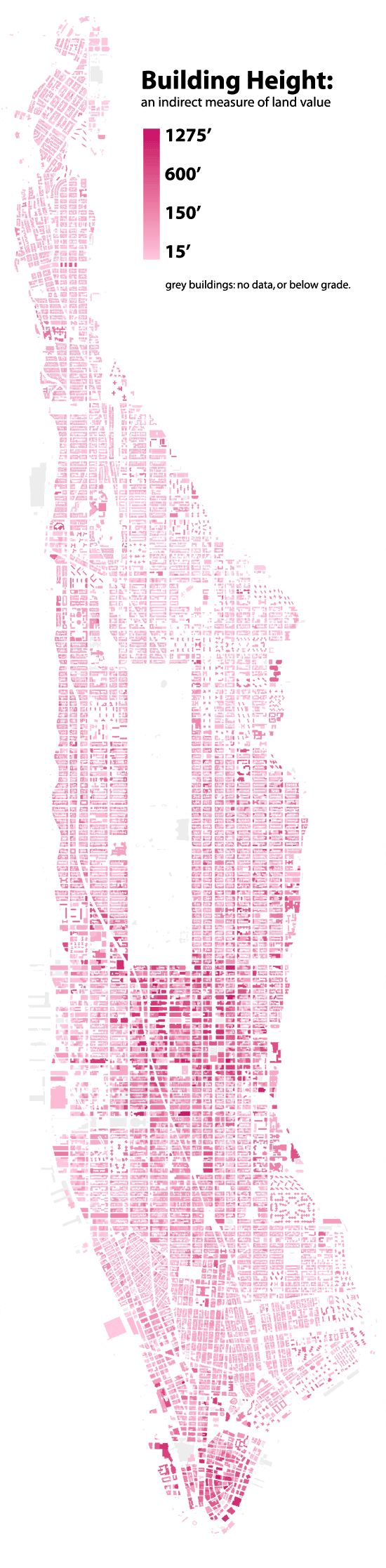
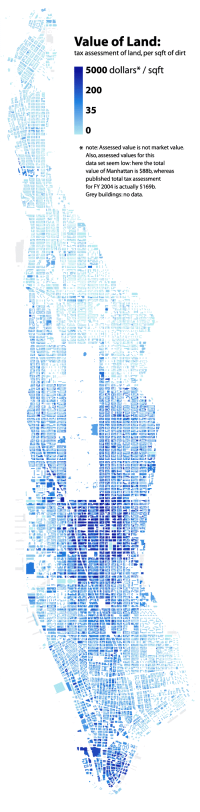
Manhattan Building Hieghts by radicalcartography.net is an indirect measure of land value based on building height. The infographic is shaped like Manhattan itself, and the actual building’s color darkness shows their heights in their correct locations.
You can also see an alternate design using assessed tax value as the data set, and how that maps out land value differently.
I missed posting this before the actual Grammys, but I really like the design. The Social Grammys from Activ8Social looks at the online stats of the biggest names in music.
What is the only thing that could be more exciting than this year’s Grammy Awards? An infographic about the Grammy Awards, of course! Before we see them rock the red carpet, we wanted to see how the biggest names in music size up against each other in terms of their social reach.
To find out who would win the “Social Grammys,” we analyzed the Facebook, Twitter, Instagram, and YouTube accounts of the nominees for the Best New Artist, Song of the Year, Record of the Year, and Album of the Year. There’s no question that the nominees all have a substantial and influential online presence but some are shockingly stronger in some areas than others. One surprising statistic is “Thinking About You” artist, Frank Ocean, has over 1 million more followers on Twitter than he has fans on Facebook. Another interesting statistic is the fact that only 42% of the nominees have Instagram accounts.
I thought the photos of the artists shown through the grids of squares representing the number of YouTube subscribers was really clever and well done.
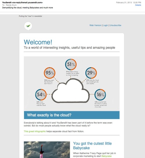
Cloud Computing: Fact or Fiction? is a new infographic from Devry University helping to explain the basics about cloud computing, and the clear up the common misunderstandings people have about the Cloud.
Cloud computing allows you to store, access and share data from Internet-connected devices in one central location. As technology careers continue to grow across the U.S. and cloud computing creates nearly 14 million jobs by 2015, the Cloud is more important than ever. Here are the fact you need to know about the Cloud - and the fiction than many believe.
This is a really clean and easy-to-read design, with a great color scheme. The statistics to support each section are good, and clearly sourced in the long list of data sources in the footer.
The data visualizations are a mixed bag. The doughnuts are easy to read and the percentage bars are clearly visualized as portions of 100%. The 24% doughnut in the top visualization is wrong. That will catch many people’s eye, and cast doubt on the rest of the visualizations. Once you get one data visualization wrong, you lose credibility and people will more closely scrutinize the rest.
Why are other numbers not visualized? The “cyber attacks” and “people using the cloud” statistics would have been easy to visualize, but now seem unimportant to the reader because they are just shown in text.
The most interesting thing is that I got this promotional, marketing email (image above) from YouSendIt.com highlighting this infographic and showing the top portion with the incorrect visualization. As far as I know, Devry and YouSendIt are not related in any way, so this is just using someone else’s work for their own purposes.
Of course, infographics are meant to be shared, but you shouldn’t claim credit for someone else’s work, especially in an email promoting your own commercial services. By omitting any design credit to Devry in the email, the message implies that the infographic is coming from YouSendIt, so it looks like the YouSendIt designers messed up the data visualization. The negative impression created by the false visualization will now also create a negative impression of the folks at YouSendIt. Oops.
Back in May we published an infographic about Top 250 Internet Retailers’ presence on social media. The infographic was perceived really well by our readers, customers and the media; thanks a lot to all the people sharing it on Facebook, Twitter, Pinterest and their blogs!
Now we are happy to present you with the Q3 update! Spoiler: those were two incredible quarters for Pinterest! Amazing growth in terms of the number of brands building their presence on Pinterest and the size of their communities!
I like the color scheme and the variety of data visualizations used in this infographic. Bars, icons, arcs and proportional circles. The use of the Internet retailer logos in the circles is especially effective.
I wish the Social Media site logos had been used, especially in the first three sections. I shouldn’t have to read the text and match the color to figure out what the visualization represents. That’s too much work for the reader. How many people does each of the people icons represent in the “How Many Followers Do They Have?” section? The lines look “relatively right”, but the number of icons seems to have no relationship to the actual numbers shown.
The footer needs both a copyright statement (or Creative Commons license) and the infographic landing page URL so readers can find the original when they see this posted on other sites (like this one!). Many bloggers are not good about linking back to your original site correctly, and you want your audience to be able to find it easily.
On February 12, 2013, President Obama gave his annual State of the Union speech, but this year it was “enhanced” with charts, data visualizations and additional information in a sidebar of the display (full video above). The team at NPR (@nprapps) published a great review a few days later called Chart Check: Did Obama’s Graphics ‘Enhance’ His Big Speech? They also included opinions from a couple of the best data visualization experts Stephen Few (PerceptualEdge.com) and Nathan Yau (FlowingData.com)
I will say that I think the use of the charts was very successful and does make the President’s speech more effective. By their very nature, the charts imply that the President has data behind his message, and that can be a very persuasive, compelling tactic. You’ll also notice the wide array of chart styles so they are each memorable for different topics in the speech. We didn’t get 27 bar charts, because the audience wouldn’t have been able to tell them apart after the speech. We got different data visualizations for different types of data. Stacked bars, line charts, area charts and grids colored icons.
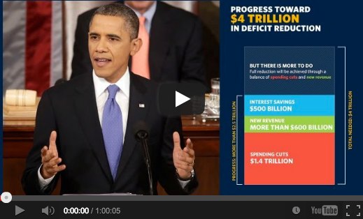
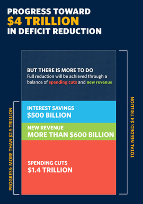
The key frame from the video (above) is what first caught my eye. This is the still image shown before you start playing the video. I was instantly concerned about all of the charts after seeing this one about Deficit Reduction. It may be because I work with data visualizations every day, but I could see instantly that the chart was wrong. How can the $500 Billion part of the stacked bar be larger than the $600 Billion part? That can’t be right! Seriously, I look at this stuff all the time, and this jumps out at me in a big way. Welcome to my life.
Here’s the full chart:
One of the biggest risks with data visualizations and infographics is what I call the Risk of Negative Impression. The idea is that while good visuals can quickly leave a good impression with your audience, if your visualizations are incorrect or flawed, you can leave a bad impression just as quickly and effectively. The audience thinks, “if they messed up this chart, why should I trust anything else they have to say?” Then they feel like they have to carefully scrutinize every chart, and you have lost all credibility with your audience.
The NPR piece does a great job of breaking down 14 of the 27 charts from the speech, and even created some corrected charts to show a more realistic real visualization of the data. I highly recommend you read the whole article on the NPR site.
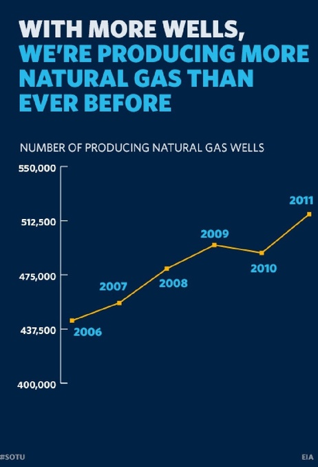
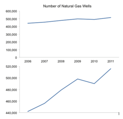
I’ll mention one more example. By visualizing data, the designer adds context and bias to the information. The best designers try to minimize the bias, but even the choices about what data to include in the visualization help frame the audience’s understanding. One common way to skew perception of the data is to change the scale of one or both of the axes. A number of slides from the speech don’t start at zero, so the chart exaggerates the changes. This is a common practice when charting stock values so the audience can see the small changes, but they often make the changes feel much bigger than they actually are. That was the intent with this chart that only shows the range of values from 400,000 to 550,000.
Stephen Few redesigned this corrected chart for the NPR piece, and I think he nailed it. By expanding the y-axis to start at 0, he puts the changes over time into a different perspective for the audience.
The White House has published all of the 107 slides as a scribd.com presentation:
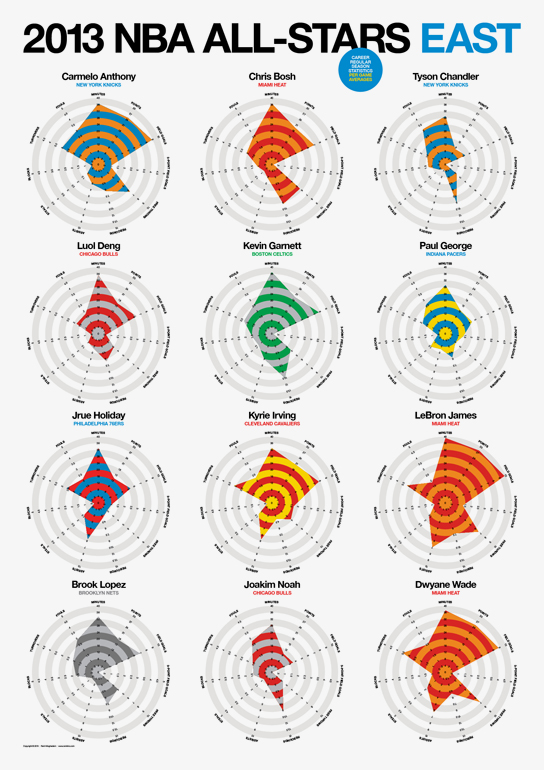
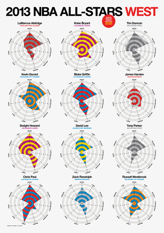
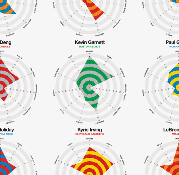
Rami Moghadam has just published two infographic posters detailing the stats for each of the players on the NBA All-Star teams. 2013 NBA All-Stars East and 2013 NBA All-Stars West both use radar charts to highlight each player’s strongest areas.
The individual radar charts are color-coded for each player’s regular team. In the radar charts, you have to look at each stat to determine which direction is a favorable number. A high number of turnovers isn’t a good thing, so I might suggest reversing the direction of some of the negative stats like fouls and turnovers.
Good job Rami, and thanks for sending in the link!


 Randy
Randy


