About
Randy Krum
President of InfoNewt.
Data Visualization and Infographic Design

Infographic Design

Infographics Design | Presentations
Consulting | Data Visualizations

DFW DataViz Meetup

Join the DFW Data Visualization and Infographics Meetup Group if you're in the Dallas/Fort Worth area!

Search the Cool Infographics site

Custom Search

Subscriptions:


Feedburner

The Cool Infographics® Gallery:

How to add the
Cool Infographics button to your:

Cool Infographics iOS icon

- iPhone
- iPad
- iPod Touch


Read on Flipboard for iPad and iPhone

Featured in the Tech & Science category

Flipboard icon

Twitter Feed
From the Bookstore

Caffeine Poster

The Caffeine Poster infographic

Friday
Feb012013

America's New Minority

America's New Minority infographic

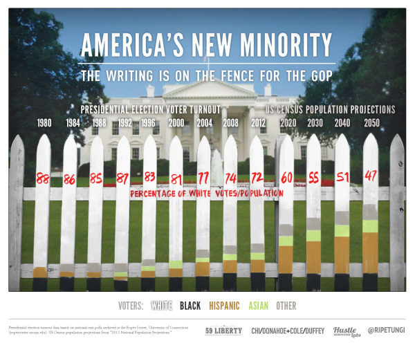
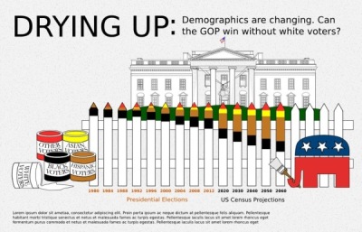
The demographics of America are changing, and America’s New Minority from 59 Liberty shows us how far we have come and predicts the next 40 years.  

With the country’s changing demographics, whites will drop under 50% of the population in the 2040s. Every Republican Presidential candidate since 1968 has won the white vote, but with the population shift can the GOP compete?

This graphic simply presents the data of a changing electorate. We went through numerous iterations attempting to find something appealing that presented the data accurately.

We worked with Projects by Chi/Donahoe on concepts, Ripetungi on design, and Hustle Labs for PR support.

For direct access to the data used, please view the spreadsheet here.

I really like how simple and strong the message is with this design.  The data will be surprising to many people, so it should be popular with social sharing.

I LOVE that they include a link to the raw data in a Google Docs spreadsheet for anyone to get their hands on the raw numbers from the data sources.  The link is in the additional text on the infographic landing page.  It would be more effective if the URL of the infographic landing page and the Google Docs spreadsheet were both included in the infographic so they would be readily available to readers who see the infographic posted on other sites.

They also share some of the early drafts and other versions of the design they considered on the infographic landing page.  You can see a couple here, but there are more on the page at 59 liberty.

America's New Minority infographic

America's New Minority infographic

Thursday
Jan312013

The History of Microsoft Office

The History of Microsoft Office infographic

Word, PowerPoint and Excel are the Holy Trinity of work productivity. This is the package that makes up Microsoft Office. The History of Microsoft Office infographic from Best STL (microsofttraining.net) highlights the history of past Microsoft Office releases and a preview of the 2013 version just released.

With MS Office 2013 launching soon (see below), let’s go back in time  to look at the Microsoft Office story so far.  When launched in 1990 it was called “The Microsoft Office”.

Which version was your favourite? Do you prefer an old faithful?

The design is great.  Easy to read and not too much information.  I’ve used every version of Office they have shown in the timeline.

At first, I thought this might have been an official Microsoft design, but it’s really from Best STL, who is a Microsoft partner.  It looks so much like a Microsoft design, they may be pushing the Fair Use of Microsoft’s trademarks a little further than I would be comfortable with.

Thanks to David for sending in the link!

Tuesday
Jan292013

How Social Sites Make Money

How Social Sites Make Money infographic

The number of social media followers are growing. But how do the sites make a profit? How Social Sites Make Money infographic from usbundles.com tells you which social media websites make money with ads, or paying customers, or mobile apps, or affiliates.

We turn to social media services to stay connected more and more each day. But even with hordes of devoted followers, how do these social sites manage to turn a profit?

Here’s a quick look at which revenue streams help major social networking companies go from social service to successful business.

Nice use of a Venn Diagram.

The doughnut charts aren’t accurate.  Like the designer eye-balled them instead of doing the calculation.  For example, the 71% doughnut is actually visualizing a value of 66.6% (2/3).

Found on http://socialtimes.com/how-social-sites-make-money_b91551

Monday
Jan282013

James Bond: 50 Years of Movies

James Bond: 50 Years of Movies infographic

James Bond: 50 Years of Movies infographic from hrblock.com is all about Bond, James Bond. See the top grossing films, iconic bond accessories and more.

It’s been almost 50 years since Sean Connery first delivered those now-legendary words on the big screen.

And 22 films later (with #23 on the way in November), the super suave super-spy known as 007 is celebrating a half century of fast cars, money and martinis on October 5th. To mark the milestone, we’ve put together an infographic taking stock of all that is Bond.

Very nice design.  My only suggestion would be to visualize more of the dollar figures shown instead of just showing them in text.  I appreciate that all of the dollar values have been inflation adjusted to 2012 dollars.

Thanks to Jane for sending in the link!

Friday
Jan252013

Philippe Dubost's Amaz'ing Resume

Philippe Dubost's Amaz'ing Resume

Very cool!  You have to check out Philippe Dubost’s (phildub) resume site.  Completely designed to emulate an Amazon product page, down to the smallest details.  Many of the links work nicely, taking you to a contact form or details on his LinkedIN profile page.  Things like his Product Dimensions, Only 1 Available, Star ratings and frustration-free packaging from France.  Even a Google Ad, similar to the ads on actual Amazon pages.

Certainly creative, I wondered if this should be considered an infographic resume.  I ended up convincing myself that “Yes” I do consider it to be infographic because it visualizes Philippe’s information in a way that is recognizable and easier to read and understand to the audience.  Star Ratings, key features, product photos and recommendations.  The visuals do bring meaning to the information, even though it’s done in a fun and amusing way.  It doesn’t have to be a chart of numerical data to be infographic.

What do you think?

Wednesday
Jan232013

LEGO Minifigs

LEGO Minifigs infographic

The LEGO Minifigs infographic is a history of LEGO Minifigs (Mini Figures). The infographic designed by Hot Butter Studio for visual.ly includes the dates when characters were introduced or when a certain feature was added. An added bonus to the infographic is the information about female LEGO minifigs and the FRIENDS line that was designed primarily for girls.

This is a fun infographic with some interesting factoids that will keep readers engaged with the design.  LEGOs are cool right now, so the timing for this design is good.  It’s also a topic that has not been well covered in infographics, so it stands out as unique information.

I wish a few of the data points were visualized like number of minifigs sold each year or space events along an actual timeline visual.

Thanks to Karyn for sending in the link!

Friday
Jan182013

Brockhaus Encyclopedia Infographics

Brockhaus Encyclopedia Infographics

Check out the Brockhaus Encyclopedia Infographics, infographics and data visualizations in the new German Brockhaus Encyclopedia!  Designed by oberhaeuser.info, the design studio of Martin Oberhäuser.

Series of info graphics for brockhaus, a large encyclopedia publisher from germany. The info graphics visualize several statistics and informations of topics like: the worlds highest mountains and their first ascent, the languages of the world, comets close to the earth, world oceans, ecology, media evolution and so on. One graphic shows the evolution of the world population from 1950 to 2050. Six transparent pages (one for each 20-year period) overlap each other.

These are some beautiful designs.  I’m sorry an English version isn’t available.

Found in the Behance 100 Most Appreciated Projects of 2012

Brockhaus Encyclopedia Infographics

Brockhaus Encyclopedia Infographics

Brockhaus Encyclopedia Infographics


Thursday
Jan172013

The Cheetah Animated Infographic

The Cheetah Animated Infographic

The Cheetah infographic introduces to you nature’s speed machine from Jacob O’Neal (jacobneal.com). Learn about how each body part is important to the Cheetah and why you don’t want to be on this mammal’s menu.

Did you know that cheetahs can accelerate from 0 to 60 MPH faster than a Ferrari? The amazing cheetah is the perfect example of natural specialization. They’re made for speed. Such a beautiful animal deserves a closer look!

This is definitely a cool infographic design!  I really like this use of the animated GIF image file format.  Seriously!  I REALLY like this design.  Animated GIFs have been used and abused for decades, but the use of animation here is done in a way that is very visually appealing.  It actually adds to the value of the content, and catches your attention.

One issue with animated GIF image file infographics is social sharing.  Not all social media and photo sharing services can support the animated format, so you also need a static JPG image as a backup for anyone that want to share with those service.

Thanks to Chris for sending in the link!

Monday
Jan142013

SEO & Infographics - an Interview with Eric Enge

Eric Enge, Author and SEO GuruRecently, I had an amazing opportunity to interview Eric Enge about SEO & Infographics.  Eric has incredible insight in the world of SEO as a consultant, author, speaker and entrepreneur.

Eric Enge is the CEO of Stone Temple Consulting, a consulting company that provides a full range of Internet marketing optimization services including: strategic business planning, on page search engine optimization, link building, content optimization, conversion optimization, social media optimization, user engagement, and pay-per-click campaign development and optimization. Eric is co-author of the book The Art of SEO, a speaker at numerous search marketing events, and a contributing author to Search Engine LandSearch Engine Watch, and SEOmoz

 The interview covers some of the hottest topics that impact the infographics design industry today:

  • Infographics as part of a content marketing strategy
  • How Google’s changes to their algorithm impacts infographics
  • Infographics relevance and accuracy
  • Using attribution links, anchor text and embed code for infographics
  • Infographics on Pinterest 

You can read the complete interview on the InfoNewt blog

Wednesday
Jan092013

Strata Conference CA Feb 26-28 - 20% Discount Code

2013 Strata Conference

If you have any thoughts of attending the 2013 Strata Conference in Santa Clara, CA, the discount code “COOL20” will cut 20% off the registration price for readers of Cool Infographics!  Big data, visualization, privacy, science and business!  What’s not to love?!?

This is an expensive conference, so the 20% discount is a BIG deal; saving hundreds of dollars!  The 2013 conference will run from February 26-28, 2013 in Santa Clara, CA.  If you can register early…

Early REGISTRATION Prices END THURSDAY, January 17TH!

Strata Conference 2013 - Feb 26-28, 2013 in Santa Clara, CA

Join the best minds in data for the latest in the data revolution: trends, tools, new practices, careers, and culture. Bringing together decision-makers, practitioners, and leading vendors from enterprise and the web, Strata provides three days of training, breakout sessions, and plenary discussions, along with an expo hall showcasing the new data ecosystem.

 Check out the video including clips from some of the prior presentations!