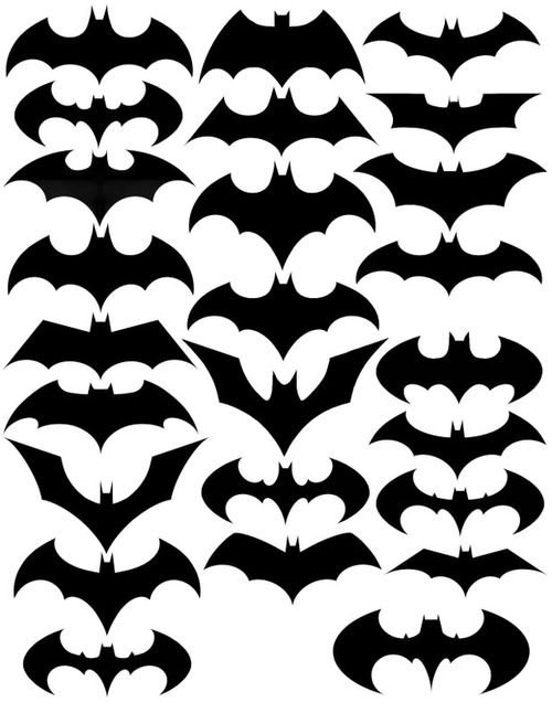
Evolution of the Batman Logo
 Randy
Randy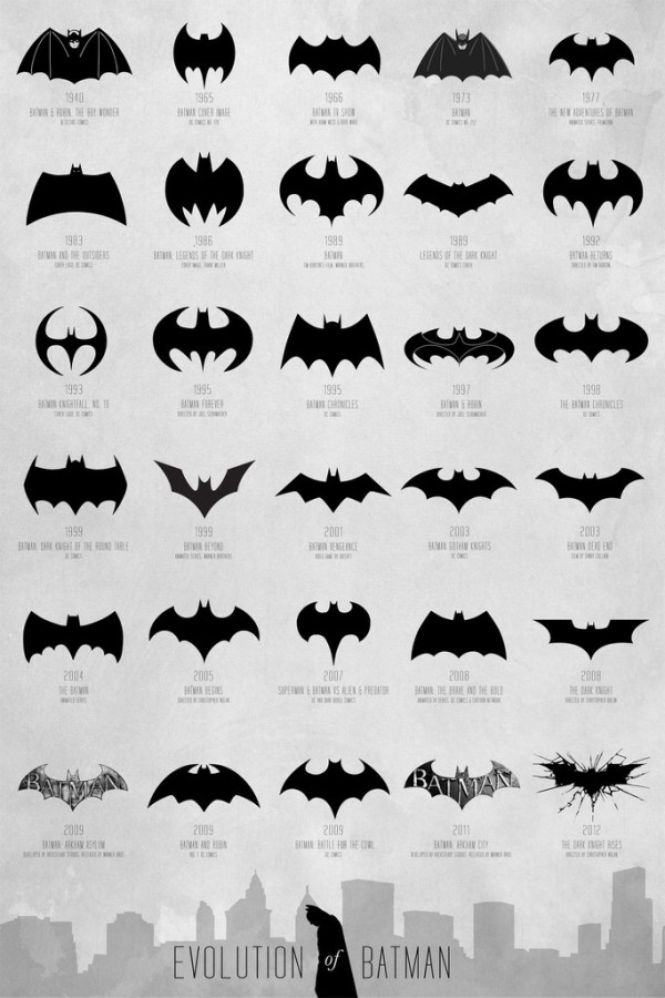
The Evolution of Batman poster designed by Cathryn Lavery from Calm the Ham is a visual history of the Batman symbol over the years. I can’t think of any consumer logo that has changed this much, but the Batman logo remains a very powerful and recognizable brand.
A comprehensive and extensive chart of the Batman logo evolution, spanning over 72 years from 1940 - 2012 to map the transformation of a timeless hero. Thanks to DC Comics for creating this cultural icon that we can all obsess over, all logos belong to them.
The infographic timeline covers 72 years (1940-2012) and shows different version of Mr. Wayne’s logo so the reader can easily distinguish the different iterations. Additional information like the year and media publication format are listed in text. I would have liked to see them spaced out along an actual timeline, but this design format fits better on a standard poster. Three different size posters are available from the Calm the Ham site.
I found this design on the FastCoDesign site, but a few other designers have also tackled this specific history. Cathryn Lavery mentions this 2008 video from Rodrigo Alejandro Rojas Sandoval as being the first one she knows of that had attempted this:
I saw this design on Nathan Yau’s FlowingData site in 2010, but he wasn’t able to cite the original source. This one shows fewer versions, and doesn’t include any additional information.