About
Randy Krum
President of InfoNewt.
Data Visualization and Infographic Design

Infographic Design

Infographics Design | Presentations
Consulting | Data Visualizations

DFW DataViz Meetup

Join the DFW Data Visualization and Infographics Meetup Group if you're in the Dallas/Fort Worth area!

Search the Cool Infographics site

Custom Search

Subscriptions:


Feedburner

The Cool Infographics® Gallery:

How to add the
Cool Infographics button to your:

Cool Infographics iOS icon

- iPhone
- iPad
- iPod Touch


Read on Flipboard for iPad and iPhone

Featured in the Tech & Science category

Flipboard icon

Twitter Feed
From the Bookstore

Caffeine Poster

The Caffeine Poster infographic

Tuesday
Dec042012

Tracking Customers for Retail Profiling

Tracking Customers for Retail Profiling infographic

Is tracking customers purchases creepy? Decide for yourself! The You are Not Special, but Your Purchases are infographic from Camcode.com talks about profiling customers based on their purchases and then giving them a coupon that is relevant to them. Other companies like Dominos tracks when people buy pizza the most and discovered it was when it rains. So they base their campaigns on local weather patterns.

Did you know that major brands profile you based on what you buy? Retailers like Target and Domino’s Pizza gather and store this data via barcode technology, and they use it to determine everything from how best to market to you, which coupons you’re most likely to use based on your life stage, and what you might buy based on previous purchasing habits. Yes, they get all this from scanning a barcode! It’s what’s known as predictive technology, and major retailers use it to create database-driven consumer profiles to not only boost sales, but also to create more personalized buying experiences.

We decided to take a closer look at predictive technology and its role in consumer profiling. We did some digging and put together this infographic called, “You are Not Special, but Your Purchases are.”

I like how this design walks the reader through a easy to understand story about retail profiling.


  1. What is Retail Profiling?
  2. How does it benefit both consumers and retailers?
  3. What do customers find disturbing about tracking?
  4. Real-life case studies


Some of the dark red on red colored visualizations are hard to read, and the footer should include a copyright statement.  The brand URL back to Camcode.com is included, but there should also be a URL to the infographic landing page so readers can find the original high-resolution version. 

Thanks to Ashley for sending in the link!

Monday
Dec032012

The History of the Christmas Tradition

The History of the Christmas Tradition infographic thumbnail

The History of the Christmas Tradition infographic timeline from Balsam Hill visually lays out the events from Culture, Decorations, Traditions and Historical Characters that over hundreds of years have shaped the current Christmas holiday.

Across the world, Christmas is celebrated in a multitude of rich and cherished traditions. Their origins are wonderfully varied, emerging out of cultures and beliefs throughout history. This illustrated timeline, brought to you by Balsam Hill, captures the flow of some of the most popular Christmas traditions and figures and traces their simple lineage from St. Nicholas’ humble beginnings to today.


The History of the Christmas Tradition infographic

This design is a great example of Online Lifespan for infographics.  The topic is timely and popular during the month of December, but not tied to a specific trending topic from 2011.  Therefore, this design will generate ongoing traffic, links and views every year for Balsam Hill as new readers discover it each year for years to come.

Designed by InfoNewt with designer Jeremy Yingling, the design takes a more classic approach the the illustrations on the timeline by using historical images that instantly make the events relevant and recognizable to the readers.  The four, parallel timelines show the reader how events combined over time, combined into the Santa Claus and Christmas we know today.  The layout makes it easier for the readers to see how separate songs, books and parades began to converge into one story.

Friday
Nov302012

The Dangers of Speeding While Driving

The Dangers of Speeding While Driving infographic

Of course you already know that speeding is dangerous, but The Dangers of Speeding While Driving infographic from Chucker & Reibach highlights some of the statistics behind traffic incidents that result from putting the pedal to the metal!

The dangers of speeding are certainly well known to most drivers, either by getting a ticket for speeding from law enforcement or being part of an accident due to someone driving too fast or even having a loved one be a victim of excessive speeding. This infographic provides statistics about speeding, including how often speeding results in a fatality, how much does speeding actually cost and what are the main reasons that people speed. In the end, any reason a driver gives for speeding will never be worth the potential costs.

I like this design, and it lays out the relevant statistics for the reader in an easy to understand layout.

A few suggestions I would make to improve the design:

  • Too many of the statistics are shown in a large font text, but not visualized
  • Needs a URL to the original landing page of the infographic so readers can find the original, full-size version on sites that don’t link back correctly.
  • Needs a copyright or Creative Commons license statement in the infographic itself
  • How does speeding make gas more expensive?  I think it means that your car will use more gas per mile with a lower fuel efficiency (gas guzzler), but the stat wording says that you would pay $0.24 more per gallon.
  • The “Where People Speed” section is hard to understand.  Does the statistic “47% speed on roads 50MPH or less” mean that the speeding accidents happen at speeds less than 5-MPH or the speed limit on the road is 50MPH or less?  The visual speedometer implies it’s the speed of the car, but I think the stat meant the posted speed limit on the road.

Thanks to Shell for sending in the link!

Thursday
Nov292012

40 Must-See Modern Marketing Charts

40 Must-See Modern Marketing Charts

Eloqua has teamed up with infographic design firm JESS3 again to create Modern Marketing Insights, a series of 40 infographics using big data analysis that can help marketers anywhere.

Did you know that dynamic content can improve conversions by 50%? Or that emails sent on a Saturday get the highest number of click-throughs? Were you aware that when influencers share your content on social it can result in a dramatic increase in traffic and conversions?

That’s why we produce a chart every week that modern marketers can easily learn from and use. And it’s why we’ve gone back with our friends at JESS3 to reproduce the most indispensable data points, coming up with 40 understandable, actionable charts. Wide-ranging in scope, the charts hit the most important topics hitting marketers today – from social media to email.

With that in mind, we offer the charts in two forms. You can head over to the custom-made website and explore the charts by topic, getting to the data that matters most to you. Or you can download all 40 charts in a free eBook. It’s well worth keeping near your desk.


40 Must-See Modern Marketing Charts

Even those each of these is only exploring one data set, these are actually good infographic designs that follow some important design rules.

First, each one tells one story really well, and the Key Message is easy to understand.  Most readers of infographics are only looking at a design for less than 5 seconds, and a good infographic design will successfully communicate their primary message in that short time.

Second, each design is easy to share.  Each of the 40 designs has it’s own landing page on Eloqua’s site, and their own dedicated social media sharing buttons.  This is fantastic for SEO, and much easier to utilize the information for users.  So, if you’re interested in a data set about email to customers, you can share that information with colleagues without also sharing a data set about Pinterest.

You can read more about the series on the Eloqua blog.


40 Must-See Modern Marketing Charts

A couple things I do think are missing from each design that would help Eloqua in the future.

  • Since these are being shared individually, the URL back to the original on Eloqua site should be included in the image.
  • A copyright statement to clarify usage rights.  Does everyone have permission from Eloqua to include these charts and data in their own presentations?
  • Much of the data is proprietary to Eloqua, so the raw data behind the designs isn’t available to the public.  It would be great for Eloqua to make the data behind each chart available publicly (like in a Google Docs spreadsheet) since they are making the data public in the charts.
  • A conclusion.  I think the subtle implication is that companies should call Eloqua for help using this information, but a short statement suggesting what action companies should take based on each data set would close each design nicely.

Thanks to Jarred for sending in the link!

Wednesday
Nov282012

State of Graphic Design

State of Graphic Design infographic

Smartpress surveyed some of the best and most talented graphic designers and put the results into the State of Graphic Design infographic.  They include tips like “How to learn the field” and “Top 5 states for graphic designer employment” that could be crucial for newbies to the field.

Welcome to the 2012 edition of the State of Graphic Design!

Smartpress.com conducted a survey to aggregate the opinion of dozens of the best and most-talented graphic designers in the industry. The results were turned into a success factors/guide document in form of an infographic. This year the survey included more than 40 industry experts that have 5+ years of experience.

Thanks to Harrison for sending in the link!

Tuesday
Nov272012

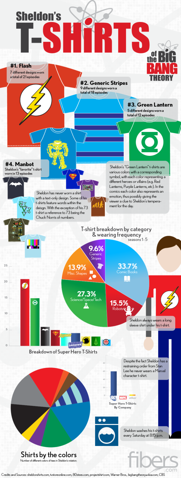
Sheldon's T-Shirts of The Big Bang Theory

Sheldon's T-Shirts of The Big Bang Theory infographic

If you have seen the comedy show The Big Bang Theory, then you know Sheldon…. If you haven’t seen it, go watch it and get back to us.  Have you ever noticed his wardrobe?  The Sheldon’s T-Shirts infographic from fibers.com tells you his favorite shirts, how often he wears his shirts, and even what colors he wears the most! 

Graphs, Charts and illustrated T-Shirts with correlating sizes to wearing frequency - would there be any other way to visualize Sheldon Cooper’s t-shirt collection from The Big Bang Theory? We think not.

Big thanks to Sheldon’s Shirts where we got most of the data for this graphic. You can find a lot of Sheldon’s Shirts for purchase on the following websites:

This is just a fun infographic that uses some data visualization to appeal to fans of the show.  Good design using publicly available data that has been complied in an engaging way.

The charts actually very well done.  Charts are color-coded to match the data.  Icons are included on the bars or in the pie slices, so no chart legends are needed.  This makes the data faster and easier to understand.

Found on Fibers.com

Monday
Nov262012

What Makes a Travel Writer?

What Makes a Travel Writer? infographic

For those who would love to travel and write, the What Makes a Travel Writer? infographic from hotelclub.com is the infographic for you. This infographic covers the ages and careers of these writers, and also what technology they use.

If you’ve ever wanted to become a travel writer, you’ve probably wondered about the tools and resources the pros use to make their jobs possible. The trade secrets of those who successfully turn international adventures into paychecks are an enticing mystery. Does the key lie in social networking? Is it finding the right technology that makes all the difference? Or have these professionals stumbled onto some obscure websites that the rest of us are ignorant about?

Unfortunately, there isn’t one explicit answer that will transform you into a travel writer overnight. It is a combination of all of these things that enable the professionals to do their jobs well enough to afford a warm meal and their next plane ticket.

So to gain some insight into the tricks of the trade, and hopefully get you one step closer to your dream job, we surveyed some of the best travel writers on the web about their working habits. We got the scoop on Twitter from three of the most ‘Followed’ travel tweeters in the business (@Paul_Steele@TravelEditor, and @DaveDTC); found out that Paris and NYC are two of the best places in the world to find (marketable) inspiration; and were warned against going any where near Birmingham or Malaga.

Find out what else we learned in our detailed infographic.

I really like this design.  I like that the infographic keeps the same, simple color scheme throughout to match the colors in the header. However, it lacks a border or a background color to help frame the infographic on a webpage with a white background.  The white background creates uncertainty of where it actually ends.

Most of the information is in percentages; however, it is all conveyed in different visual formats.  The stacked bars, pie charts and doughnut graphs correctly show them in comparison to the complete 100%.  The partially shaded shaped of film canisters, people icons and the world map aren’t quite correct.  The readers see the area colored of an object, and because of the odd shapes the designer had to guess the correct shading by just changing the height.  It’s close, but not actually correct.

A few other suggestions I would make:

  • The two age groups compared with the man & woman icons aren’t related to each other, so the comparison isn’t helpful information.
  • For the Male-Female comparison comparison in Travel Career, the icons need to be the same width for them the be accurate.  Visually it looks like 75% is at least double 53%, which obviously isn’t true.
  • The Tablet Brands statistics of “100% of male travelers use Amazon Kindle” isn’t support by the data to the left, and is a highly unbelievable stat.  
  • When lining up rows of icons, like in Blogging Platforms, the design should always use rows of 10 icons.
  • I’m sure the last circle in the Twitter Usage section was supposed to be <100 Twitter followers instead of >100.
  • There should be a URL at the end of the infographic linking to the original full-size version.

Thanks to Ally for sending in the link!

Monday
Nov192012

The Difference Between the United Kingdom, Great Britain, and England

The Difference Between the United Kingdom, Great Britain, and England infographic

Do you know the Difference Between the United Kingdom, Great Britain, and England? This infographic from sa-la.jp spells out the differences. It also includes a timeline of major events and some ideas for the future.

The terminology of the UK is quite complicated, so it’s no wonder that people get confused. Are Great Britain, the UK and England the same thing? Is Ireland part of the UK? What’s Wales!? To help explain things, I put together this infographic to define the parts that make up the UK and how it came about. If you still have any questions by the end of it, feel free to ask in the comment section below.

Really good infographic design that uses different visualization methods in the visual explanation.  Maps, icons and a subway map style timeline are easy to understand, and give the reader a basic understanding of the UK.

The sources should be more specific, linking to specific web pages, and there should be a URL to the original infographic landing page in the footer.

Thanks to Tim for sending in the link!

Friday
Nov162012

Choosing the Right Line - The Science of Corners

Choosing the Right Line- The Science of Corners infographic

Choosing the Right Line- The Science of Corners infographic is a design about Motocross.  Motocrossgear.com takes the science of successfully navigating corners in motocross racing and brings it to the infographic world. 

Since the beginning of racing, riders have been faced with many choices on the track. The fastest rider is often the one who chooses the best lines on the track. Many factors exist when deciding which line to take through a corner. Use this visual guide to help you pick the fastest line.

Not a design based on a lot of data, this visual explanation relies more on diagrams to communicate the message.  In general, I really like the design style that reinforces the feel of motorcross, but in my opinion this could be a better design with less text.

Thanks to John for sending in the link!

Wednesday
Nov142012

Total Solar Eclipse 2012

Total Solar Eclipse 2012 infographic

Today (Nov 14th) will be a total eclipse of the Sun, and the Solar Eclipses infographic from turu does a great job with visually explaining eclipses and sharing the statistics from prior eclipses.

The total solar eclipse of 2012 is set to be a spectacular event. Occurring just after sunrise on November 14 (local time), the eclipse will be best viewed from Cairns in Australia. Already a popular tourist destination, the 2012 eclipse is expected to flood the coastal city with thousands of domestic and international visitors.

The infographic provides a definition of a solar eclipse as well as information on the Australia 2012 eclipse. It offers an insight into past solar eclipses, noting duration of totality and effects on local tourism.

With a number of events scheduled such as the Solar Eclipse Marathon and the Eclipse 2012 Festival, Cairns aims to cater to this expected influx of tourists. Renowned for its sunshine, Cairns is expected to be a prime location to view the 2012 eclipse. The next opportunity to view a total eclipse in Australia will be in the year 2028, making this year’s event truly special.

A good design that tells a good story.  In the footer should be a Copyright statement, and the URL to the infographic landing page so readers can find the origial full-size version.