About
Randy Krum
President of InfoNewt.
Data Visualization and Infographic Design

Infographic Design

Infographics Design | Presentations
Consulting | Data Visualizations

DFW DataViz Meetup

Join the DFW Data Visualization and Infographics Meetup Group if you're in the Dallas/Fort Worth area!

Search the Cool Infographics site

Custom Search

Subscriptions:


Feedburner

The Cool Infographics® Gallery:

How to add the
Cool Infographics button to your:

Cool Infographics iOS icon

- iPhone
- iPad
- iPod Touch


Read on Flipboard for iPad and iPhone

Featured in the Tech & Science category

Flipboard icon

Twitter Feed
From the Bookstore

Caffeine Poster

The Caffeine Poster infographic

Thursday
Feb142013

I Love You in 130 Languages

I Love You in 130 Languages infographic pink

Fun design for Valentine’s Day from GlobalNova.  The I Love You Map, shows the phrase “I Love You” translated into 130 different languages and positioned on the map based on the primary language spoken in that country or region of the world.

When setting out on any language-related project, one can count on unexpected discoveries and changing perspectives.  Our World Valentine project seemed simple to me at the outset – just map ‘I love you” in 100 or so languages onto a world map.  I thought of it pretty simply as a Valentine card for my wife.

But the real blow landed in choice of languages.  Setting out with no goal beyond rendering a selection of languages geographically, I quickly wandered into a thicket.  Where did Mongolian go? And many others?  Were we bounded by chance and limited space, or less forgivably prey to political naiveté? 

Here is the design also in Black:

I Love You in 130 Languages infographic black

Thanks to Matt for sending it the link!

Wednesday
Feb132013

The Geosocial Universe 3.0

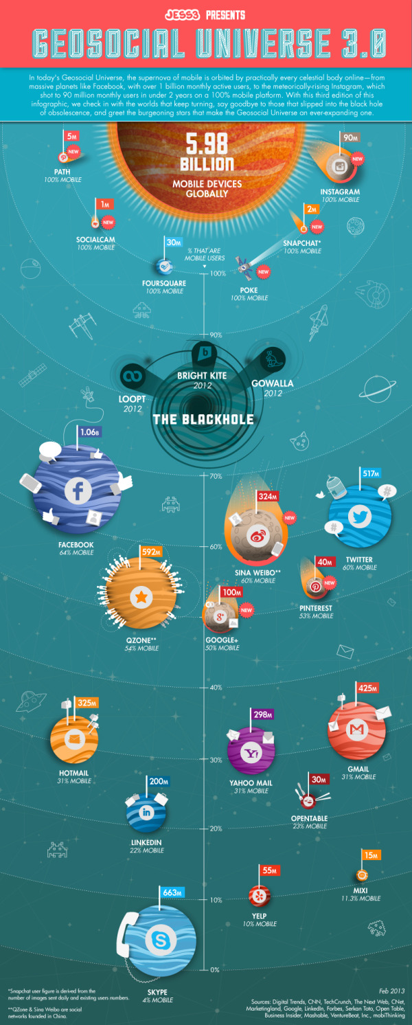
The Geosocial Universe 3.0 infographic

Last week design firm JESS3 released The Geosocial Universe 3.0, an update to their prior infographics about the size of the major social media networks.

In a time not so long ago, in a galaxy not so far away, a little phenomenon was born that united the people of cyberspace through geographic services and social networking.

With changes to the social landscape occurring at lightspeed, JESS3 presents its third iteration of The Geosocial Universe, charting the latest monthly active user data for various social networks, along with the percentage of users who access each network via mobile devices.

Take a look below to discover more about the ever-expanding geosocial universe and the course of its objects.

I really like the changes to this version of the design.  They kept the same philosophy of relatively sized circles to represent each of the main social networks.  However, I’m confused by the placement of the Black Hole on the vertical scale meant to represent the percentage of mobile users.  Why does more mobile users place a network closer to the Black Hole of Obscurity?  It’s placement around the 80% mark visually implies that has meaning, but I don’t think that was the intention of the design.  Is Facebook close to obscurity?

Both a copyright (or Creative Commons) license and the URL to the infographic landing page are missing from the design.  You want readers to be able to find their way back to the original when they find the infographic posted on other sites.

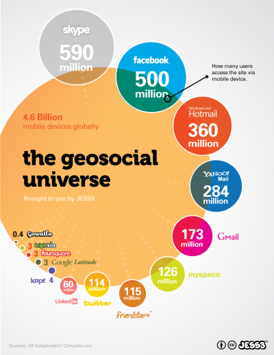
This is an update to the original design from 2010:

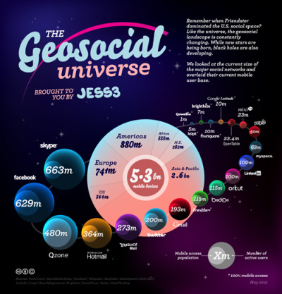
And version 2.0 in 2012:

Tuesday
Feb122013

Visualizing AOL's Return to Growth after 8 Years

Visualizing AOL's Return to Growth after 8 Years infographic


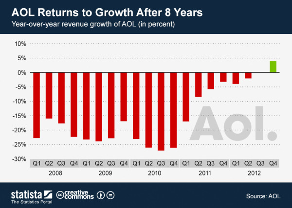
Sometimes you only need one data visualization or chart to tell your story.  Statista recently published the infographic AOL Returns to Growth After 8 Years with only this bar chart of year-over-year revenue since Q1 2008, which clearly shows the last five years of quarterly losses.

This chart shows AOL’s revenue growth since the first quarter of 2008. In the fourth quarter of 2012, the former internet heavyweight returned to positive growth after 8 years of declining revenues.

The latest results mark a milestone in CEO Tim Armstrong’s quest to transform his company from an internet service provider into a digital media company. Since AOL’s spin-off from Time Warner in 2009, the company had acquired TechCrunch and The Huffington Post to re-position itself as an ad-selling provider of premium online content.

The above chart nicely illustrates the slow progress AOL has made in the past 2 years.

Not an infographic in the modern online interpretation of telling complete stories in one image file, but more in-line with the definition of infographics simply as “information graphics”.

I’m not sure why they didn’t show the complete 8 years of data in the chart.  By only showing 5 years of data in the chart, they really didn’t support their claim that it has been 8 years of losses for AOL.

Found on Visual Loop.

Tuesday
Feb122013

Breakdown of A Person's Google Results...and How to Look Better

Breakdown of a Person's Google Results: How People Look in Google- and How to Look Better infographic

When you type your name in Google, what comes up? Hopefully nothing negative. The Breakdown of A Person’s Google Results: How People Look in Google - and How to Look Better infographic from brandyourself.com tells you which of your profiles are going to show up higher in google. If your personal image needs a boost, use BrandYourself, a free website that allows you to create a positive image of yourself and land it on the top page of the Google search.

At BrandYourself, our goal is give our users and readers everything they need to put their best foot forward in Google.  Since we track the Google results of over 130K users we were able to analyze millions of results and found some really insightful information.

Want to look better in Google? Think twice about building your personal website on WordPress.

  • Bad First Impression: 1.5 Billion names are Searched everyday in Google but people generally don’t look great on their first page
  • If you want to look better, you need to choose your profiles wisely: For example, LinkedIn is the best social network for rankings, while WordPress is the highest ranking personal site builder. Even more interesting, popular pages like about.me really have trouble ranking high.
  • BrandYourself is effective: To date, we have helped people raise their favorite profiles over 250K positions higher in Google. People can expect to raise a profile over 20 positions, or 2 whole pages, by using our software. We are very proud of this.

We know not everyone loves looking at data as much as we do, so we put it in fun infographic form so you can enjoy it too. Let us know what you think!

This is a great informational design that shares some really valuable information.  I can attest to much of the information, and have the advantage of owning all 10 results on Google if you search for “Randy Krum”.  Go ahead…try it!

A couple recommendations I would make to improve the design:

  • There doesn’t seem to be a higher resolution version available, so some of the font sizes are too small to read.  Especially the Sources list and the design credit.
  • There’s some good data and values in here that would make a better impression if they were visualized
  • There should be a URL to the infographic landing page in the footer, so readers can find the original

Thanks to Patrick for sending in the link!

Monday
Feb112013

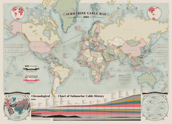
The Submarine Cable Map 2013

The Submarine Cable Map 2013 infographic poster

A beautiful map of the World’s undersea Internet cables, The Submarine Cable Map 2013.  Brought to us be TeleGeography, sponsored by Telecom Egypt and design credit is listed as Nick Browning, Markus Krisetya, Larry Lairson, Alan Mauldin.

Cables depicted include all active international and U.S. domestic cables.  In-service cables have an announced Ready for Service (RFS) date by December 31, 2012.  Planned cables include those actively under construction and those that have announced they were fully funded as of year-end 2012.  Map does not depict proposed cables that have not announced landings or configuration.  Cable routes are stylized and do not reflect physical cable location.

I love the hand-drawn design style, meant to pay homage to old maps, but overlaid with very current information.  This is also available for purchase as a poster 36” x 50” for $250.

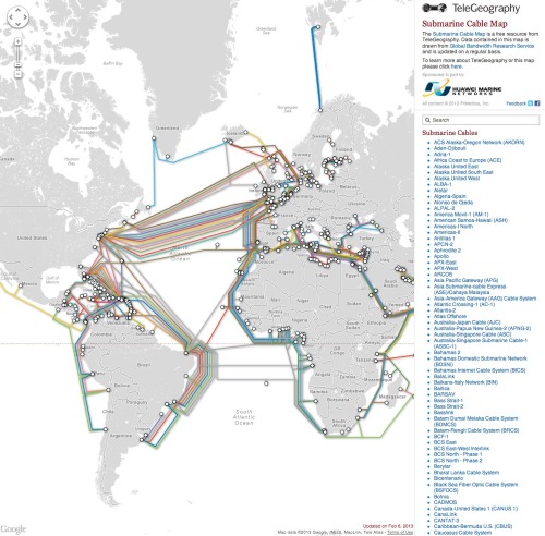
An interactive website with more information about all of the cables is also run by TeleGeography and can be found at submarinecablemap.com

Found on FastCoDesign.


Thursday
Feb072013

Syria: The Basics, an infographic presentation

Syria: The Basics is an infographic slide show using the Prezi presentation tool.  It plays like a movie, and does a great job utilizing the new features of Prezi like Fade-In animation and Audio Overlay.

Designed by Lara Setrakian (@Lara), co-founder and managing editor of Syria Deeply, a single issue news website.  Fantastic design work!  The presentation utilizes data visualization design concepts including relative sizing to put the size of the country into perspective, a timeline layout of events, related news photos and world map information.

Syria: The Basics, an infographic presentation

Wednesday
Feb062013

The History of Doctor Who Companions

The History of Doctor Who Companions infographic

The History of Doctor Who Companions infographic from mirror.co.uk gives us a guide to all the companions that Doctor Who has travelled with and a sneak peak on the newest one.  Along with the names and photos come statistics of gender, species, and who is the worst and the best companions.

It’s goodbye Amy Pond after Karen Gillan left in a tear-jerking mid-season finale, The Angels Take Manhattan. You can read our review here.

But how will Amy be remembered in the pantheon of best and worst Doctor Who companions? Did she hit the lofty heights of a Rose Tyler or a Leela? Or sink to the lowly lows of Ace and - Time Lords preserve us - Bonnie Langford as Mel Bush?

Take a look at the amazing infographic below and make up your own minds while learning all there is to know about the Doctor’s Tardis co-travelers…

I’m generally opposed to using photos in an infographic design because their full-color nature add a lot of visual complexity to a design.  In this case, photos work better than illustrations by making the different characters easily recognizable.

Thanks to Chris for sending in the link!

Tuesday
Feb052013

How to Find A Missing Child Using Social Media

How to Find A Missing Child Using Social Media infographic

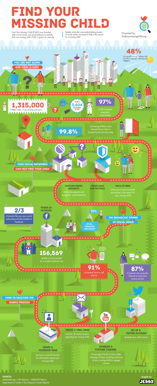
Find Your Missing Child is a new infographic design by the team at JESS3.com for FindYourMissingChild.org.

Find Your Missing Child (FYMC) was founded after social media and email helped successfully find one missing child.  FYMC’s goal is to educate families about the community-building powers of social media and email to help in the search for a missing child.

The design does a good job of walking the reader through the statistics and benefits of engaging with social media as a tool in the search for a missing child.  The path provides a clear sequence of information for the readers to follow.

Some of the statistics are impressive, and would make a bigger impression on the reader if they had been visualized.  Big numbers are not data visualizations, and many designs make the mistake that using a big font makes the numbers more impressive.  An infographic should put those values into context for the reader by visualizing them.

In the footer, the URL to the infographic landing page is missing and would be helpful to readers that want to find the original full-size infographic.

Thanks to Jarred for sending in the link!

Tuesday
Feb052013

How Texas Laws Are Made

How Texas Laws Are Made infographic

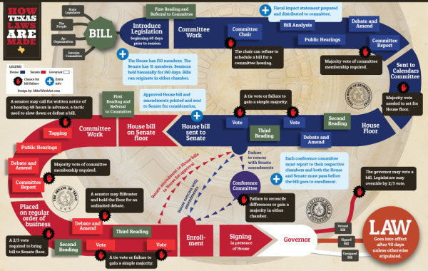
Texas Co-Op Power brings us the How Texas Laws Are Made infographic outlining the process bills go through in the state legislature to become the law of the land.  Also available as a PDF for download here.

The 83rd session of the Texas Legislature—150 representatives and 31 senators—is under way. What transpires over the 140-day session that began January 8 may seem incomprehensibly complex to the average citizen. So, in the interest of keeping our co-op members informed and involved, we offer this compact guide to how a bill moves through the legislative process and reasons why communication with your legislators matters.

Designed by Mike Wirth Art with Suzanne Cooper-Guasco, Ph.D., this infographic uses a game-board design style to online all of the steps along the path.  The color-coding to differentiate the activities between the House, the Senate and the Governor is clear and easy to understand.

Monday
Feb042013

The Periodic Table of iPhones

The Periodic Table of iPhones infographic

The Periodic Table of iPhones infographic from scientificamerican.com (credit to Mark Hobbs at CNET) is an infographic about the materials it takes to create an iPhone.  A PDF version is available for download here.

Key ingredients in the iPhone include so-called rare-earth minerals, elements whose properties make it light, bright and loud.

The key message in this design is obviously a wanring to readers that their iPhones (let’s be honest, this applies to any modern smartphone) are using rare materials that may be hazardous and cause environmental problems when they are mined.  

The design ends abruptly, without an ending.  At the end should be a few key things that are missing:

  • What’s the conclusion or call-to-action?  What should readers do now that they understand the key message?  Is the desired action recycling, participating in protests or choosing a different phone?
  • Data sources?  This design accompanied a full-text article, but because infographics are shared independently they need to list the data sources for transparency and credibility.
  • URL to the infographic landing page so readers can find the original story and full-size infographic?
  • Copyright statement.

Found on visualoop!