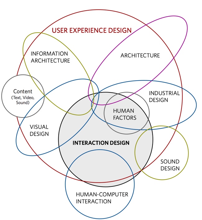
The Mostly Complete Chart of Neural Networks
 Randy
Randy
The Mostly Complete Chart of Neural Networks by the team at the Asimov Institute.
With new neural network architectures popping up every now and then, it’s hard to keep track of them all. Knowing all the abbreviations being thrown around (DCIGN, BiLSTM, DCGAN, anyone?) can be a bit overwhelming at first.
So I decided to compose a cheat sheet containing many of those architectures. Most of these are neural networks, some are completely different beasts. Though all of these architectures are presented as novel and unique, when I drew the node structures… their underlying relations started to make more sense.
One problem with drawing them as node maps: it doesn’t really show how they’re used. For example, variational autoencoders (VAE) may look just like autoencoders (AE), but the training process is actually quite different. The use-cases for trained networks differ even more, because VAEs are generators, where you insert noise to get a new sample. AEs, simply map whatever they get as input to the closest training sample they “remember”. I should add that this overview is in no way clarifying how each of the different node types work internally (but that’s a topic for another day).
Composing a complete list is practically impossible, as new architectures are invented all the time. Even if published it can still be quite challenging to find them even if you’re looking for them, or sometimes you just overlook some. So while this list may provide you with some insights into the world of AI, please, by no means take this list for being comprehensive; especially if you read this post long after it was written.
High-res poster image version is also available.