About
Randy Krum
President of InfoNewt.
Data Visualization and Infographic Design

Infographic Design

Infographics Design | Presentations
Consulting | Data Visualizations

DFW DataViz Meetup

Join the DFW Data Visualization and Infographics Meetup Group if you're in the Dallas/Fort Worth area!

Search the Cool Infographics site

Custom Search

Subscriptions:


Feedburner

The Cool Infographics® Gallery:

How to add the
Cool Infographics button to your:

Cool Infographics iOS icon

- iPhone
- iPad
- iPod Touch


Read on Flipboard for iPad and iPhone

Featured in the Tech & Science category

Flipboard icon

Twitter Feed
From the Bookstore

Caffeine Poster

The Caffeine Poster infographic

Entries in business (68)

Thursday
Sep052013

The Monstrous Cost of Work Failure

The Monstrous Cost of Work Failure infographic

The Monstrous Cost of Work Failure infographic from AtTask looks closely at the cost of failure within companies.  How many at-bat attempts does your company take before hitting a homerun?

Projects fail, budgets blow up, fire drills reign and chaos abounds

Work failure plagues all types of teams – from marketers working on a campaign to IT teams deploying a major software system. The root of the problem – impacting 70% of teams – is work chaos. And it can be conquered. Click on the image below to view or download the full graphic and learn more about work failure and how to avoid it.

Fun design with monster characters to help tell the story to readers.  The design does a good job telling a 3-part story to the audience:

  1. Introduction - What is the problem?
  2. The Main Event - How big is the impact?  How can this effect me?
  3. Call To Action - How do I fix the problem? 

Big fonts are not data visualizations, and in this design I would liked to see more of the statistics visualized.  Visualization would help put the data into context for the audience.  The footer of the design should also include the copyright information and the URL to the original infographic landing page so readers can see the full-size infographic.

Thanks to Matt for sending in the link!

Monday
Aug192013

Evening Etiquette: A Gentleman's Guide

Evening Etiquette: A Gentleman's Guide infographic

Gentleman is not just a title, it is a way of life. The Evening Etiquette: A Gentleman’s Guide infographic created by Boisdale explains the finer points to being a Gentleman. The infographic shares tips on how to look the part, what to wear, and dinner advice.  A great follow-up to the last post about matching ties.

Being a gentleman is more than opening the door for the ladies. For men to truly live up to this title, they must look and act the part in all areas of life -  from grooming, style and culture to knowledge of food and booze and the proper treatment of women.  Making these gestures a natural part of one’s behaviour is how a true gent stands out from the boys.

In order to help lads mature into men of virtue, Boisdale has created an evening etiquette guide. From knowing one’s tweed and collars to the proper table setting and whiskey protocol, this infographic will turn those willing into a man ladies want and other men aspire to be.

Another great visual explanation, that shows the reader the information with illustrations and images instead of spelling out the information with too much text.

Thanks to John for sending in the link!

Tuesday
Aug132013

How to Match Shirt and Tie Patterns

How to Match Shirt and Tie Patterns infographic

If you have some trouble balancing your serious business side with your fun side, a look at the How to Match Shirt and Tie Patterns infographic could be helpful. The infographic from Beckett Simonon shows a few examples of complicated patterns that work together, and then some to definitely stay away from.

So you’ve been wearing solid ties and shirts for a while, you think you look great but you feel is time to earn some extra style points by adding some patterns? No worries, we got you covered! Shirt and tie patterns are great if you want to stand out from the crowd, they are also fun and will bring a new life to your look. Just make sure your pattern groupings are far from making people dizzy and fall hypnotized. We made this cheat guide so you can learn the basics and develop your own combinations and style from there. Enjoy!

Great visual explanation design that stays focused, and tells one story really well.

Thanks to Nicholas for sending in the link!

Thursday
Aug012013

Choosing a CMS for Your Business

Choosing a CMS for Your Business infographic

This graphic will help you figure out what is the best Content Management System (CMS) for you and your business. Discover what a CMS is, types of CMS, popular CMS, market shares and advantages with, The Most Popular CMS for Your Business Needs infographic posted on Dot Com Infoway

Chennai, India Dot Com Infoway (DCI), a premier IT company providing offshore IT outsourcing solutions to businesses across the globe, has announced the release of its latest infographic, titled “Content Management Systems: Choosing the Right One for Your Business Needs”. The infographic provides a top to bottom look at various CMSs and chalks out a road map for organizations, businesses and individuals looking to choose content management systems perfect for their needs.

The infographic outlines the fundamentals of content management systems, the industries in which they find use and the types of CMSs available. It is replete with information, data, statistics and illustrations such as the date of initial release, the platform used, the latest version, the number of themes it has, average setup and customization cost, average monthly maintenance cost, the number of websites using the CMS, the popular websites that use the platform and the top industries using the CMS.

“With the recent exponential growth of nightly builds of CMSs’ modules and plugins, we thought this would be the perfect time to showcase the CMS industry with an infographic that provides users with an all-around perspective. Our run through of key aspects of various CMSs, will help firms make better business decisions by taking advantage of all the information at their disposal,” said Venkatesh C. R., CEO of Dot Com Infoway.

The infographic also provides statistics on the market share of various content management systems. Based on the analysis and research data, WordPress, with a market share of 54.4%, has a competitive advantage over other top CMSs. Following WordPress, (with margins of difference of more than 45%) are Joomla and Drupal with market shares of 8.9% and 7% respectively.

Personally, I run this site on the Squarespace.com CMS platform, and I’m very surprised that it wasn’t listed in the infographic.  I realize there are over 1,200 CMS platforms, so they had to make some hard choices about which ones to include.

The design does a good job of using the platform logos to clearly identify the different players.  I wish the numerical data associated with each platform was visualized instead of just shown in text.  It very hard for a reader to compare the costs or stats between the platforms when all of the data is only in text.

Also, the data is not clearly sourced.  The sites where the data was gathered from are listed, but no specific links the pages with the actual data used, like market share numbers.  Most of the source sites are actually lookup and comparison tools, so it would be hard to list specific URLs for some of the data.

Found on bestinfographics.co

Tuesday
Jun112013

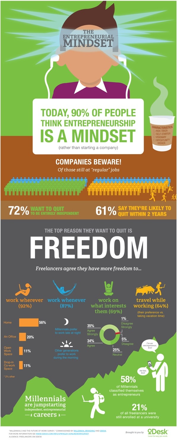
The Entrepreneurial Mindset

The Entrepreneurial Mindset infographic

The era of “regular” jobs is coming to an end. The Entrepreneurial Midset infographic from oDesk warns us of the changing mindset of workers. They want more freedom and are more likely to quit their current jobs in search of what they want.

Workers want freedom, and this desire is driving them towards independent (and often entrepreneurial) career paths. Following a prior study on disruption of work from the perspective of businesses, this survey examines the future of work as envisioned by professionals. Results found that many are planning their escape from corporate jobs — 72% of freelancers still at “regular” jobs want to quit entirely, and 61% say they are likely to quit within two years.

Millennials in particular are pursuing independent careers that foster faster progression than traditional hierarchical organizations. Of almost 2,000 Millennial respondents, 58% classified themselves as entrepreneurs. These responses (from more than 3,000 freelancers worldwide who have worked online) quantify the mindset of freelancers today, providing a glimpse into the professional landscape of tomorrow.

There are some great statisitics in this design, but it’s disappointing that some of the data near the end is just shown in text instead of visualized.

I really apprecaite the data transparency.  They also published the full results of the survey in a SlideShare presentation.

Thanks to Alexia for sending in the link!

Tuesday
Apr162013

The Anatomy of the Social Media Command Center

The Anatomy of the Social Media Command Center infographic

Beingyourbrand.com has created The Anatomy of the Social Media Command Center so that you can learn more about a few of their favorite social media command centers, and how to construct your own.

In the recent months, many major brands have developed what they are calling “Social Media Command Centers.” These centers are state-of-the-art listening hubs that allow brands to monitor their presence on major social platforms and be ultra-responsive to conversations happening about their company. However, with all their glamor, are these command centers really capable of delivering results, or are they just for show?

The following infographic, looks at three of the most noteworthy examples of social media command centers:

  • The University of Oregon’s Quakecave in Autzen stadium
  • Gatorade’s Mission Control at their Chicago headquarters, featuring custom visualization from STRUCKUndercurrent, and Radian6
  • The American Red Cross Command Center powered by Dell

More of a visual explanation, the design does share some common points of data like number of employees and a relative scale of the amount of data being collected.  It’s a good design that clearly explains this new marketing function to readers.

The URL link to the infographic landing page on the should have been included in the footer to help readers find the original full-size version when the infographic is shared on other sites (like this one).  Especially a good idea since this was posted on their blog, and will get buried in the archive over time.

Thanks to Matt for sending in the link!

Wednesday
Apr102013

How Corporate Logos Evolve

How Corporate Logos Evolve infographic

How Corporate Logos Evolve, from The Logo Company, shows us how even iconic world-wide recognized company logos change over time.

We often get asked for a logo design that can stand the test of time. Something that will last forever. I mean, we look at all these “Mega Corporates” and their logos never change. Do they? Well, actually and surprisingly, they do….a lot.

This illustration depicts some of the biggest global brands and highlights the evolution of their logos from humble beginnings to the present day. It might strike you how some of the designs started out looking like their biggest rivals and others appear to of hardly changed at all. Timeless is certainly not the overriding characteristic of most of these early creations.

This is a perfect use of an informative infographic that ties directly into a company’s business, and makes for a great content tool for marketing.  The big challenge in the coming years will be the relevance of infographics to the sites that publish them, and this is the right way to do it.  Informative, entertaining infographic that is directly relevant to the hosting website without specifically being an advertisement for their business.

They should have included a copyright (or Creative Commons) license and the direct URL to the infographic blog post in the footer of the design.  That way the information travels with the infographic as it is shared and posted across different sites.

Found on Best Infographics

Tuesday
Jan292013

How Social Sites Make Money

How Social Sites Make Money infographic

The number of social media followers are growing. But how do the sites make a profit? How Social Sites Make Money infographic from usbundles.com tells you which social media websites make money with ads, or paying customers, or mobile apps, or affiliates.

We turn to social media services to stay connected more and more each day. But even with hordes of devoted followers, how do these social sites manage to turn a profit?

Here’s a quick look at which revenue streams help major social networking companies go from social service to successful business.

Nice use of a Venn Diagram.

The doughnut charts aren’t accurate.  Like the designer eye-balled them instead of doing the calculation.  For example, the 71% doughnut is actually visualizing a value of 66.6% (2/3).

Found on http://socialtimes.com/how-social-sites-make-money_b91551

Thursday
Nov292012

40 Must-See Modern Marketing Charts

40 Must-See Modern Marketing Charts

Eloqua has teamed up with infographic design firm JESS3 again to create Modern Marketing Insights, a series of 40 infographics using big data analysis that can help marketers anywhere.

Did you know that dynamic content can improve conversions by 50%? Or that emails sent on a Saturday get the highest number of click-throughs? Were you aware that when influencers share your content on social it can result in a dramatic increase in traffic and conversions?

That’s why we produce a chart every week that modern marketers can easily learn from and use. And it’s why we’ve gone back with our friends at JESS3 to reproduce the most indispensable data points, coming up with 40 understandable, actionable charts. Wide-ranging in scope, the charts hit the most important topics hitting marketers today – from social media to email.

With that in mind, we offer the charts in two forms. You can head over to the custom-made website and explore the charts by topic, getting to the data that matters most to you. Or you can download all 40 charts in a free eBook. It’s well worth keeping near your desk.


40 Must-See Modern Marketing Charts

Even those each of these is only exploring one data set, these are actually good infographic designs that follow some important design rules.

First, each one tells one story really well, and the Key Message is easy to understand.  Most readers of infographics are only looking at a design for less than 5 seconds, and a good infographic design will successfully communicate their primary message in that short time.

Second, each design is easy to share.  Each of the 40 designs has it’s own landing page on Eloqua’s site, and their own dedicated social media sharing buttons.  This is fantastic for SEO, and much easier to utilize the information for users.  So, if you’re interested in a data set about email to customers, you can share that information with colleagues without also sharing a data set about Pinterest.

You can read more about the series on the Eloqua blog.


40 Must-See Modern Marketing Charts

A couple things I do think are missing from each design that would help Eloqua in the future.

  • Since these are being shared individually, the URL back to the original on Eloqua site should be included in the image.
  • A copyright statement to clarify usage rights.  Does everyone have permission from Eloqua to include these charts and data in their own presentations?
  • Much of the data is proprietary to Eloqua, so the raw data behind the designs isn’t available to the public.  It would be great for Eloqua to make the data behind each chart available publicly (like in a Google Docs spreadsheet) since they are making the data public in the charts.
  • A conclusion.  I think the subtle implication is that companies should call Eloqua for help using this information, but a short statement suggesting what action companies should take based on each data set would close each design nicely.

Thanks to Jarred for sending in the link!

Thursday
Nov012012

Finding the Productivity Sweet Spot at Work

Finding the Productivity Sweet Spot infographic


The Finding the Productivity Sweet Spot infographic from NICE.com takes a close look at how employees waste their time online at work, but offers a better solution to manage employee productivity.  Don’t cut off Internet to your employees!  Instead, manage their personal time online to a reasonable level and everyone wins!

Everyone wastes a bit of time at work, and some of the key sources may surprise you. It’s not just the internet that can cost employers time at work. Read our infographic on time wasting at work to understand if fantasy football or facebook causes us to procrastinate more.

There is an ideal balance of non-work activity that keeps people refeshed and employees engaged. It’s just unrealistic to expect 100% efficiency through the day. Distractions at work existed before the Internet. The key for companies is to manage these time wasters at work to an ideal level. 

Designed by InfoNewt, the infographic walks the reader through a 3-part story…


  1. How much time is being wasted at work?
  2. What are employees doing during this wasted time?
  3. What’s the ideal amount of time to let employees have personal time online?


 Big thanks to the team at NICE!