About
Randy Krum
President of InfoNewt.
Data Visualization and Infographic Design

Infographic Design

Infographics Design | Presentations
Consulting | Data Visualizations

DFW DataViz Meetup

Join the DFW Data Visualization and Infographics Meetup Group if you're in the Dallas/Fort Worth area!

Search the Cool Infographics site

Custom Search

Subscriptions:


Feedburner

The Cool Infographics® Gallery:

How to add the
Cool Infographics button to your:

Cool Infographics iOS icon

- iPhone
- iPad
- iPod Touch


Read on Flipboard for iPad and iPhone

Featured in the Tech & Science category

Flipboard icon

Twitter Feed
From the Bookstore

Caffeine Poster

The Caffeine Poster infographic

Entries in business (68)

Monday
Aug112014

12 Reasons Your Business Needs to Get Visual

12 Reasons Your Business Needs to Get Visual infographic

If we’ve said it once, we’ve said it a million times… but once more wont hurt! Visuals are important!!! This infographic from re:DESIGN attempts to summarize the reasons why in 12 Reasons Your Business Needs to Get Visual.

The shift to the visual is evident everywhere we look, in all media — the infographic explains why.

A good, strong visual married to a good concept — with the right strategy and the right words — wins every time, especially in today’s busy, noisy media world. One thing is clear: visuals and all that traditional creative expertise brings to the table has never been more important for capturing eyeballs, expanding brand influence, and getting people to act.

Love the message and most of the points included.  Good choice of images for each section. However, big fonts are not data visualizations and the infographic looks like it’s pushing the use of bigger fonts instead of visuals. Data shown in a big font does not provide the audience with any context, not do they make the data easier to understand.

I also noticed the popular false statistic included in the design: “Visual data is processed by the brain 60,000 times faster than text.”  It’s a statistic often quoted in presentations and infographics about the value of visual information, but it’s not true.  I’d love for this statistic to be real, but no one has been able to track down the original research.  It was used decades ago in some 3M marketing materials for transparencies used with overhead projectors (yes, that long ago).  It’s quoted so often now that everyone believes it.

If this topic interestes you, check out Chapter 1 of my book, Cool Infographics, called The Science of Infographics.  There I cover the research and data behind why visual information is more effective and why infographics are so popular.  You can download a free sample PDF of the chapter on the BOOK page.

Found on re:DESIGN

Thursday
Apr102014

3 Common Time Wasters at Work

3 Common Time Wasters at Work infographic

Do you feel like your employees are slacking? The 3 Common Time Wasters at Work infographic from Biz 3.0 points out the time wasting problems so that you can target them and create a more efficient work day.

No business can afford to have wasted time at work, especially when growth and profitability is directly tied to how productive your employees are. So check out our new infographic that identifies the top three reasons why people waste their time at work, so that you can find possible solutions to eliminating them. 

Great data with fun illustrations that engage the audience.  Great topic for a productivity software company.  The design is informative and will appeal to a broad audience, while being directly related to their product.

However, with all of the number values shown in circles, very few of them are visualized.  For the percentages, the circles could at least have been doughnut charts coloring only the appropriate portion of the circumference.  A good infographic design is supposed to make the data meaningful and relevant to the audience.  This helps them better understand the data, and you have to visualize the information to make that work.

Thanks to John for sending in the link!

Friday
Apr042014

44 Simple Daily Activities To Enjoy Your Work

44 Simple Daily Activities To Enjoy Your WOrk infographic

Here are 44 Simple Daily Activities To Enjoy Your Work created by OfficeVibe to help keep the motivation high and add some fun back in your work day!

You might think it’s a truism, but most people tend to forget this crucial fact:

You should always make the effort to build good habits that will make you healthier, happier, and more productive over time.

Also, when it comes to new habits, it’s important to remember that these are things to do for long term changes.

This infographic will give you an overview of 44 habits to improve your productivity, your health and the overall quality of your workdays.

A fun infographic for Friday!  There is some fantastic information included in here.  The topic choice will also have a long Online Lifespan, and has the potential to be relevant to readers for years.

The design is visually very busy.  I understand the color-coding of the different activities, and those should be the visual highlight.  The illustrations in the background should be less “noisy” with simpler illustrations and fewer colors.  I might even consider making the background illustrations grayscale to make the 44 activities stand out even more.

The font choices in the text boxes seems too small, and clicking the image on the infographic landing page doesn’t open up a larger version.  I think this was done to allow more of the background illustration to be visible, even though that shouldn’t be the focus of the design.  The designer didn’t want all of their background illustration work to be covered up by the important information?  This also made the great activity icons too small to understand.

The point scores for each activity were intended to add the element of gamifying these activities, but that gets lost in the overall design.  There aren’t any score total categories, so there’s no benefit to the readers from adding up their scores.

The additional text on the infographic landing page is a little out of control.  Every one of the 44 activities has a few paragraphs of text on the page providing more details.  WAY more information that readers will stick around for, but thankfully they kept that separate from the infographic design.  

The infographic should include the URL to the landing page so readers can find this additional information about the activities as well as the original, full-size version of the infographic.  They include the URL to the OfficeVibe home page, but there are no links to the infographic there.

Thanks to @JacobShirar on Twitter for sending in the link!

Thursday
Mar132014

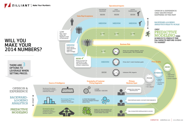
How Will You Make Your 2014 Numbers?

A good B2B infographic design, How Will You Make Your 2014 Numbers from Zilliant gives you 3 options to leverage when setting prices. Good luck making your numbers!

Pricing is the most powerful lever a company has to boost profitability, yet it is often the last bastion of guesswork in many companies.

When it comes to setting prices, what we typically see is that B2B companies take one of three distinct approaches: opinion and experience, backward-looking analytics and predictive modeling.

Where does your company fall? Take a peek at this infographic and find out!

I’m definitely seeing a big increase in design requests for B2B infographics that can be used in presentations, brochures and handouts.  This design is a great example of showing how their service outperforms the alternatives.  The design was sized to fit on standard size paper, so anyone can print it out.  The racetrack path also walks the audience through the information in a very specific sequence.

Thanks to Danielle for sending in the link!

Wednesday
Nov202013

The Online Shopping Cart Experience

Shopping Cart Experience infographic

Online shopping is a convenience that a lot of people take advantage of. But the convenience varies. The Shopping Cart Experience infographic from checkoutoptimization.com finds the optimal situation to make customers happy.

Over the course of the last few years, I have been in and out of the details of conversion rate optimization. My career at a digital marketing agency affords me the privilege of working with some of the top brands in the world. I am equally lucky to know some great entrepreneurs with very small businesses. Among the fascinating things that I get to see every day and across the spectrum is how much of an impact a small improvement at the checkout makes.

Simply, more sales equals more sales. Given finite resources to optimize a thousand different things, I’m awestruck that the shopping cart is not a greater focus. And as sites have changed in incredible ways over the last few years, shopping carts remain unchanged.

In 2009 I thought about this issue and started researching attributes across a number of shopping carts. It was a story of small diversity and great uniformity. I started writing a book on the subject, but I shifted focus to double down and grow a separate business. (Which has been extremely rewarding and I now get to work with a growing group of talented, bright, extremely funny people that are accomplishing amazing things for the world’s coolest brands, but that’s another story.) A couple of months ago, I came back to the idea of checkout optimization, and thought it would be really interesting to compare my 2009 research to the current state of things.

And that’s how this infographic came to be. My hope is that this is useful to anyone curious about shopping cart design patterns, or perhaps someone looking for a standard to measure up against. Let me know what you think, and you want more like this, you can sign up here.

Nice overview of the differences sites choose when setting up checkout pages on e-commerce sites.  Some of the subtle visualizations work very well, like the multiple pages shown behind the numbers in the User Friendly section.  However, some values aren’t visualized at all, like the percentages for the different merchant features.

The infographic landing page explicitly asks people to repost the infographic with links back to the original page, but sadly, most people don’t do that.  The landing page URL should be included in the infographic image itself so readers can find the original when bloggers don’t include the link.

Thanks to Nicholas for sending in the link!

Monday
Nov182013

17 LinkedIn Profile Must-Haves

17 LinkedIn Profile Must-Haves is a how-to infographic that walks the reader through optimizing their LinkedIn profile page.  Published by MarketMeSuite working with Maximize Social Business.com’s Neal Schaffer.

This year has been a big one for LinkedIn. With new features like the Creative Portfolio Display, you now have the ability to visually showcase your professional portfolio. But before diving any deeper with the latest add-ons, does your LinkedIn profile have all the elements that will help you rise to the top? This new infographic has all the tips you need to elevate your LinkedIn profile: 17 LinkedIn Profile Must-Haves!  Everyone can use great tips, so please share the LinkedIn love!

Great design using a mock LinkedIn profile as the background.  The callouts are clearly connected to the appropriate areas on the profile.  There’s a lot of text, but in this case I think most of it is necessary to clearly explain each point.  The reader can work off of this infographic without any additional research on other sites.

The statistics at the bottom should have been better visualized.  Mixing the 50.5% stat with the profile complete percentage visual from LinkedIn is confusing.  Also, it was difficult for me to find the original infographic landing page.  The footer should have the URL for readers to find the full-size original version of the infographic.  The source list text is too small to read too.

Thanks to Martin Mosler for post on Google+!

Friday
Nov152013

Two Years Without Steve Jobs: Has Apple Crumbled?

Two Years Without Steve Jobs: Has Apple Crumbled? infographic

Has Apple Crumbled? is an infographic from WhoIsHostingThis.com that takes a close look at the business and financial results of the last couple of years under Tim Cook’s leadership.

With the passing of Steve Jobs in 2011, many tech industry experts were quick to predict that his company, Apple, Inc., would soon falter without its charismatic founder at the helm. Yet in the years since Jobs’ successor, Tim Cook, has taken the wheel, Apple has not only continued on, but flourished.

The design starts off well, but gets lazy towards the bottom with a number of statistics shown in text only, and not visualized.  Readers will perceive these values as less important and visually skim right over them.  With a mix of visualized data and text only data, the text only values are perceived as secondary information and often ignored.

I really like the character illustrations. They are minimal, but still easily recognizable.  The same goes for the product icons.  Minimal but easily recognizable.

The footer does a good job with sources and the company logo, but should have also included the URL link back to the original infographic landing page so readers can find the full-size original version.

Found on MacTrast.com

Monday
Oct142013

The Modern Workforce

The Modern Workforce infographic

The Modern Workforce infographic from unum shows that the workforce demographic has changed in the last 30 years, but the benefits have not evolved to support this. There are more women, disabled, and older people in the modern workforce, but the protection, time away from work, and services given to employees are not keeping up.

The research finds significant gaps have opened up between employer-provided benefits and the protection required by today’s workforce. At a time when the demographics of the modern workforce are shifting towards employees that have a greater need for financial benefits, the research shows that the ratio of wages to employee benefits is outdated.

As a result, we’re more likely to fall into financial difficulty than we were 30 years ago. And, if we’re in financial difficulty we’re less productive, so it’s in an employer’s best interests to better protect their people.

We’ve published research called Keeping Pace? Financial Insecurity in the Modern Workforce with Cass Business School. It paints a picture of how the make-up of our workforce has changed. It also makes recommendations about what employers should do to better protect their people.

The infographic has some great data from their case study research, but the design could have done a better job making the information easier to understand for readers.  Many of the visualizations don’t match the data from the study.

For example, the pie slices shown in the Demographic Changes section changed their radius instead of their angle.  This creates a false visualization because the area of a pie slice with twice the radius is much larger than the data values.  So, the visualization is displaying a much larger increase than the data actually shows.  This design mistake with the radii was repeated in the Social Changes section, so that visualization doesn’t match the data either.

Unum also created a motion graphic video to share some of the research findings as well.  I would have recommended tying these two content types together, using the same design assets in both.  They already have the data visualizations from the static infographic, so use them in the video as well.


Thanks to Ed for sending in the link!

Monday
Oct072013

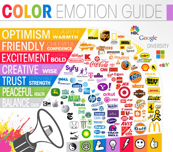
The Color Emotion Guide

The Color Emotion Guide infographic

The Color Emotion Guide arranges well known company logos into a rainbow of emotion to help readers understand which logos are using color to create a perception of their brands.

Logo designers have several puzzles to solve when presented with a new logo design project. One of the main considerations that a designer must deal with is to understand what it is that the client wants to achieve with the logo design.

The designer asks the client a series of questions that illicit answers helping to bring the parts of the puzzle together. A typical question might be “What qualities does your business want to be known for?” The answer might be for a doctor for instance, “I want to be known as someone you can trust”. So the question and answer begs: How does the designer portray trust in the logo design?

Scientists have been studying the way we react to colors for many years.  Certain colors make us feel a certain way about something. As long as the designer knows what these colors and emotions are, the designer can use that information to help present the business in the right way. These are not hard and fast rules but smart designers use the information to their clients advantage.

This fun infographic lays out the emotions and qualities that well known brands like to be known for. The color psychology is only one part of the puzzle but I think you will agree it is a very important part of it.

As far as I can tell, this appears to be a design from The Logo Company, but it was very hard to track down.  Infographics are usually shared without the accompanying articles, so designs need to include basic information like their own company logo, a copyright statement and the URL back to the original design in the actual image file.

Found on Laughing Squid

Thursday
Oct032013

Agile Development Methodology Talent Gap

Agile Development Methodology Talent Gap infographic

Who’s Hiring & Who is Hirable? The Agile Development Methodology Talent Gap infographic from Yoh points out why it is so hard to find agile developers and why the pros get paid the big bucks.

The rapid adoption of the agile development methodology has created a sizable talent gap. The INFOGRAPHIC from Yoh uncovers the impact: 

  • Demand outstrips supply by nearly 4x
  • Companies have to pay a premium for Agile expertise
  • The agile talent gap is most significant in thePacific Northwest
  • Labor pressure for agile talent goes from bad to worse
  • Competition for agile talent is fierce

Good design, and certainly eye opening for agile developers and employers.  The only visualization I struggled with was the Experience stacked bar, because the bar sizes don’t match the data shown.  Not even close.

Thanks to Stephen for sending in the link!