About
Randy Krum
President of InfoNewt.
Data Visualization and Infographic Design

Infographic Design

Infographics Design | Presentations
Consulting | Data Visualizations

DFW DataViz Meetup

Join the DFW Data Visualization and Infographics Meetup Group if you're in the Dallas/Fort Worth area!

Search the Cool Infographics site

Custom Search

Subscriptions:


Feedburner

The Cool Infographics® Gallery:

How to add the
Cool Infographics button to your:

Cool Infographics iOS icon

- iPhone
- iPad
- iPod Touch


Read on Flipboard for iPad and iPhone

Featured in the Tech & Science category

Flipboard icon

Twitter Feed
From the Bookstore

Caffeine Poster

The Caffeine Poster infographic

Entries in business (68)

Tuesday
Apr262011

Real Estate Professionals & Social Media Infographic


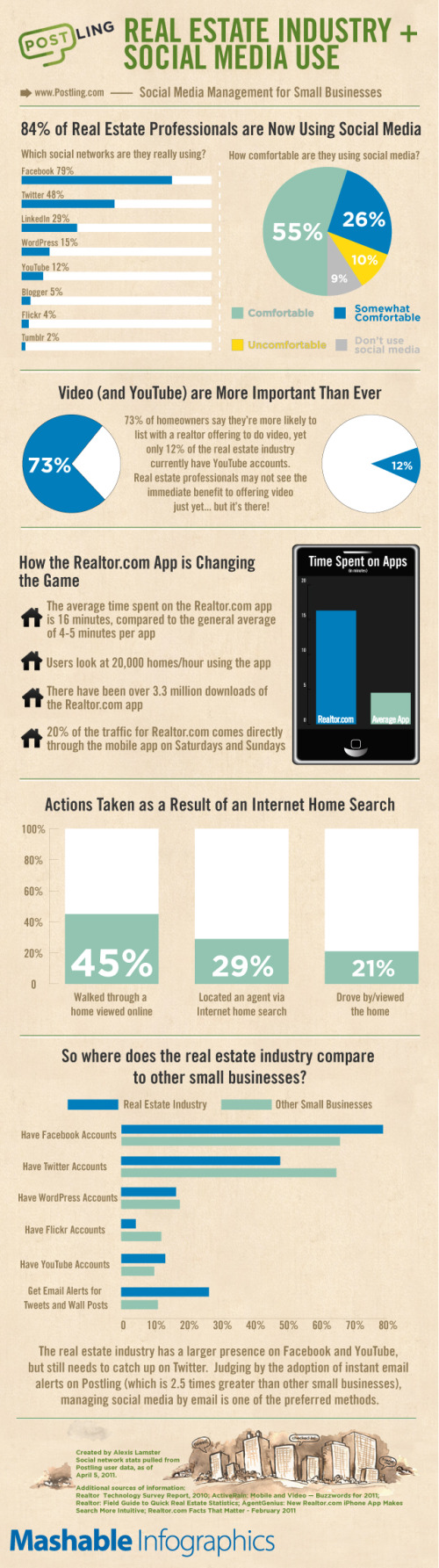
From Mashable and Postling, the Real Estate Industry + Social Media Use infographic looks at how social media is reshaping how realestate agents communicate with potential buyers.

The real estate industry has seen a number of social media innovations over the past few years. Real estate pros are using social media to provide online property tours, schedule showings and showcase local expertise.

Alexis Lamster, VP of customers at Postling and creator of the infographic below, told us that the company analyzed more than 500 Postling accounts specific to real estate and more than 7,000 small business accounts to extract information on how the real estate industry is using social media.

Although the infographic is made up of mostly pie charts and bar charts, it clearly communicates the information in a clean, easy-to-read format.

Friday
Jan282011

InMaps: Viewing Your Business Network

The new LinkedIN Maps is a very cool interactive infographic that visualizes your own LinkedIN network.  The InMaps pull data from your own LinkedIN profile when you allow access, so you can only see your own network.  

The connections are grouped into clusters based on shared connections and companies.  You can see above that my network has a few clearly defined clusters, but then a large blue area that has no clear cluster information.  You can also learn about you network with some of the visual data built into the map.  People with bigger dots and their names in larger fonts have more connections.

It’s interactive, so you can zoom in to see the individual names, and if you click on a connection, it highlights all of their connections as well.

Check out the quick, descriptive video from LinkedIn’s chief scientist DJ Patil:


For some reason, it doesn’t show every connection between people.  There are a few people in my network that I know are also connected to each other; however, the map didn’t show any connection between them.  Not sure what’s going behind the scenes.

You can publicly share your map on Twitter, Facebook and of course LinkedIN when you click the share buttons.  Here’s mine.  This creates a static image with a legend if you have named your color-coded clusters.  Clicking on the map takes readers to the front page to create their own, but clicking on your name takes them to your LinkedIN profile page.

You can also see some other anonymous maps on the front page by clicking on the “Next Map” button which will change to the background map image.

This one has been popular.  Found on FlowingDataVizWorld, Infosthetics and Mashable.

Monday
Jan242011

Small Business: By The Numbers


Intuit brings us By The Numbers: Small Business in the U.S. and Abroad.  I like the mix of 2D and 3D visuals, but the visuals at the bottom seem odd.  Showing different statistics for a handful of countries instead of comparing the same statistics across countries makes that part harder to understand.  I would guess that was dependent on what data was available for the different countries.

Inflation and currency exchange play large factors in the cost to start-up a new business abroad compared with the United States. If you’re considering starting up a small business, the below infographic breaks down start-up costs, ease of business and success rates broken down by country, as well as a view of small business around the globe.

I appreciate that they cite their sources, but I wish I could give credit to the designer, who isn’t listed on the infographic.

As a small business owner myself, I hope I fall on the good side of the survival statistics!

Thanks for sendng the link Rachael!

Thursday
Jan202011

The Illusion of Diversity: Visualizing the Soft Drink Industry


Very cool visualization from Philip H. Howard at Michigan State University called The Illusion of Diversity.  It’s fairly big and hard to read, so I dropped the image link into Zoom.it to create the zoomable image above.  You can see the high-resolution image here, or download the high-resolution PDF here.

Background
Three firms control 89% of US soft drink sales [1]. This dominance is obscured from us by the appearance of numerous choices on retailer shelves. Steve Hannaford refers to this as “pseudovariety,” or the illusion of diversity, concealing a lack of real choice [2]. To visualize the extent of pseudovariety in this industry we developed a cluster diagram to represent the number of soft drink brands and varieties found in the refrigerator cases of 94 Michigan retailers, along with their ownership and/or licensing connections.

Professor Howard’s team did a lot of legwork visiting stores to gather the data, recording 987 different varieties of soft drinks from 94 food retailers in the Lansing, Michigan area.


The statement “Three firms control 89% of US soft drink sales” really means that “89% of the drinks available come from only three firms”.  The distinction is subtle, but there is no sales data included.  This is just an ownership structure.

You also have pay attention to what you’re seeing.  The bubble sizes are mixed because the parent company bubbles are sized to the portion of drinks they control, but the size of the individual drink bubbles is consistent and doesn’t convey any meaning.  For the individual drink, the color-coding is what conveys meaning.

Conclusion
The illusion of diversity in the soft drink industry extends beyond obscuring ownership, as its products are primarily water and sweeteners. More research is needed on the links between pseudovariety and the consumption of energy-dense, nutrient-poor substances.

I noticed that this was created using OmniGraffle, which is a vector mapping application that I use a lot.

Found on Infosthetics.com and VizWolrd.com 

Wednesday
Jan192011

Client Infographic: An Illustrated View of SAP SPS 18 


The SPS 18 Fact Sheet is a new infographic InfoNewt (my company) designed recently for Panaya, a software-as-a-service company that provides upgrade automation to SAP customers.  The team at Panaya has some fantastic, proprietary data and needed a way to share that information with current and future customers.

It’s mind-boggling that the SAP Enterprise software is so big that the last round of updates had 13,349 notes/changes!  I can totally understand the need for Panaya’s simulations and analysis for IT managers trying to manage implementing these updates.  Panaya has a fantastic service that can evaluate the impact of each update package (support package stack) for their clients’ unique and different installations of SAP.

Every company uses (or doesn’t use) the SAP modules differently and knowing which modules have the most notes/changes can make a big difference on how you implement each update.  

SAP Support Package Stacks Have Never Looked so Sexy – An Illustrated View of SPS 18

SAP Support Package Stacks are “mega bundles” of software updates that SAP periodically makes available. These updates include important bug fixes, performance improvements, and legal changes such as labor and tax law changes. The challenge is that most stacks include well over 10,000 changes or “Notes.” And these changes can impact installations in ways that are hard to predict, with possible adverse effect on business processes.

One of the advantages of running a SaaS solution here at Panaya is that we can run aggregate analysis across hundreds of projects. Think “Google Trends” for SAP Support Package Stacks. We ran our simulation over hundreds of different instances to determine the typical impact areas and other stats. The goal is to help you plan towards your implementations.

We sent an early version to several thousands of reviewers and got great feedback.

As a next step, we partnered with designer Randy Krum, who, believe it or not, is not only a talented artist, but also a former SAP BPX-er. So he can actually pronounce ABAP and can tell BI from FI.

So without further ado, here’s SAP Support Pack 18 like you have never seen it before

Thanks to Udi and the rest of the team at Panaya!  There’s much more information available at Panayainc.com and ERP Executive: The Magazine for SAP Managers.

Tuesday
Sep282010

The Display Ad Tech Landscape


Developed by Terence Kawaja of LUMA Partners, the Display Advertising Technology Landscape makes an attempt to map out the companies involved in this ever-changing business.  This is his latest version, but even he admits that his chart is far from perfect.

By definition the chart will never be final since the space is so dynamic. I am still discovering companies.

A few things to bear in mind. This chart is far from perfect. Organization of such a fragmented and dynamic industry is flawed by its very nature. Many companies operate across several categories and there are distinctions within categories. This chart does not include many of the search players which are increasingly overlapping with display nor does it reflect whole categories such as lead generation and ecommerce which likewise utilize display advertising in their funnel, not to mention international companies which are barely reflected. At some point in the future I may construct an uber landscape which captures these and other players.

I believe we are in for some interesting times as the space rationalizes and consolidates along with the advent of new strategic entrants.

I applaud Terence in his attempt to visualize this complicated business environment that he works with.  Even if it’s not perfect, it certainly helps readers understand this business better by making it visual.  You certainly don’t have to be a graphic artist to make useful infographic, and I think Terrance has made a step in the right direction.  I look forward to seeing future versions.

Found on AllThingsD.com and AdExchanger.com

Wednesday
Jul282010

Inside the Glenn Beck-Goldline Scheme infographic

Fools Gold: Inside the Glenn Beck Goldline Scheme is a new infographic posted on The Big Picture blog.  Designed by our friend Jess Bachman from WallStats.com, Fool’s Gold is a controversial visual explanation of how Glenn Beck’s comments on his shows can drive viewers to purchase gold coins from Goldline, who is one of his show sponsors.

Tuesday
Jul132010

The Entrepreneur's Visual Guide to Tech Startups

HackFwd is a European tech investment firm, and they posted this flowchart on their front page to help startup companies see what it’s like to work with them.

We’re experienced tech entrepreneurs looking to support and invest in Europe’s most passionate geeks. We’re a pre-seed investment company designed to enable great people to launch great ideas. Our start-up and support process accelerates the route to beta, profitability, and success.

We want you to feel good at every step along the way. Here’s how your experience might look:

Apply-Rinse-Repeat

Found on FlowingData.com

Page 1 ... 3 4 5 6 7