About
Randy Krum
President of InfoNewt.
Data Visualization and Infographic Design

Infographic Design

Infographics Design | Presentations
Consulting | Data Visualizations

DFW DataViz Meetup

Join the DFW Data Visualization and Infographics Meetup Group if you're in the Dallas/Fort Worth area!

Search the Cool Infographics site

Custom Search

Subscriptions:


Feedburner

The Cool Infographics® Gallery:

How to add the
Cool Infographics button to your:

Cool Infographics iOS icon

- iPhone
- iPad
- iPod Touch


Read on Flipboard for iPad and iPhone

Featured in the Tech & Science category

Flipboard icon

Twitter Feed
From the Bookstore

Caffeine Poster

The Caffeine Poster infographic

Entries in business (68)

Monday
Dec122011

Client Infographic: Top 20 Marketing Automation Software Solutions

Designed here at InfoNewt for Capterra, the new infographic: The Top 20 Marketing Automation Software Solutions explores the relative Popularity of different software companies playing in the Marketing Automation arena. 

In this design, I used a pie chart to represent the total Popularity of the Top 20 solutions, and connected the related company logo to each slice as appropriate.  It was a specific design choice to list the rank number, but not the specific percentage of each slice.  Because the data was gathered and combined from a number of different sources that can change daily, the results needed to be informational at a general level and valid for a longer period of time.  Visually, you can quickly and easily understand the relative popularity, but the specific value isn’t relevant to any purchase decisions.

An infographic product comparison is a great way to help buyers cut through the clutter and add value.  There are currently 184 software solutions listed in the Marketing Automation category directory, so buyers need some way to compare products and make an informed decision.

Capterra is the authority when it comes to finding software solutions for businesses, and they’ve done some great work gathering data and measuring the relative popularity of different software categories.  Although popularity doesn’t necessarily mean the software is right for your business, it is a really good indicator that the solution is working successfully for many businesses and may be worth a closer look.  A better indicator than just total revenue or trying to rate “the best.”

Designed in OmniGraffle, and I cleaned up the logo images using Pixelmator.

Thanks to Mike and the great work from the team at Capterra!

Thursday
Oct202011

The Socially Optimized Business


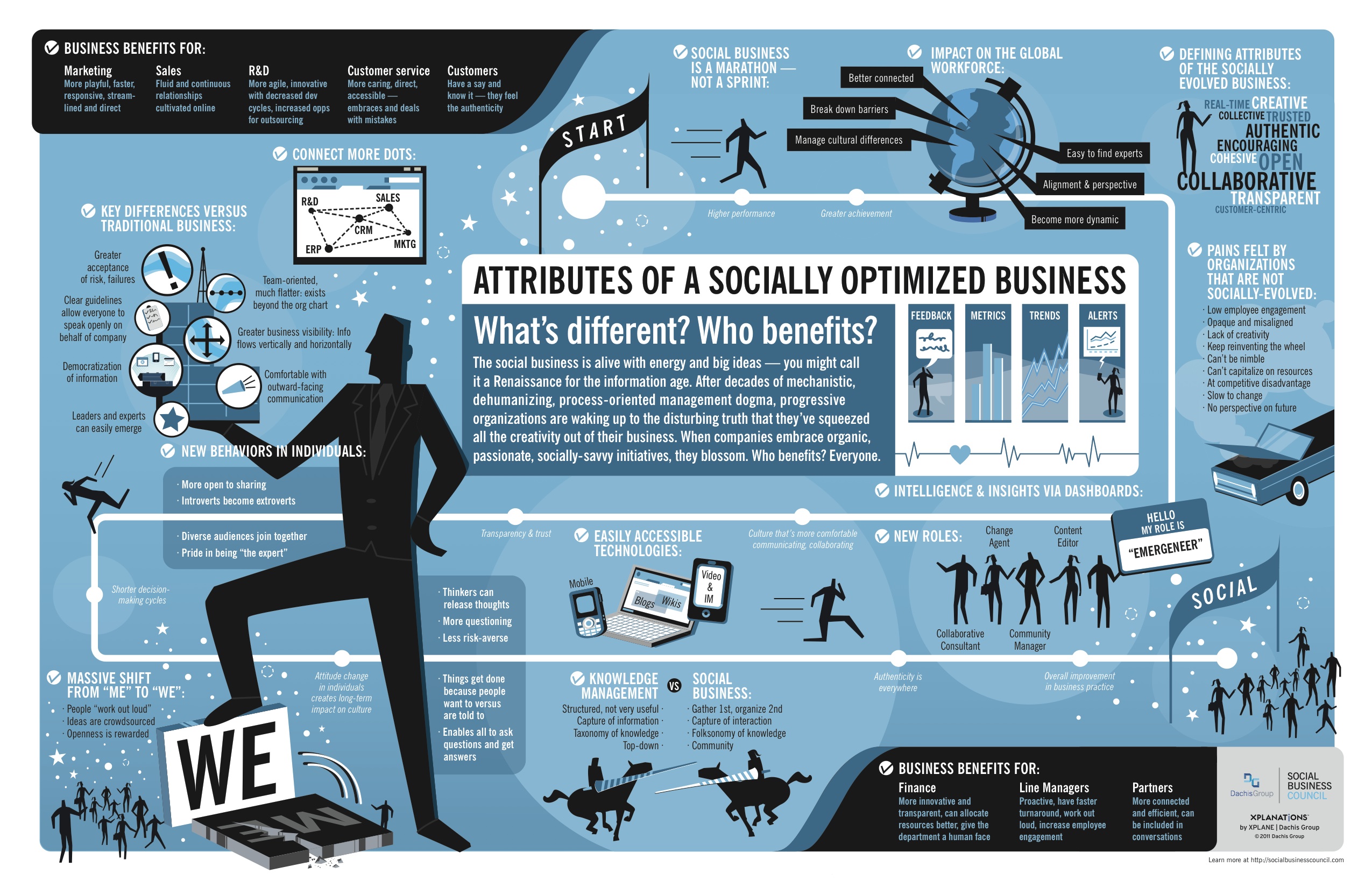
Attributes of a Socially Optimized Business is a new, visual XPLANATION from the Dachis Group after acquiring the XPLANE company.  You can view it in SlideShare (they should have put it into Prezi), or download the high-resolution PDF.

What’s a Social Business? It’s a business alive with energy and big ideas. It’s collaborative, authentic, customer-centric, trusted, open and real-time.

And it’s about time. After decades of mechanistic, process-oriented management dogma, progressive organizations are waking up to the disturbing truth that they’ve squeezed all the creativity out of their business. But when companies embrace organic, passionate, socially-savvy initiatives, they blossom. That’s Social Business.

This would make a great poster!

Wednesday
Aug312011

Who Owns The Beer Brands?

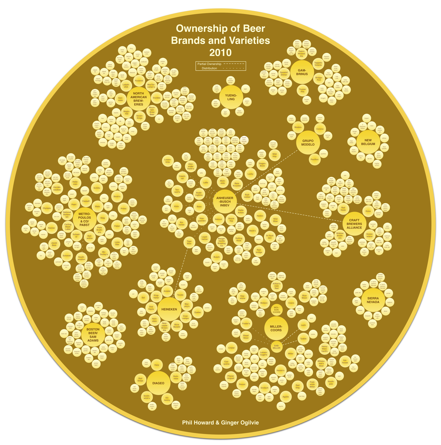
That beer you’re drinking from that cool independent brewery may not be what you think.  Another very cool data visualization from Philip H. Howard and Ginger Ogilvie at Michigan State University called Concentration in the US Beer Industry.  Similar to their last project visualizing the soft drink industry in The Illusion of Diversity, this new project shows the breweries and individual beers owned by the top 13 companies.

There is an appearance of great diversity in the number of brands and varieties of beer sold in the United States. The beer industry, however, is dominated by a relatively small number of firms.

AB InBev owns, co-owns or distributes more than 36 brands, for example, while MillerCoors controls at least 24 more. MillerCoors also brews Metropoulos & Company’s products under contract (thus the company that controls Pabst and 21 other brands is a “virtual” beer company).

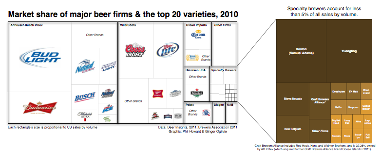
Only meant to show which companies own which beer brands, the three bubble sizes are used to show parent companies, brewery brands and individual beer brands.  They designed a separate treemap visualization to show market share.

Because these are large visualizations, they have posted them within zooming viewers on the Michigan State University site.

Found on Flowing Data.

Wednesday
Jul132011

The Content Grid v2

First, The Content Grid v2 is a cool, new infographic collaboration between Eloqua and JESS3.  The infographic maps out the different ways that companies can deliver information to potential customers, how that content can effect the buying process and the different distribution channels for that information.

It’s a complex set of data, and this infographic does a fantastic job of summarizing the different tools available onto one page.  This would work as a fantastic tool to use when planning a strategy to release a new product, and choosing the different ways you could successfully reach your customers.

The Content Grid v2 picks up where its predecessor left off. Intact is the prescriptive connection between content type and distribution channel. New is the perspective of the buyer, a multi-stage purchase funnel, and a comprehensive collection of KPIs (like they say, “What isn’t measured, isn’t purchased.”). Although v2 contains significantly more information than the original, the new design is infinitely more simple. This achievement is a tribute to the unrivaled design team at JESS3 – and the clarity of client/agency communication that comes only with time and trust.

Enjoy The Content Grid v2. It’s not only the next generation of the Web’s most popular and award-winning content marketing infographic, but it’s also a how-to for marketers looking to operationalize content marketing programs.

Second, Jesse Thomas, CEO of JESS3, has posted a good “The Making of an Infographic” article on Forbes.com looking behind the scenes at the infographic design process, and sharing some of the other design options that were explored during the process.  A couple of the other designs are included above.


And finally, third, Joe Chernov has a good article about designing Planned Obsolescence into the infographic as an effective markleting practice.  Eloqua and JESS3 released the original Content Grid (above) in June of 2010 knowing it was interesting data, but not quite useful yet as a tool.

We knew the graphic was interesting visually, and we also knew it could be used by marketers. But deep down we felt that something was “off,” but we couldn’t quite put our finger on what was wrong. We could have sat in the drawing room until it was “perfect” (translation: indefinitely), but we didn’t. Instead we published the content as-is and deliberately planned to revisit it one year later.

During that time, we solicited feedback (in blog comments, on Twitter, from colleagues, even from the audience at speaking engagements) and preserved all comments in a spreadsheet. By provoking widespread feedback (positive and negative), we were deliberately rendering obsolete the infographic we had worked so hard to develop.

A fascinating look at how infographics are made and used as effective marketing tools.

Thursday
Jun302011

Humor: Corporate Organizational Charts

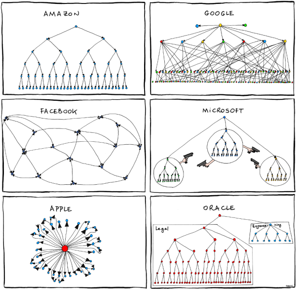
From Bonkers World, Organizational Charts is a very funny look at the corporate cultures and structures for some very high-profile tech companies using hand-drawn organization charts as the visual language.

Found on Daring Fireball.

Friday
Jun242011

Britain's Changing High Street Businesses

From SimplyBusiness.co.uk comes the Our Changing Highstreet: The Rise and Fall of High Street Shops infographic.

A third of independent High Street shops are now cafes, pubs, restaurants, and takeaways, a major new survey from Simply Business has found.

The survey, which looked at some 75,000 businesses quoted by Simply Business between 2008 and 2010, also found that hairdressers and beauty salons are beginning to thrive – with the former now the most common type of non-hospitality establishment on the High Street.

But retailers have fared worse, with clothes shops and newsagents showing a marked decline during the period.

Unsurprisingly London remains the country’s foodie heaven – with restaurants now making up 11 per cent of the capital’s High Street businesses.

I like the different ways to look at the data, and the connecting lines in the changing ranking visualization are really well done.  I like the ones that connect to additional listings below the visuals, presumably to the actual location on the listing.

I don’t understand some of the ranking change visuals off to the right.  Computer shops fell from #12 to #14 in the list, but the change visual shows “New Entry” instead of Down 2?

Apparently I should go drinking in Wales though!

Thanks to Mark for sending in the link!

Thursday
Jun162011

The Business of Giving


The design of The Business of Giving from SocialCast does a good job of walking the reader through a story about companies donating to charities.  However, they could have done more to visualize the scope of donations instead of just including the dollars values in text.

In the Popular Causes section, I would have built the icons right into the pie chart.  They don’t serve much purpose on their own next to the chart.

I love the puzzle piece images used for Partnerships.

Designed by Column Five Media

Wednesday
May182011

Microsoft Acquisitions Subway Map #infographic

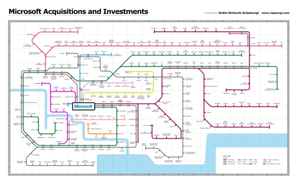
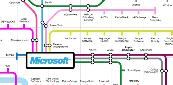
Robin Richards (@ripetungi) recently updated his fantastically detailed subway map of Microsoft Acuisitions and Investments.  Although Robin is the Information Design Director at JESS3, this is one of his personal projects.

Infographic showing the acquisitions and investments of Microsoft, done as a tube map with each coloured line representing a different industry for each acquisition or investment.  Where the stations meet is where the two industries overlap.  The key at the bottom displays information about the location on the map of the station (company) the year of acquisition or investment.


This thing is big!  Poster-sized big.  I dropped the link into Zoom.it so it would be easier for you to zoom in closer and see the details.

Zoom inZoom inZoom inZoom in
Zoom outZoom outZoom outZoom out
Go homeGo homeGo homeGo home
Toggle full pageToggle full pageToggle full pageToggle full page
 

Great job Robin!  I love this project.

Thursday
May052011

The Reality Behind Social Location Apps #infographic

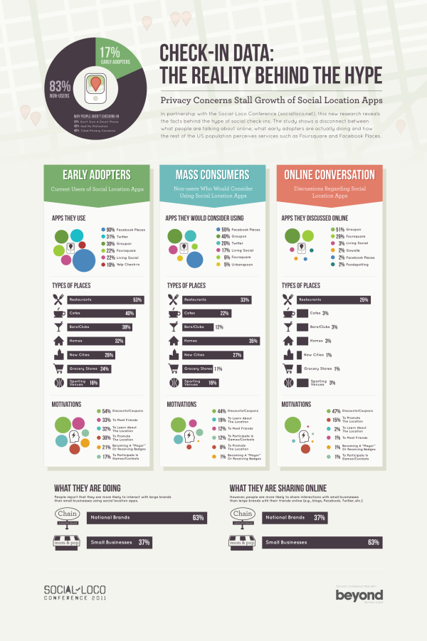
Digital services company Beyond compiled the results of their research into location-based apps, and designed this infographic summarizing the results; Check-In Data: The Reality Behind the Hype.  Released in conjuction with the Social-Loco conference in San Francisco, CA on May 5th.

As part of our involvement in the Social-Loco conference we have done some research to try to understand the difference between what people are saying online compared to the actions of early adopters and the views of the rest of the US population when it comes to their mobile check-in habits.

The results give us a clear understanding of who the winners and losers are likely to be, as well as the types of things that will motivate the mass consumer to adopt location-based apps. They also highlight some of the real challenges there are to consumers embracing this technology.

The data is very interesting.  Personally, I continue to use Foursquare, but find myself checking in less and less because I don’t get any direct benefits out of it.

From a design standpoint, I like the circle clusters, but I don’t like data separate in a legend on the side.  I appreciate that the color-coding remains the same, so Twitter is the same color in each visualization.  I would have included the logo images for the social location-based apps, and connected the data directly to the circles.  Data legends like this make your readers work harder to understand the information.

I also think that the most interesting learning from the study is the comparison between how people interact with national brands and small, local businesses.  However, this is the last visualization at the bottom, and gets lost.

Found on Mashable!

Wednesday
May042011

Real Estate: Social Media Killed the Blog Star


Another good infographic from Fixr.com about the how the real estate industry is changing.  Social Medai Killed the Blog Star: Real Estate looks at how buyers are finding their information online and who are the most influential blogs and real estate people on Twitter.

I like the use of company logos and Twitter profile images.  I also like that all of the data is built-in to the pie charts and bar charts to make it easier for the readers to comprehend.

The side-by-side Top 10 lists are interesting, but because they’re based on different measurements (followers vs. Alexa page rank), the graphic should give the reader some context of how to compare the different values.  Why do these lists support the overall message that social media is more important than blogging?

Some major technical errors as well.  Pie chart percentages should ALWAYS add up to 100%.  The pie charts here add up to 71%, 99%, 91% and 100%, which means that the visual of the slice sizes doesn’t match the data.  You never want your data visualizations to tell a story that isn’t supported by the data.

Thanks to Raul for sending in the link!