About
Randy Krum
President of InfoNewt.
Data Visualization and Infographic Design

Infographic Design

Infographics Design | Presentations
Consulting | Data Visualizations

DFW DataViz Meetup

Join the DFW Data Visualization and Infographics Meetup Group if you're in the Dallas/Fort Worth area!

Search the Cool Infographics site

Custom Search

Subscriptions:


Feedburner

The Cool Infographics® Gallery:

How to add the
Cool Infographics button to your:

Cool Infographics iOS icon

- iPhone
- iPad
- iPod Touch


Read on Flipboard for iPad and iPhone

Featured in the Tech & Science category

Flipboard icon

Twitter Feed
From the Bookstore

Caffeine Poster

The Caffeine Poster infographic

Entries in visual (320)

Wednesday
Mar022011

Blood Simple: Designing Infographic Health Reports

Blood Simple, by Steven Leckart, is a great article in the recent issue (Dec 2010) of WIRED magazine, and is also available to read online.  Three visual designers were challenged to design a better lab report to help make health information more approachable and understandable by patients.

…lab reports don’t have to be unintelligible. With some thought and design-minded thinking, tests can be as informative to patients as they are to physicians. With a little context and color, we can make sense of the numbers. And with a bit more understanding, patients can become participants in their own health.


These designs certainly aren’t perfect, but they very clearly illustrate the point that we should be able to help patients get a better grip around their own health information.  The last few decades have seen a tremendous shift in pushing the responsibility of a patient’s health back onto the patient without giving them a better way to understand the information. 

We consulted with Lisa Schwartz and Steven Woloshin, physicians at the Dartmouth Medical School Institute for Health Policy and Clinical Practice and experts in communicating data to patients, to make sure the right information gets onto the forms and the irrelevant stuff stays off. And we tapped three exceptional designers to reimagine how this information can be presented—limiting them to one printed page per report. Consider these a proof of concept, a refutation of the argument that ordinary people can’t handle their health (and inspiration, we hope, for the medical establishment).


I want my own Visual Health Report!

Monday
Feb282011

Visualizing Daily Activities With Media Wheel


I really like the Media Wheel for Visualizing Daily Activities from Hill Holiday.  The wheel visualizes how people consumer different types of media over the course of a day.  For example, DVD/Video is mostly consumed in the evening and Newspaper is mostly consumed in the morning.  each slice is a different type of media, and the consumption levels are shown by how bright the colors are at that time of day.

For a media planning project, we needed to find a simple way to illustrate how people in a particular segment engage with different media. After some experimentation, we came up with this “media wheel” chart that summarizes 216 data points from a media spreadsheet.  

Read their blog post, they included a good description of how they normalized the data and created the media wheel.  They also gave credit to the designer, Eric Fensternheim, which is always nice to see.

The wheel graph itself was built by hand in Adobe Illustrator. Each data point’s value relative to the highest in its row is tied to the corresponding level of color transparency.

Design: Eric Fensterheim, media design intern.

Friday
Feb182011

The 2011 Massachusetts Budget infographic poster

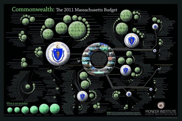
Jess Bachman, from ByJess.net,  has designed this new government budget poster of the 2011 Massachusetts Budget for The Pioneer Institute.

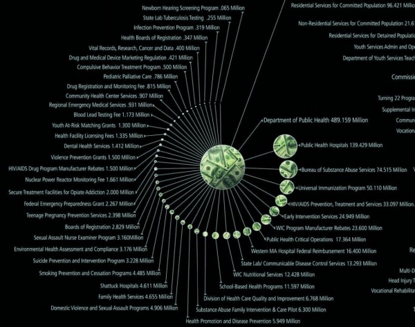
The most largest and most detailed visualization of a state budget ever, this 864 sq in poster (not for sale) compares hundreds of programs and expenditures from the billions down to the thousands of dollars.  If you really want to see how a state (like Massachusetts) spends it’s tax payers money, this is it.

The above graphic is a massive visual guide to the Massachsettes state budget. It presents hundreds of government departments, agencies, and programs in a visual format, proportionate in size to their funding level. The largest item is $15 billion, the smallest is $65 thousand.

Similar to his Death & Taxes poster of the Federal budget, the Massachusetts Budget poster is highly detailed, showing how spending for every department is broken down.


Although it’s not clear if The Pioneer Institute will make posters available for purchase, you can see the full detail online in this high-definition zoomable image.  (Check it out full-screen too!)


Wednesday
Feb162011

The Visual History of the Political Parties (infographic posters)


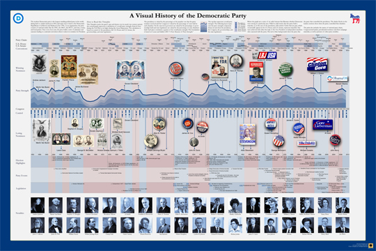
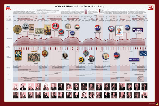
Timeplots.com has just released two new posters visualizing the history of the two major American political parties.  Zoomable images of both A Visual History of the Democratic Party and A Visual History of the Republican Party are available so you can see all of the detail online.  

Timeplots is also offering a discount to readers of Cool Infographics!  Enter the Coupon Code “CIG020311” to receive 10% off until 3/31/11!


Just like the other great posters from Timeplots.com, these are highly-detailed posters, loaded with a huge amount of data.  At its heart, they are timelines that show the overall party strength from 1832 (Democrats) or 1856 (Republicans) to the present.  Along the timeline additional information is included like the names of the national party chairs, Congressional leaders, city where the party convention was held, who were the winning and losing party nominees for President (along with campaign material), election highlights, party events, major legislation, as well as pictures of other party notables.

You get the point that there is a lot of history in there!

It places each party event in historical context, visualizing a remarkable range of party events, legislation, election results, and leadership to succinctly tell the story of the party. Narratives are displayed within the larger context of party strength by aggregating and annotating data on presidential elections, Congress, Governorships and State Legislatures. The Timeplot provides a new lens into American political history; it is not intended to be absorbed at a glance, but rather to be visited and revisited over time.

Posters are 36” x 24” and normal price without the discount is $29.95.

Posters should start shipping by 2/28.  Also, check the Timeplots.com site for student discounts on any of their posters.

Friday
Feb112011

Hop On, Hop Off The Jefferson Airplane

Hop On, Hop Off The Jefferson Airplane is a visual history of the band Jefferson Airplane by Italian infographic artisan Gino Selva.  The colored lines show which performers were involved in each album and which instrument they played.  A guide on the left side shows which band name was used for the different albums.

It’s fairly complicated, but that’s the reality of the band’s history and why needs an infographic to help simplify it.

Nice job Gino!

Wednesday
Feb092011

The Doctor Who Infographic

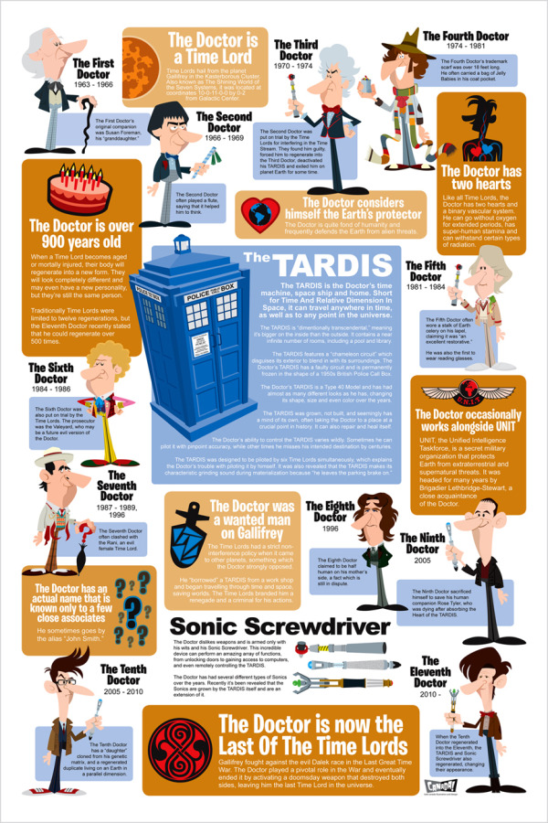
Very cool overview Infographic History of Doctor Who, with some fantastic illustrations, by Bob Canada (@bob_canada on Twitter).  The world of Doctor Who is incredibly complex, but this infographic gives new viewers the basics.


Here’s everything you’ve ever wanted to know about the Doctor, but were afraid to ask. Click here to see a super-sized version so you can better read the text.

This piece took quite a while to finish. I worked on it a little at a time over several days. There was a lot of moving around of elements and a lot of text editing to get everything to fit in an efficient manner. Hopefully there aren’t any glaring errors in the information.

Laid out entirely in InDesign. All the Doctors, the Sonics and the TARDIS were drawn in InDesign as well.


You can tell from the illustrations that the hair was iconic for each Doctor.  You could probably identify each doctor in silhouette by the hair alone!

Wednesday
Jan192011

Client Infographic: An Illustrated View of SAP SPS 18 


The SPS 18 Fact Sheet is a new infographic InfoNewt (my company) designed recently for Panaya, a software-as-a-service company that provides upgrade automation to SAP customers.  The team at Panaya has some fantastic, proprietary data and needed a way to share that information with current and future customers.

It’s mind-boggling that the SAP Enterprise software is so big that the last round of updates had 13,349 notes/changes!  I can totally understand the need for Panaya’s simulations and analysis for IT managers trying to manage implementing these updates.  Panaya has a fantastic service that can evaluate the impact of each update package (support package stack) for their clients’ unique and different installations of SAP.

Every company uses (or doesn’t use) the SAP modules differently and knowing which modules have the most notes/changes can make a big difference on how you implement each update.  

SAP Support Package Stacks Have Never Looked so Sexy – An Illustrated View of SPS 18

SAP Support Package Stacks are “mega bundles” of software updates that SAP periodically makes available. These updates include important bug fixes, performance improvements, and legal changes such as labor and tax law changes. The challenge is that most stacks include well over 10,000 changes or “Notes.” And these changes can impact installations in ways that are hard to predict, with possible adverse effect on business processes.

One of the advantages of running a SaaS solution here at Panaya is that we can run aggregate analysis across hundreds of projects. Think “Google Trends” for SAP Support Package Stacks. We ran our simulation over hundreds of different instances to determine the typical impact areas and other stats. The goal is to help you plan towards your implementations.

We sent an early version to several thousands of reviewers and got great feedback.

As a next step, we partnered with designer Randy Krum, who, believe it or not, is not only a talented artist, but also a former SAP BPX-er. So he can actually pronounce ABAP and can tell BI from FI.

So without further ado, here’s SAP Support Pack 18 like you have never seen it before

Thanks to Udi and the rest of the team at Panaya!  There’s much more information available at Panayainc.com and ERP Executive: The Magazine for SAP Managers.

Thursday
Jan132011

Should I Work for Free? - a flowchart

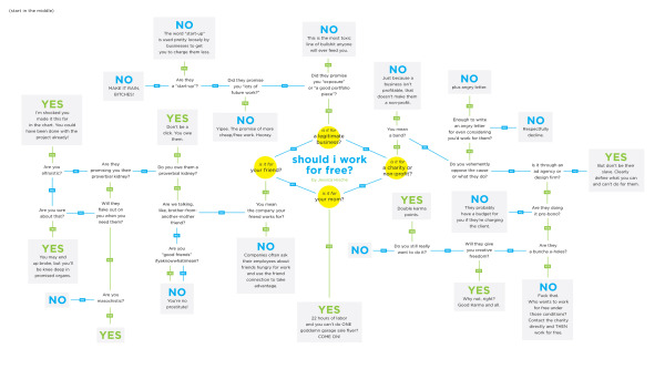
Should I Work for Free? is a great decision tree flowchart from Jessica Hische.  Start in the middle and work your way out.  

I made this flowchart for my future students but I think it’s useful for pretty much any creative, myself included. Prints to come!

I’ve heard some of these rationales before…

Thanks for the link Erica!

Monday
Jan102011

The (Visual) Evolution of the Batmobile


This is a really TALL infographic, but fun to read through nevertheless.  The Evolution of the Batmobile from Carinsurance.org (I wish they would credit the designer) is a visual timeline in the form of a comic book page looking at many (I’m sure they missed some, but not many) versions of the Batmobile from 1941 to 2010.  They also cover different versions from comics, television, movies, ads, posters and computer games.

The Batmobile has always been the trademark vehicle for Batman. However, throughout the history of the comic, the Batmobile has undergone some changes to its design and gadgets. Here’s an overview of some of the evolutions of the Batmobile.


Tuesday
Dec282010

How Would You Like Your Graphic Design? #infographic


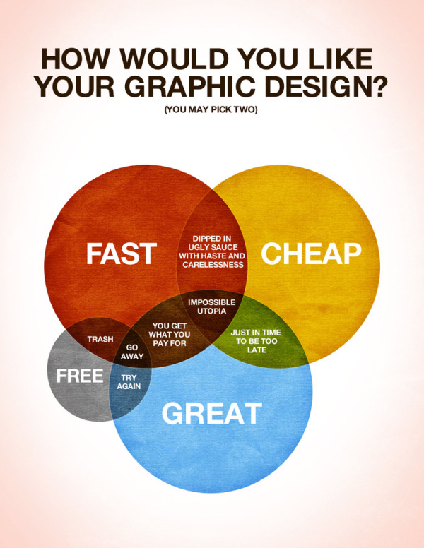
Designed by Colin Harman, How Would You Like Your Graphic Design? made me laugh this morning.  Great venn diagram infographic.

There are times when things just need to be explained using a spectacular Venn diagram. I made this last night whilst sitting on a screened in porch by an outdoor fireplace when it was late. Design is a funny thing, not as funny as a Kangaroo jumping on a trampoline, but let’s be honest what is as funny as that? I’ll give you a little hint: nothing.

Anyways, I love design, but it has it’s limitations in the creation process. Hopefully this helps you understand what those are and help you choose how you would like your design work in the future.

Your thoughts?

Although designed as a treatise about graphic design, it applies to infographics as well.