About
Randy Krum
President of InfoNewt.
Data Visualization and Infographic Design

Infographic Design

Infographics Design | Presentations
Consulting | Data Visualizations

DFW DataViz Meetup

Join the DFW Data Visualization and Infographics Meetup Group if you're in the Dallas/Fort Worth area!

Search the Cool Infographics site

Custom Search

Subscriptions:


Feedburner

The Cool Infographics® Gallery:

How to add the
Cool Infographics button to your:

Cool Infographics iOS icon

- iPhone
- iPad
- iPod Touch


Read on Flipboard for iPad and iPhone

Featured in the Tech & Science category

Flipboard icon

Twitter Feed
From the Bookstore

Caffeine Poster

The Caffeine Poster infographic

Entries in visual (320)

Monday
Dec272010

The Blog Tree


The Blog Tree is growing on me.  A project collaboration between JESS3 and Eloqua, it uses the tree metaphor to map out the post prominent Marketing blogs by traffic size and category.

The Blog Tree maps out the marketing blog structure from the most prominent blogs at the roots through the leaves which are shown in different colors to indicate the size of each blog’s readership. The positioning and color of the blogs were determined using publicly-available visitor data about each web site on compete.com.

This has gotten a lot of traffic on its own, and they are experimenting with an interesting call to action for viewers.  

As for those blogs not yet portrayed on the infographic, Eloqua invites and encourages their authors to tag The Blog Tree infographic on Eloqua’s Facebook account in order to be included in future versions and receive an official “Blog Tree” badge for their site.

Where’s the infographic blog branch?

Friday
Dec172010

FREE Infographic Holiday Cards!!!


Once again this year, FUNNEL, Inc. is offering FREE 4-pack mixed sets of Infographic Holiday Cards, but quantities are limited (US & Canada only).  You won’t find them on the main site, because they’re only available on this secret page of their site for Cool Infographics readers.  When you enter your address, make sure you choose “Cool Infographics Blog” in the How did you hear about us? question.  There are 50 packs of cards reserved just for Cool Infographics readers!

This year brings a new infographic called “Delivery” to the mix:


Also on the page are seven infographic holiday desktop backgrounds available for free download.  They have multiple screen resolutions, and the new one even has iPhone versions.


Thanks to Lin and Lori at FUNNEL for this special treat just for Cool Infographics readers!

Friday
Dec032010

Journalism in the Age of Data


Wow!  Journalism in the Age of Data, by Geoff McGhee at Stanford, is a fantastic video documentary looking at the Age of Infographics, and how we got here.

Journalists are coping with the rising information flood by borrowing data visualization techniques from computer scientists, researchers and artists. Some newsrooms are already beginning to retool their staffs and systems to prepare for a future in which data becomes a medium. But how do we communicate with data, how can traditional narratives be fused with sophisticated, interactive information displays?

A video report on data visualization as a storytelling medium.  Produced during a 2009-2010 Knight Journalism Fellowship.  Total running time: 54 minutes with related information and links.


It is 54 minutes long, but nicely broken out into 8 chapters.  Geoff was able to interview some of the true superstars in the Infographics field.

Found on Visual Journalism

Wednesday
Nov172010

Rogue Infographics - The Empowered E-Patient Translated into Chinese


I found one of my recent client infographics, The Empowered E-Patient, translated and posted on a Chinese site, www.mazingtech.com (along with many others), but it’s not a version that I designed.  I also had to view the site using this link with Google Translate.  Someone has downloaded the original image file, translated all of the text into Chinese and then reposted the infographic.

Let me start by saying that although I designed the original infographic, I don’t think I have a big problem with someone else translating it and republishing it without my permission (or involvement) in this way.  It was done very well, and the client I designed it for feels the same way.

Here you can see the original and the translated version side-by-side:


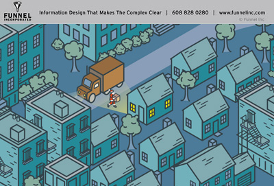
You can see that someone spent some time with an image editing program trying to do this right and make it look official.  The Chinese text is the same size and color as the original English, and was very carefully positioned.  The visuals were left intact, as were all of the logos, website addresses and even the copyright information.  

Technically, I think this would be considered a copyright violation, but it’s not like another site is claiming ownership or directing traffic to a new, different destination site.  Because of the care that was taken, if this infographic is reaching more people because of the translation, it would be successfully driving more awareness and traffic to the PathOfTheBlueEye.com site.  That was the whole point of the original infographic in the first place!

One issue is that because I wasn’t part of the translation process, I don’t know that it was translated correctly.  If there actually is some existing demand to view this in Chinese, I could have offered that service to my client to make sure that we were happy with the translation.

It’s worth noting, that there are MANY English infographics that have translated into Chinese on this site, but the navigation to find them is very difficult.  Here are a few more from other designers that I have posted before on Cool Infographics, but have been translated and reposted in Chinese.  (You can click the titles to see the original English version I posted)


WTF is HTML5, and Why Should We Care?

Apple, Adobe Flash and H.264

The Visual FAQ of SEO infographic

Thursday
Nov112010

Visualisation Mag: Hand-Drawn Infographic Contest!


Chris Watson, author of Visualisation Magazine is hosting a contest for all of you.  The next issue will be Visualisation: Volume 4 - Handmade Informal, and the contest winner will be featured on the cover (plus featured on the GOOD Magazine blog, the VisualThinkMap blog and here on Cool Infographics).  Seriously, ANYONE can enter, and you don’t have to be an expert in any expensive design software or programming languages.

Deadline is the end of December, so you have plenty of time to submit your entry.

Chris has setup a special group on Flickr where anyone can submit their entries.

This is the group to share your submissions for the contest to feature your work on the Cover (front wrapping round to the back), a double page spread and a blog post on GOOD Magazine blog, Vism.ag/blog and CoolInfographics.com.

I want to emphasize handmade techniques like, etching, screen printing, metal press, lino, mono printing, drawn, paper folding. the only digital element would be the capturing of the work for the front cover to send us, or taking printed elements and manipulating them by hand… to an extent.

CHECKOUT THESE PEOPLE FOR INSPIRATION:

Stefan G Bucher

Denis Wood & Siglio Press

Grayson Perry

Stefanie Posavec

Sara Fanelli

Amy Franceschini

Alfred Wainwright

VENTURI, SCOTT BROWN AND ASSOCIATES, INC

Visualise any subject you like (try not to be too offensive, would like all ages to appreciate) and to consider the: 

Complexity
Innovation
Culture

TO BE JUDGED 

by GOOD Magazine, Density Design, Cool Infographics & Visualisation Magazine

End date: aiming for end of December. 

Judging: Beginning of January


Dont’ be intimidated if you’re not an infographic designer by day.  This contest is open to everyone who thinks they can tell a good message visually.  Judging will be based on these criteria:

Complexity: More complexity doesn’t always equal better infographic.  Does the infographic improve understanding of a normally complex topic?

Innovation: Is the visual design method innovative, and visualize the data in a new way?

Culture: Is the infographic relevant to a broad audience in today’s world?  Does it have cultural importance?


More details can be found at vism.ag/61

Since I’ll be one of the judges, I can’t enter myself.  I will probably post more than just the winner here on the blog.  I expect the judging will be tough, and we’ll have a number of really good entries.

Please help spread the word and retweet the contest!

Wednesday
Nov102010

Client Infographic: What Consumers Think About Concrete

A project I did recently for The Concrete Network visualizes the results of their 2010 Concrete Floor Survey.  They have some exclusive research data from consumers, and What Consumers Think About Concrete explores the consumer perceptions of concrete floors and uses visuals to make the information interesting and relevant.

The team at Concrete Network did a great job of taking a boring report filled with bar chart after bar chart, converting that data into an appealing infographic and then integrating those visuals into the report they distribute publicly.

Original survey report:

Infographic Design:

Public Survey Report PDF:

Images of actual projects were very important to make the concrete floor color choices relevant and understandable.  

I also made this project somewhat interactive.  Instead of zooming in and moving around a large infographic image, each of the separate data visuals is clickable to view that section in detail.  Using textures relevant to the data also makes the resulting visuals interesting and quick to comprehend.

Thanks to Khara and the team at The Concrete Network!

Tuesday
Nov022010

Client Infographic: The Empowered E-Patient


The Empowered E-Patient is a recent project InfoNewt (my company) did for the Path of the Blue Eye Project.  The statistics are compelling, and certainly support that e-patients are now mainstream.

In 2000, the Pew Internet and American Life Project found that 25% of Americans searched online for health information.  Today, 61% rely on the Web for medical and health content.  Americans’ growing reliance on Dr. Google and Nurse Yahoo! has led to profound changes in how health organizations and providers relate to and communicate with consumers.

Notably, this infographic provides information on e-patient social media communications from a Project-produced research report, “Communicating with the Empowered E-Patient.”  This report is available free of charge to individuals making regular contributions to the Project’s knowledge community, Living the Path.  Learn more about how to access this report here.


One of the challenges was defining not only what is an e-patient, but also what is the correct term to refer to these people looking up medical information online.  We ended up using Google to determine which terms are used most commonly, and the title ‘e-patient” was clearly the term used most often.

Thanks to Fard and the team at Enspektos.com.  There’s much more information available at the Path of the Blue Eye Project.

Monday
Nov012010

World Series Infographic Comparison


What makes an infographic, an infographic?  

It’s commonly understood that infographics visualize data.  But the question is: at what point data becomes information is where the grey area begins. The following two submissions from CoolInfographics.com readers allow a clearer comparison between interesting presentation of information vs. infographic.  As a Dallas-area resident, I couldn’t be happier to present two visualizations about the World Series between the Texas Rangers and the San Francisco Giants.  Go Rangers!


Lillian Smith of VerticalBrands.com created the first in our series: 2010 World Series By Numbers (above).  A look at the home cities of the two teams dueling it out in the 2010 World Series, the San Francisco Giants and the Texas Rangers from Dallas.

In the spirit of the World Series, MyCheapApartments.com has decided to take a closer look at the two bustling metropolises that this year’s championship contenders call home.

Posted on mycheapapartments.com, this one does a better job of visualizing data.  The cities are located on visuals of the states, some housing statistics are in bar charts and even the mascot visuals add to the comparison.  There are certainly other statistics included that could also have been visualized, but are only included as text (Show me the map of San Francisco inside the map of Dallas for size comparison).  I do like that most of the comparisons are side-by-side for the cities, so the reader can understand the comparisons quickly.


On the other hand is a blog post from the folks at Sterling Satellite: 14 Things You Didn’t Know about the World Series.


My opinion is that this one doesn’t actually qualify as an infographic, because there isn’t any data being visualized.  It’s a list of interesting facts presented in a graphic format, but many of the statistics included would have been better understand if they had been visualized (i.e. graph the comparison of advertisement costs).

The World Series is one of the premier events in all of sports, and it is steeped in fascinating facts and figures that will amaze anyone.  Here are the 14 things you didn’t know about the World Series (as if you need anything to make you more excited):


What do you think?


Thanks for submitting these.  And… Go Rangers!

Friday
Oct082010

Client Infographic: Tech Upgrades for Geeks

A new infographic for Fixr.com designed by InfoNewt (my company), the Tech Upgrades for Geeks looks at a handful of home improvements that anyone can do to their house to upgrade their technology quotient.  Upgrades range from small ($100) to large ($82,000), and the images surrounding the floor plan are sized appropriately.


Most of the data comes from the Fixr.com Cost Guides, but some of the projects can be DIY, so the costs are just for parts (like the keyless entry pads).  

A big thanks to Raul, Andres and everyone at Fixr.com 

…excuse me while I go setup Good Eats in the kitchen.

Monday
Oct042010

SoTech Infographic v1.0 - your feedback requested

The SoTech Infographic v1.0 was released during the Social Collective 2010 Conference in London last week as a visual way to show how social networks interact with the different functions of business.  The infographic was created by Hold, a Brighton based graphic design studio.

Introduced at Social Collective, Darika Ahrens, Shannon Boudjema + Paul Armstrong presented an infographic (created by http://www.wearehold.com) that demonstrates how social technologies work within a business + outside a business - 

The infographic is available in a number of formats, like PDF and JPG, Scribd and Slideshare.  An online copy of the presentation from the conference is below (using Prezi, a great visual presentation tool!).  I agree with their thoughts on using infographics as a conference tool as well.


Both on the SoTech Now website, and the email I got from Paul Armstrong, is the invitation to heavily critique this v1.0 of the infographic.  They would like to develop and release v2.0, but are looking to incorporate all of the feedback they can get.  Leave comments below or on the SoTechNow site with your own reactions.

Here are some of my initial thoughts (mainly on the design):

  • Very text heavy.
  • Readability is low.  I’m a fan of big infographics that allow you to zoom in and dig deeper into the details, but in this version, by the time you zoom in close enough the read the text, you’re too close to understand the context.
  • Use icons, at least for the different business functions
  • Show examples of sites in each of the “Social Tech” sections.  Otherwise it seems like wishful thinking that there is a product that successfully does each of these functions.
  • Show examples of the metrics.  Are these actually quantifiable?

I think the infographic does provide a great framework to either develop a social plan, or to evaluate an existing plan.  It would be fascinating to review a company’s efforts using this framework as an example of social media being used successfully (or not) by a corporation.

What do you think?