About
Randy Krum
President of InfoNewt.
Data Visualization and Infographic Design

Infographic Design

Infographics Design | Presentations
Consulting | Data Visualizations

DFW DataViz Meetup

Join the DFW Data Visualization and Infographics Meetup Group if you're in the Dallas/Fort Worth area!

Search the Cool Infographics site

Custom Search

Subscriptions:


Feedburner

The Cool Infographics® Gallery:

How to add the
Cool Infographics button to your:

Cool Infographics iOS icon

- iPhone
- iPad
- iPod Touch


Read on Flipboard for iPad and iPhone

Featured in the Tech & Science category

Flipboard icon

Twitter Feed
From the Bookstore

Caffeine Poster

The Caffeine Poster infographic

Entries by Randy (1654)

Friday
Jul152011

Our Choice: Interactive, Infographic iPad book

Our Choice, is a new ebook for the iPad and iPhone by Al Gore that includes many infographics and interactive data visualizations that the readers can interact with.  Intended to be the sequel to his book and presentations, An Inconvinient Truth, Our Choice brings a lot of the global warming data to life.

Mike Matas presented the book design in the TED Talk video above, and he’s the co-founder of Push Pop Press, a new digital publishing company. This is the first book from Push Pop Press, but they are working to make the software tools used to make this ebook app available to produce more ebooks.

Ignoring the message and any controversy this book will inspire, the use of data visuals in a ebook format like this is a sign of many more data visualizations to come.

Al Gore’s Our Choice will change the way we read books. And quite possibly change the world. In this interactive app, Al Gore surveys the causes of global warming and presents groundbreaking insights and solutions already under study and underway that can help stop the unfolding disaster of global warming.

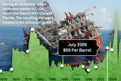
Our Choice melds the vice president’s narrative with photography, interactive graphics, animations, and more than an hour of engrossing documentary footage. A new, groundbreaking interface allows you to experience that content seamlessly. Pick up and explore anything you see in the book; zoom out to the visual table of contents and quickly browse though the chapters; reach in and explore data-rich interactive graphics.

More than 30 original interactive infographics and animations

100% of Al Gore’s earnings from Our Choice will be donated to the nonprofit Alliance for Climate Protection.


The app is $4.99 in the iTunes Store, and if you purchase through this link, Our Choice ebook, a small portion will go to helping maintain the Cool Infographics site.  You can also buy the printed book from Amazon.

Thursday
Jul142011

Distracted Driving Infographic

From the Christensen Law Firm in Utah comes the Cell Phones & Driving infographic that looks at the horrifying statisitics behind accidents and deaths caused by people using cell phones while driving in the U.S.

shocking facts about the realities of texting and driving in modern culture. It mentions, for example, that 18% of all fatal accidents are caused by cell phone use, and that 6 collisions occur every 10 minutes because of cell phones. In other words, keep the cell phone as far away from you as possible while driving, because frankly, becoming one these statistics is not an admirable achievement.

The design style is very crowded and busy, but I like the unique approach to using each number on the keypad as a statisitic.

“More than one in four Americans who download apps admit to using those apps while driving.”  On my iPhone, one of those apps is the TomTom GPS app, so of course I use it while driving!

Thanks to Jake for sending in the link!

Wednesday
Jul132011

The Content Grid v2

First, The Content Grid v2 is a cool, new infographic collaboration between Eloqua and JESS3.  The infographic maps out the different ways that companies can deliver information to potential customers, how that content can effect the buying process and the different distribution channels for that information.

It’s a complex set of data, and this infographic does a fantastic job of summarizing the different tools available onto one page.  This would work as a fantastic tool to use when planning a strategy to release a new product, and choosing the different ways you could successfully reach your customers.

The Content Grid v2 picks up where its predecessor left off. Intact is the prescriptive connection between content type and distribution channel. New is the perspective of the buyer, a multi-stage purchase funnel, and a comprehensive collection of KPIs (like they say, “What isn’t measured, isn’t purchased.”). Although v2 contains significantly more information than the original, the new design is infinitely more simple. This achievement is a tribute to the unrivaled design team at JESS3 – and the clarity of client/agency communication that comes only with time and trust.

Enjoy The Content Grid v2. It’s not only the next generation of the Web’s most popular and award-winning content marketing infographic, but it’s also a how-to for marketers looking to operationalize content marketing programs.

Second, Jesse Thomas, CEO of JESS3, has posted a good “The Making of an Infographic” article on Forbes.com looking behind the scenes at the infographic design process, and sharing some of the other design options that were explored during the process.  A couple of the other designs are included above.


And finally, third, Joe Chernov has a good article about designing Planned Obsolescence into the infographic as an effective markleting practice.  Eloqua and JESS3 released the original Content Grid (above) in June of 2010 knowing it was interesting data, but not quite useful yet as a tool.

We knew the graphic was interesting visually, and we also knew it could be used by marketers. But deep down we felt that something was “off,” but we couldn’t quite put our finger on what was wrong. We could have sat in the drawing room until it was “perfect” (translation: indefinitely), but we didn’t. Instead we published the content as-is and deliberately planned to revisit it one year later.

During that time, we solicited feedback (in blog comments, on Twitter, from colleagues, even from the audience at speaking engagements) and preserved all comments in a spreadsheet. By provoking widespread feedback (positive and negative), we were deliberately rendering obsolete the infographic we had worked so hard to develop.

A fascinating look at how infographics are made and used as effective marketing tools.

Monday
Jul112011

Client Infographic: Facebook, Privacy and Health

For the Path of the Blue Eye Project, InfoNewt (my company) recently designed the infographic: What You Need To Know: Facebook, Privacy and Health.  The group at the Path of the Blue Eye Project has done some fantastic, primary research about online users’ willingness and attitudes about sharing health information online, and specifically Facebook.

The answer is overwhelmingly “NO”.

If Facebook is so popular (Pew reports that 62% of Web users frequent sites like Facebook and MySpace), why are people shying away from sharing health content with others on the site?  To answer this question, the Path of the Blue Eye Project commissioned a national survey designed to tease out some of the reasons why Americans are reluctant to exchange health information on Facebook.  We found:

  • 68% of Facebook users have not and would not share their personal health information on the site. The most commonly cited reason for refusing to share: “it’s no one’s business but my own (86%).”
  • Privacy concerns may be one reason many refuse to share.  39% of non-sharers were afraid strangers would find their health information and 32% worried marketers might use it to sell products and services.

Online users do a lot of searching for health information, but very few are willing to share any of their own information on social sites like Facebook.

The Facebook Privacy Policy is huge, and most of the concerns why oline users are unwilling to share online information have to do with unintended people finding their information.  Insurance companies, marketers and strangers top the list of concerns.

Thanks again to Fard and the team at Enspektos.com.  There’s much more information available at the Path of the Blue Eye Project.

Thursday
Jul072011

Bye Bye Space Shuttle infographic

I really like An Uncertain Future, a tribute infographic for the Space Shuttle program’s last launch of Atlantis scheduled for Friday.

Designed by for the Washington Post

Last week I published what could be my very last Space Shuttle infographic. As a space exploration enthusiast and a professional visual artist, NASA’s spacecraft will be sorely missed. Over the years, the Shuttle was the focal point in many of the most fun projects I’ve been involved, directly or indirectly.

I really like the arc timeline.  Not only is it a different design than you usually see, but it also indirectly implies the flight paths of the shuttles up into space and back down to Earth.

Found on Visual Loop

Friday
Jul012011

Client Infographic: Waste in the Texas Energy Market

Waste in the Texas Energy Market from ChooseEnergy.com is a new infographic by InfoNewt and designer Jeremy Yingling.  This one tells the story of how much money is NOT being saved by households that don’t take advantage of lower pricing since Texas has a deregulated electricity market.

As the economy struggles to recover and households continue to cut back on spending, one of the easiest ways to save money might just be in your electric bill. In these tough economic times, consumers realize the importance of watching how every penny is spent. Today we look at the “Waste in the Texas Energy Market” and how pennies can certainly add up quickly to improve consumer finances.

Following the Infographic Release Strategy from InfoNewt, ChooseEnergy also did a great job setting up a dedicated landing page and custom URL for the infographic.  All of their links then drive traffic to this single page.  So the company blog post, Twitter feed and Facebook posts provide additional descriptions and links to this landing page.

While highlighting the fact that the Texas energy market is the 11th largest in the world, the infographic also shows that 48% of the electricity consumed is from residential use.  So what’s the big deal?  On average Texas residents pay about 11.5 cents per kWh for their home electric use when they could be paying 8.5 cents per kWh.   Doesn’t sound like much does it?  Well, those 3 pennies can add up fast and they add up to $3.7 billion for the Texas consumer market.

You can follow ChooseEnergy on Twitter at @texas_electric

Thursday
Jun302011

Humor: Corporate Organizational Charts

From Bonkers World, Organizational Charts is a very funny look at the corporate cultures and structures for some very high-profile tech companies using hand-drawn organization charts as the visual language.

Found on Daring Fireball.

Tuesday
Jun282011

Rhinos by the Numbers & infographic video

A cool infographic from Earth-Touch.com, Rhinos By The Numbers tells a good story about the plight of rhinos and their struggle against poachers in Africa.

Here in South Africa, we lost 333 rhinos to poaching in 2010. And things are not looking up this year. Five incidents of poaching were recorded in just the first ten days of 2011. If you’re in the dark about the poaching crisis, you’ll find some need-to-know facts in our slick infographic (click to enlarge).

This is organized very well, and tells a very clear story that progresses as the reader moves downs the graphic.

They also created a great animated video based on the infographic!

Thanks to Chris for sending in the link!

Friday
Jun242011

Britain's Changing High Street Businesses

From SimplyBusiness.co.uk comes the Our Changing Highstreet: The Rise and Fall of High Street Shops infographic.

A third of independent High Street shops are now cafes, pubs, restaurants, and takeaways, a major new survey from Simply Business has found.

The survey, which looked at some 75,000 businesses quoted by Simply Business between 2008 and 2010, also found that hairdressers and beauty salons are beginning to thrive – with the former now the most common type of non-hospitality establishment on the High Street.

But retailers have fared worse, with clothes shops and newsagents showing a marked decline during the period.

Unsurprisingly London remains the country’s foodie heaven – with restaurants now making up 11 per cent of the capital’s High Street businesses.

I like the different ways to look at the data, and the connecting lines in the changing ranking visualization are really well done.  I like the ones that connect to additional listings below the visuals, presumably to the actual location on the listing.

I don’t understand some of the ranking change visuals off to the right.  Computer shops fell from #12 to #14 in the list, but the change visual shows “New Entry” instead of Down 2?

Apparently I should go drinking in Wales though!

Thanks to Mark for sending in the link!

Thursday
Jun232011

Stuxnet: Anatomy of a Computer Virus [video]

Stuxnet: Anatomy of a Computer Virus from Patrick Clair on Vimeo.


Stuxnet: Anatomy of a Computer Virus is a video that claims to be a “motion infographic.”  Created by Patrick Clair, it explores some of the information that has emerged as people have been dissecting the Stuxnet computer virus.

An infographic dissecting the nature and ramifications of Stuxnet, the first weapon made entirely out of code.

I really like the idea of motion infographics, but I disagree that moving text and animation make this an infographic.  There is a lot of information, but there aren’t any data visualizations.  There were a couple of animations that looked like data visualizations, but they’re vague and don’t convey any data to the viewer.

I really like the video, the topic of weaponized software is fascinating and the Security Now podcast #291 has a really good explanation of what has been publicly learned about the virus.

Question for everyone reading: “Does informative = infographic?”

Direction and Motion Graphics: Patrick Clair patrickclair.com
Written by: Scott Mitchell

Found on Visual News

The video is now also available on YouTube: