About
Randy Krum
President of InfoNewt.
Data Visualization and Infographic Design

Infographic Design

Infographics Design | Presentations
Consulting | Data Visualizations

DFW DataViz Meetup

Join the DFW Data Visualization and Infographics Meetup Group if you're in the Dallas/Fort Worth area!

Search the Cool Infographics site

Custom Search

Subscriptions:


Feedburner

The Cool Infographics® Gallery:

How to add the
Cool Infographics button to your:

Cool Infographics iOS icon

- iPhone
- iPad
- iPod Touch


Read on Flipboard for iPad and iPhone

Featured in the Tech & Science category

Flipboard icon

Twitter Feed
From the Bookstore

Caffeine Poster

The Caffeine Poster infographic

Entries in Data (85)

Friday
Mar112011

What is Data Visualization?


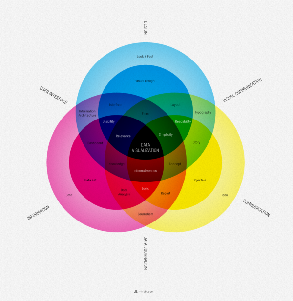
I love this map of What Is Data Visualization? from Sébastien Pierre, founder of ffunction.  It lays out the different aspects of information design, and acts as a fantastic guide to the vocabulary used in the design community.

ReadQWriteCloud has a good interview article with Pierre on his thoughts behind designing the infographic.

Pierre:

“Will it be interactive or static? Will it be used as a tool or to illustrate something? Depending on how we position the visualization, it will be more demanding on UI aspects or on visual aspects. Dashboards, online reports and interactive web visualizations need a solid understanding of UI design, while infographics and print reports require a strong foundation of typography, layout and visual communication.”

Found on ReadWriteCloud and ChartPorn

Thursday
Dec162010

DataStore - Launched at The Guardian


Today, the Guardian, home of the DataBlog, has launched a new site as the home for their data journalism, DataStore.


From Simon Rogers, Editor of the DataBlog and the DataStore:

Today we launch a new gateway to our data journalism and visualisations - find out what’s new at guardian.co.uk/data.

Data journalism has become an increasingly big part of our work here at the Guardian - from Wikileaks to government spending, it’s our job to make the key data accessible and easy to understand.

As Tim Berners-Lee said recently:

[Journalism is] going to be about poring over data and equipping yourself with the tools to analyse it and picking out what’s interesting. And keeping it in perspective, helping people out by really seeing where it all fits together, and what’s going on in the country

So, we’ve pulled all our data journalism into one new place: guardian.co.uk/data.

Besides our award-winning datablog, the site includes:
• The key data of the day - broken down for you
• Our pick of the data blogosphere - which sites have the key posts?
• Search the world’s government data - and global development data
• What have you done with our data? Featured apps

We’ll be adding new features and changes over the next months. What would you like to see?


Friday
Dec032010

Journalism in the Age of Data


Wow!  Journalism in the Age of Data, by Geoff McGhee at Stanford, is a fantastic video documentary looking at the Age of Infographics, and how we got here.

Journalists are coping with the rising information flood by borrowing data visualization techniques from computer scientists, researchers and artists. Some newsrooms are already beginning to retool their staffs and systems to prepare for a future in which data becomes a medium. But how do we communicate with data, how can traditional narratives be fused with sophisticated, interactive information displays?

A video report on data visualization as a storytelling medium.  Produced during a 2009-2010 Knight Journalism Fellowship.  Total running time: 54 minutes with related information and links.


It is 54 minutes long, but nicely broken out into 8 chapters.  Geoff was able to interview some of the true superstars in the Infographics field.

Found on Visual Journalism

Thursday
Jul292010

Apple iPhone Statistics 2010 infographic video

The Apple iPhone Statistics 2010 infographic video by Creative Licence Digital (an iPhone app development firm) takes a look at the numbers behind the iPhone phenomenon.

I pose this question to my readers: Is this infographics?  I think it walks a fine line between being artistic and infographic.  While a lot of numbers are shown and communicated to the viewers, they aren’t represented in any graphic form, just text.  What do you think?

Thanks to Darren for sending in the link.

Tuesday
Jun152010

InfoChimps Data API BETA program launched!

InfoChimps.com has launched the BETA program for the use of their data through InfoChimps APIs.  The two initial data sets are Twitter and U.S. Census data.

Initial pricing has been announced for this introductory period, and there is a level for FREE access for anyone who want to experiment with the data.

Found on ReadWriteWeb

Page 1 ... 5 6 7 8 9