About
Randy Krum
President of InfoNewt.
Data Visualization and Infographic Design

Infographic Design

Infographics Design | Presentations
Consulting | Data Visualizations

DFW DataViz Meetup

Join the DFW Data Visualization and Infographics Meetup Group if you're in the Dallas/Fort Worth area!

Search the Cool Infographics site

Custom Search

Subscriptions:


Feedburner

The Cool Infographics® Gallery:

How to add the
Cool Infographics button to your:

Cool Infographics iOS icon

- iPhone
- iPad
- iPod Touch


Read on Flipboard for iPad and iPhone

Featured in the Tech & Science category

Flipboard icon

Twitter Feed
From the Bookstore

Caffeine Poster

The Caffeine Poster infographic

Entries in Data (85)

Monday
Aug202012

ROI = Return On Infographics

ROI Return On Infographics


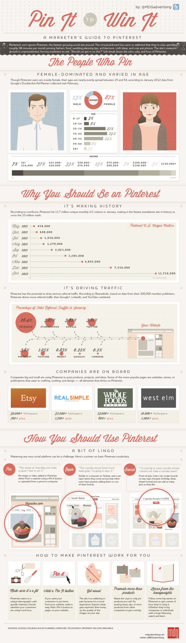
Infographics about infographics are always fun.  Return on Infographics by Bit Rebels and NowSourcing takes a look at some of Bit Rebels’ own data from releasing infographics as part of their marketing.

The impact of an infographic can be measured on many levels, which makes it all just a little bit more complex and complicated to present. With the help of NowSourcing, we have been able to produce an infographic that will compare the traffic and social action impact of an infographic post with a traditional post that does not involve an infographic. It’s through social media analytics that a clear image slowly emerges to tell a story that for some has just been a question without an answer.

They’re pretty clear about this, but remember that this design is completely based on internal data from Bit Rebels.  It may be a good indicator of infographics in general, but we don’t know for sure.

Bit Rebels has shared some fantastic data from their internal tracking, which will be of interest to the you, the readers of Cool Infographics.  However, the design makes a few mistakes, and we’re all here to learn how to make infographics designs better.

  • One of my pet peeves, the design messed up the size of the circles in the comparison table.  Based on the full-size infographic they released at 975 pixels wide, the smaller circle for 243 Actions is about 55 pixels in diameter.  Doing the match for the area of a circle, the diameter of the larger circle for 1,091 Actions should be about 117 pixels wide.  In the design, it’s actually about 256 pixels wide!  So instead of visually showing a shape roughly 4x larger, it’s actually showing a circle about 22x larger!  This is a “false visualization” and mis-represents the data.
  • Are these comparison data points an average or a total of the 500 posts?
  • How many infographic posts are compared to how many traditional posts?
  • Love the use of the actual logos from the social networks in the comparison table, and they should have continued that with the rest of the design instead of just text later in the design.
  • The blue bars behind the higher comparison value look like bar charts, but obviously don’t match the data.  They just fit the text, and have no visual relevance to the data.  An indicator icon or highlighting the entire column width would have been better than the bars.
  • Are the Top 6 Social Networks in rank order?  LinkedIN is the top social network for infographics???
  • The circles near the end of the design are also incorrect.  Instead of showing a 10x comparison to match the dollar values, the circles show an over 100x comparison!

Found on WebProNews, MediaBitro’s AllTwitter, and Visual.ly.  Thanks to everyone that also submitted it and tweeted links to it!

Tuesday
Aug142012

The Lifespan of Storage Media

Crashplan has just released The Lifespan of Storage Media, a comprehensive guide to how long your data will last.  Designed by Mike Wirth with InfoNewt, this infographic compares the expected lifespans of popular media types used over the last 100 years to save different kinds of information: computer data, photos, videos and audio.  Do your 8-tracks still play?

As each new form of data storage comes on the scene, the market is at first enamored with its compactness, convenience and hoped-for data longevity. But invariably, the reality of physical vulnerability and a limited lifespan remains. Eventually, all media fails, but Cloud backup is forever.

This was a fantastic project to work on, and the data research was the most challenging piece.  We had to find data to support both an average expected life and an extended “with extreme care” life.  We certainly found some contradictory data sources, and ultimately used data we felt was the most commonly accepted in the industry.

Do you have old computer backups burned to CDs, tapes or even hard drives on your shelf?  Don’t count on being able to read the data from them too much longer!  The short lifespan for many of these types of media that people use everyday to archive their personal photos and videos was most surprising.

Thanks to the team at Crashplan for a great project!

Wednesday
Jul112012

Strata Conference NY Oct 23-25 - 20% Discount Code

If you have any thoughts of attending the 2012 Strata Conference + Hadoop World, the discount code “COOL20” will cut 20% off the registration price for readers of Cool Infographics!  Big data, visualization, privacy, science and business!  What’s not to love?!?

This is an expensive conference, so the 20% discount is a BIG deal; saving hundreds of dollars!  The 2012 conference will run from October 23-25, 2012 in New York, NY.  If you can register early…

Best Price Registration ENDS Thursday, July 19th!  [EDITED]

 Now in its second year in New York, the O’Reilly Strata Conference explores the changes brought to technology and business by big data, data science, and pervasive computing. This year, Strata has joined forces with Hadoop World to create the largest gathering of the Apache Hadoop community in the world.

Strata brings together decision makers using the raw power of big data to drive business strategy, and practitioners who collect, analyze, and manipulate that data—particularly in the worlds of finance, media, and government.

Get the nuts-and-bolts foundation for building a data-driven business—the latest on the skills, tools, and technologies you need to make data work—along with the forward-looking insights and ahead-of-the-curve thinking O’Reilly is known for. The future belongs to those who understand how to collect and use their data successfully.  

And that future happens at Strata.

Check out some of the videos from the earlier Strata Conference in California from February 2012!

Friday
Jun292012

The Massive Challenge of Search Engine Complexity

Search Engine Complexity Infographic
Courtesy Stone Temple Consulting

The complexity of generating Search results online is HUGE.  The What’s So Hard About Search? infographic from SEO expert Eric Enge at Stone Temple Consulting takes a look at the massive numbers involved with indexing and searching the Web.

Building a search engine is a very complex task. I often find myself trying to justify to people why it is that search engines can’t understand their site. They seem fixated on believing that a search engine should understand it if a human can understand it. The short answer is that with an infinite amount of time the search engine could, but the scale of the Internet makes it oh so VERY hard.

The infographic below tries to give you some sense of the scale of the problem. Please note that a few numbers are hard to truly pin down, but I pulled them from the best sources I could. For example, no one really knows how many pages there are on the web, though Majestic SEO is aware of 3.7 trillion (the number I used) or the average web page size.

Regardless, the message is the same either way. The web is a really complex place!

Designed by InfoNewt, the design gathers data from a number of different sources to put together the picture of complexity.  Combining the number of web pages, the average number of links on each web page, the amount of data online and the number of searches every minute, you begin to understand the scale of the challenge search engines face.

This design takes a different approach by citing each data source along with it’s visualization instead of gathering them all at the bottom.  I think it works well with this many different data sources, and is easier for the readers to understand where each part of the data comes from.  All of the key elements are included at the bottom: copyright, brand logo and the URL to the infographic landing page so readers can always find the original (even when blogs repost it without linking or using the embed code).

I just have to say “Cheers!” to the developer teams that tackle this problem every day.  The scope of this challenge will only get bigger in the future!

Thanks to Eric and the team at Stone Temple for being great to work with!

Tuesday
Jun192012

Infographic Contest Winner: #Blame Twitter

A big congratulations to Tim Cooley!  Tim won the PosterBrain Design the Future contest with the entry above called #Blame Twitter, which is essentially a parody infographic.

From Tim:

All claims in this infographic are obviously false in nature and are solely intended for the comedic entertainment of readers. We <3 Twitter.

From PosterBrain:

We are sending a HUGE shout out to Tim Cooley for winning our Design the Future Infographic Contest! His infographic, #Blame Twitter, is very creative, informative, visually pleasing, and incredibly well done! We will definitely think twice about what, and how often, we tweet! Congrats again Tim, and thanks to everyone who participated!

Tim took the real data provided for the contest, but fictitiously correlated it to Twitter statistics.  In a classic example that “Correlation does not imply causation”, Tim visualized the real-world statistics as if they were caused by Twitter.  For example, it is true in the real-world that nearly 13,000 hectares of forest is lost every day, but it has nothing to do with the 233,370,615 Tweets every day.

Tim won an iPad2 for his winning infographic!  You can see all of the contest entries on the PosterBrain Facebook Contest Photo Album.

Please fell free to retweet this post without harming the environment…

Tuesday
Jun052012

Market and Competitive Intelligence Trends

Market and Competitive Intelligence Trends

Meidata brings us the Market and Competitive Intelligence Trends infographic that covers the sources and uses of competitive intelligence online and related Internet trends that affect the availability of information.

Meidata is a company in Israel, but has clients from around the world.  The infographic is based on their own internal information from global customers and system statistics, so this information is not available anywhere else in the world.

Designed by Robert Ungar at Meidata, the design is colorful and easy to follow.  A great design overall.  One of his best design accomplishments is the language translation.  More than merely pasting the translated text, the design has to account for the change in direction between Hebrew and English, and still tell a smooth story.

You can view the original design in Hebrew, and they just released an English language version (above) on their site, and you can download either the English PDF or the Hebrew PDF.


Thanks to Shaul from Meidata for sending in the link, providing the information and the English translated version.

Wednesday
May232012

Fast Facts on Coffee Consumption 

Fast Facts on Coffee Consumption infographic


Pouring in Your Cup: Fast Facts About Coffee Consumption is a good infographic from Hamilton Beach.

This is a good example of a company publishing an informative, marketing infographic about a topic related to their products (coffee makers), without feeling like a sales pitch or ad for their products.  However, I don’t think there is a clear story told by the infographic.  It’s generally a bunch of coffee and caffeine statistics put together in an infographic without a clear message.

I like the design and the simple color palette.  Most of the visualizations are clear and easy to understand except the bunch of coffee cups lined up in the middle.  I think each cup is supposed to represent the 20 cups/week the average office worker drinks, and all of the cups together is supposed to represent a year of coffee consumption.  When you line up images like this, the rows really should have only 10 images each for the reader to easily understand the quantity.  So, there should be 52 cups to represent the whole year, but there are only 48 cups shown.

There are a handful of stand-alone statistics that are just shown in text, that could have been visualized.  The clock image shown next to the stats “24 minutes a day” should have had a highlighted portion showing 24 minutes.  I like the male/female symbols used on the coffee cups, and the Venn-diagram style of coffee blends is great.

I’m going to go pour myself my third cup of coffee this morning…

Found on Infographics Showcase, Infographic Pics and Infographipedia

Tuesday
May222012

A Marketer's Guide to Pinterest, Video and Infographic

The Marketer’s Guide to Pintrest infographic video from MDG Advertising illustrates this hot new trend with this video that builds on their static infographic Pin It To Win It!

MDG Advertising has produced an engaging video highlighting the facts, figures, and findings from its popular “Pin It To Win It” infographic.

The video details the social site’s demographics, growth, and potential to drive abundant traffic to company websites. Pinterest is especially popular with the most highly coveted markets—about 60 percent are female and 80 percent are in the 25 to 54 age demographic. Plus, Pinterest drives more referral traffic than Google+, LinkedIn, and YouTube combined.

The video goes on to cover the brands, both large and small, on board the pinboard phenomenon, such as Whole Foods, Etsy, West Elm, and Real Simple. These companies reflect the cooking, décor, and crafts interests that are prevalent among the Pinterest audience.

In addition, the video helps marketers navigate Pinterest’s features and terminology by demonstrating the “pin,” “repinning,” and “board.” It also shows how companies can leverage Pinterest for maximum response and referral traffic, whether by improving their image quality or promoting more than just a product line.

Only a couple companies have begun to leverage the research and time put into developing a static infographic, by using that same data to produce an infographic video that reaches a whole new audience.  It’s a very effective way to get the most out of the data research that was already done as part of designing the original infographic.

The most disappointing thing is that whoever did the video production got the data visualizations wrong.  Since when is 6 six times as big as 3?  And 27 only twice as big as 6?


3% and 7% sections of the stacked bar can’t be the same size.  In fact, 3% looks a little bit bigger to make room for the text.


Here’s the original static infographic, Pin It To Win It, where they got the data visualizations correct.  I’m guessing that the infographic designer was not involved in the video production.

Marketer's Guide to Pinterest infographic


Thanks to MDG Advertising for sending in the link!  Also found on Daily Infographic and The Infographic Showcase.

Wednesday
May092012

TEDTalk Video: Information is Food

In March 2012, JP Rangaswami gave a short TEDTalk in Austin, TX, Information Is Food, about treating information similar to how we treat food.

How do we consume data? At TED@SXSWi, technologist JP Rangaswami muses on our relationship to information, and offers a surprising and sharp insight: we treat it like food.

With a background in economics and journalism, JP Rangaswami has been a technology innovator and chief information officer for many leading financial firms. As an advocate for open source and disruptive technologies, Rangaswami has been a leading force in the success of multiple startups, including School of Everything, Salesforce.com and Ribbit. He blogs (unmissably) at Confused of Calcutta.

This is an interesting concept, and was appealing to me because I talk about humans evolving into Informavores in my presentations about infographics and data visualization.

The analogy is that we have food consumption issues that cause health problems, and we can have information overload issues that can cause issues with understanding and our belief systems.  I loved the quote from the presentation posing the question: “Are we going to reach the stage where information has a percentage of fact associated with it?”

The video is also available on YouTube:


Wednesday
Apr182012

Where the Startup Jobs are

Where the Startup Jobs are infographic from StartUphire.com aims to help raise awareness of the lack of qualified people filling technical positions in startups.

StartUpHire, with support from the National Venture Capital Association, is releasing a new infographic today depicting 2011 hiring data for startups.  What’s the biggest take away? While most of the country is still sluggish on job creation, startups face the opposite problem- a glut of open technical jobs.

36 percent of all open jobs at startups last year were engineering or technical jobs. However, those two sectors saw only 15 percent of the overall applicant pool trying to fill those positions.  This supports evidence of an ever-tightening market for specific skills out there, and the need to keep developing and attracting qualified talent to young startup companies remains critical.

I think if the country wants to know who holds the best hope for meaningful economic growth, we need look no further than our own home grown, innovative, and passionate startup ecosystem.

This is an interesting story to tell, and an infographic is a great way to do it.  In a down economy with higher unemployment, there are certain job sectors that still aren’t getting enough qualified candidates!

Obviously, everyone assumes there are startup jobs in California (in Silicon Valley), but the map clearly shows startup positions that have been filled across the country.  Visually, the size of the state callout boxes and text seems to imply how big the numbers or for each state; however, that’s not the case and it’s misleading the reader.  Massachusetts had a higher number of job posts than Texas, but the callout text is much smaller.

The circle sizes in Job Posts by Industry appear accurate, which is where many designs make mistakes.  I also like the Areas of Expertise chart, and how the positions are arranged along the X-axis in order of the disparity between open positions and the number of applicants.  That conveys an additional level of information to the reader.

I was disappointed to see the last couple of statistics in the design didn’t get the data visualization treatment.  Show a visualization of 27% and give the 502 number some visual context to show how big that number actually is.  The URL for the original infographic is included at the bottom, but there should also be a copyright statement in the design.

Thanks to Robin for sending in the link!