About
Randy Krum
President of InfoNewt.
Data Visualization and Infographic Design

Infographic Design

Infographics Design | Presentations
Consulting | Data Visualizations

DFW DataViz Meetup

Join the DFW Data Visualization and Infographics Meetup Group if you're in the Dallas/Fort Worth area!

Search the Cool Infographics site

Custom Search

Subscriptions:


Feedburner

The Cool Infographics® Gallery:

How to add the
Cool Infographics button to your:

Cool Infographics iOS icon

- iPhone
- iPad
- iPod Touch


Read on Flipboard for iPad and iPhone

Featured in the Tech & Science category

Flipboard icon

Twitter Feed
From the Bookstore

Caffeine Poster

The Caffeine Poster infographic

Entries in design (479)

Tuesday
Jan242012

The Cool Infographics 2011 Gallery...A Pinterest Experiment


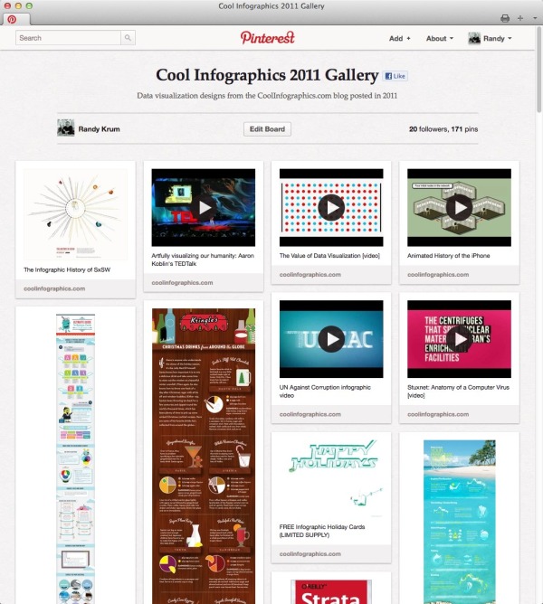
Check out the Cool Infographics 2011 Gallery!  I’m trying an experiment using Pinterest to create a one-page, visual gallery of the infographics I post.  On this board I have pinned every post from the Cool Infographics blog from last year, and it makes a really nice, visual way to browse through the infographics I have shared.  One of the reasons I wanted to play around with Pinterest is that it displays the entire (sometimes very long) infographic, not just a square thumbnail like many galleries.

In general, I keep the 10 most current posts on the front page of the blog.  Once they scroll off the front page, of course their traffic and visibility drops off dramatically.  I’m looking for a way to create a live, growing gallery of the infographic images so these great examples of design can continue to be easily discovered.

Because infographics is, by definition, a visual media, I think people would be more likely to find examples they like and inspiration for their own type of design if there was a better way to browse.  I’m not sure that Pinterest is the answer yet, but it’s certainly worth trying.  On the down-side, I haven’t been able to integrate the Pinterest PinIt button into the blog along with the other social sharing buttons.  Their button doesn’t seem to work with the Squarespace platform I use for the blog.

I am absolutely looking for feedback, so please leave your thoughts in the comments.

Cheers!

Wednesday
Jan182012

The Manual Photography Cheat Sheet

The Manual Photography Cheat Sheet by Miguel “Mig” Yatco is a very cool infographic for anyone who is ready to move off of Automatic Mode on their camera!  Yes, that means you!  Quit taking average photos with average settings!

No matter if you shoot with film or digital, understanding of these four aspects of photography are key to taking good shots.  I love how each one shows the reader the range of values, the impact of moving along the range to the pcitures and what the actual display looks like in the viewfinder on both Nikon and Canon cameras.

The only thing I would have liked to see was a visualization of the changes to depth of field.  How much range is in focus for each aperture setting?

Miguel has prints available on Zazzle.com.  You can buy a printed as a poster for $50, or as small as a 4”x6” card to carry around with you.  The standard size available is 23”x34.5”, but I wish the standard poster size was 24”x36” to fit in standard poster frames.

Great job Miguel!

Monday
Jan162012

Learning to Love Tennis

Learning to Love Tennis is a cool infographic describing the major changes within the USTA’s rules for kids playing tennis.  Designed by Digital Surgeons, the infographic visualizes some the biggest changes like court sizes, raquet sizes and net height.  Also, including things like comparing the calorie burn of different sports help show the reader why tennis is such a great sport for kids.

The game of tennis has been scaled for youth play.  To date, tennis has been the only major sport without equipment and field of play dimensions specific to children.  By introducing smaller and lighter racquets, balls with different compression ratios, lower nets and scaled court sizes, kids can begin playing and competing earlier.  Earlier participation and play increases engagement and reduces frustration associated with using adult-sized racquets that kids find clunky and heavy, or court sizes that are simply too large for children to effectively navigate.  Far too many of our country’s youth are huddled around the TV or tethered to a video game controller.  These new rules provide the means to get kids off the couch and engage in an activity that they can continue for life.

Overall, I really like this design.  The style is eye-ctaching and information is laid out in an easy-to-read manner.  I like most of the visuals, and there are only a couple things I would change:

  • The grid of 30 kid icons showing 70% of Kids Quit Sports isn’t accurate.  The visual is 22/30 kids , which is 73.3%  This type of visual always works better as a grid of 100.  Don’t make your readers count icons to figure out what you’re showing them.  Rows of 6 are just odd, and tought to understand.
  • One of the biggest differences is the new balls used by different ages.  It would have been nice to visualize the difference in bounce for each ball to help the reader understand.
  • The Average Height, Stride Comparison and Average Weight is lost in the design, because it’s all text.  In an infographic that makes it less important and the reader just skips over that section.
  • At the bottom should be the URL to the official landing page so readers can find the original infographic.

This is a really huge initialative for the USTA, and the new rules are complicated to understand for parents.  An infographic is a fantastic way to simplify their message, and I think this will help them out a lot.

Thanks to Pete for sending in the link!

Wednesday
Jan112012

Calendar Visualization of Fatal Car Crashes

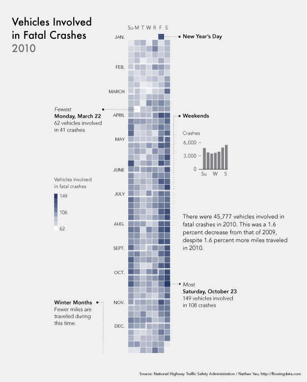
I really like this data visualization from Nathan Yau at FlowingData.comVehicles Involved in Fatal Crashes 2010 takes a new look at the statistics released by the U.S. National Highway Traffic Safety Administration.  Instead of plotting them on a traditional map, Nathan looked at the time data.

After seeing this map on The Guardian, I was curious about what other data was available from the National Highway Traffic Safety Association. It turns out there’s a lot and it’s relatively easy to access via FTP. What’s most surprising is that it’s detailed and fairly complete, with columns for weather, number of people involved, date and time of accidents, and a lot more.

The above shows vehicles involved in fatal crashes in 2010 (which is different from number of crashes or number of fatalities). This data was just released last month, at the end of 2011 oddly enough. It’s a calendar view with months stacked on top of one another and darker days indicate more vehicles involved.

- Nathan Yau

As was suggested by others in the comments on FlowingData, I agree that since the weekends have the higher incidence rate, starting the week with Monday and moving Sunday to the last column may show that a little bit clearer.

Nathan has made all of the data avaialble for anyone that would like to try a visualization themselves.  Student project?

Monday
Jan092012

An Intimate Look at Infographics

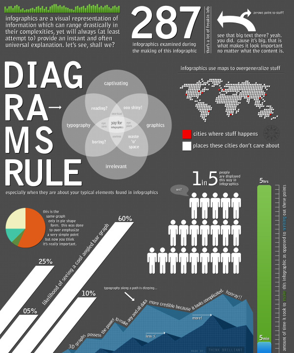
An Intimate Look at Infographics is a fun, satirical look at infographics from Think Brilliant that comes in the form of an infographic!

A well done infographic has the power to capture one’s acute attention span and convey information that would have taken longer to simply read (oh no, not reading!). However, for every brilliantly thought out and well executed mashup of art and data, there now seems to be an influx of mundane and formulaic counterparts infesting the very internet that we hold so near and dear.

Here we have an infographic that explores commonalities between the seemingly vast expanse of contrived infographics that appear to have spawned in mass over the past year. If you’re an infographic purest, view at your own risk.

This one is not new, but it did make me smile!

Thanks to David for sending in the link!

Friday
Dec302011

Ultimate Guide to Business Cards

Start the New Year off right with a new business card design!  The Ultimate Guide to Business Cards is a very well designed infographic from BusinessCards.com

Business owners can find themselves easily overwhelmed when it comes to working with a graphic designer on creating branded business cards. Often enough business owners underestimate the quantity and importance of design decisions (selecting typeface, font, card shape, size and material) that must be made in addition to organizing basic contact information.

Below are some common areas that sometimes get lost in translation between designer to business owner. If you’re starting a business card or identity project we recommend getting a head start and figuring out the following elements for your project.

I really like how the infographic literally shows the reader what each of the topics mean.  Using the actual fonts, showing the color blends, showing the actual business card dimensions is easy-to-compare rectangles, showing examples of the different materials, etc.

Simple, easy-to-read design that tells a story nicely from top-to-bottom.

Thanks to Chris for sending in the link!

Monday
Dec192011

Turks & Caicos: Your Personal Tropical Escape Awaits

A beautiful design, Turks & Caicos: Your Personal Tropical Escape Awaits shares information for potential tourists.  Designed by Digital Surgeons for Tranquility Vacations.

The “Your Turks and Caicos Escape” pulls together top attractions and things to do in the Turks and Caicos from our client Tranquility Vacations. The Providenciales based business manages private Turks and Caicos villas and sets guests up with perks like vacation concierge services and the good advice that comes from being longtime island locals. The infographic conveys a calm, sultry feel designed to entice, combined with facts and cool tips for fun in Turks and Caicos.

The colors and images convey a great sense of calm beaches and a carefree vacation experience.  I am left wondering where these islands are, and a globe showing the islands would have been helpful. 

Thanks to Peter for sending in the link!

Wednesday
Dec142011

Infographic Christmas Card from Australia

Lee Jackson is a freelance designer in Sydney, Australia, and sent out this infographic Christmas Card looking at the unique Christmas experience in Australia.

A shameless piece of self promotion for Christmas is always good. We call it a Christmas card. This year, I wanted to create something that would engage the reader in a in old fashioned way – reading! No bells, no whistles just a simple Infographic to display just how great it is being in Oz for Christmas…

- Lee Jackson

I love this idea for a Christmas card!  Shrimp on the barby sounds like a good Christmas meal to me too!

The sizes of the wildlife silhouettes aren’t accurate to the numbers, but the comaprison from 27 million to 138 wouldn’t actually be visible and the message would be lost.  I love the old-style airport/train station arrivals and departures board to show the top 5 countries travelling in each direction.

Based on Lee’s “My Day in Beverages”, I’m guessing Christmas will be a good day for him.  Cheers!

Friday
Dec092011

The Anatomy of a Perfect Website

The Anatomy of a Perfect Website from R.O.I Media does a really good job of looking at the primary components of a good website design.  There are many decisions that need to be made by website owners and designers in each of the different sections, and of course data should be driving those decisions.

Websites need a formula – a vivid blueprint that painstakingly weaves technicality, design and detail into something iconic and memorable. Without it, most wouldn’t function for more than a moment and they certainly wouldn’t impress. You may have navigation and usability down, but in today’s fast paced climate you’ll crash and burn without social media. What about SEO, where would it be without content? These are all the things we have to consider, if we are to succeed – from vital tracking and analytics to the often disregarded footer, every detail oils the machine. With that in mind, we bring you the Anatomy of a Perfect Website…

A couple things bother me about the visualizations used in the design.  Designers need to get the “area” of objects correct for the data visualizations to be accurate.  In the Social Media section, the size of the clocks with the site logos should represent the scale of the time spent on each of the sites, but the sizes aren’t actually connected to the values at all.  They’re only a series of increasing shapes without any meaning.  The Facebook clock should be at least five times the diameter shown.

Also, the Browser Statistics section is another victim of the “area” challenge.  I LOVE the visual design style of the color saturation only extending up on the logos as far as the statistics show!  However, you can’t just use the height of the percentage because all of the logos are round shapes.  You need to use the Area of a Circle Segment to calculate the appropriate height to use.  This visual design is probably close, but it’s not accurate.

Thanks to Francois for sending in the link!

Friday
Dec022011

Client Infographic: The Visual History of Christmas Trees

The Visual History of Christmas Trees is a new infographic from ChristmasTreeMarket.com.  Designed by InfoNewt and designer Jeremy Yingling, this one creates a visual timeline of the major milestones for the Christmas Tree mostly focused on the last 100 years.

The history of the Christmas tree has garnered a lot of fascinating points over the years. A tradition with humble beginnings in 15th century Latvia, the festive tower of foliage has grown to be one of the holiday season’s most beloved symbols. From the first decorated tree in 1600 to Gubbio, Italy’s 650-meter tall wonder, get a glimpse of Christmas tree history through this handy visual guide from Christmas Tree Market.

This one was a lot of fun, and of course is timed to be appropriate for the holidays.  I love how this design turned out, and it was a unique topic that had not received a thorough infographic treatment before.  The design challenge was letting the images shine, keeping the text to a minimum, but still providing the reader with a lot of interesting information.

No matter which side of the Live Tree vs. Artificial Tree debate you fall on, you'll find lots of good information in the infographic.  I bet you'll even learn something you didn't know.  I'm still fascinated by the upside-down Christmas Tree!