About
Randy Krum
President of InfoNewt.
Data Visualization and Infographic Design

Infographic Design

Infographics Design | Presentations
Consulting | Data Visualizations

DFW DataViz Meetup

Join the DFW Data Visualization and Infographics Meetup Group if you're in the Dallas/Fort Worth area!

Search the Cool Infographics site

Custom Search

Subscriptions:


Feedburner

The Cool Infographics® Gallery:

How to add the
Cool Infographics button to your:

Cool Infographics iOS icon

- iPhone
- iPad
- iPod Touch


Read on Flipboard for iPad and iPhone

Featured in the Tech & Science category

Flipboard icon

Twitter Feed
From the Bookstore

Caffeine Poster

The Caffeine Poster infographic

Entries in design (479)

Wednesday
Aug152012

Which Countries were Successful at the Olympics?

Which Countries were Successful at the Olympics? infographic

A personal infographic design project by Paulo Estriga, Which Countries were really the Most Successful in London 2012? compares the Top 10 medal winning countries with a normalized set of data showing the number of medals per one million people in the population of each country.

The official standings are reached by counting the number of gold medals obtained by each country, using silver and gold [bronze? - Randy] medals to break ties.  By this method, the USA was the most successful country, followed by China in second and Great Britain in third.

However, most of these countries have many millions of people to pick from, which naturally generates a large number of quality athletes making it to the Olympics.  What happens when we take population numbers into account?  Which are really the most successful countries in getting the most gold medals out of the fewest people?

This design is clear, easy-to-read, and does a great job of showing how normalizing the data with population gives you a very different result.  He clearly cited his sources, included a copyright statement and the URL to his site.  I would have preferred the URL to be directly to the infographic.

Paulo’s structure of the overall infographic is a great example of the 3-part story format!  The introduction visualizes the traditional way of measuring countries based on their gold medal counts, by showing medal icons.  The Main Event is the visualization of the new, normalized for population chart that shows something new and unexpected to the reader.  Finally, a conclusion wraps up the design describing where the traditional Top 10 countries fall in the new ranking.

Outstanding job Paulo!

Monday
Aug062012

New Feature: DataVis & Infographic Designer Job Openings

Infographic Designer Jobs

I recently added a new feature page here on the Cool Infographics blog called Cool Jobs.  The Jobs page is open for anyone to post freelance, part-time and full-time opportunities for data visualization and infographic designers.  Posting an opening on the Jobs page is FREE, and you should include a job description, a link to the opportunity, and contact information in the main body of your post.

Monday
Jul232012

True Colors: What Your Brand Colors Say About Your Business


True Colors: What Your Brand Colors Say About Your Business infographic

Does your companies brand reflect their business correctly? Check out True Colors: What Your Brand Colors Say About Your Business infographic from Marketo.

The most prominent brands in the world are defined by their colors. Think of McDonald’s golden arches, the name Jet Blue, and UPS’ slogan, “What can Brown do for you?” These companies, and many others, strategically use colors in their logo, website, and product to appeal to customers. As a B2B marketer, it’s important to think about how you utilize colors and what the colors you choose say about your business.

Research has found that different colors provoke very different reactions in people. Marketo choose to use the color Purple for branding because at the time Marketo was founded, purple was relatively un-used. Additionally, purple represents wealth, royalty, and richness which also has associations to leadership and revenue. Integrating your brand colors in your logo, landing pages, product, and more will help you achieve the highest impact. We put the rainbow under a microscope to find out how each color can help you connect with your consumers.

Designed by Column Five Media, this is a really good infographic.  The use of the specific colors in question make the design attractive and very easy to follow.  I also like the use of icons to show industries that use the different main colors.  The icons and bullet lists also help cut down on the amount of text the audience has to read.

A couple things I would change: 

  • There are a number of statistics at the top that should have been visualized instead of just making the fonts really big.
  • There are a number of what appear to be quotes from different sources about the power of colors, but the sources aren’t citied.  I assume they’re a part of the sources listed in the footer, but quotes should be immediately attributed.
  • Which Colors are Companies Using Most? adds up to 103%.  It’s not clear if these should be mutually exclusive or if the study counts multiple colors from the same company in the results.
  • The bottom should have a copyright and the URL link to the original infographic landing page. 

Thanks to Carra for sending in the link!

Friday
Jul062012

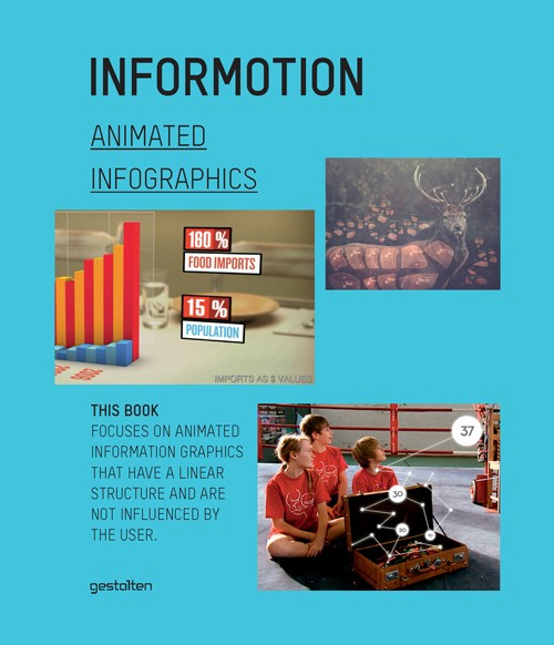
Informotion: Animated Infographics - Interview & Book Giveaway

Informotion: Animated Infographicsfrom Informotion: Animated Graphics, Copyright Gestalten 2012

The Informotion: Animated Infographics book edited by Tim Finke, Sebastian Manger and Stefan Fichtel was just released from Gestalten, and only recently appeared in the U.S.  I also have a promotional copy of the book to giveaway!  So keep reading until the end to find out how to get a chance to win the book.
Informotion: Animated Infographicsfrom Informotion: Animated Graphics, Copyright Gestalten 2012

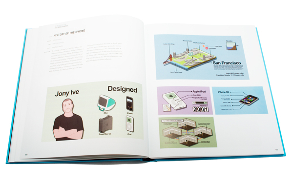
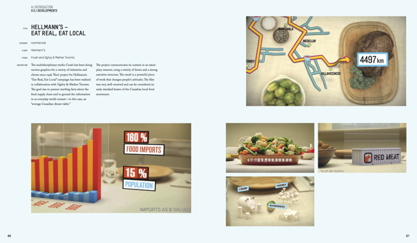
This is the only book I am aware of that focuses on infographic animation and video production.  The book covers topics like Forms of Representation, Storyboarding, Animation, Voice-Over Narration and Content.  The book also highlights at least 25 animated infographic videos, and takes a deep look at how they were made.

At the nexus of design and journalism, the field of information graphics offers some of the most exciting and dynamic work for creatives. Today, even more so than static versions, animated information graphics are serving to communicate complex correlations succinctly. The production of such animations on the basis of up-to-the-minute data is already common practice in select TV programs. Now, these moving formats are finding wider application in television and on the internet, as well as on an increasing number of mobile devices, and in public places. They can be seen in editorial contexts and in the areas of advertising and corporate communication.

Informotion is the first book to document the fundamentals needed to create compelling animated infographics and to explain them with numerous examples. It focuses on key aspects of visualizing data, current forms of information graphics, and future possibilities for moving images. The publication also outlines the factors that improve the viewer’s ability to absorb information.

Informotion: Animated Infographicsfrom Informotion: Animated Graphics, Copyright Gestalten 2012


Sebastian Manger was kind enough to provide some of his time to answer a series of interview questions about the future of infographic videos and production of the book:

CI: What brought you, Tim Finke, and Stefan Fichtel together to collaborate on the book?

Sebastian

 Manger: Tim and I both studied communication design at the University of Applied Sciences in Potsdam near Berlin. Our collaboration on many projects during our studies welded us together as team, and so we decided to do our master’s thesis as a joint project as well. This thesis formed the initial basis for Informotion. During our research for the book we came into contact with Stefan Fichtel. We initially just wanted to interview him about his experiences in the field of information graphics, but we then wound up working with him more closely.

CI: You cover this briefly in the book, but how do you define the difference between data visualizations and infographics?

Sebastian

 Manger: Data visualization is mostly based on a very complex set of data, which is then transmitted by tools such as processing into a graphical representation. Examples can include user behavior in a certain context or the air traffic in a given airspace. In our opinion, an infographic is more concentrated on a particular piece of information that needs to be communicated. In contrast to data visualization, infographics often boil something down to one core message that is then conveyed.

CI: Who do you see as the primary audience for the book?

Sebastian Manger: The book is a guide for designing animated infographics. Therefore, the primary target group is, of course, designers who create those. But Informotion is actually also interesting for any designer who deals with the transfer of information through moving images because it deals with our general perception of animation. The book introduces the range of tools now available for implementing animated infographics and explains their appropriate use. 

In addition, Informotion is also very interesting for journalists. They can gain valuable insight into how the information they first researched can be processed into an animation. This insight can then help avoid misunderstandings in any future collaboration.

CI: How difficult was it to select the videos in the book and did you get support from the companies that produced the videos?

Sebastian Manger: In some cases, the choice was indeed very difficult—especially when we needed examples focusing on a particular means of implementation. In those cases, we needed scenes that showed exactly what was meant without getting overlayed by other effects or information. In our thesis, which was the original inspiration for the book, we simply created such specific examples ourselves. For Informotion, however, we wanted to always use current examples from actual practice.

Once we found a fitting example, it was usually quite easy to convince the agency or studio to participate in the book. It was, however, sometimes a bit difficult to figure out who exactly was the author of a certain animation.

CI: Based on what you have observed, is there a “best practice” method for releasing an infographic video on the Internet?

Sebastian Manger: As the field of animated infographics is still quite young, it is currently very difficult to speak of a “best practice” example. We do hope that our book can help generate such an example one day.

CI: Do you believe that infographic videos are a stronger tool than static image or interactive infographics? 

Sebastian Manger: Yes, we do. People’s viewing habits are changing more and more. Ever more videos are appearing on the internet (YouTube, Vimeo, etc). The viewer is already getting used to absorbing information more passively. This environment is very favorable for the use of animated infographics. A certain fact can be presented to viewers in a simple manner without the need for them to toil through charts or diagrams themselves.

But herein also lies a danger or a special responsibility for the designer of an animated infographic. Under these conditions, a given set of information must always be reduced to a few details. In a static infographic, a statistic for example, viewers can make conclusions by themselves—provided, of course, that they take the time to do so.

CI: How quickly are infographic videos growing as a communication tool?

Sebastian Manger: In our research over the last few years we have ascertained a clear increase in the use of animated infographics. A simple indicator of this, for example, is the increasing number of videos tagged as “animated infographics” on YouTube or Vimeo. The number of websites and blogs that feature animated infographics is also growing continuously.

In addition, infographic design elements are being used more and more frequently in music videos, commercials, main titles, etc. This paves the way for consumers to deal with infographics as a means of implementation. Of course, the use of graphic elements in these fields is currently mostly limited to decoration, but why can’t it expand over the next few years and become more professional? These circumstances are causing viewing habits to change. Designers not only have a significant interest in these changes, but are also a contributing factor to them.

CI: What do you see as the future of infographic videos?

Sebastian Manger: We expect that the trend just described in our previous answer will continue and that animated infographics will be used even more frequently—especially in fields such as reporting but also in advertising. For most people, the use of information graphics is an indicator of seriousness. However, interactive graphics and data visualization will certainly play a huge role too.

CI: How difficult was it to put together a paper book about the highly visual topic of infographic videos?

Sebastian Manger: Not very difficult. Informotion includes a login code for accessing a password-protected website from where you can watch all the referenced videos in full length. In the printed book we use screenshots from and explanations of these videos to identify and explain current theories and means of implementation.

CI: Do you have any plans for a video infographic about video infographics in the future?

Sebastian

 Manger: Not until you came up with this question, but we’ll surely think about now!


Free Copy of the Book:

I have two copies of the book to give away to readers of Cool Infographics.  To enter you name into the hat, tweet a link to this blog post on Twitter and include the hashtag #informotionbook so I can find the Tweets.  At noon on Friday, July 13, 2012, I will randomly choose two people from the Tweets to receive a copy of the book.  You need to be following me (@rtkrum) on Twitter so I can send you a Direct Message (DM) if you are selected.

Here’s an example Tweet that would qualify:

Check out Informotion, the new book about animated infographic videos bit.ly/OdaGTg #informotionbook

Thanks to Sebastian for all his hard work, and participating with the interview.

Thursday
Jun212012

Kelly Slater: Greatest Athlete of All Time?

Quiksilver - Kelly Slater Infographic

Kelly Slater: Greatest Athlete of All Time? is a design collaboration between InfoNewt (my company) and the design team at Quiksilver.

It is common knowledge among our tribe that June 20th is recognized as International Surfing Day so who better to celebrate then Kelly Slater, 11X ASP World Champion. In the spirit of ISD, we’ve created an Infographic comparing Slater to athletes from traditional sports who have made history and measured their achievements to our Champ’s. Have a look and decide for yourself if Slater truly is “The Greatest Athlete of All Time”.

Do you think Kelly Slater is “The Greatest Athlete of All Time”? If yes, share this with your friends and get ready for summer with a pair of Kelly’s Cypher Nomad Boardshorts.

Of course it’s difficult to compare athletes from different sports, but Kelly Slater’s surfing achievements are truly impressive.  Despite being both the youngest and the oldest to win the ASP World Champion title, holding three Guinness World Records, winning 11 Would Tour Championships and winning events in 11 different countries, Kelly Slater has never been on the cover of Sports Illustrated.  :(

Here are some of the design aspects that this infographic gets right:

  • The key message is communicated within the first couple of seconds.  Even if a reader doesn’t read the whole infographic, they will leave understanding the key message.
  • Visually appealling with vivid, colorful images, but still easy to read top-to-bottom.
  • Intergrated the visual brand style of Quiksilver using photos, with the data visualizations about his career.
  • Good mix of different data visualization styles that are unique to the data they communicate
  • The key parts at the bottom are all there.  Data sources, brand logo, copyright statement and the URL to the original, full-size infographic.

The data for this design was the key challenge, and finding similar titles or awards in the other sports inspires discussion and debate among readers of the infographic.  Whether it’s on Facebook, Twitter or blog comments, this design draws in readers and invites everyone to share their own opinion.

Check out the full-size infographic HERE, and you can voice your own opinion about Kelly Slater in the comments below.

Thanks to the team at Quiksilver for being fantastic to work with!

Tuesday
Jun192012

Infographic Contest Winner: #Blame Twitter

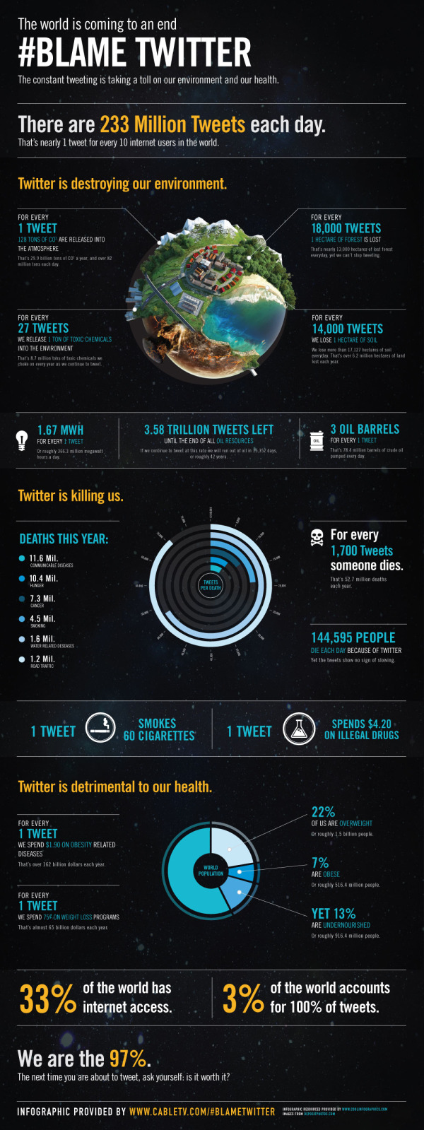
A big congratulations to Tim Cooley!  Tim won the PosterBrain Design the Future contest with the entry above called #Blame Twitter, which is essentially a parody infographic.

From Tim:

All claims in this infographic are obviously false in nature and are solely intended for the comedic entertainment of readers. We <3 Twitter.

From PosterBrain:

We are sending a HUGE shout out to Tim Cooley for winning our Design the Future Infographic Contest! His infographic, #Blame Twitter, is very creative, informative, visually pleasing, and incredibly well done! We will definitely think twice about what, and how often, we tweet! Congrats again Tim, and thanks to everyone who participated!

Tim took the real data provided for the contest, but fictitiously correlated it to Twitter statistics.  In a classic example that “Correlation does not imply causation”, Tim visualized the real-world statistics as if they were caused by Twitter.  For example, it is true in the real-world that nearly 13,000 hectares of forest is lost every day, but it has nothing to do with the 233,370,615 Tweets every day.

Tim won an iPad2 for his winning infographic!  You can see all of the contest entries on the PosterBrain Facebook Contest Photo Album.

Please fell free to retweet this post without harming the environment…

Friday
Jun152012

200+ Infographic Resumes, an escalating trend

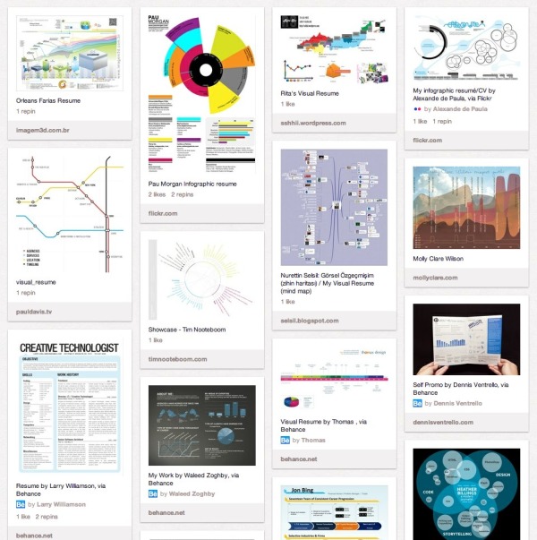
Pinterest Board of Infographic Visual ResumesPinterest Board of Infographic Resumes

Back in January of 2010, I posted 16 Infographic Resumes, A Visual Trend that highlighted the start of the trend of infographics and data visualization moving into resumes.  Why 16?  Because that’s how many good examples I could find at the time on the Internet to showcase the concept.  Two and a half years later, that post continues to be one of the most viewed blog posts on Cool Infographics with an average of 3,500 views every month.  A 2.5 year-old blog post!

Since then, the idea of infographic visual resumes has exploded.  I have continued to gather links to infographic resumes, and my collection is now over 200 examples of infographic resumes that have been published online.  Instead of trying to post them here on the blog like I did in 2010, I’m experimenting by creating a Pinterest Board dedicated to sharing Infographic Visual Resumes.  I will continue to add resumes and grow the board, so follow the board if you want to see new ones as they are addded.  If you know of any that I should include, add the link in the comments or send a link through the Contact form with “Infographic Resume” in the Subject line. 

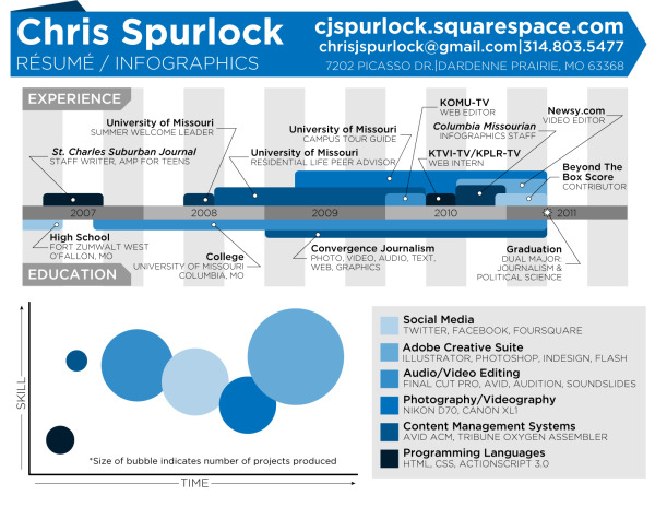
The Cinderella Story example is the Chris Spurlock resume shown below.  The story is that Chris was a graduating Journalism major at Missouri School of Journalism in early 2011, and created his infographic resume because he wanted to pursue data journalism as a career.  It was posted on the J-School blog, but quickly went viral on the Internet.  As a result, he was hired as an Infographic Design Editor for the Huffington Post!

Chris Spurlock infographic resume

I haven’t made any distintion between good and bad designs on the Pinterest board, because all of the designs can give you good ideas about types of data visualizations you can include in your own design.  The only distinction I have made is that they have to include some type of data visualization to be considered infographic.  There are many, many great graphic designer visual resumes that aren’t “infographic” so they aren’t included on the board.

Also, I have attempted to link each design back to the original owner’s site (like Chris’ resume above), but for many the public posting is on a portfolio site like Behance or Visual.ly.  If any of these should be linking to a different location, please send me a note through the Contact page, and I’ll get them linking to the correct places.

It’s definitely worth mentioning that there are a whole bunch of new online sites launching to capitalize on this growing trend.  The service they offer is to create an automatic infographic resume for you, usually based on your LinkedIN profile.  Vizualize.me, re.vu, Kinzaa, ResumUP and cvgram.me all create an infographic resume for you using their pre-designed templates.  I’ve tried to only include a couple examples from each service because 50 resumes based on the same template won’t provide you more inspiration to design your own.  My opinion is that these sites and templates are currently new enough to help your resume stand out, but very quickly the risk is that the templates will become recognized (like PowerPoint templates).

I’m planning a separate, future post about the best practices when designing your own infographic resume, but I wanted to shared the Pinterest Board with you as a resource for inspiration.

Please add a comment with your thoughts about the future of infographic resumes!

Friday
May252012

NASCAR 101: The Beginner’s Guide to NASCAR

NASCAR 101 The Beginner’s Guide to NASCAR infographic

Have you ever watched NASCAR? Apparently, its the 2nd most popular professional spectator sport in the U.S.! However, if you haven’t, the NASCAR 101: The Beginner’s Guide to NASCAR infographic from Quicken Loans Racing gives an illustrated breakdown of the 2012 Sprint Cup Series.

By now you’ve heard that Quicken Loans is dipping our toes in the whole NASCAR sponsorship world. We’re new to the whole thing, so we decided to put our creative heads together and make a super cool, fun-for-your-eyeballs NASCAR 101 infographic to explain the basics of NASCAR!

Maybe you’re new to racing and could use an introduction?  

Maybe you’re a superfan and you want to help your uninformed friends/family members/random people on the street realize the awesomeness of stock car racing?  

Maybe you like beautifully-designed artwork that is not only pleasing to the eyes but chock full of neat info?


Check it out.

This is a cool infographic design that does a fantastic job of communicating the basics.  Bold color scheme that uses the black background and textures to embody racing.  Simple, clear visualizations that are easy for the reader to understand.  Not too many stats or information crowded into the design to keep the overall design clean.

At the bottom, there should be a copyright statement and the URL to final the original landing page.  I linked back to the original landing page here, but not everyone will.

Found on TopSpeed.com


Friday
Apr272012

Mapping Popular Story Plot Lines

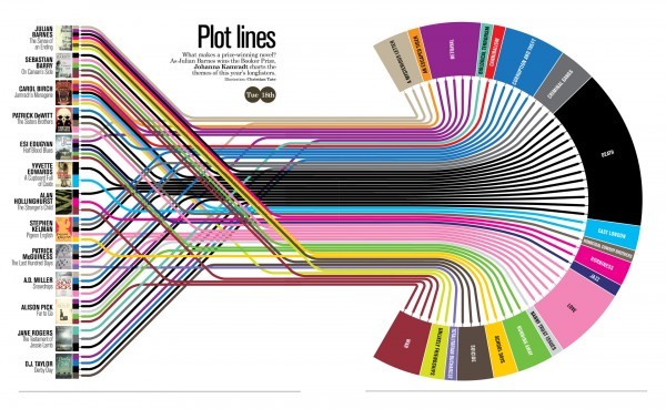
Finally! The secret ingredient to writing a good book has been revealed. Plot Lines, the infographic from Delayed Gratification, the slow journalism magazine, shows the dominant themes in last year’s books nominated for the Man Booker Prize for Fiction.  An interactive, zooming viewer available on the original landing page.

What makes a prize-winning novel?  As Julian Barnes wins the Booker Prize, Johanna Kamradt charts the themes of this year’s longlisters.  (Illustration by Christian Tate)

If you want to write a hit novel, it pays to stick with the tried-and-true plot lines.  DEATH of your characters is clearly the overall winning theme, with every one of the novels listed from 2011 including death as a theme.  Other classics like WAR, LOVE, BETRAYAL and CORRUPTION followed closely.  Obscure plot points like AN ESCAPED TIGER and HOMICIDAL COWBOY BROTHERS are certainly much more of a risk.

I love this design, and how it takes the multiple, complex story plots from the complicated mix on the left, and converts the chaos into order on the right.  Even with all of the crossover lines, you can still pretty easily follow a line across the diagram.  It’s fun and engaging for readers to follow the connections, and draws the readers in to look more closely. 

Found on visualnews.com

Thursday
Apr262012

The Eagle Scout Infographic

The Eagle Scout infographic is a new design from the Boy Scouts of America, and shows them experimenting with using infographics to share their message.  It’s odd that I can’t find any mention of it on Scouting.org, but found it posted on the Bryan On Scouting blog, which is the official blog from Scouting Magazine, and posted in the official BSA Twitter stream (@boyscouts).  There’s also a high-resolution PDF file available for download if anyone wants to print it out.

My son just bridged over to Boy Scouts from Cub Scouts, and their national office is here in the DFW area, so I was naturally interested.  This is a really good first attempt at an infographic design from their design team, but makes a few mistakes visualizing the data.

  • Good use of the red, white and blue color scheme.  It’s clearly scouting, and specifically related to Eagle Scouts
  • The data being presented is fantastic since only the BSA would have access to many of these statistics.
  • I love the choices of imagery used.  The embroidered patches and icons used for the scouts keeps the design clean and easy to read.  Many BSA publications use a lot of full-color photos of the scouts, and that would have added too much visual noise to an infographic design.
  • The BSA logo at the top clearly identifies this as an official publication, but it’s missing a title.  What should we call this infographic?  Why should I read this infographic?  Something like “100 Years of Eagle Scouts: By The Numbers” would have worked nicely.
  • The information included will change over time since the data is a current snapshot of the state of Eagle Scouts.  2,151,024 Eagle Scouts as of what date?  The infographic should more clearly identify the date that the data is gathered from, because people will be looking at this for years on the Internet.
  • Filling unusual shapes to show percentages is always a challenge.  With images like the hand icon and the globe you can’t just calculate the height of the colored area like a bar chart.  You have to calculate the AREA of the space to be colored, or you end up with false visualizations like these.
  • The same is true for sizing shapes, like the people icons for the Average Age of Eagle Scouts visualization.  You have to size the overall AREA of the shapes to match the data being presented, which is hard with complex shapes.  You can’t just change the height.
  • The space shuttle avoids this issue by only coloring a rectangular shape in the middle, turning it into a stacked bar chart, but the visualization doesn’t match the data.  The red colored section is visualizing more than 60 astronauts as Eagle Scouts, when the number shown is only 40.
  • I love the Eagles by Decade data, but avoid 3D charts.  The 3D effect doesn’t add anything to the data being presented and it’s incosistent with the rest of the design.  The data tells a great story, and clearly shows that Boy Scouts continues to grow strongly and is a viable organization in the 21st century.
  • I like this use of the word cloud for Notable Eagles, but don’t change the font sizes because in infographic design this is assumed to convey data.  With Brave and Loyal in larger fonts, it implies that these are more important than all of the other virtues.  The virtues should all be one, consistent font size, and the names should all be a second font size.
  • At the bottom, there should be a copyright (or Creative Commons) statement, and a URL for readers to be able to find the original high-resolution version. 

Thanks to Dean for sending in the link!