About
Randy Krum
President of InfoNewt.
Data Visualization and Infographic Design

Infographic Design

Infographics Design | Presentations
Consulting | Data Visualizations

DFW DataViz Meetup

Join the DFW Data Visualization and Infographics Meetup Group if you're in the Dallas/Fort Worth area!

Search the Cool Infographics site

Custom Search

Subscriptions:


Feedburner

The Cool Infographics® Gallery:

How to add the
Cool Infographics button to your:

Cool Infographics iOS icon

- iPhone
- iPad
- iPod Touch


Read on Flipboard for iPad and iPhone

Featured in the Tech & Science category

Flipboard icon

Twitter Feed
From the Bookstore

Caffeine Poster

The Caffeine Poster infographic

Entries in history (262)

Wednesday
Jun182014

World Cup Final Stadiums: A Visual History

World Cup Final Stadiums: A Visual History infographic

The World Cup is in full swing with group play starting last week. We cannot tell you who will be the winner of this World Cup; however, the World Cup Final Stadiums: A Visual History infographic from Grass Form can tell you the countries, stadiums, and winners of the past.

La Coupe de Monde. La Copa del Mundo. The World Cup. No matter what language you say it in the biggest competition in football always means the same thing; a summer festival for millions watching the beautiful game.

Every edition of the World Cup is special in it’s own right but this year stands out from the rest; football is heading back to its spiritual home, Brazil.

The Seleção are aiming for a historic sixth triumph in front of an expectant home crowd – the pressure is on for Neymar & co. to deliver the goods in classic Jogo Bonito style.

Of course part of the World Cup legend are the iconic stadia; from the timeless twin towers of Wembley to the newly-revamped Maracanã which will take pride of place at this year’s tournament, these coliseums have provided the platforms for the most iconic moments in the history of the game.

A good visual representation of each stadium. Adding the flag of the host’s country on top of each of the stadiums is great touch. However, underneath the stadiums, we could use some better visuals.  The design could have visualized the relative sizes of the stadium capacities and used the flag of the winning teams.  The year each stadium was built isn’t really relevant information.

I love the topic choice by Grass Form, a turf company.  More information could have been included in the infographic about the type of grass used in each stadium to make the topic even more relevant to the publishing company.

Thanks to Dave for sending in the link!

Monday
Jun162014

Let Dad Be A Kid Again!

Let Dad Be A Kid Again! infographic

Wait…Dad Was A Kid??? is a fun infographic that was released for Father’s Day by Sphero.  A child from the 60s and 70s myself, I remember EVERY one of those toys!

It’s true.  Once upon a time, your old man was a young lad.  And like any kid, he loved his toys.  But which toys did Dad play with back in the day?

This is a fun, highly sharable timeline design.  Mostly images with minimal text.

The footer should include a copyright statement and the URL back to the infographic landing page so readers can easily find the original, full-size version. 

Thursday
Jun122014

The Evolution of Life Poster

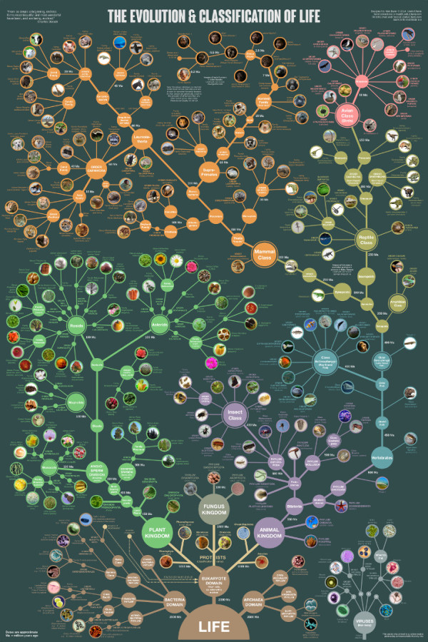
The Evolution & Classification of Life poster

This beautiful “tree of life” poster does two things at once:

First, it shows how over 250 common plants, animals, and microbes are classified by biologists into domains, kingdoms, phyla, orders, families, and genera.

Second, it shows where each group fits into the evolutionary history of life according to the most up-to-date genetic research.

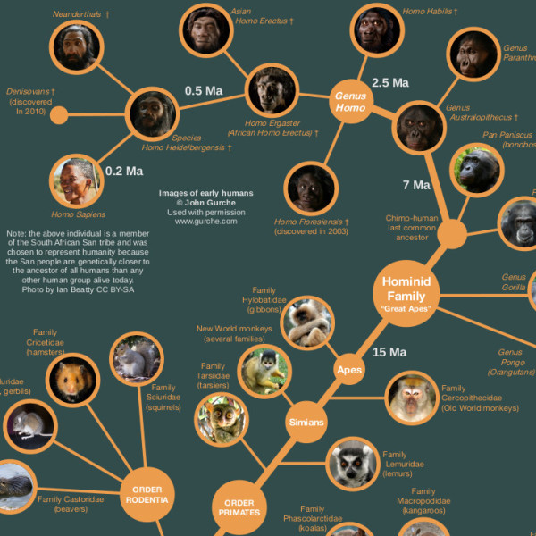
It also includes several extinct groups, featuring artwork by paleo-artists John Gurche and Nobu Tamura.


A “Tree of Life” in a 24” X 36” poster form, The Evolution & Classification of Life poster was designed by Matt Baker from Useful Charts, and and can be purchased on Amazon for $24.95.

There is good use of color to help organize the tree and allow the reader to understand the major section breaks.  Having the pictures of the animals as the main focus of the tree, rather than their names keeps the poster clean and not too cluttered.

Great job Matt!

Monday
Jun022014

History of the Battle Dress

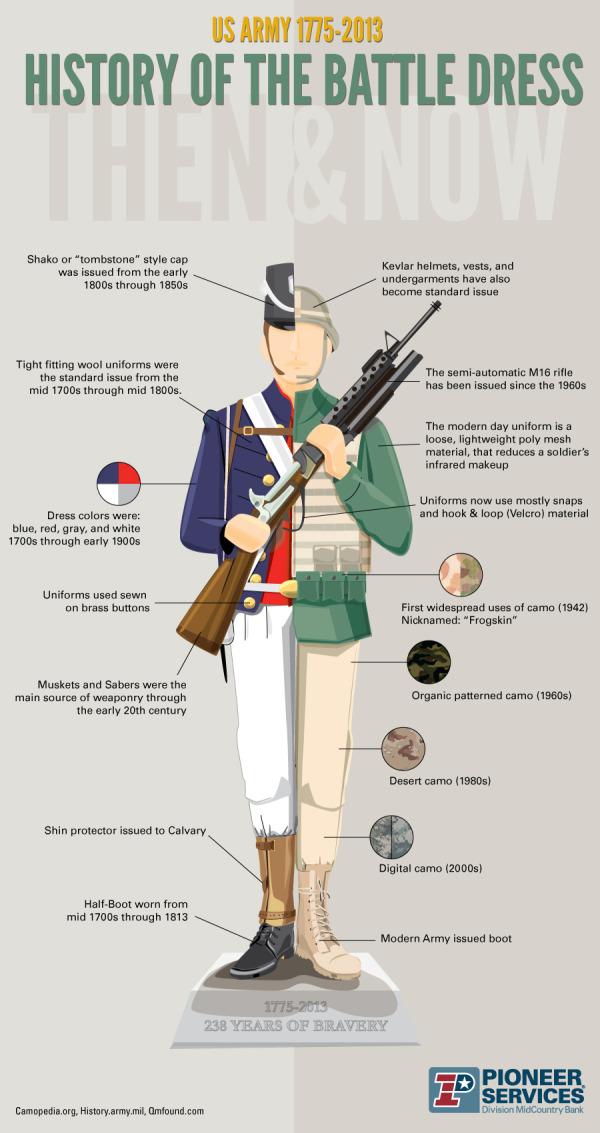
History of the Battle Dress infographic

History of the Battle Dress infographic from Pioneer Military Loans covers 238 years of battle dress for the military.

As the Army soldiers on into its 238th year, we celebrate the service of our troops whose tours of duty have been as diverse as the men and women sacrificing their lives in honor of defending ours. Fighting for enduring freedom requires that Soldiers –and their dress—be both dynamic and sustainable, guarding themselves and our country. While you may be most familiar with America’s hard-fought battles, let us acquaint you with the uniforms worn into them.

Battle Dress Uniforms have been tailored to fit the varying elements and environments for well over 200 years. As combat situations change, so do the weapons and gear carried by the Army Soldier. The info graphic below illustrates the BDU’s most major alterations from the Calvary Days to Operation Iraqi Freedom. And from their boots on the ground to the caps and helmets that protect their heads, you’ll note the evolving details that have served Soldiers well… then and now.

This is a good side-by-side before-and-after comparison infographic.  Simple design without too much information.  It’s a very quick read for the audience and easy to share.

The design should include the URL to the infographic landing page so readers can find the original on sites where they don’t link back to the Pioneer Military Loans site.

Thanks to Jake for sending in the link!

Thursday
Feb272014

The Best Pictures from the Academy Awards

The Best Pictures from the Academy Awards infographic


The Best Pictures infographic from Beutler Ink is an iconic timeline through the history of the Academy Awards winners for Best Picture.  Can you identify the movies from the icons?

Beutler Ink celebrates the 2014 Oscars with a poster commemorating each of the past 85 Best Picture winners. See how many movies you can recognize from the icon alone.

This is a fun design that draws the readers in by challenging them to identify the past winners based on the icons or illustrations shown for each film.  I could only identify about half of them, so I appreciated the answers included in the footer.

The big lesson we can learn from this design, is that once an infographic image is published online, it takes on a life of its own.  Infographics are usually shared online by people without any of the accompanying text that the publisher included on the original infographic landing page.  Because of this, all of the relevant information needs to be included in the infographic image file itself, or it gets lost when people share it.

In this case, the audience would have no idea that the award winning pictures in this design are from the 2014 Academy Awards (popularly known as the Oscars).  The landing page includes the introductory description text “Every Best Picture winner since the inception of the Academy Awards…” but there’s no introduction in the infographic design itself.  There are literally hundreds of different types of Film Awards (see http://en.wikipedia.org/wiki/List_of_film_awards), and the audience doesn’t know what this infographic is sharing without that introduction.  It needs to be included in the the infographic itself.

There’s no information that identifies this design is relevant for 2014.  Infographics are generally available online for years, and for a timeline based design, it’s important to clearly state the timeframe represented.  When someone finds this design in 2016, the section for “This Year’s Nominees” won’t be accurate.  Additionally, if they update this design next year, there should be a clear way to identify the version based on the timeframe shown.

Also, when readers find this infographic shared on other sites, they have no way to find the original without a URL.  The URL to the original infographic landing page should be included in the footer.

Thanks to Jarred for sending in the link!  Also found on Visual.ly

Thursday
Feb062014

Shutterstock's Global Design Trends 2014

Shutterstock's Global Design Trends 2014 infographic

Shutterstock’s Global Design Trends 2014 infographics is essentially a visual press release.  Based on their own internal web stats from their users, they are sharing the most popular image searches and trends from 2013.  And of course is should be shared visually!

One of our favorite annual traditions at Shutterstock is sharing our hard-earned design-trend data with the world. For this, our third annual infographic, we used data from our 350 million all-time downloads to explore recent and emerging trends from around the globe.

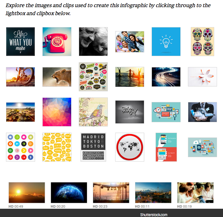
Check out the infographic below, then scroll on to view a lightbox featuring images showcased in the design, get the code to embed the infographic on your site, and share your own thoughts and insights in the comments.

Searches for infographic design elements in 2013 were up 332% compared to 2012!

Many infographics include data sources, but this one is based on their own internal data!  As a alternative, I love that they include clickable links to all of the stock photos, vectors and videos included in the design on the infographic landing page.  However, it would have been helpful to readers for the infographic to include the longer URL directly to that landing page on the Shutterstock blog, instead of just the front page.  Readers that make it that far, then have to search for the specific blog post to find the links and the original infographic.  Today, it’s the most current post and easy to find, but after a few more blog posts it will be much harder to find.


Thanks to Danny for sending in the link!

Tuesday
Jan142014

Information Destruction Through History

Information Destruction Through History infographic

Information Destruction Through History from Global Data Vault explores and quantifies the worst data disasters in history.

Information the most valuable commodity in the world. All human progress depends on the accumulation and preservation of information. When information is lost, human progress suffers. This infographic displays some of the most significant loses of information human civilization has suffered.

The circular timeline shows the data disaster events in chronological order, while also connecting to their geographic locations.  The triangles are proportionally sized so readers can visually compare the modern data equivalents between the events.  This really helps put the disasters into perspective for the audience.

A great infographic design that tells one story really well, but there are a few things I would recommend to improve the design:

  • I wouldn’t have any of the triangles run off the page, because the audience will lose perspective on how disastrous those specific events were.  Show the full impact of those events to the readers.
  • Add the URL directly to the infographic landing page so readers can find the original full-size version when people don’t link back correctly
  • I wouldn’t list Wikipedia as a data source if possible. Track the Wikipedia references back to the original data source to include in the list.

Thanks to Joe for sending in the link!

Monday
Jan062014

The Evolution of Reddit

The Evolution of Reddit Through Time infographic

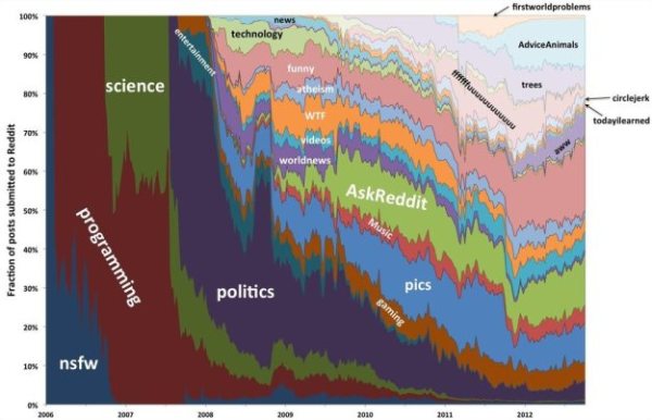
The Evolution of Reddit Through Time infographic from Randal Olson.com covers the history of Reddit for the past 7 years. With thousands of active subreddits, the visual above displays the 24 most active. Track the popularity of each subreddit through the years!

The graph below shows how 24 of the most active subreddits have changed over time. I ordered the subreddits by the time that they first appeared on Reddit. I recommend zooming in so you can see it better.

(I should note that I purposely excluded /r/reddit.com from this graph because it dominates the entire graph until about 2008, then screws things up again when it got closed down in late 2011.)

The biggest thing that you may notice is that there were very few subreddits from 2006-2008. In fact, there was only one subreddit before 2006 (/r/reddit.com). The majority of the content in 2006-2008 was focused on more techie-friendly subjects: programming, science, politics, entertainment, and gaming. Major subreddits dedicated to solely picture and video content started becoming popular in mid-2008, and even then their posts only comprised less than 1/4 of Reddit’s content. It wasn’t until 2011 did the picture-related subreddits really start taking over, and Reddit never looked back after that.

This graph covers so many changes in the Reddit community that it can’t explain what happened by itself. In the following sections, I will take a closer look at how the Reddit community evolved on a year-by-year basis.

Love these data visualizations of the reddit’s evolution over time from Randy, a 3rd year Computer Science graduate research assistant at Michigan State University.  In his original post, he actually visualizes each year separately, and you can see some major milestones and clear changes in the reddit universe.

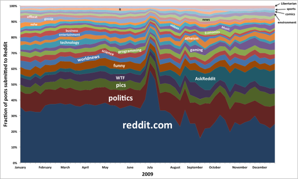
The Great /r/reddit.com Spike of 2009

The total growth of reddit over the years is lost in the 100% Stacked Area chart; however, you can clearly see the growth of subreddit content as a portion of the whole.

Found on Flowing Data!

Friday
Jan032014

The Shield of Superman: The Evolution of an Icon

The Shield of Superman: The Evolution of an Icon infographic

If you want to dress up like Superman, it is important to understand which Superman your going to be. The Shield of Superman: The Evolution of an Icon infographic from HalloweenCostumes.com provides visuals and a brief synopsis of each Superman logo in the comics and pop culture.

It’s a bird…It’s a plane…It’s Superman! Well, not Superman himself, but it IS a super awesome Superman infographic.

2013 is THE year for everyone’s favorite Man of Steel. Between it being the hero’s 75th anniversary, and Man of Steel hitting the silver screen on June 14th, we’re bursting with red and blue excitement! Thankfully, we were able to use our energy for good rather than evil, and create a visual guide to the evolution of Superman’s iconic emblem.

We cover the logo’s various incarnations in both comics and popular culture, starting with its first appearance in 1938 and culminating with what the famed “S” will look like when Henry Cavill reveals it on on his Clark Kent-ee chest in theaters in a little over a week!

Love this.  The visual images clearly show the readers how dramatically the logo has changed over the years in both comics and film.  

The footer should include a copyright statement and the URL link back to the infographic landing page.  Readers need to be able to find the original full-size version from the publisher when people share the infographic on other sites without linking back.

Which one was your favorite?

Found on http://www.infographicsarchive.com

Monday
Dec302013

The State of Social Media 2013

The State of Social Media 2013 infographic

The State of Social Media 2013 summarizes some of the major milestones and events in social media that happened during the last 12 months.

What a wild year it’s been. You could say that 2013 was the year of social media and you’d be correct. What was once a novelty for people bored and surfing on the ‘net has risen to be an industry in and of itself that companies large and small have embraced around the world as a powerful cornerstone of their marketing initiatives.

In case you got lost in the details of 2013, we’ve laid out all the notable moments of the year, month by month, in this handy infographic.

There are a handful of statistics listed in the design that should have been visualized instead of just shown in text.  The use of logos and images from the web do a good job of showing the specific events.

Designed by Infographic Promotion UK