About
Randy Krum
President of InfoNewt.
Data Visualization and Infographic Design

Infographic Design

Infographics Design | Presentations
Consulting | Data Visualizations

DFW DataViz Meetup

Join the DFW Data Visualization and Infographics Meetup Group if you're in the Dallas/Fort Worth area!

Search the Cool Infographics site

Custom Search

Subscriptions:


Feedburner

The Cool Infographics® Gallery:

How to add the
Cool Infographics button to your:

Cool Infographics iOS icon

- iPhone
- iPad
- iPod Touch


Read on Flipboard for iPad and iPhone

Featured in the Tech & Science category

Flipboard icon

Twitter Feed
From the Bookstore

Caffeine Poster

The Caffeine Poster infographic

Entries in money (137)

Thursday
Jun202013

The Cost of a Road Trip to the Top 10 U.S. Vacation Cities

The Cost of a Road Trip to the Top 10 U.S. Vacation Cities infographic

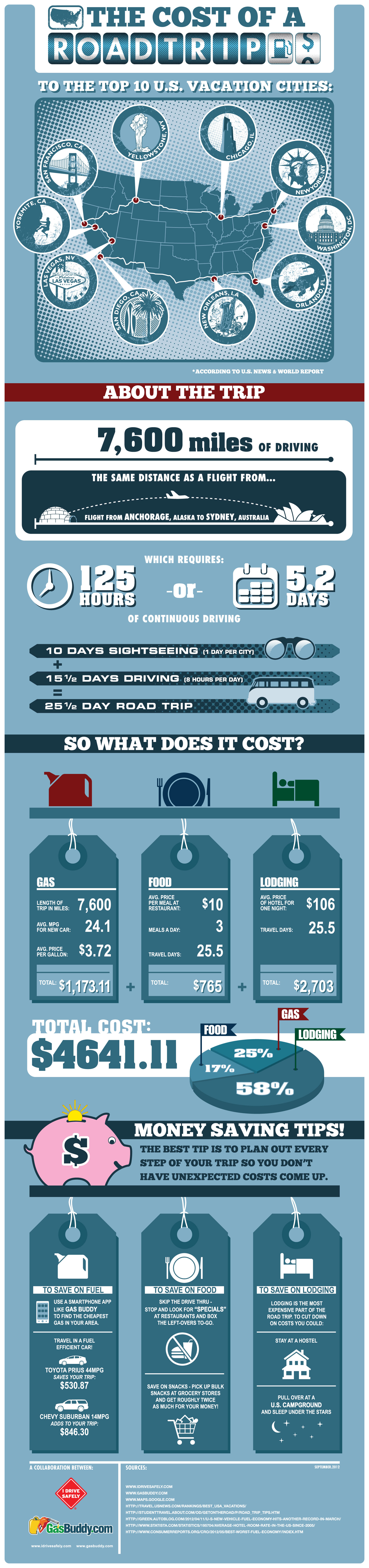
I Drive Safely and Gas Buddy partner up to create the Cost of a Road Trip to the Top 10 U.S. Vacation Cities infographic. The infographic calculates the total cost of food, lodgings, and gas and then gives some money saving tips. This infographic can be found on idrivesafely.com.

Did you know that a road trip to the top 10 US vacation cities is more than 7,600 miles (12,231km) of driving? That’s the same distance as a flight from Alaska to Australia! Wondering if you could afford to pack up and leave on this awesome road trip? We partnered with our friends at GasBuddy.com to bring you the infographic below which breaks down the cost of a 25-day road trip including the cost of gas, food and lodging. We’ve also included some tips for saving money on your trip.

The top 10 U.S. vacation cities are based on a 2012 poll from U.S. News Travel and excludes cities not in the continental United States. Fun fact: 3 of the top 10 US vacations spots are in California: San Diego, Yosemite and San Francisco!

Fun topic idea, and certainly relevant to both Gas Buddy and I Drive Safely.  Relevance is super-important as the search engines would like to down-grade the value of links to irrelevant content.

I would have liked to see more of the actual data visualized in the design.  Why does the calendar icon have 8 days shown when the data is 5.2 days?  Because it’s just an icon, not a data visualization, and can be confusing to readers.  The costs would have been very easy to visualize as stacked bars to make them easier to understand.

Thanks to John for sending in the link!

Tuesday
Jun042013

Home Energy Savings

Home Energy Savings infographic

70% of electricity in the US is generated from non-renewable sources.  The Home Energy Savings infographic provided by Accent Building Products tells us how to have an energy efficient home without sacrificing comfort.

Today it is more important than ever to make our homes more energy efficient without sacrificing home comfort. An energy-efficient home will keep your family comfortable while saving you money. Unfortunately, a lot of energy is wasted through leaky windows or ducts, old appliances, or inefficient heating and cooling systems. You can use many tips to save money and energy! This infographic details many different money saving tips and shows how we spend the money on our homes.

Infographic provided by Accent Building Productsa direct distributor of the industry’s top accent home and building products.  All products are shipped to you directly from the manufacturers’ factory.

It’s interesting from an online marketing and SEO perspective that I can find the infographic on gallery sites like Infographics Showcase, Infographics Inspiration, and Visual.ly but I was unable to find the original anywhere on the Accent Building Products website or blog.  This means that any popularity in terms of links and visitors to the infographic itself will benefit the gallery sites, but not Accent Building Products.  Only indirectly will Accent get any benefit if readers separately visit their site, but they would have to manually type in the URL because none of the infographics have a link back to the site.

This is a fun visual explanation design.  The illustrations clearly put the suggestions and data into context of the areas in the house.  There is a lot of text, but the small callouts make it easy to read.  It would have been more effective to visualize the pieces of data that are included in the design.

Thanks to Chris for sending in the link!

Wednesday
Apr242013

The Digital Dorm

Digital Dorm infographic

College is expensive and it is not getting any cheaper. Lucky for us, the advancement in technology and the introduction of apps could actually lower costs! The Digital Dorm infographic from CourseSmart can tell you the details.

College is getting more expensive but going digital helps students keep more money in their pockets in more ways than one. Check out our infographic on how students can save not just money but also time by moving to a digital dorm.

Not only saving money.  The visual story here is also how to save space and clutter in a student’s dorm room, which will help them find that missing homework assignment!

Thanks to Temple for sending in the link!

Monday
Jan282013

James Bond: 50 Years of Movies

James Bond: 50 Years of Movies infographic

James Bond: 50 Years of Movies infographic from hrblock.com is all about Bond, James Bond. See the top grossing films, iconic bond accessories and more.

It’s been almost 50 years since Sean Connery first delivered those now-legendary words on the big screen.

And 22 films later (with #23 on the way in November), the super suave super-spy known as 007 is celebrating a half century of fast cars, money and martinis on October 5th. To mark the milestone, we’ve put together an infographic taking stock of all that is Bond.

Very nice design.  My only suggestion would be to visualize more of the dollar figures shown instead of just showing them in text.  I appreciate that all of the dollar values have been inflation adjusted to 2012 dollars.

Thanks to Jane for sending in the link!

Tuesday
Dec042012

Tracking Customers for Retail Profiling

Tracking Customers for Retail Profiling infographic

Is tracking customers purchases creepy? Decide for yourself! The You are Not Special, but Your Purchases are infographic from Camcode.com talks about profiling customers based on their purchases and then giving them a coupon that is relevant to them. Other companies like Dominos tracks when people buy pizza the most and discovered it was when it rains. So they base their campaigns on local weather patterns.

Did you know that major brands profile you based on what you buy? Retailers like Target and Domino’s Pizza gather and store this data via barcode technology, and they use it to determine everything from how best to market to you, which coupons you’re most likely to use based on your life stage, and what you might buy based on previous purchasing habits. Yes, they get all this from scanning a barcode! It’s what’s known as predictive technology, and major retailers use it to create database-driven consumer profiles to not only boost sales, but also to create more personalized buying experiences.

We decided to take a closer look at predictive technology and its role in consumer profiling. We did some digging and put together this infographic called, “You are Not Special, but Your Purchases are.”

I like how this design walks the reader through a easy to understand story about retail profiling.


  1. What is Retail Profiling?
  2. How does it benefit both consumers and retailers?
  3. What do customers find disturbing about tracking?
  4. Real-life case studies


Some of the dark red on red colored visualizations are hard to read, and the footer should include a copyright statement.  The brand URL back to Camcode.com is included, but there should also be a URL to the infographic landing page so readers can find the original high-resolution version. 

Thanks to Ashley for sending in the link!

Tuesday
Oct232012

Tracking American Poverty - interactive infographic

Tracking American Poverty - interactive infographic

Tracking American Poverty & Policy is an interactive infographic visualization site that breaks down the data about…you guessed it…poverty in America.

The site provides a sequence of interactive pages that start with the overall poverty numbers, and then break them down in more detail by race, gender, education, age and family type.  In addition to the initial pie charts for the official poverty rate, the visualizations change to show details for Near Poverty, In Poverty and Deep Poverty numbers when you hover your pointer over each chart.


Tracking American Poverty - interactive infographic

You also have the option on each page to change the year to see how the number have changed from 1967 - 2010.

Good visualization design by Two-N 

Thursday
Oct112012

Obamacare: The Price of Socialized Medicine

Obamacare: The Price of Socialized Medicine infographic

The big news in the public health field in the U.S. is Obamacare. In response to its passing, Master of Public Health.org created The Price of Socialized Medicine: Obamacare’s Unconstitutionality by the Numbers infographic to give insight into how it will affect everyone.

The Supreme Court yesterday upheld the constitutionality of the Patient Protection and Affordable Care Act of 2010, in a landmark 5-4 decision. Unfortunately, they got it wrong. The PPACA, known colloquially as Obamacare, should have been struck down by the high court, as it is both unconstitutional and very costly:

  • Individual Mandate: Obamacare requires that all Americans carry health insurance or face an annual penalty. The federal government is effectively compelling individual citizens to enter a market, which is a clear violation of the Commerce Clause of the Constitution. The Supreme Court ruled that this was constitutionally valid as within Congress’ taxing power.
  • Medicaid Expansion: As the original Act is written, the PPACA would require states to expand Medicaid support or risk having their entire Medicaid federal funding cut off. This infringes on states’ rights. Fortunately, the Supreme Court did rule against these sanctions.

In response to the ruling, we have produced an infographic titled, “The Cost of Socialized Medicine: Obamacare’s Unconstitutionality by the Numbers”, which illustrates the folly of the PPACA as well as some of the costs that will be borne as a result.

Obviously, this design is promoting a specific opinion, but we’re here to discuss the infographic design itself.

  • The design outlines a really good step-by-step story top-to-bottom, and summarizes the data behind their point of view clearly
  • Good mix of illustrations and data visualization within each section.
  • In general, there’s WAY too much text in the design.  They want to be thorough in their explanations, but this much text will turn away many readers from reading the infographic at all.  Also, most of the text is too small to read on their landing page.  Less text would have been more effective, and allowed for a larger font.
  • The timeline looks like events along the heartbeat axis, but they aren’t spaced out appropriately to match their dates.
  • I like the icon representation of the justices.  Just enough detail to be recognizable.
  • Clear, easy to understand map of the costs to each state in the country map
  • The sizes of the circles in the Cost of Obamacare section are close, but not quite accurately representing the dollar figures shown.  Some are larger than they should be, and a couple are smaller.  Almost like the sizes were eye-balled instead of calculated mathematically.  Odd.
  • The states that have filed lawsuits would be easier to understand if the colored states were still placed within the map of the U.S.
  • Good list of sources
  • Need a copyright statement and the URL to the original infographic landing page for readers that find the infographic posted on the Internet to be able to find the original.

Thanks to Jimmy for sending in the link!

Wednesday
Sep262012

How Much Does SEO Cost?

How Much Does SEO Cost? infographic

How Much Does SEO Cost? is generally a mystery in the online marketing world.  The range is certainly big, from under $50/month up to the unbelievable price of over $250,000/month!  This informative infographic shares the results of custom research from SEOmoz, and was designed by AYTM.

How much does SEO cost? How much time do you have to discuss the various models and prices out there! However, a new survey sheds some light on the subject.

Over 500 people and companies who offer search engine optimization services were asked about how their models. Turns out, it’s most common to charge $100 to $150 per hour, in the US. But by-the-hour consulting is only one of four nearly co-equal ways of charging.

Also popular is project-based pricing, where the average price is between $2,500 to $5,000, in the US. That’s also the same average price for those who buy on a monthly retainer basis. Fixed prices on a contract basis is also a popular way that SEO is sold, but no averages were provided.

The survey was conducted by SEOmoz and compiled into the infographic below by AYTM:

From a design standpoint, there are a lot of things I like about this infographic.  

The consistent columns for regions of the world make the layout very easy to follow.  The data is also organized nicely by starting with basic demographic data to provide a foundation to the reader before getting into “The Main Event” - the main research results.

The data visualizations are fairly simple, and very easy for the reader to understand.  I also like the variety of data visualization methods; no one wants to see all bar charts.  The color scheme is also simple, which visually implies a certain level of authority.  By taking complex data and designing simple visualizations, the design shows the readers that SEOmoz has a clear understanding of the content.

The actual values are not included in the design, which is disappointing.  Since this was custom primary research, I have no way to validate the data visualizations without seeing the data, and that reduces the credibility of the entire design.  From a sharing perspective, it’s hard to quote interesting statistics in a text Tweet or Facebook post without having the numbers to work with.

Legends are Evil!  My biggest complaint is their use of legends in a few sections.  In those charts, the colors are visually hard to differentiate, and the reader has to work very hard to understand which pie slice or bar goes with each color.  This is only a problem in the Agency Type and Common Client Types sections.  The rest do a good job of connecting the data labels directly to the visualization.

The footer should include some type of copyright statement, and the URL for readers to find the original infographic landing page.

Found on Visual Loop

Thursday
Sep062012

White House Infographic: Extending Middle Class Tax Cuts

Extending Middle Class Tax Cuts Infographic

Here is a new infographic from the White House illustrating why Obama’s plan to Extend Middle Class Tax Cuts is the right thing to do. The infographic points out the pro’s for why it should be passed and what will happen if it isn’t passed.  I’m certainly not pushing a political bias, but I thought it would helpful to take a close look at some issues with the design.

From the White House:

Unless the the House of Representatives takes action before January 1, 2013, a typical middle-class family of four will see their taxes go up by $2,200 in the coming year.

President Obama is fighting to prevent that from happening. He is pushing lawmakers to get this done.

What we should do right now is give middle-class families and small business owners a guarantee that their taxes will not go up next year,” he said. “When families have the security of knowing that their taxes won’t go up they’re more likely to spend, and more likely to grow the economy. When small business owners have certainty on taxes and can plan ahead they’re more likely to hire and create new jobs. And that benefits all of us.” – President Obama


A few thoughts:

  • I like the progress bar design to visually show the current status of the issue.
  • Overall, the text is very small.  Even  when viewing the full-size resolution version on the landing page, some of the text is hard to read.
  • Sources are only listed for one statistic the Reducing the Federal Deficit section.  Where does the rest of the data come from, and why should we believe it?
  • Visualizing the stats in the first section would have been very helpful to put the numbers into context.  They should show the reader that 114 Million Middle-Class Families is a certain percentage of the total number of families in the U.S.
  • Nice use of red color to show the opposing proposal.  From a design standpoint, red = bad/negative so this visually shows the opposing plan with a subconscious negative bias.
  • The visualization of 100 people icons is correct, but would be easier for the reader to understand if it was organized in rows of 10.  Our number system is Base-10, so that’s how readers understand data.
  • Again, the rows of 15 small office buildings are hard for the reader to understand.  They should be rows of 10 to be immediately understandable.
  • The U.S. map should be display the values as a heat map.  States with higher values would have full color, and states with lower values would have lighter shades of the same color in accordance to the values.  Don’t make the reader read all of the text values and hunt to figure out the higher and lower values.  You don’t want to make your readers work that hard, when you can visualize it easily for them.
  • The “Learn more…” statement at the end is a good call-to-action at the end of the infographic, but they should also include the URL of the infographic landing page so people can find the original.

The White House has been experimenting with infographics for about a year now.  You can see my thoughts about two previous examples of The Obama Energy Agenda and The Resurgence of the American Automobile.

What do you think about the design?  What do you like, or would have done differently?

Found on the White House webpage

Thursday
Aug232012

The Rising Cost of Higher Education

The Rising Cost of Higher Education infographic

The Rising Cost of Higher Education from SchoolTutoring Academy does a good job visually showing the reader how quickly the price of college educations have risen.

Attending a college or university represents a significant investment for families. Tuition fees have continued to rise which has made it increasingly difficult for families to accurately budget and save. This problem is exacerbated for low and middle-income families where tuition fees as a percentage of median family income has increased significantly. Learn how affordable tutoring can help your child.

The design gets to the point immediately.  If the reader only looks at the top portion of the infographic (without scrolling down) they still walk away understanding the key message of how dramatically college costs have risen as a percentage of the median family income.  However, I don’t see any indication that the values have been adjusted for inflation or not.

I also like the concentric doughnut graphs that are used with consistent colors to show the same 8-year comparison for different income level families.  The line chart comparison of annual costs is also clear and easy to understand.

The lower portion of the design becomes too text heavy, and begins to show data values in text without visualizing them.  This is where the design will start to lose readers by trying to convey too much text information.  What is the icon in the description of Private Loans?

The bottom of the design is missing a copyright (or Creative Commons) license and should also include the URL to the infographic landing page where readers can find the original, high-resolution version.